What to Put On A Cookie Banner So Visitors Aren’t Annoyed

We’ve all experienced the pop-up when you first visit a website that tells you they use cookies and asks for your permission to track them. That’s a cookie banner.
People are already irritated. Let’s not rile them up even more with an annoying cookie banner that doesn’t let them say no. A cookie banner that doesn’t annoy visitors has:
- A short paragraph explaining why you collect cookies
- Consent buttons right on the banner
- Specific colors for each consent button
- A link to your cookie policy
- Pops up right away
A Short Paragraph Explaining Why You Collect Cookies

First and foremost, you need to include a short paragraph explaining why you collect cookies. To be honest, most people don’t read this part, so that’s why I say keep it short and simple.
Tell visitors that you use cookies, which cookies you use, why you use them, and how they can consent or opt out of them. But try to explain it in a way that will make visitors okay with sharing their data to better the chances of them accepting all cookies.
For example:
“[Our Site] uses cookies (necessary, marketing, functional, performance) to give you an experience that feels like our site was made specifically for you. Use the buttons below to opt in or out of cookies. You can read more about our Cookie Policy here.”
You can add a punch of brand personality if you want to. But again, it’s not really necessary because most people go straight to the consent buttons because they’ve experienced cookie banners on other sites and know the gist of what’s happening.
So, a short paragraph is all you need.
A Link to Your Cookie Policy
The link to a site’s cookie policy often gets lost on the cookie banner. Some don’t even have it. But you need it. Despite what you might think, there are people who want to know more about what you do with cookies. And these are the people that will notice it’s not there and call you out on it.
You can clearly see the cookie policy underlined and linked in ProveSource’s cookie banner.

Whether you have an independent cookie policy or people can learn more about your use of cookies in your privacy policy, link to it in the initial paragraph on your cookie banner.
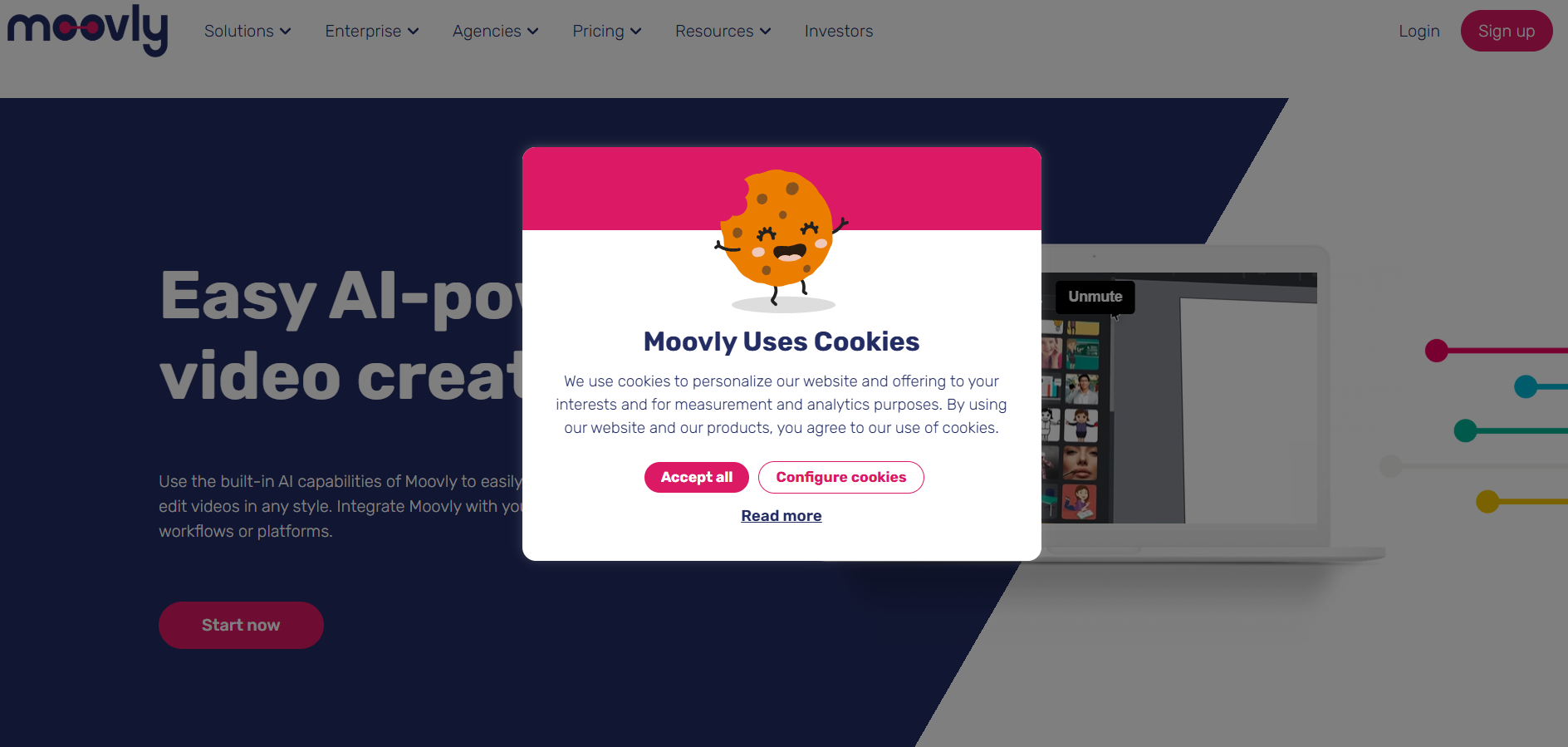
Consent Buttons Right on the Banner
I despise those cookie banners that make me go to another pop-up or screen to get to the consent buttons. Or, the ones that just have “Accept All” and “Choose My Preferences” and don’t have an opt-out button displayed.
At the end of the day, I don’t want to go to another page or pop-up to get the cookie banner off of my screen, and neither do your visitors. Display all of your buttons on the first layer of your cookie banner. And make it just as easy to opt out as it is to opt in.
This one from Pandectes is simple but gets the job done.

You can easily accept or deny cookies. You can also click on view preferences, get a quick list of cookies they use, and choose which ones you want.
I like this one from Cookie Script even more because they highlight the preferences AND give you the option to accept or deny all. It gives the user more flexibility in what they choose without making them go to another screen or pop-up.

I highly suggest going with the format Cookie Script uses. But if you don’t want to do that, include three buttons right on the announcement:
- “Accept Necessary Cookies Only”
- “Decline All Cookies”
- “Choose My Preferences”
Most people usually agree to all cookies or none at all. So, even chopping this down to those two options only would be okay.
This isn’t talked about enough but use the closest thing to positive wording on your buttons. It gives people good feelings versus bad ones. For example, instead of, “Deny non-necessary cookies,” use “Accept necessary cookies only.” Even when it comes to denying all cookies, “Decline” feels a little more polite and light than “Deny.”
Specific Colors for Each Consent Button
Sites pretty much depend on you being frustrated and wanting to click the first button you can to get rid of the cookie banner. So, they put “Accept All” at the top of list and/or make it seem like it’s the only option to capitalize on frustration.
Come to find out this annoys visitors a whole lot more than you might expect. Many of them would prefer to decline cookies, but they just can’t find the button.
Instead of trying to get one over on your visitors, use color to highlight your buttons. Yes, even the “Decline All” button. Just do it in a way that still points them to the button you really want them to choose, like Drip did here.

The accept button is bright pink and catches your eye first. The decline button is the opposite color scheme, with the button being white and the words being bright pink. It still stands out and differentiates itself from the accept button. Visitors clearly see their options and that’s what you want.
Make Sure the Cookie Banner Pops Up Right Away
This isn’t exactly about what to put on your cookie banner but it’s an incredibly important design element. Your cookie banner should pop up right away.
People shouldn’t have to go searching for it. They shouldn’t have to wait for some cheeky animation that has it sliding or dropping in. Nor should they have to interact with it before consuming content.
I think the cookie banner popping up right away is only annoying if it’s a modal, which is one of those pop-ups that take over the middle of the screen and disables all other page content until you interact with it.
Even if they don’t want to interact with your cookie banner right away, people can still enjoy the content they initially came for when the banner is tucked away in the lower corner of the page.
If they want to leave it there, that’s probably a good thing for you because it’s a constant reminder they need to make a decision. This is annoying in a good way because who wants to keep seeing that banner out of the corner of their eye?
However, giving visitors the option to “X” out of the cookie banner or hide it for the time being is best.
What’s the Best Position for a Cookie Banner?

Where a cookie banner is placed influences visitors to interact with it to some degree. I’ve found that I personally notice and interact more with cookie banners that are in the bottom left or right corner. And others who’ve studied the placement of cookie banners tend to agree.
Many sites have a chatbot in the bottom right corner, so their cookie banners end up in the bottom left corner.
Again, I wouldn’t use a modal or have a pop-up in the middle of the screen. I also wouldn’t put the banner at the top of the screen because it’s easily overlooked. Stick with the bottom left or right corner.
Do You Really Need a Cookie Banner?
If you collect and process personal data or track your website visitors with cookies in any way, you absolutely need a cookie banner. If you use cookies, either your own or from third parties, you need a cookie banner.
People’s personal data is protected by the law and a lot of the data you collect with cookies is personal. So, a cookie policy and banner make sure you’re protected and respect your visitors’ fundamental right to privacy.
What Are the Consequences of Not Having a Cookie Banner?
First and foremost, if you collect data and use cookies without getting consent, people are going to be extremely upset when they find out you’ve done it behind their backs. They’ll stop supporting your site at the least, but they could also go so far as to bring a lawsuit against you.
In addition, and possibly even worse, you’ll be in trouble with the law. As mentioned above, people’s personal data is protected by the law. And you have to tell them when you’re collecting it, why, what you’re doing with it, and get consent to gather it. If you don’t, legal and reputational damage, fines, and the possible shutdown of your site or business are the consequences.
If you don’t have a cookie banner, you can’t collect the data that’s so important to your marketing and improving the overall user experience.
Is a Cookie Banner Required By Law?
Sort of. We have the General Data Protection Regulation (GDPR).
It doesn’t talk specifically about cookies or having a cookie banner, but it does protect data that is considered personal information and governed under the law, like IP addresses, locations, names, and user IDs. The data is often tracked with cookies.
With this kind of data, you must collect valid consent before gathering and processing it. So, cookie law or not, the GDPR takes over.
The European Union (EU) has the European ePrivacy Directive (aka the “cookie law”) where you have to collect informed consent for cookies and other tracking tech, meaning the site has to simply inform users they’re using cookies before setting them up.
Does a Cookie Banner Affect SEO?
Your cookie banner won’t directly affect search engine optimization (SEO). Search engines aren’t crawling and ranking it. But it can indirectly affect your SEO strategy if you think about it.
For instance, an annoying cookie banner negatively impacts the user experience. When users don’t have a good user experience, they stop visiting your site. This impacts the traffic and engagement you get, and those things do impact SEO.
Also, cookies help you collect important information that you can use to better the content on your site. When your content gets better, more people engage with it, and that can potentially improve your rankings in search engine page results (SERP).