Understanding and Benchmarking Your MRR Movements

Tring Tring. You just received a notification from ChartMogul. A new customer signed up. Oh yes! Your monthly recurring revenue (MRR) just shot up.
Tring Tring. Another notification. A customer just canceled. Oh no! Your MRR went down.
Tring Tring. A customer just upgraded their plan from basic to premium. Yes! MRR goes up again.
You get the point. Your monthly recurring revenue (MRR) moves every day. It’s because of all the underlying dynamics of customers joining, upgrading, canceling, or downgrading.
Understanding and being on top of all these MRR movements can sometimes get confusing. To simplify this a bit, you can think that your MRR movements only have two components:
Below is a screenshot of the MRR movements chart in ChartMogul. The blue bars show the MRR added while the pink ones show the MRR lost.

If your goal is to grow your business, you need to add more MRR than you lose. So the blue bars need to add up to more than the pink ones.
Understanding MRR Movements
Let’s dive deeper into how your SaaS business adds or loses MRR. And how those changes are categorized in SaaS as MRR movements.
You can add MRR to your business by:
And, you can lose MRR when your:
So that’s how you lose or add MRR to your business. Now that you have a basic understanding of MRR movements, let’s look at these metrics for an average startup.
Benchmarking MRR Movements by MRR Bands
MRR Added Benchmarks
As we discussed above, MRR added is made up of three components: i) New Business, ii) Expansion & iii) Reactivation
We analyzed, aggregated and anonymized data from ChartMogul to find out how MRR movements split up across these three sub-components.
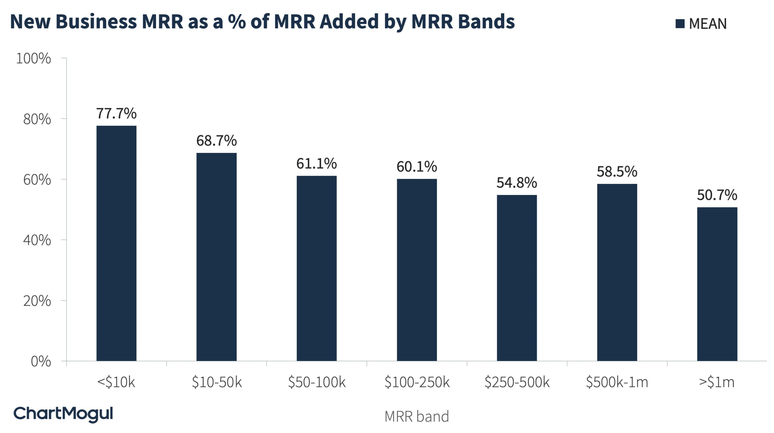
The chart below shows new business MRR as a percentage of MRR added.
As you would expect, new business makes up the largest component of MRR added for most businesses. Specifically, for startups with MRR <$10k, new business MRR makes up for 77.7% of their MRR added. As businesses grow, the proportion of revenue generated from new business decreases. It goes down to almost half (50.7%) for startups with MRR >$1m.
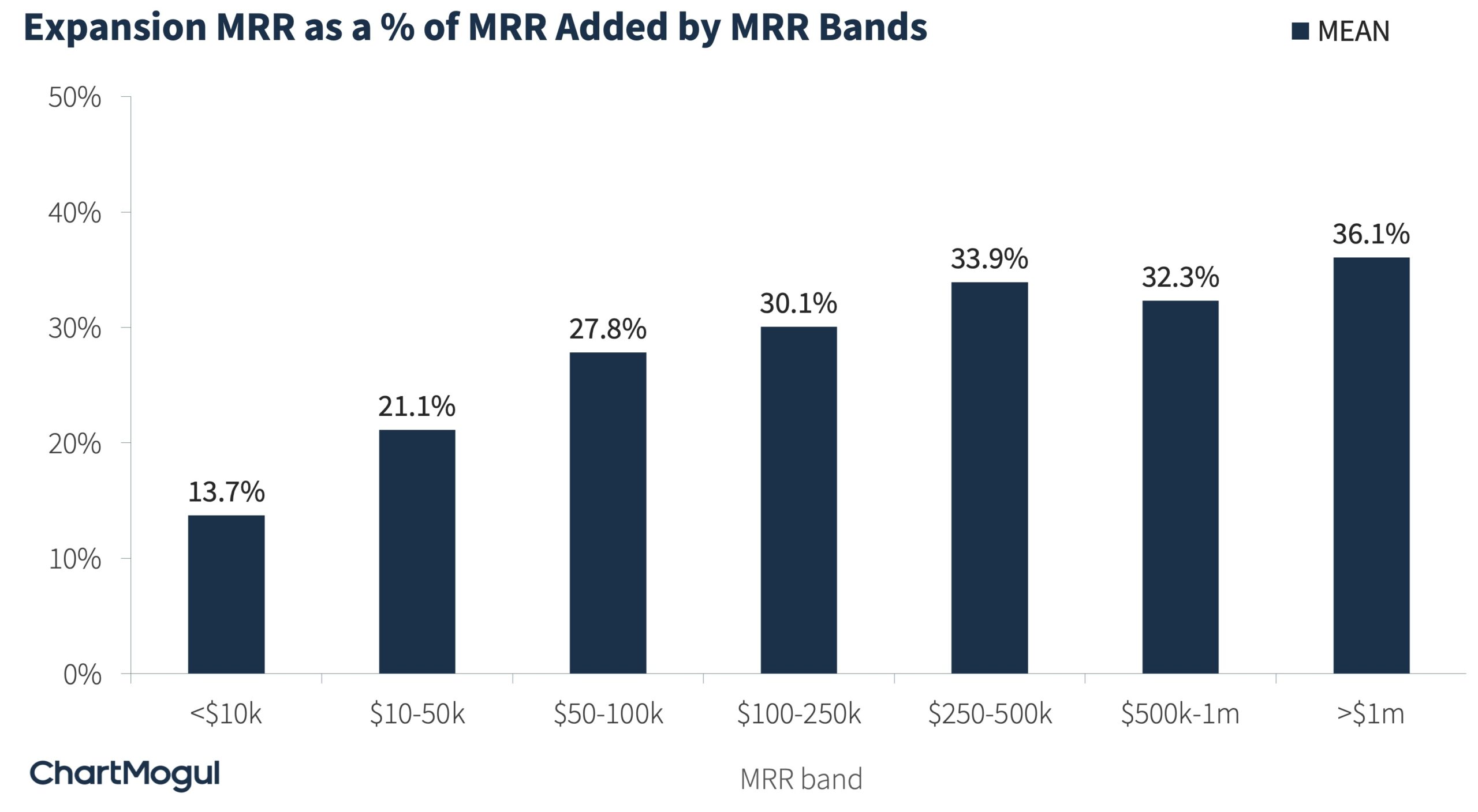
This is because as SaaS businesses grow, they focus their energy on increasing revenue from their existing customers. Hence, the proportion of expansion revenue as a percentage of total MRR added increases. As you’ll notice in the chart below, startups with >$1m in MRR, generate 36.1% of MRR added from expansion activities. This is the classic “land and expand” strategy that many SaaS businesses employ.
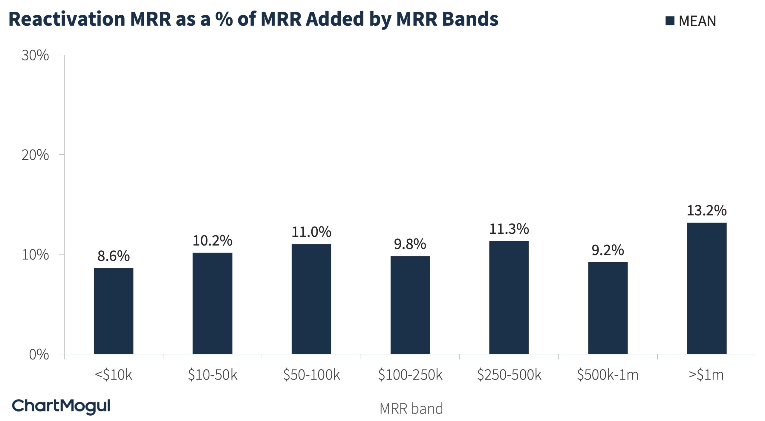
The third component of MRR added is reactivation. This component remains roughly stable throughout business growth, contributing to 9-13% of MRR added.
MRR Lost Benchmarks
Now, let’s move on to MRR lost. As a reminder, MRR lost can be grouped into two components: i) Churn and ii) Contraction.
The chart below shows Churn MRR as a percentage of total MRR lost. Churn makes up for the bulk of the MRR lost — roughly 70-80%.
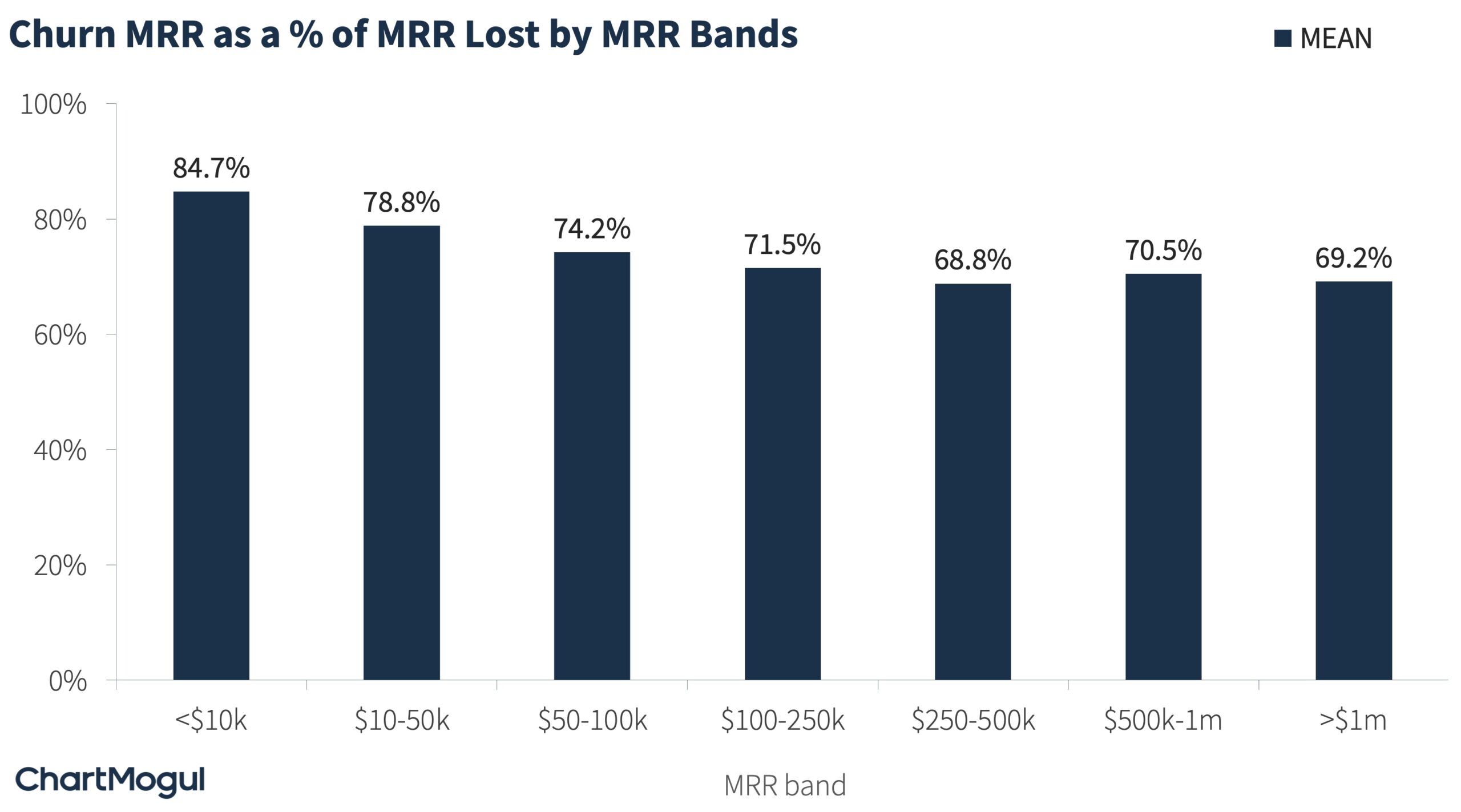
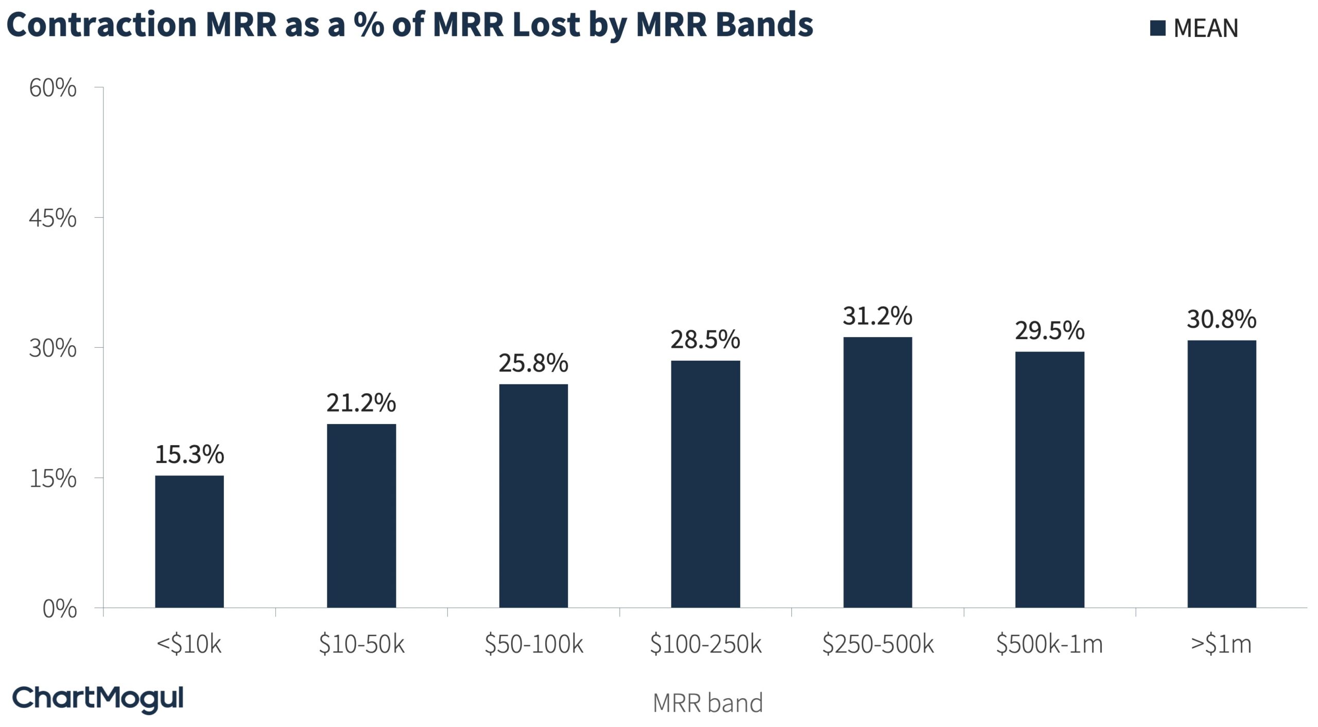
Here too, as the business grows, contraction MRR as a percentage of MRR lost increases in proportion. Although, it does eventually stabilize around that 30% range.
Benchmarking MRR Movements by ARPA Bands
In the section above, we looked at MRR movements by the MRR band. In this section, we look at MRR movements by bands of average revenue per account (ARPA) per month.
As a reminder, ARPA is the average revenue per account, i.e. average MRR across all your customers. It is also known as ARPU or APRC. You can find your ARPA in ChartMogul.
Why look at MRR movements by ARPA band? Well, everything is sort of the same at a given ARPA value. The way you sell, the way you service, and the way you retain all depend on your ARPA.
MRR Added Benchmarks by ARPA Bands
The chart below shows new business MRR as a percentage of MRR added across bands of ARPA per month. As you’ll notice, here too, new business MRR makes up the largest share of MRR added. Although, at higher ARPA, this proportion does get smaller.
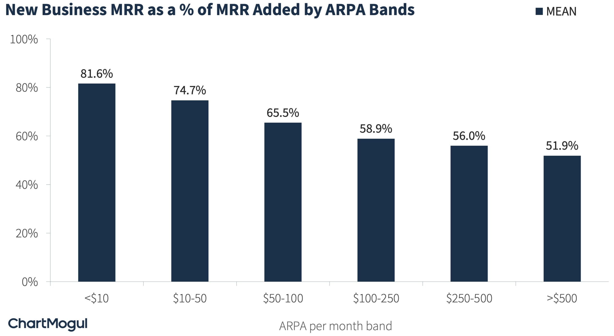
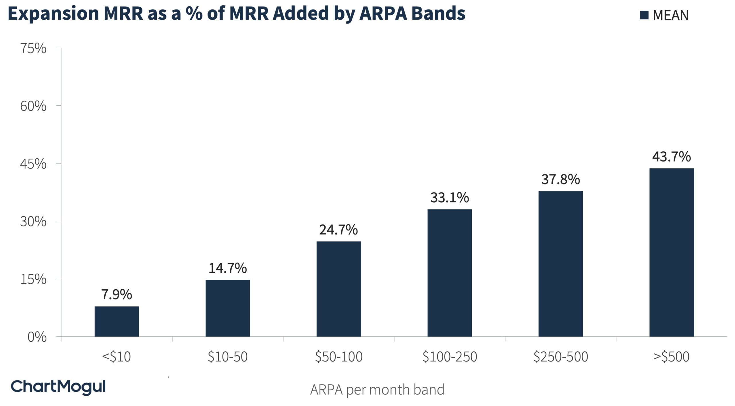
This is because, at a higher ARPA, expansion starts to contribute more to the MRR added. For example, companies with ARPA per month of >$500 or annual contracts over $6k get 43.7% of their revenue through expansion. For companies with an ARPA of less than $10, it’s only 7.9%.
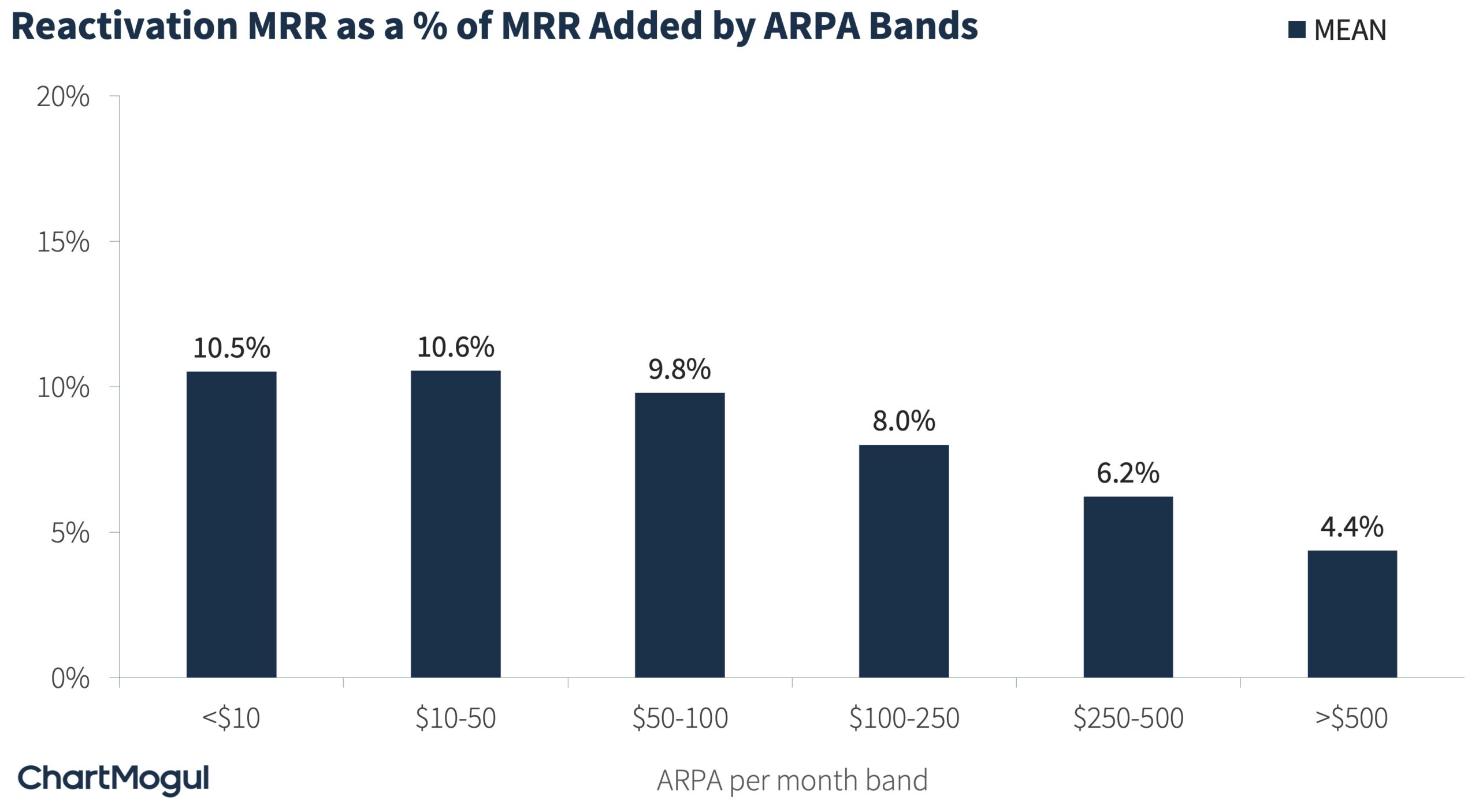
The reactivation proportion of MRR also depends on your ARPA. At a higher ARPA, your reactivation MRR decreases. One reason for this could be that at a higher ARPA, fewer customers take the knee-jerk reaction of churning. And because of that informed decision, fewer come back.
MRR Lost Benchmarks by ARPA Bands
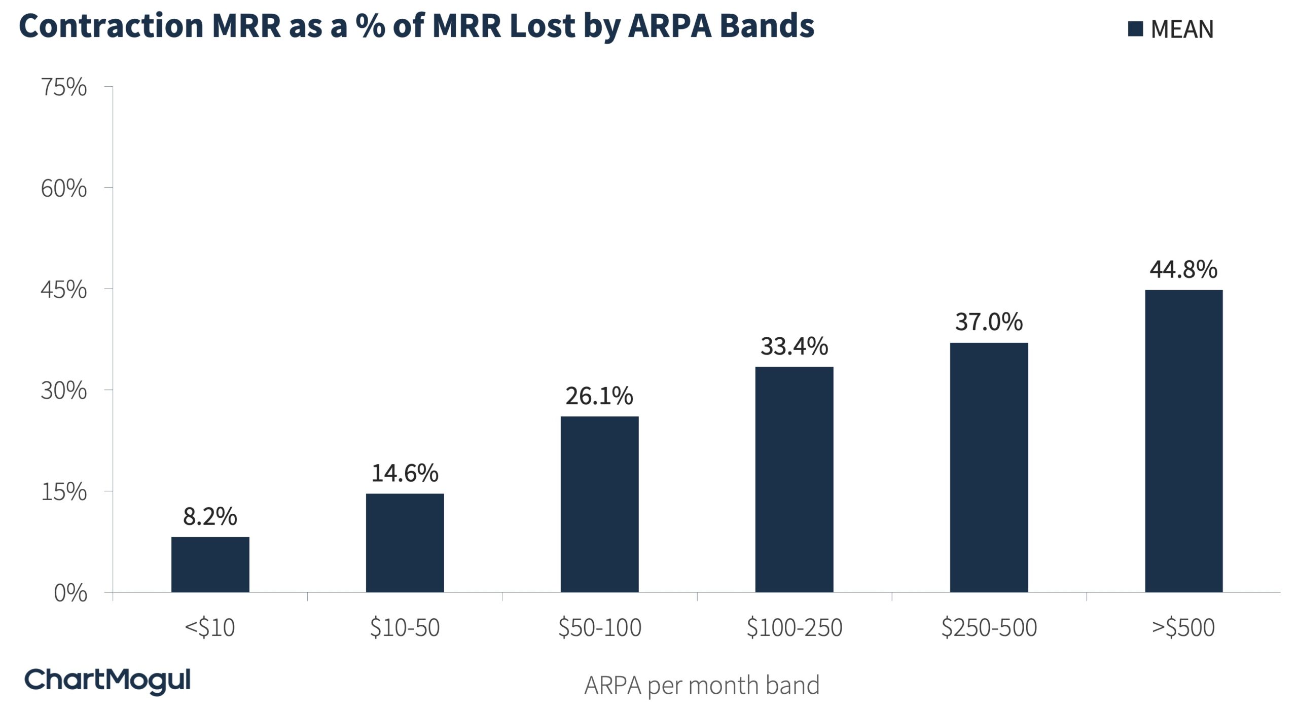
As for MRR lost, Churn is the largest contributor. Although, for startups with ARPA >$500, churn contributes to only a little more than half of the revenue lost.
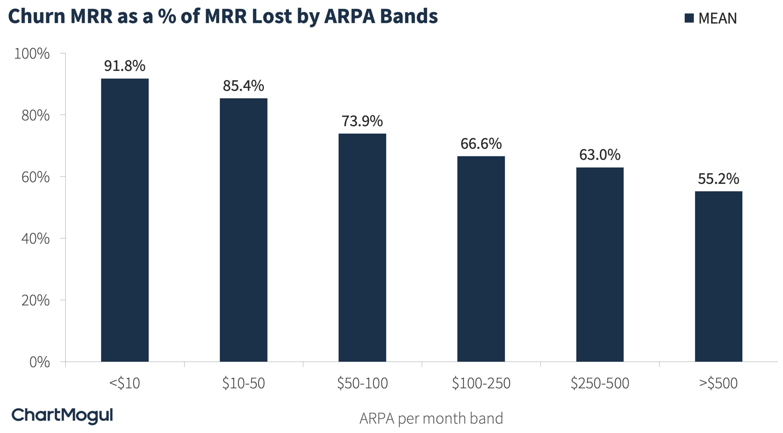
The rest is contraction MRR. If your business is in a higher ARPA band, retaining existing customers and making sure they are using your product becomes of key importance.
Calculation Methodology. We used anonymized and aggregated data from ChartMogul’s platform to carry out this analysis. We categorized companies into MRR & ARPA bands and then calculated aggregates over 3 months (Dec ‘21, Jan ‘22 & Feb ‘22).
Three Questions You Should Ask Yourself
Now that you understand the basics of MRR movements, there are three questions that you should ask yourself:


