The 10 Best About Us Page Examples on the Internet

We didn’t just grab a bunch of random about us page examples for this piece. We found the absolute best examples—the website about us pages you should model yours on.
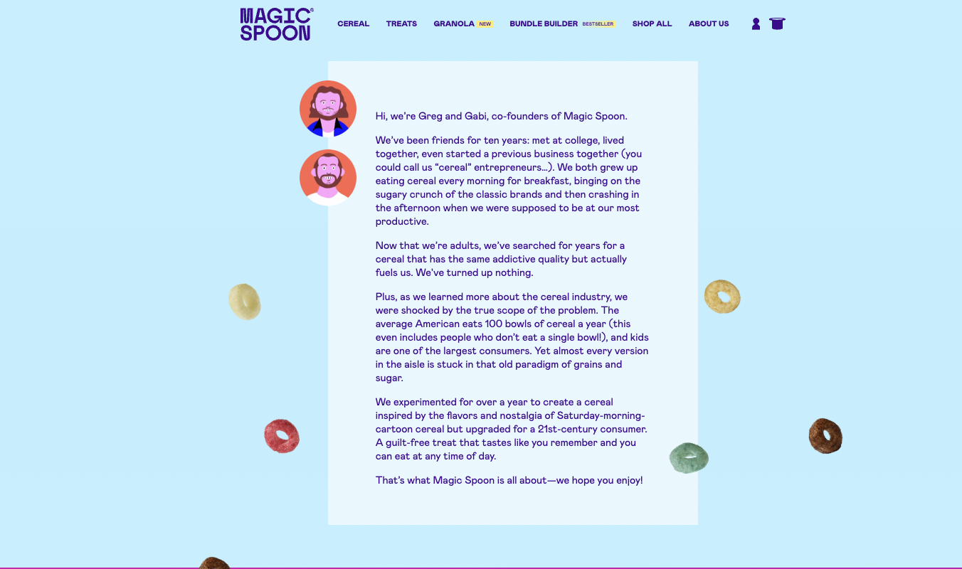
1. Magic Spoon

Magic Spoon makes low-carb, sugar-free cereals to replace your favorite sugary cereals. Magic Spoon’s About Us page is short, sweet, and playful—just like the brand itself.
The page doesn’t go too deep into the founding of the brand or all the great accolades Magic Spoon has won.
Instead, the founders immediately jump into the pain point that spurred them to start Magic Spoon in the first place.
And what is that pain point? A lack of nutritious, energizing cereals that look and taste like everyone’s childhood favorites.
You know, like Froot Loops, Cocoa Puffs, and Cinnamon Toast Crunch (my personal fave).
But as most adults know, traditional cereal just isn’t great for the body. Which is where Magic Spoon comes in.
The two founders give a snippet of how long it took them to make the first Magic Spoon cereal (1 year) and promise that it’s a guilt-free alternative to the sugary stuff.
The colorful cereal pieces help the page pop visually, and intriguing facts sprinkled throughout the text do too.
Like the stat that the average American eats 100 bowls of cereal every year even if they don’t eat a single bowl of cereal.
Please explain that one to me, Magic Spoon! I’m dying to know.
Unsubstantiated cereal-bowl-consumption fact aside, it’s a colorful, fun, and customer-focused about us page.
2. Buffer

Buffer is a social media management platform with a fully remote workforce, and its About Us page shines in several ways.
First, the page oozes with friendliness. There’s a smiley-face emoji, casual language, and pictures of Buffer team members looking positively joyous.
Second, the copy expertly weaves tidbits about Buffer’s history together with details about the company’s core values. These include transparency, gratitude, a commitment to compete with “our yesterday selves,” and optimism.
Third, the visuals back up the values. You can see all of Buffer’s current numbers—including monthly recurring revenue and daily active users—right there on the about page.
The copy hints at how Buffer’s way of doing business positively affects its clients. Under the tidbit about gratitude being a core value, for instance, Buffer states, “We approach customer conversations with the knowledge that it’s a privilege to serve them.”
This digital marketing agency about us sample is completely devoid of any competitor-bashing copy. It basically makes the reader feel like everything is going to be okay, mistakes can be overcome, growth can happen with small steps, and support is all around.
That’s some powerful stuff.
3. Allbirds

The about us page for Allbirds is visually gripping right from the first glance. Mother Nature made Allbirds do what?? I must know!
The answer, we learn just below this image, is that Mother Nature inspired the two Allbirds founders to create a sustainable new fabric made of wool: “A native of New Zealand, Tim Brown was always well versed in the magical qualities of merino wool. Inherently curious, he began asking himself why such a remarkable, sustainable resource was virtually absent in the footwear industry. And with that spirit of wonder, the Allbirds journey began.”
Boom. Short, sweet, and interesting—all at once.
The copy on this about us page example for an online store quickly moves to what customers will get when they wear Allbirds shoes. These features include:
- A simple, natural design
- An absence of synthetic materials
- “Cloud 9”-level comfort backed by a 30-day, no-questions-asked guarantee
All of this information is backed by more eye-catching visuals.
Then there’s a quick breakdown of Allbirds’ commitment to the Earth (it’s a certified B Corp), giving back, and customer comfort.
I literally came away with a complete understanding of the company’s story, products, and values after just one scroll down through the about page. It took maybe 60 seconds to gain all that information.
That’s what I call effective.
4. Melissa & Doug

If you’re a parent, you are almost certainly acquainted with the colorful, wooden offerings sold by Melissa & Doug. Originally known for its puzzles, the company now offers everything from toy wooden doctors’ offices and grocery counters (really!) to train sets and craft kits.
Not everything is wooden, but Melissa & Doug steers clear of plastic as much as possible.
The toys hearken back to a simpler time, and parents gobble it up. (Myself included. When my son turned two, he got a Melissa & Doug Latches Barn Toy and I played with it more than he did.)
As screens have become more ubiquitous in the parenting sphere, Melissa & Doug offers a refreshing alternative to tablets and toys that do all the playing for your kids.
Instead, the focus is open-ended, screen-free, sustainable play. The about page showcases these core values with playful, pastel illustrations.
It’s short, it’s sweet, and it hits a major pain point in parents everywhere: how do I get my kid to stay off the tablet and actually play with toys?
You run-don’t-walk to Melissa & Doug, that’s how.
5. Cotopaxi

Cotopaxi is an outdoor brand that makes sustainable gear and donates a portion of its profits to fighting poverty around the globe. The Cotopaxi About Us page immediately grabs the eye with a photo of four people wearing colorful Cotopaxi jackets.
Right below this, there’s a snippet that tells readers what Cotopaxi’s all about in just three lines.
Then the focus moves away from Cotopaxi’s offerings and focuses on the company’s three core tenets:
- Fighting poverty
- Ethical & sustainable manufacturing
- Accountability
Scroll further down and you’ll find a link to Cotopaxi’s 2023 Impact Report, released in April 2024.
(Side note: I clicked on the report, which adheres to GRI Sustainability Reporting Standards, and it’s impressively thorough. All sections that contain data about the company’s impact around the world are fact-checked by third-party organizations like 1% for the Planet and Fair Trade Certified.)
If you go even further down the About Us page, you’ll find more information about why Cotopaxi is committed to helping others: “[Founder] Davis Smith grew up throughout Latin America, where he saw first-hand the hardship resulting from unequal access to opportunity. He has since dedicated himself to using business as a force for good in order to address the inequality he witnessed during his childhood.”
And at the very bottom of the page, you’ll find links to every single one of the company’s Impact Reports dating back to its 2015 inception.
That’s what I call transparency.
If you want to make an about page that inspires customers to care about your brand because your brand cares about others, Cotopaxi is your blueprint.
6. Mayo Clinic

Mayo Clinic is a nonprofit medical center known for advanced research and excellent patient care. And when it comes to about us pages in the medical field, Mayo Clinic is an engaging example.
The first thing you see when you visit the Mayo Clinic’s about us page is the tagline, “Solving the world’s toughest medical problems — one person at a time.” Directly beneath this is a photo of a Mayo Clinic patient with a link to their story.
Nothing says patient-centered care like an about us page that literally focuses on patients from the jump.
Scroll down and you’ll find more information about how the Mayo Clinic serves patients. The medical nonprofit’s history is sprinkled throughout the text.
Like in this quote from the about us page: “At Mayo Clinic, experts work together to solve the most challenging unmet needs of patients. Our history of innovation dates back almost 150 years, when brothers Will and Charlie Mayo pioneered an integrated, team-based approach to medicine.”
It always comes back to the patient.
Go even further down and you’ll find links to more in-depth information about the Mayo Clinic’s:
- Locations
- Governance and board of trustees
- Medicare Accountable Care Organization
- Volunteers
- Mayo Clinic Care Network resources
- Mission and values
Since each of these topics has its own page, the information doesn’t clutter the about page.
And at the bottom of the page, there’s a CTA button to donate to the Mayo Clinic so it can keep helping patients overcome medical challenges.
Nonprofits, take note!
7. Toyota

Toyota makes cars, and the about page could wax poetic about how amazing its cars are.
And I mean, they are amazing. They last forever. How do I know? My family has a history of only buying Toyotas. My only car is a 2014 Toyota Tacoma that’s going strong with over 150,000 miles on it. I expect it to last for at least another two decades, like the Toyotas my parents drove throughout my whole childhood.
But instead of bragging about how awesome and durable its vehicles are, the Toyota About Us page immediately shines the spotlight on the customer.
The very first sentence is this: “Our passion is about giving people the freedom to explore their world and reach their full potential.”
Then, there’s the Toyota Philosophy. The sand-colored background makes the image of a customer enjoying a picnic in the back of a Toyota pop out.
And the text continues to celebrate the customer. The headings in this section say things like “You are what drive us” and “Built for how you live” and “Drive change, your way.”
You, you, your.
Could you get any more customer-centric in an about us page?
I don’t think so.
8. Nike

Nike is…well, everyone knows what Nike is. Despite its obvious success, the sportswear giant has yet to lose focus on the customer.
Even on its about page.
No one would really blame Nike for humble-bragging just a little. I mean, it’s Nike after all. The Nike Swoosh is recognized around the world.
But Nike’s visually striking about us page is all about the athletes it serves. Cleverly, according to this about us page, “If you have a body, you are an athlete.”
That’s a bold statement.
It’s also inclusive. It tells everyone who sees the page that they are welcome here. That Nike wants them to celebrate their body and what it can do. That Nike gear is for everyone, not just Olympians and NBA stars.
Scroll down a little further and you get a sneak peek at a photo essay that shows behind-the-scenes glimpses of how Nike shoes are made. Go down more and you’ll find news articles, athlete interviews, and stories that capture Nike’s past.
Go down even more and you’ll find a link to a 2023 Impact Report, links to new products and events, and links to Nike’s initiatives.
There are lots of links and not a ton of text, which works well because everyone knows what Nike is.
But it’s that first glimpse of the About Us page that stands out to me. The bold statement that Nike serves athletes, and that if you have a body, you are an athlete in Nike’s eyes.
It’s welcoming, it’s affirming, and it’s making me want to go grab myself a pair of Nike shoes.
9. National Park Service

The National Park Service (NPS) is a government agency that manages and protects 433 national parks, historic sites, and natural landmarks in the United States.
Even though it’s not a business, the National Park Service about us page tells a story, reads smoothly, and focuses on the user.
But in this case, the user is simply people who visit and value these protected sites.
Three short, easily readable paragraphs introduce the NPS’s history, the work it does, and the focus it has on “creating close-to-home opportunities for kids and families to get outside, be active, and have fun,” among other things.
Lower down on the page, you’ll find sections showing the:
- Mission statement with a link to the legislation that governs the NPS
- Employee section with links to various career and volunteer programs
- Clear breakdown of the NPS’s structure, complete with a visual representation
- Short history of the iconic NPS arrowhead emblem
- Learn More section with links to FAQs, park planning help, maps, and visitor statistics
- Follow Us section with links to all official NPS social media sites
The about page is easy on the eyes and incredibly digestible. If you’re in an industry where you need to be clear, direct, and helpful, the NPS site is a great about us page example.
10. Burt’s Bees

Burt’s Bees is a natural personal care brand that makes beeswax-based lip balm and skincare products. If you know me IRL, you know I don’t go anywhere without Burt’s Bees lip balm.
That’s why I was pleased to see that Burt’s Bees has an excellent about page design, just like it has excellent lip balm.
The dripping honeycomb! The real Burt and his bees (okay it’s an actor but still)! The short yet fascinating history of how a hitchhiking moment turned into a brand so profitable Clorox bought it in 2007 for over 900 million!
It’s all there on the Burt’s Bees about us page.
There are also sections on how the company practices sustainability, how it supports its farming partners, and how its products help the skin stay healthy.
With bold pinkish-red headers, short chunks of text, and lots of sunshine-yellow highlights, the design is cheerful, outdoorsy, and very on-brand.
What Makes a Great About Page
Now that we’ve explored 10 of the best examples around, you’re probably bursting with your own about page ideas for your website.
Here are five essential ingredients for crafting a compelling about us page.
It tells a story
This goes beyond just documenting the history of your brand or organization. Instead, focus on moments in your history that resonate with your audience. Link to a longer history page if you really want to share the details.
But save your about page for the highlights. Extra points if you tie the highlights in with your mission, values, and reason for creating a business in the first place.
There’s an audience-centered approach
Instead of just talking about yourself or your business, frame your story in a way that connects with your visitors. Keep this thought in your head the whole time: why should they care?
It sounds harsh, but here’s the thing. Your web visitors are on your site to learn how what you do connects to what they want.
So show them. Show them how your journey, or your expertise, or your values benefit them.
It’s bursting with personality
People want to connect with real humans, not faceless conglomerates. You’ll notice that none of the about page examples I’ve included here have corporate speak to wade through.
There’s a reason for that, and it’s that no one wants to read corporate speak.
Even if you’re in the driest, most boring industry ever, find a way to infuse your about page with personality. It doesn’t have to be forced. Just keep the language simple, the sentences short, and the content relatable and genuine.
If your brand does have more room for playfulness, though, embrace it!
The page includes high-quality visuals
Your about us page should include images or other visual elements that make your message stand out. At the same time, the design should line up with your brand. Use the same fonts, colors, and image styles across your website to keep your brand consistent and recognizable.
It ends with a clear call-to-action (CTA)
Or several.
Don’t be afraid to have at least one clear call to action. Most of the brands on this list have way more than one CTA. This is fine, as long as things don’t get cluttered.
Whether they realize it or not, visitors will want something concrete to do with the information they’ve gained from your about page.
Having buttons for actions like exploring other services, signing up for a newsletter, or following you on social media gives visitors clear next steps to take.