How To Build a Convincing Opt In Popup That Gets Signups


Everyone complains about popups. But if you are trying to grow your business, who cares?
Opt in popups work. The right offer, shown at the right time, will turn casual visitors into subscribers or buyers. Every successful online business knows it’s true, which is why it’s nearly impossible to visit a site without being asked for your email.
I’ll walk you through everything you need to know in order to create an opt in popup that resonates with your site’s traffic. When it’s done, you will have a highly-automated process for capturing email addresses and building a lucrative contact list.
An opt in popup is a window that opens while a user is browsing the site, which asks them to enter their email address. In exchange, brands offer something that they believe their target audience will find valuable, such as a discount, lead magnet, or access to exclusive content.
When someone provides their contact information, it gets stored in your CRM software, email marketing service, spreadsheet, or wherever your contact list is stored.
Opt in popups for lead generation
From a digital marketing perspective, people who opt in are leads: a potential customer that has expressed interest in your company. It’s worth nurturing these leads using email marketing, paid social media, and other tactics to convert them into paying customers.
Think of opt in popups as the second stage of a simplified digital marketing funnel:
Website traffic → opt in popup → email marketing → sale
Without capturing the email address with the opt in popup, the funnel dead ends as soon as potential customers leave your site. Some users may shop (if you have an online store) or sign up on their own, but a much bigger fraction of them are going to move on and potentially never return.
After you set it up, an opt in popup works 24/7 to collect email addresses from that traffic before users leave. It’s automatically pitching every visitor on starting a relationship with your business.
Not everyone is going to opt in. Not even close. But if you have crafted an offer that resonates with your ideal customers, the fraction of people who sign up are the ones who are most interested in what you have to offer.
How do we know opt in popups work?
Because everyone uses them. Everyone. Scrappy solopreneurs, global brands, mom & pop shops. It’s hard to find a website these days that doesn’t ask for your email. This isn’t by accident.
Take any brand with 100,000+ subscribers. Behind that list is a pipeline supported by specialist salaries, creative teams, CRM software, attribution modeling, development time, and I could keep going on. That infrastructure doesn’t exist for vanity metrics. It’s there because email converts consistently and profitably.
Popup tools charge $40–$100+ per month for access to premium features like exit-intent popups, scroll-based triggers, and A/B testing. The small businesses and bootstrapped startups that use these tools are only willing to pay these prices because of the ROI they can realize in a short timeframe.
There really is not a debate here. Opt in popups are going to recover customers from otherwise lost visits. If you want to capture more of the traffic you have, this is one the best, cheapest, easiest, and lowest-maintenance options out there.
There are four common types of opt-in popups, which are:
- Lightbox: Appears in the middle of the screen and dims the background.
- Slide-in: Enters from the side or bottom of the screen without blocking content.
- Floating bar: A persistent, narrow banner that stays visible as users scroll.
- Full-screen: Covers the entire page.
Lightbox and full-screen popups are more disruptive to the user experience than slide-in or floating bars, which don’t demand the user close the window before engaging further.
On the other hand, bars, banners, and slide-ins don’t give you a lot of room to work with, whereas lightbox styles allow you to use more text and visual elements to convince the user to sign up.
Let’s look at a few examples that show the range of what you can do. Opt in pops may be as small and unobtrusive as this example from the popular personal blender maker, Nutribullet.

Notice the simple email opt in “Subscribe and save 15%” in the banner popup at the bottom of the screen. It’s easy to explore the site without having to close the popup.
On the other end of the spectrum are the large popup windows that dominate the screen and force the user to sign up or close them before continuing to engage with the site.
This lightbox style popup from the online retailer, Revolve, offers users a 10% discount and updates about the latest fashion trends.

Here users must enter their email and select a radio button (Women, Men, or Both) to continue to use the site. Or they can just click “X” to disregard the offer and keep shopping, which keeps the popup from being too intrusive for users that aren’t interested.
What about other types of opt in popups?
In addition the traditional opt in popup for email capture, there are several other types of popups that users encounter, such as:
- Cookie policies
- Privacy policies
- Push notification requests
- Affiliate disclosures
These opt ins usually require at least an acknowledgement from users, sometimes more. You will also see SMS opt in popups, which allows companies to market using text messages.
In this post, I’m focused entirely on the email signup type of opt in popups.
For now, let’s just acknowledge that there are a ton of different popups competing for user attention. And if your site has chatbot, that’s one more window users have to close before engaging with the content that they came for.
A good opt in popup has to cut through all of this noise and earn the user’s attention.
There are six elements that must be working together in order for an opt in popup to convert:
If any of these factors is off the mark, you are not going to struggle to get people to opt in — or worse, you’ll wind up building a list full of bad-fit leads that will never generate meaningful revenue for your business.
On the other hand, when all of these elements are dialed in, you will have an opt in popup with a high probability of converting the traffic on your site.
Not everyone is going to opt in, of course, but you can be sure that you have made the offer as irresistible as possible.
Let’s go through each of these factors in detail and how to approach them.
1. A compelling offer
Why should users care?
Nobody wants another newsletter. I think that’s fair to say. But, people are willing to provide their email in exchange for something that is really valuable to them, such as:
- Discounts and special deals
- Free gifts
- Exclusive content or features
- Early access
- Private communities
- Freemium tools
Use market research to figure out what is going to be perceived as valuable by your target audience. Who are they? What do they care about? How do competitors market to them?
Customer demographics like age, location, industry, and job titles are critical to nail down, but so too are psychographics, like beliefs, attitudes, and opinions. Work backwards from what you know about your customers to create a compelling offer that speaks to their expectations, goals, desires, challenges, or how they want to be seen.
What works:
- A clearly stated offer that is easy to read and understand. The offer itself should usually be the largest, boldest, most prominent text in the popup.
- Specific, bite-sized value. “Get 3 social media templates” is going to convert better than “Sign up for tips”.
- Percentage discounts and “free gifts” work well in B2C. Access to downloadable resources, freemium tools, and expert insights work better in B2B.
Questions to ask:
- How does the incentive you offer really help the user?
- Is the offer 8 words or less?
- Does the offer tie into the page they’re already on?
2. Persuasive copywriting
Why should users act now?
You don’t have room to write much in an opt in popup. Most have 30-50 words total, and some of the most effective ones have far less. Focus on crafting excellent copywriting that pushes the user toward conversion with every word.
Here are the typical text elements of a popup and what they have to do:
- Headline: Grab the user’s attention and frame the offer.
- Subheads: Support the headline claim and clarify its meaning
- Supporting copy: Build the appeal of conversion with product claims, social proof, countering objections, and other copywriting strategies..
- Offer: Clearly explain the incentive and what’s required of users to get it.
- Call to action (CTA): Indicate the desired action while highlighting specific value.
You don’t have to use all of these elements — sometimes a headline and CTA is enough. Text is really easy to change, so consider experimenting to figure out what appeals to your audience.
What works:
- Making your offer as concise as possible and using power words where possible.
- Using reliable persuasion techniques. If the text describing your offer doesn’t feel useful, urgent, or relevant, no one is going to opt in.
- A clear and specific call to action. Instead of a bland “Submit” or “Subscribe” button, use a CTA like “Email me Chapter 1” or, “Send me the discount”.
Questions to ask:
- Have you angled your writing to meet the audience where they are in terms of their level of awareness and sophistication?
- Can your engagement metrics, organic CTR, or paid ad performance tell you anything about the ideas and emotions that resonate best with your audience?
- Is there any vague language you can replace with specific, concrete details? Any bland or forgettable words that could be punched up?
3. Opportune timing
When should users see the popup, and how often?
The timing of your popup shapes how it is perceived by users. The best possible timing depends on the goal of the popup, as well as the typical behavior and goals of your traffic.
Depending on the software you use, popup triggers may include:
- Instant load: as soon as the user lands on the page
- Time delay: after a user has been on the page for a set period of time
- Scroll depth: once the user has scrolled down to a certain point on the page
- Exit intent: after the user behavior indicates they are going to leave or close the page
- Inactivity: after the user has stopped interacting with the page for a set period of time.
You also have control over popup frequency settings, which determine how often the popup is displayed to individual users.
Popup frequency options are display-based (like, once per session, once per page load, or never display more than 3 times), time-based (once per day, once per week), or conversion-based (show until signup or opt out).
Together, timing and frequency have a huge impact on the impression your opt in popup creates with users. They are both easy to adjust, and with a little experimentation, you can find the sweet spot for your audience.
What works:
- Instant load popups paired with time-sensitive promotions (flash sales, countdowns) on pages with high purchase intent (product, pricing, and landing pages).
- Time-delay or scroll depth trigger on informational pages (guides, how to’s, definitions), though you should also use exit intent to capture leads during quick visits.
- Lower popup frequencies for return visitors, which is respectful, decreases popup fatigue, and doesn’t make your brand look desperate.
Questions to ask:
- Have you given the user value before making your ask?
- Does increasing/decreasing time-delay improve your conversion rate?
- When does your popup appear relative to the average time a user spends on the page?
4. Strategic targeting
Who sees the popup?
Most tools let you show popups to particular segments of users based on a range of targeting conditions like:
- Device type
- Returning vs new visitor
- Traffic source
- Referral URL
- UTM parameter
- Geolocation
- Cookie or tag
This allows you to create different popups with specific messaging and opt in offers for different groups, which is likely to convert better than a generic, one-size-fits-all, sitewide popup.
If you have significant traffic coming from search engines (paid, organic, or both), consider using page-specific targeting for opt in popups. Keyword research can help you understand the user intent — are they looking to find information, shop, solve a problem?
Understanding intent enables you to present offers that deliver exactly what users searching that keyword are looking for.
What works:
- Discounts, coupon codes, and sweepstakes for social traffic, which tends to be curious but distracted.
- Downloadable guides and checklists for search traffic, which tends to be task-oriented.
- Using cookies or tags to limit popups for existing subscribers, which reduces friction and annoyance for returning users.
Questions to ask:
- Which devices are converting best? And are we prioritizing that experience?
- Are targeting efforts leading to better customer engagement metrics, like higher open rates, lower churn, etc.?
- Where in the user journey are most of our signups happening? Which channels have the highest conversion rate?
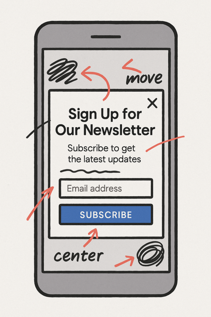
5. Intentional design
Is your popup appealing and easy to use?
A clean, mobile-friendly design with polished visual elements builds trust and makes your message land. A clunky, outdated, or confusing design will have the opposite effect, resulting in lower conversions.
I’m not someone who thinks that changing the button color matters, but the overall impression that your design makes in the first second a user sees it? That’s incredibly important to get right.
What works:
- Minimalist, distraction-free layouts with a clear hierarchy and visual cues.
- On-brand visuals and typography elements that align with your UX strategy.
- Optimized mobile experience. Buttons and form fields should be large enough to tap, for example, and located safely within the “thumb zone”.
Questions to ask:
- Does the design make the next steps obvious?
- Can someone close the popup easily?
- Is the popup visually distinct, yet clearly part of the website?
6. Visible assurances
Do users believe your site is safe and trustworthy?
People won’t sign up unless they think that your brand is credible, legitimate, and safe to engage with. For newer brands, it’s really important to give users reasons to trust you because there isn’t an established reputation to lean on.
Visitors need visual cues that you’re real, professional, and worth their attention. And they need to feel that opting in won’t lead to spam.
What works:
- Prominent subscriber counts that show others trust you, like “Join 15,000+ readers”
- Clear privacy messaging or a one-line reassurance, like “We’ll never share your info”
- Social proof near the signup, such as testimonials, logos, or review stars.
Questions to ask:
- How many reasons to trust our site are visible once the popup appears?
- Are the different types of social proof that perform better with certain audience segments?
- What signals are your competitors using to inspire trust and credibility?
Real Examples of Opt In Popups That Work (and Why)
Let’s take a look at several effective opt in popup examples that I found in the wild.
For each example, we’ll look at the context in which the popup appears and how it is executed to understand why it works.
Nerdwallet

This slide-in style opt in popup from Nerdwallet, the well-known personal finance company, shows an excellent minimalist approach.
Context
I found the popup on an informational blog post titled, “How to Open a Business Bank Account: Requirements, Documents and Top Options.” This content is only useful to (and likely to be seen by) people who:
- Own a business
- Need a bank account
- Aren’t sure what to select
- Want to know their options and how to decide.
My hunch is that few users on this page are casually browsing, regardless of whether they came from search, social, or exploring other pages on Nerdwallet.
I took a quick look at SEMRush, the SEO tool, to validate this assumption, and I found that the average cost per click for the keyword “open business bank account” was $22.90. That suggests that the traffic on pages like this has a very high degree of purchase intent. No brand would pay more than $20 per click for disinterested traffic.
Execution
The offer is clearly stated: sign up to receive a free account and access to a cash flow tool that can help them find the perfect banking solution for their business.
It’s a relevant offer because this is exactly what people want: to find the right solution for them. By signing up, they can get access to the answers and tools they need. For new business owners, cash flow problems are some of the most common sources of anxiety, confusion, and bankruptcy. A free tool to help them navigate these challenges? Fantastic.
All of this resonates with the headline “Business banking made easy,” which is, in a nutshell, exactly what users on this page are likely to be looking for.
On the design side, the background of the popup is a gentle blue, which is distinct enough from the rest of the site so as to stand out, but subtle enough that I ignored it while I explored the rest of the page. With a slide-in, there is always the chance users will leave the popup open and potentially convert after engaging with your content.
Man Crates

This lightbox style opt in from Mancrates, the online shop for mens’ gifts shop, uses five words and less than 20 total characters.
Context
I arrived at the website of online retailer, Mancrates, by searching “gifts for men” and clicking on one of the sponsored product ads. I experienced the popup almost instantly, with maybe half a second on the site before I got the offer.
Because I clicked on a sponsored link to an ecommerce site, I expected a popup, and I bet most users would as well.
In order to proceed exploring the site, I had to close the popup, but it was easy and obvious to do.
Execution
I don’t want to embellish what’s going on here — it’s a straightforward discount offer paired with a lifestyle photo. At the same time, it’s well done.
The photo captures the emotional side of what Mancrates sells, which is the joy and satisfaction that comes with giving a gift that they’re really excited about. Pictured is the crate, rather than a particular gift, which focuses on the moment of anticipation before it is opened.
The minimalist design, concise copywriting, and evocative image are all part of one clear offer that’s going to resonate with someone looking for a gift, whether they know what they are looking for or not. The color contrast makes it easy to know what to do, and exiting the window is intuitive.
I also noticed that when I returned to the site later, the opt in popup was still available as a much less intrusive button that floated in the lower left hand corner while I explored the site. I did not receive the lightbox popup on any subsequent visits.

I thought this was a good tactic to get both the in-your-face advantages of a lightbox popup along with the more gentle advantages of a non-intrusive, persistent popup offer.
There are several ways to add opt-in popups to your site, and you may already have access to one or more of these options.
The most common tools fall into a few broad categories:
- Email marketing services like Mailchimp and Kit offer basic popup builders. They’re easy to use and ideal for capturing emails directly into your list without additional integration work.
- Ecommerce platforms like Shopify and BigCommerce offer built-in tools and third-party extensions to manage a wide range of popups
- CRM software like HubSpot offers popup forms as part of their broader suite of marketing tools.
- WordPress plugins, which can be purpose-built tools, like Popup Maker, or come bundled with page builders like Elementor.
Free and built-in tools are great for small sites and simple funnels. At scale, premium tools are essential for operations, customization, and smooth integration with other platforms.
Many site owners already have access to one or more of these tools. If you can avoid adding another plugin or tool just to enable opt in popups, I would do that.