Are Popups Still Relevant? The Future of Popup Marketing Explored

Popups are everywhere on the internet, but do they actually work or just annoy people?
Popups are now much smarter and more common than ever before. However, despite their popularity, some website owners ask if popups still work.
In this article, I will try to answer this question, discuss why popups are still relevant, and explain the future of popup marketing.
Note: This is a guest post by Thomas Griffin, the co-founder of OptinMonster, the #1 WordPress popup builder and lead generation plugin. This is an expert column that we publish every other Thursday, where we invite a WordPress expert to share their experiences with our readers.
I will cover a few different topics in this post, and you can use the quick links below to navigate between the different sections:
No. In fact, they are still widely used by smart marketers everywhere you go online.
Thousands of my customers, including several Fortune 500 companies, use popups. I even use popups on the OptinMonster site and my personal website to collect leads, so I can vouch for their effectiveness.
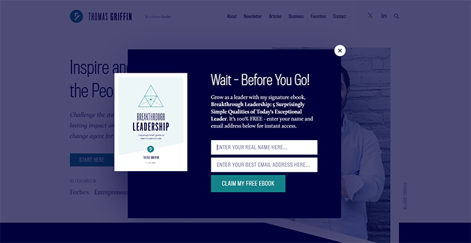
Plus, it’s not just online stores, business websites, or blogs that use popups and find them effective.
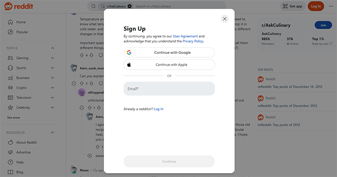
Even the biggest social networking websites,, such as Reddit, Quora, and Instagram, use popups to convert visitors into registered users.
That being said, many people are worried about using popups on their mobile websites. Since increasingly more people use the internet on their mobile devices, how effective are these popups on smaller screens?
The answer is way more effective than on laptops.
One study has found them to be 74% more effective on mobile devices, with an average conversion rate of 6.57%. (Source: GetSiteControl)
With these incredible numbers, popups are far from dead. In fact, they are thriving.
However, the popups that annoy users are slowly dying out.
I understand and agree that popups can sometimes be very annoying.
But before you dismiss them completely, I want to point out what makes particular popups annoying and disruptive.
One of the things I care about when launching a website or building a product is user experience. If visitors don’t have a good time on your website, then they are unlikely to sign up or come back.
Plus, Google uses user experience as an SEO ranking metric. They have even published a guideline on avoiding intrusive interstitials.
Here is their main recommendation:
“Instead of full page interstitials, use banners that take up only a small fraction of the screen to grab your users’ attention.”
Google Search Central
That’s why I recommend avoiding the following types of popups in your campaigns.
1. Disruptive Popups
These are the kind of popups that immediately block your view of the information that you came for.
In my experience, these popups can have higher conversion rates because they are hard to dismiss. However, I recommend against using them as these popups can negatively impact the user experience and SEO.
2. Untimely Popups
These are the popups that appear on each page load, have the same copy that users ignored the first time, and are just very unhelpful.
The bottom line is that many users will get frustrated by these popups.
3. Difficult to Dismiss
Popups I dislike the most are the ones that are difficult to dismiss until you give away your contact information.
This can feel very intrusive to your visitors as if you aren’t giving them a choice.
4. Too Many Campaigns
Some websites use a fullscreen welcome gate, followed by a popup, followed by slide-ins and floating bars. All on the same page and within a few seconds of your arrival.
These types of popups, or rather how they are used, can completely ruin the user experience altogether.
To balance it out, I recommend putting time intervals between your campaigns or using display rules to pace them in a way that enhances the user experience.
To summarize, I have learned that popups that affect user experience can hurt usability, customer sentiment, and search rankings.
Now you may be wondering, how are popups still so popular then?
Popups that are timely, relevant, and non-intrusive can be highly effective because they enhance user engagement.
With modern popup tools like OptinMonster, marketers can control when a popup is displayed, who sees it, and how it behaves. Plus, well-designed popups are better at blending in with the rest of the user experience on a website instead of disrupting it.
So, let’s look at some characteristics that make popups work for all websites.
In my years of experience with popup marketing, the most important factor is timing.
You don’t want a popup to show up too early and annoy your visitors. But you also don’t want to miss the opportunity to convert users into subscribers or customers.
For instance, ShockByte, a game server hosting provider, doubled its sales conversion rate by using Exit Intent popups. (See: Case study)
Instead of showing popups right away, Exit Intent popups appear right when a user is about to leave a website.
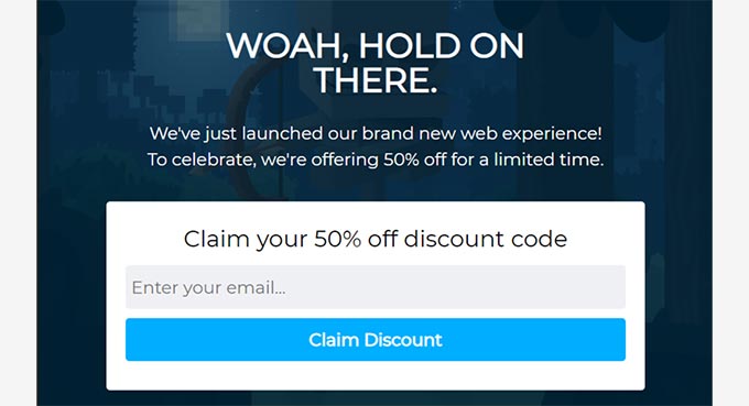
This is a great way to reduce the bounce rate and avoid cart abandonment, especially if your popup offers a discount coupon to incentivize users to stay on your website.
Modern lead generation and conversion optimization software, like OptinMonster, also allows site owners to delay popups.
This allows you to provide a good user experience on your website while offering users engaging popups that are not in their faces all the time.
For details on how to do this, you can see this tutorial on how to create popups that convert.
I believe that a well-designed popup can enhance the user experience rather than hurting it. Luckily, marketers are now better equipped to do that.
Gone are the days of ugly, flashy popups that tried too hard to get user attention. Popups are now seamless and can fit right into a website’s design flow.
In fact, many popup builders programs offer plenty of customization options, allowing you to design attractive popup campaigns.
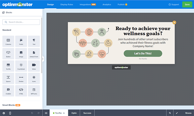
Their drag-and-drop tools make it extremely easy to use your brand colors, business logo, images, videos, and more.
You can even create multi-step popups, design success views, use templates, and do anything else to make your popups more interactive.
Did you know that 76% of customers prefer to buy from brands that use personalization to address their needs?
While working on my own businesses and talking to OptinMonster customers, I have learned that almost all customers have different needs. That’s why marketing works better when it can be tailored to different users.
Luckily, now marketers have enough data that they can make their marketing more personal for each customer.
Personalization helps you target individual customers based on their user data, website activity, geographic location, and more.
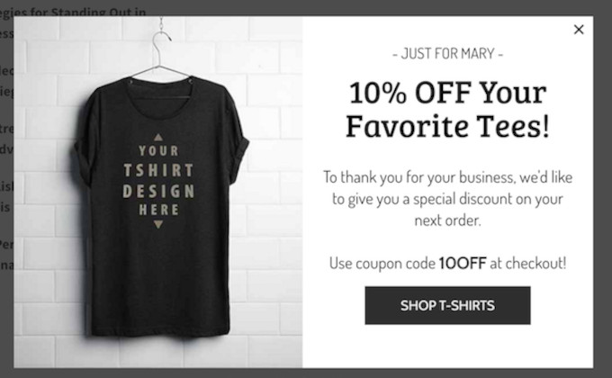
For instance, cart abandonment is a big issue for online stores.
According to Shopify, more than 67% of customers abandon their carts without completing their purchases.
With personalized popup campaigns, site owners can convince users at the last minute, offer them discounts on upsells, or reach out to them with an offer later on based on their website activity.
These campaigns work because they are not generic and address an individual customer’s needs. So, this precise targeting makes popups feel part of the user experience instead of a disruptor.
4. Offer Value
In my experience, popups that offer users a clear value proposition always win over popups that don’t.
Most people wouldn’t like a website to ask for their email address or other contact information for no reason. And to be honest, it can feel kind of rude.
On the other hand, popups that offer users something in return provide a reason to share information.
Whether it is a discount coupon or a content upgrade, this additional value seems like a fair deal.
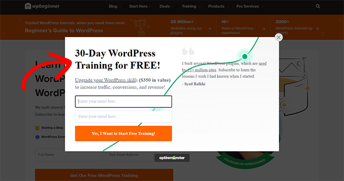
When you are designing your popups, you will want to think about your value proposition and make it front and center on your campaigns. Users shouldn’t be left guessing about what they will get in exchange for signing up.
You can see this in action in the following popup, which comes from the WPBeginner website. Users will immediately know that providing their email address will get them access to a free WordPress training course that is worth more than $350.
The Future Landscape of Popup Marketing
In my previous column, I wrote about using AI in lead generation.
I expect artificial intelligence technologies to improve rapidly and make popup marketing even more helpful for businesses and users.
Here are some examples that you can expect in the future:
- AI-powered campaign designs
- AI-enabled A/B testing to find out which campaigns work the best
- More and better personalization
For instance, my team already has AI popups that allow you to create smart campaigns in just a few seconds.
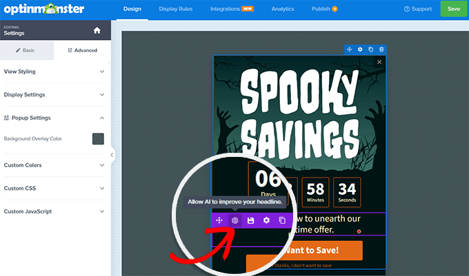
With a single click, you can use AI to write popup campaign copy for you. That means you don’t need to rely on your own writing skills, and you will be able to convert visitors more effectively.
Overall, I see popups playing a significant role in the future marketing landscape. With AI and machine learning and growing competition in all industries, I feel popups will get smarter and more user-friendly.
I hope this article answered your questions about the relevancy of popups. You may also want to read this guide on which marketing data you should track or look at these tips on growing your business on a budget.
If you liked this article, then please subscribe to our YouTube Channel for WordPress video tutorials. You can also find us on Twitter and Facebook.


