49 Best Squarespace Website Examples (2024)

Do you want to boost your inspiration with the best Squarespace website examples?
Squarespace is a popular and powerful content management system (CMS) for building websites – nearly any type.
That’s right, whether you want to start a blog, create an online portfolio, sell stuff online, push your wedding services or oh-so-much more in between, Squarespace will do the trick.
Remember, you don’t need any coding and design skills to make a beautiful and professional website. Not only that, once you pick up a Squarespace template, everything flows smoothly and quickly.
Let’s check out over forty top-notch Squarespace websites from various industries and niches to see what’s possible.
But first:
Why Use Squarespace?
Squarespace is a popular solution (primarily among creatives). It powers nearly three million websites and covers all types of businesses.
Note: Have you seen our extensive Squarespace statistics?
Thus, there are many reasons to consider using Squarespace to build and run your website and take your business to the next level.
9 Reasons Why Squarespace Rocks
This post covers:
Squarespace Blog Examples
1. A Fork & A Pencil
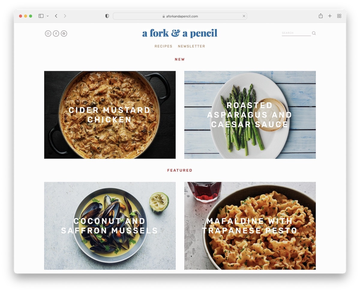
A Fork & A Pencil is an excellent example of how you can run an organized Squarespace blog without the fluff.
Its design is clean and minimalist, putting all the focus on your content (text and visuals). And to spice things up, A Fork & A Pencil uses the cool parallax scrolling effect, keeping things more engaging.
Also, the content loads as you scroll, creating an I-want-to-see-what’s-next effect, ensuring the readers stay around for longer.
Our favorite things about this site:
- Clean and organized design, emphasizing the content
- Parallax scrolling effect for added depth
- Loading content while scrolling to keep the eyes focused on the content
2. Meiwen See
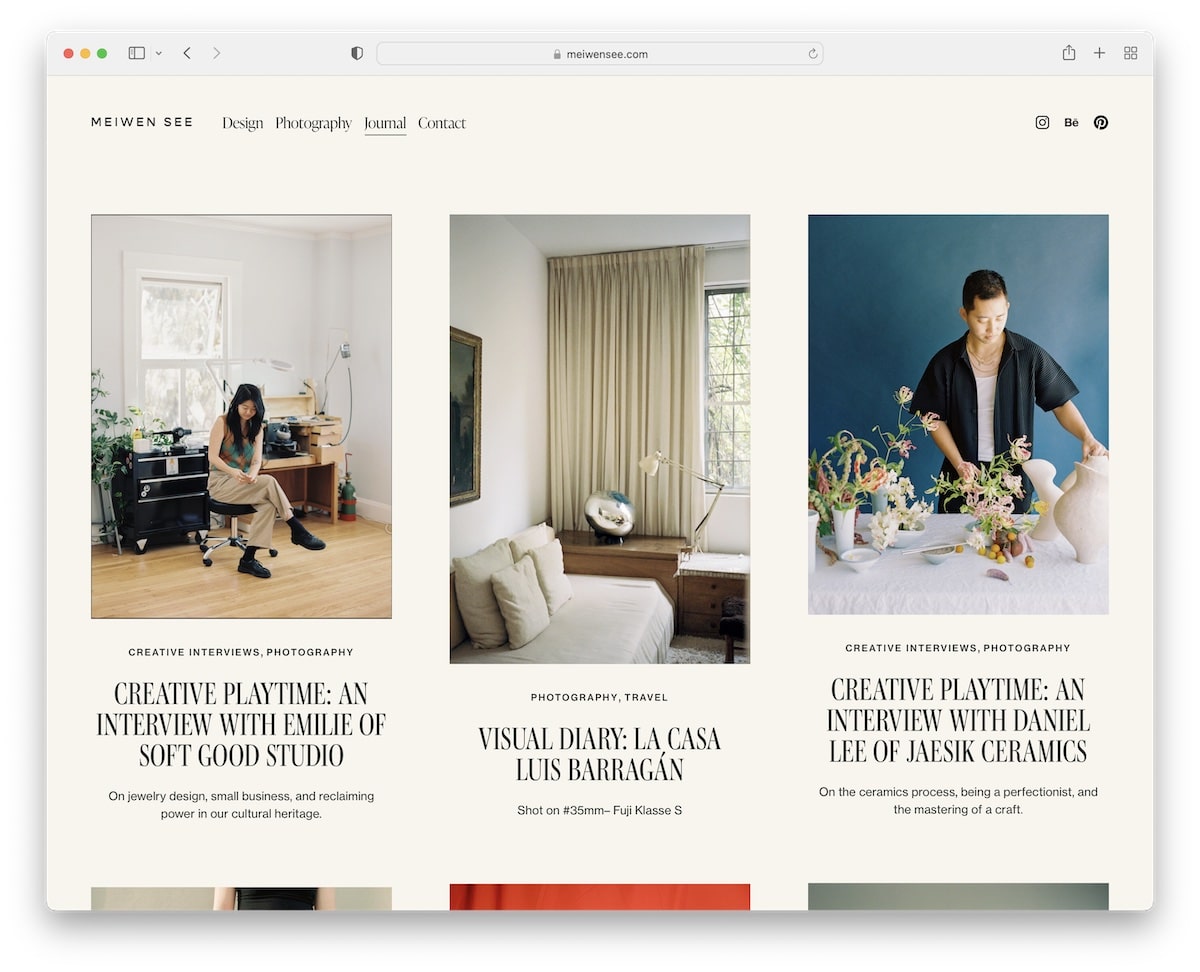
Meiwen See has a beautiful three-column post grid layout with large thumbnails accompanied by a title and excerpt.
What’s cool about this Squarespace blog is the header which disappears when you scroll down for a clutter-free viewing experience. But then it immediately reappears when you start scrolling back to the top.
Moreover, blog pages have a unique structure with plenty of white space to ensure a top-notch reading experience (but the text could be slightly larger).
Our favorite things about this site:
- Post grid layout on the blog home page
- Header that disappears and reappears according to scrolling movement
- Original and contemporary single blog post layouts
3. Sprouted Kitchen

Sprouted Kitchen has a bunch of goodies that make it one of the best Squarespace blog examples for your viewing pleasure.
First, there’s a dark and contrasting top bar notification to make your message pop nicely. Moreover, it has a sticky sidebar header/menu with social media following you around all the time.
And since it’s a recipe blog, Sprouted Kitchen also has the very convenient “print this recipe” button, which comes in extra handy.
Our favorite things about this site:
- Top bar notification for the latest posts (or something else)
- Sticky sidebar notification (so all links are always within reach)
- Option to directly download the recipes
4. Concept Kicks
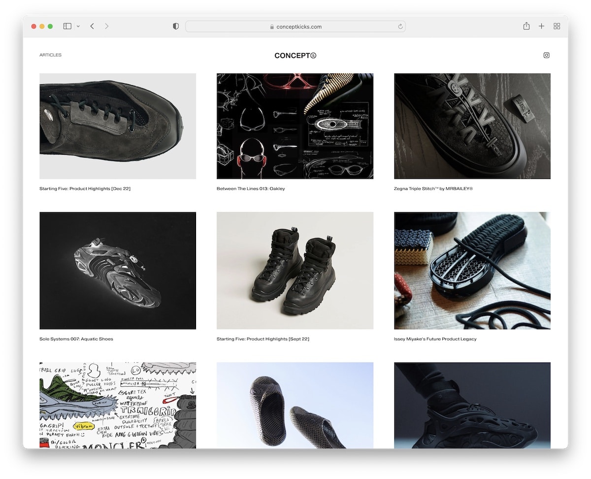
Concept Kicks has a minimalist post grid layout with decent spacing, featuring thumbnails and titles.
The header and footer stick to simplicity, with the former sticking to the top of the screen. Each blog post has centered text without a left or right sidebar but puts extra attention to the imagery.
And then there are also CTA buttons at the bottom of some posts to go straight to the online store.
Our favorite things about this site:
- Sticky header, so users don’t have to scroll all the way back to the top each time
- Minimalist design that makes the content pop more
- Next and previous buttons for exploring more content at the bottom of each post
5. The Good Trade
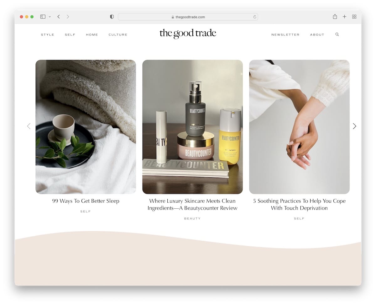
The Good Trade is a modern and trendy Squarespace blog example. Its earthy yet clean design ensures a pleasant browsing experience.
The hero area features three blog posts that are highlighted on hover – making them more clickable.
Furthermore, The Good Trade sports rounded edges for a more mobile-like feel.
Some other great parts are post carousels, a floating header with a drop-down menu, a newsletter subscription form, and a search bar in the navigation section.
Our favorite things about this site:
- Blog post carousels for displaying additional content without sacrificing website space
- Drop-down menu to create a more organized browsing experience
- Newsletter subscription form for building an email list (and growing blog through email marketing)
Note: Don’t forget to check more amazing Squarespace blog examples.
Squarespace Portfolio Examples
6. Lisa Maltby

Lisa Maltby’s Squarespace portfolio website creates a strong and lasting first impression right from the get-go.
It has these large sections with a parallax effect, which adds depth and contributes to a better scrolling experience.
The portfolio has a large two-column grid with static and animated thumbnails, whereas single project pages have a massive one-column layout to enjoy each image in great detail.
Our favorite things about this site:
- Parallax scrolling effect that adds depth and makes browsing more engaging
- Static and animated thumbnails for a livelier appearance
- Large, single-column project pages to give each image all the shine it deserves
7. Gina Kirlew
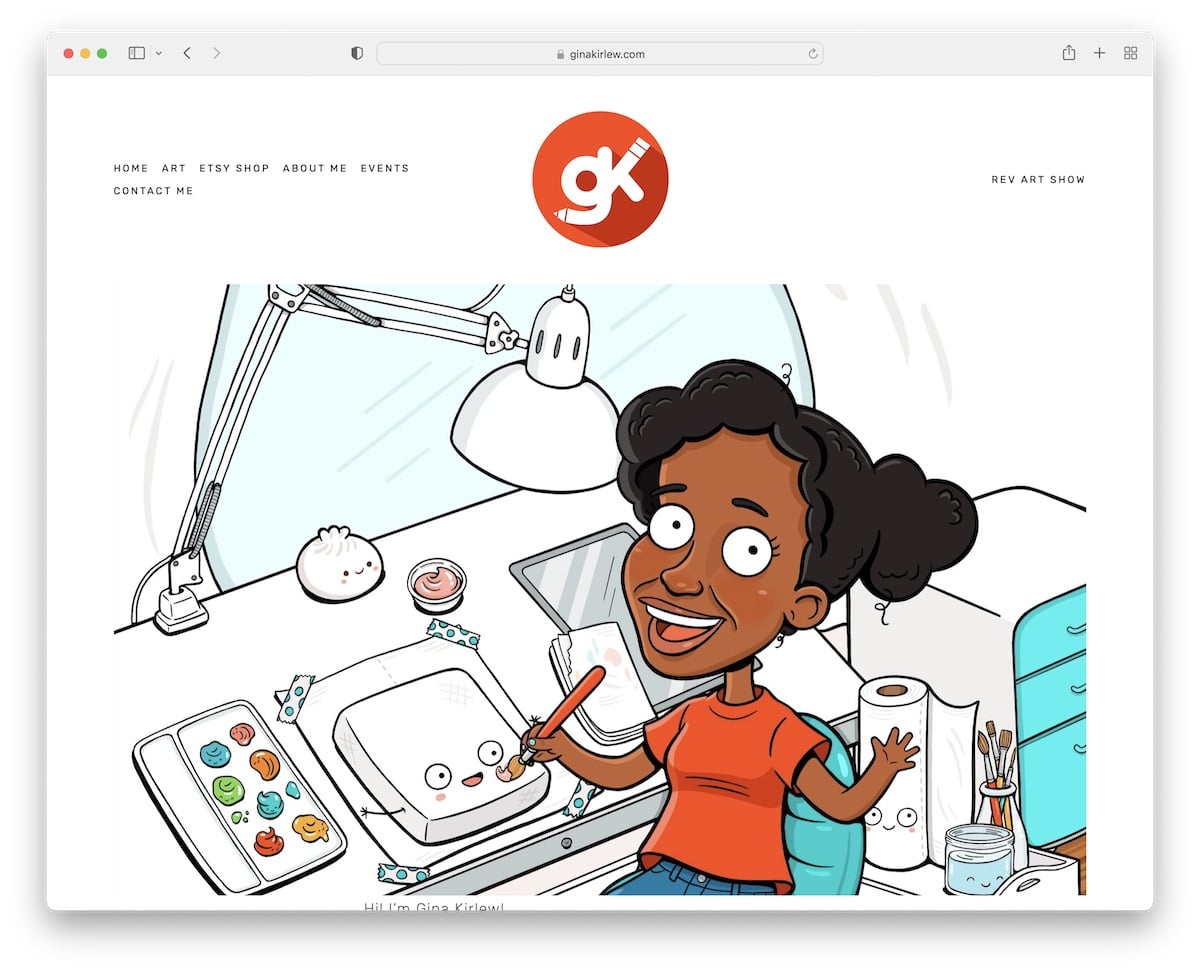
Gina Kirlew’s website has a minimalist yet bubbly vibe that triggers interest immediately. The home page is simple, with the same color for the header, base and footer, like the rest of the portfolio.
In the header, each menu link is highlighted on hover, dimming the rest for more precise clicking. In addition to that, Gina also added a direct link to her Etsy shop in the navigation bar, which opens it in a new tab.
Our favorite things about this site:
- Unified background color across the header, base and footer
- Lightbox functionality on the portfolio page for a more immersive viewing
- Link to the Etsy store in the header that opens it in a new tab
8. Clara De Lorenzi
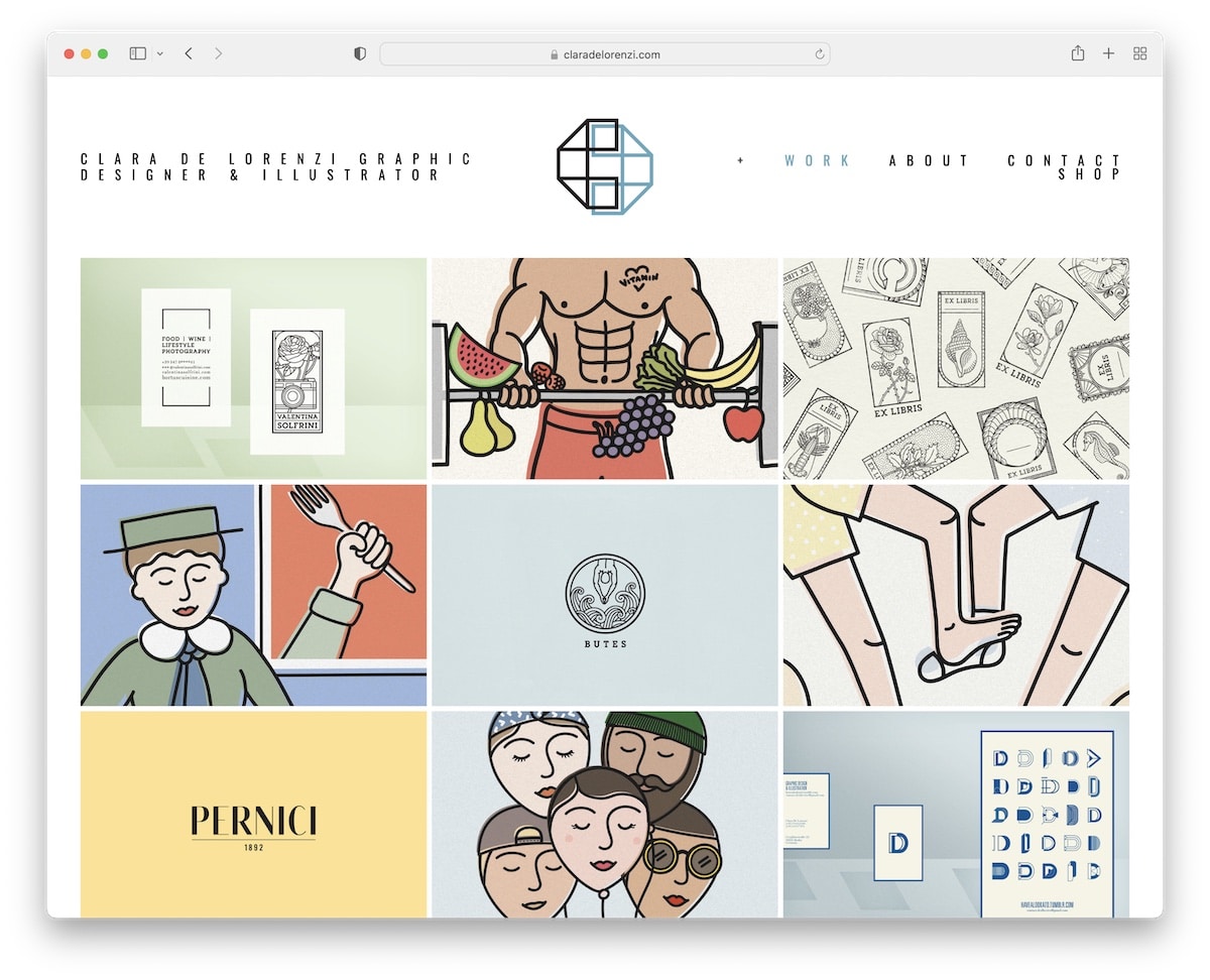
Clara De Lorenzi’s Squarespace portfolio website gets straight to the point, delivering a portfolio grid on the home page.
Each thumbnail reveals the project title on hover, and when you click it, a detailed presentation with more images and text opens.
Another handy element of this example is the lightbox gallery, which allows one to view each image in a larger format individually.
Our favorite things about this site:
- Clean portfolio grid on the home page with a hover effect (to reveal project titles)
- Detailed project presentations with more visual and written content
- Online shop section for direct purchases
9. Benjamin Hardman
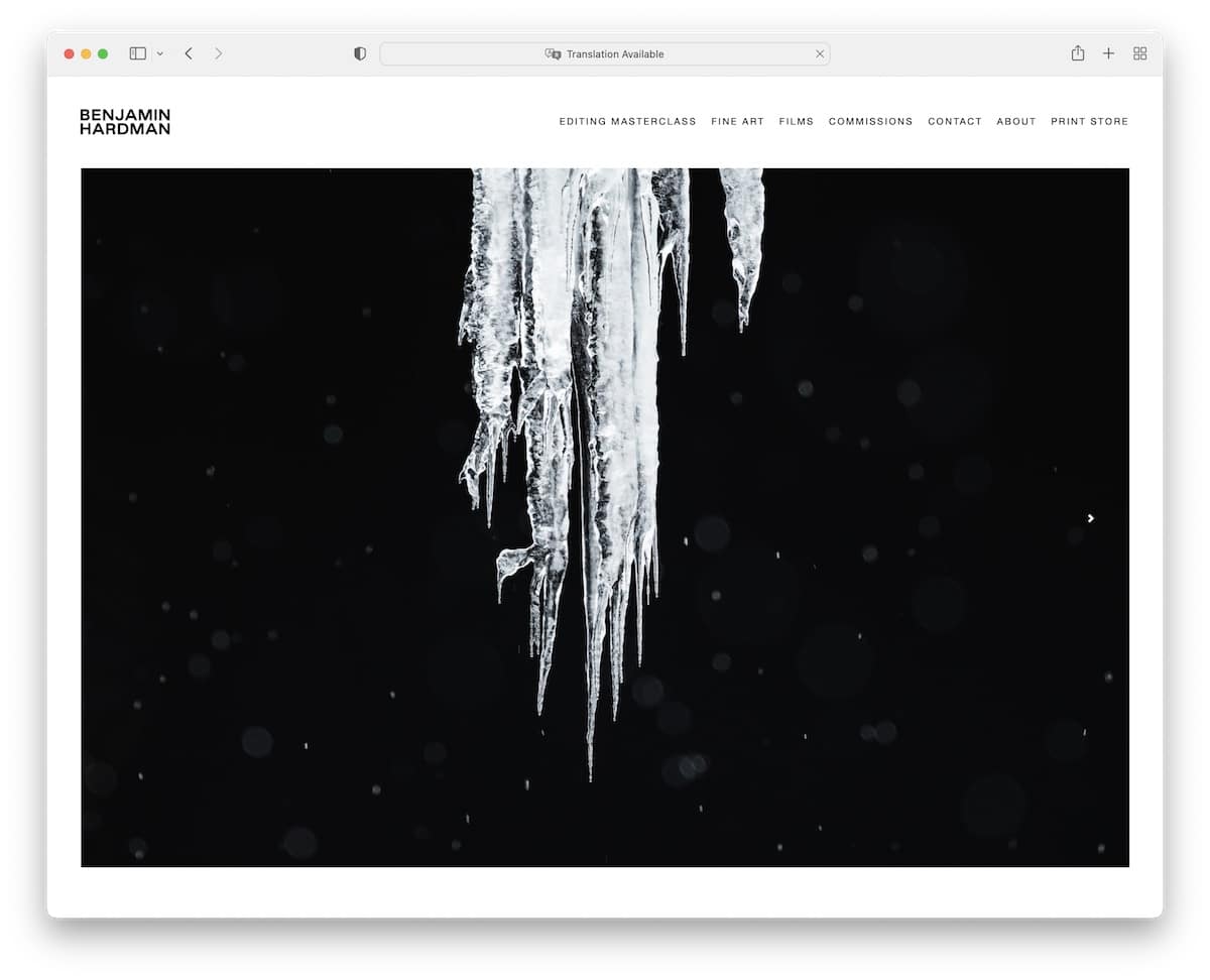
Instead of a portfolio grid on the home page, Benjamin Hardman took it one step further with a beautiful image-only slideshow. The rest of the home page is pretty basic, so all the images come front and center nicely.
What’s interesting about Benjamin’s Squarespace site is the lack of a footer, but at the same time, this is the exact specialty that makes it that much more appealing to the eye.
Sometimes, less is more.
Our favorite things about this site:
- Image-only slider on the home page that triggers curiosity right away
- The absence of a footer makes the website even cleaner-looking
- A 3rd-party link in the header to Benjamin’s online class
10. Jessica Chou
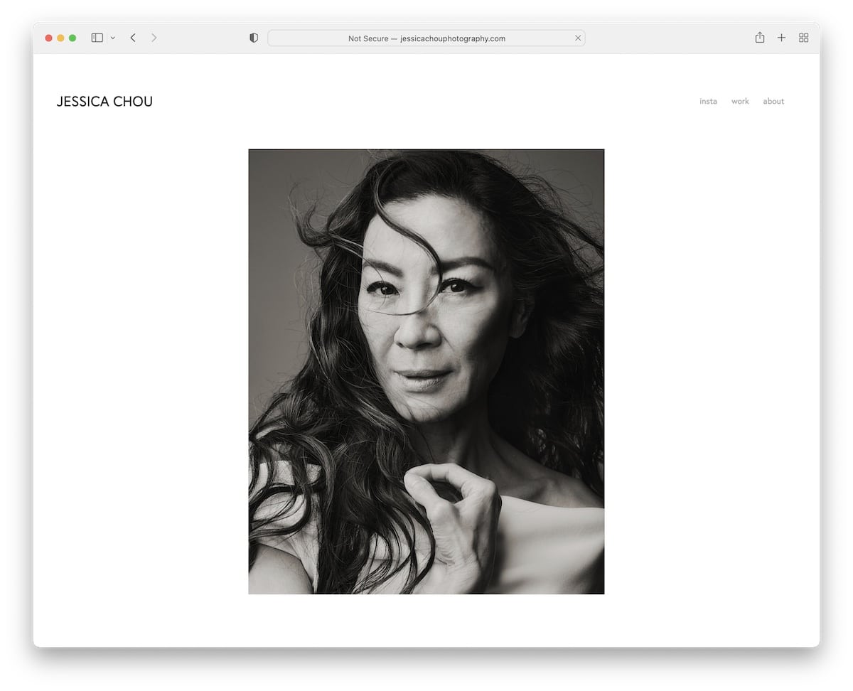
Jessica Chou’s Squarespace portfolio example is one big WOW.
Instead of ruining the viewing experience with all the fancy stuff and special effects, this website sticks to the most important – content.
It features a single-column portfolio layout on the (very long) home page, with content loading while you scroll to keep the atmosphere more exciting and captivating.
Our favorite things about this site:
- The minimalist appearance that’s all about displaying content in all its glory
- The loading of content while scrolling for an added layer of engagement
- Simple three-page online portfolio with home, work and about sections
Note: Don’t forget to check more amazing Squarespace portfolio examples.
Squarespace eCommerce Websites
11. Brew Tea Co
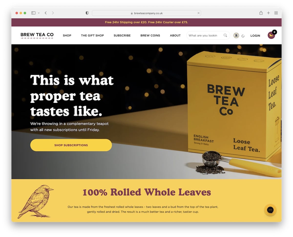
Brew Tea Co is a Squarespace eCommerce site with heaps of features that make it one of the best on the list.
It has an opt-in popup for a discount, a top bar notification with sliding text animation and a full-width slider above the fold. It also has another pop-up that appears at the bottom left corner, leading to the limited edition offer.
What’s also worth mentioning is the mega menu, which works so well due to the various pages and categories that the site sports.
Our favorite things about this site:
- Vibrant and highly branded design that captures attention
- Large slider with text and CTA buttons
- Practical mega menu navigation with links and images
12. Ocelot Chocolate
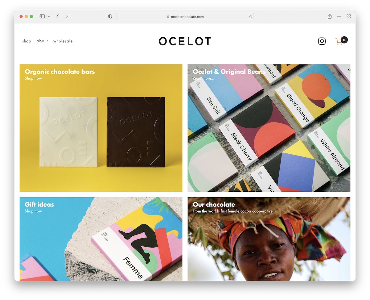
Ocelot Chocolate is a fantastic Squarespace example with a minimalist and modern design. It sports a catchy parallax effect above the fold.
The header follows you around with the necessary links, Instagram icon and quick access to the shopping cart.
Furthermore, Ocelot Chocolate also sports large image sections promoting their offerings, an Instagram feed and a newsletter subscription form.
Our favorite things about this site:
- The shopping cart in the navigation bar is a nice boost in user experience
- Large image sections that make offerings pop more
- An Instagram feed that shows sociability and helps build the profile
13. Supernatural
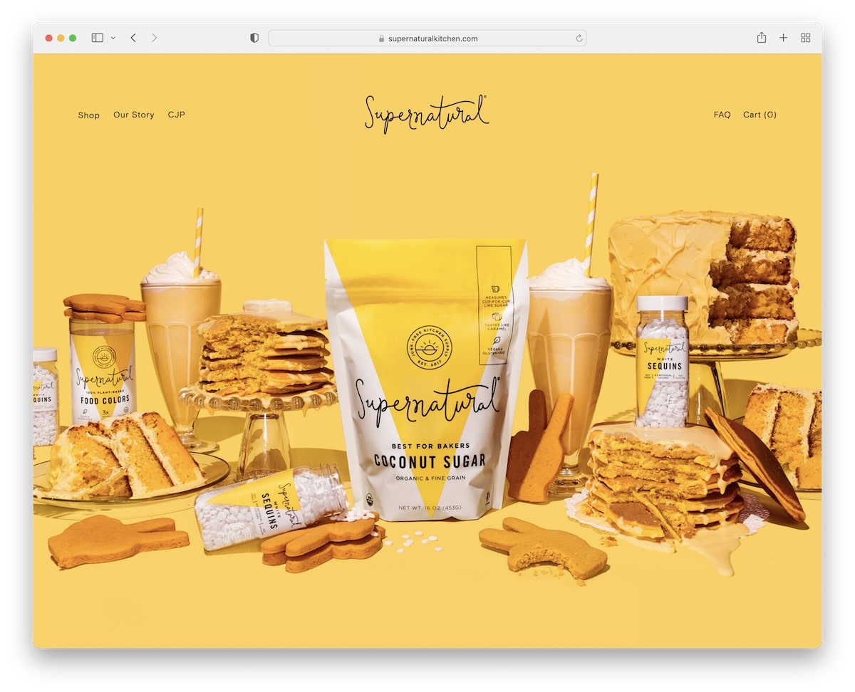
Supernatural has an impactful hero image with a parallax effect and transparent header, keeping it clean and practical.
This Squarespace eCommerce example has plenty of white space for better readability and large, full-width sections to keep the visitors glued to the screen.
What’s more, it features an Instagram grid, minimalist footer and insightful product pages with a lightbox gallery.
Our favorite things about this site:
- Transparent header, which ensures a cleaner, distraction-free vibe
- Decent amount of white space to bring products, images and text front and center
- Lightbox gallery on product pages to showcase items from every angle and close-ups
14. Jones Bar-B-Q
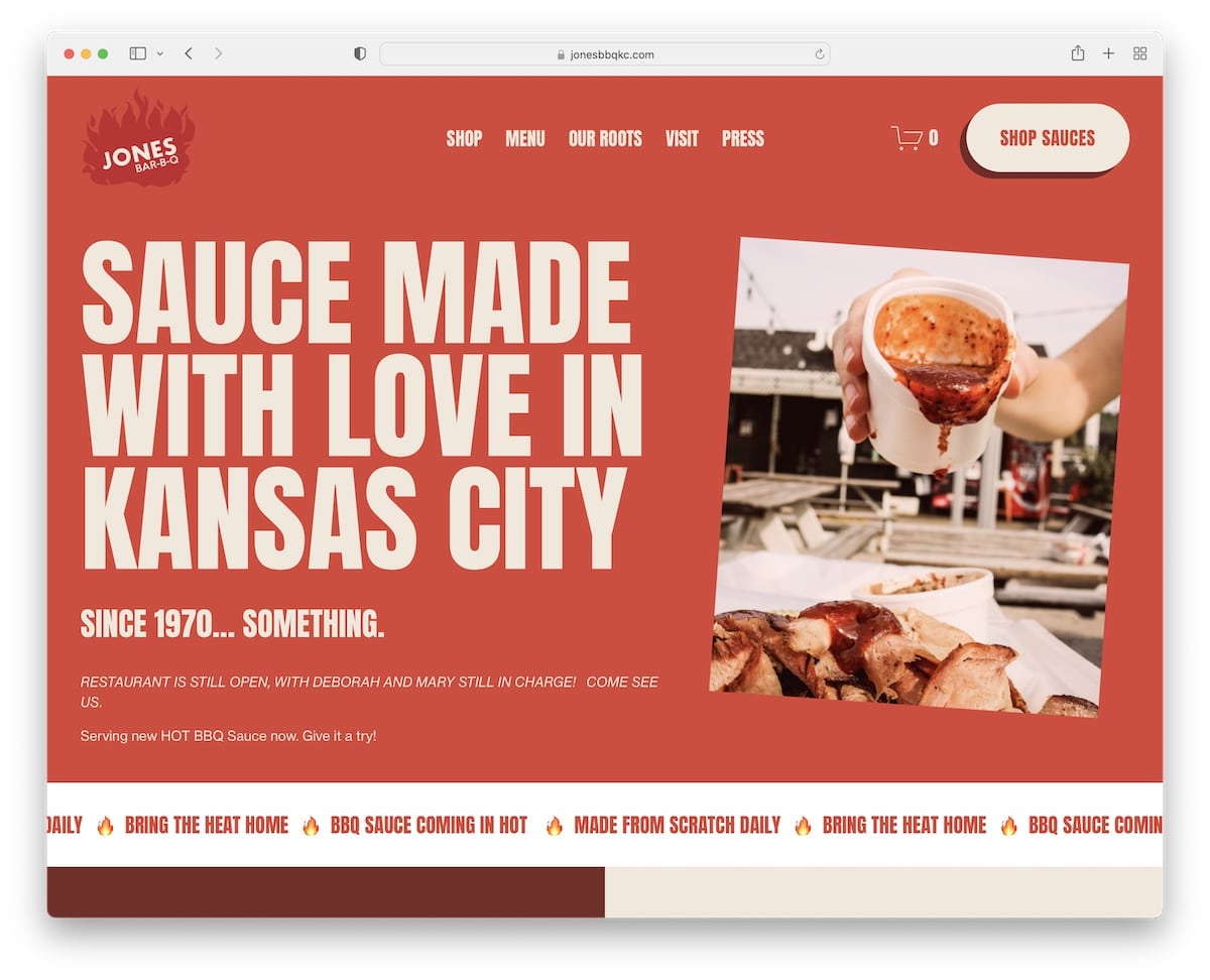
Jones Bar-B-Q is all about a bold and I-want-your-attention kind of atmosphere.
It starts with an impressive above-the-fold section with large text and an image, followed by a sliding text animation.
The CTA button in the header leads you directly to the online shop, while the “featured in” area builds credibility.
Also, Jones Bar-B-Q’s header disappears when scrolling down and reappears when scrolling up, keeping distractions at a minimum.
Our favorite things about this site:
- Large and bold typography that makes everything pop more.
- Disappearing and reappearing header depending on the scrolling movement
- Sliding text animation for an added layer of engagement
15. Minna
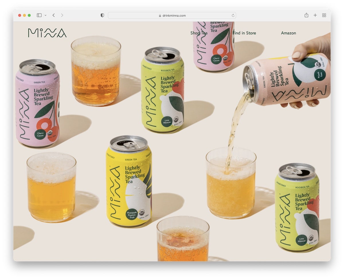
One of the more interesting things about Minna is the full-screen image background-only above-the-fold section. Yup, there is no text and no CTA button. It also spices things up with the parallax effect.
The presentation of drinks is very immersive, with large sections, images, descriptions, and shop buttons.
Minna also has a large IG feed and a feature-packed footer with quick links, social media icons and a subscription widget.
Our favorite things about this site:
- A distraction-free above-the-fold section with a full-screen image-only background (+ parallax effect)
- Large product presentation sections
- Practical footer with menu links, social icons and newsletter subscription form
Note: Don’t forget to check more amazing Squarespace eCommerce websites.
Squarespace Photographer Websites
16. Peter McKinnon
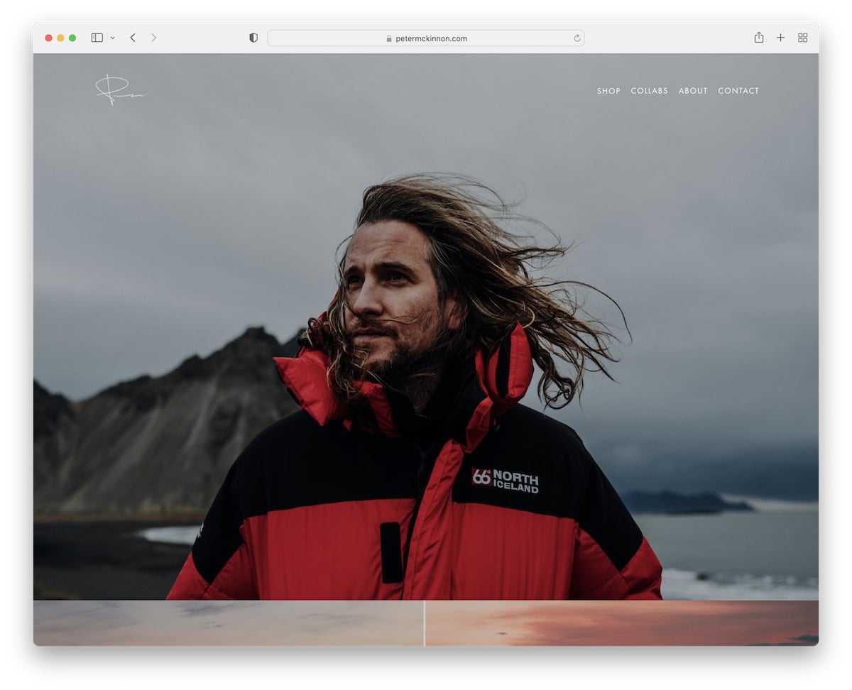
Peter McKinnon’s website speaks photography. This Squarespace website features a home page that’s real eye candy with all the images and parallax effect that boosts UX.
The header is transparent with a drop-down menu, while the footer is larger with social media icons and a newsletter subscription form.
Moreover, Peter also runs a full eCommerce section, selling prints, presets, gear, and more.
Our favorite things about this site:
- Massive image and video sections without any spacing
- Online shop (for selling prints, presets, gear – but you can use it for anything)
- The website sticks to simplicity, emphasizing content first and foremost
17. Olga Miljko
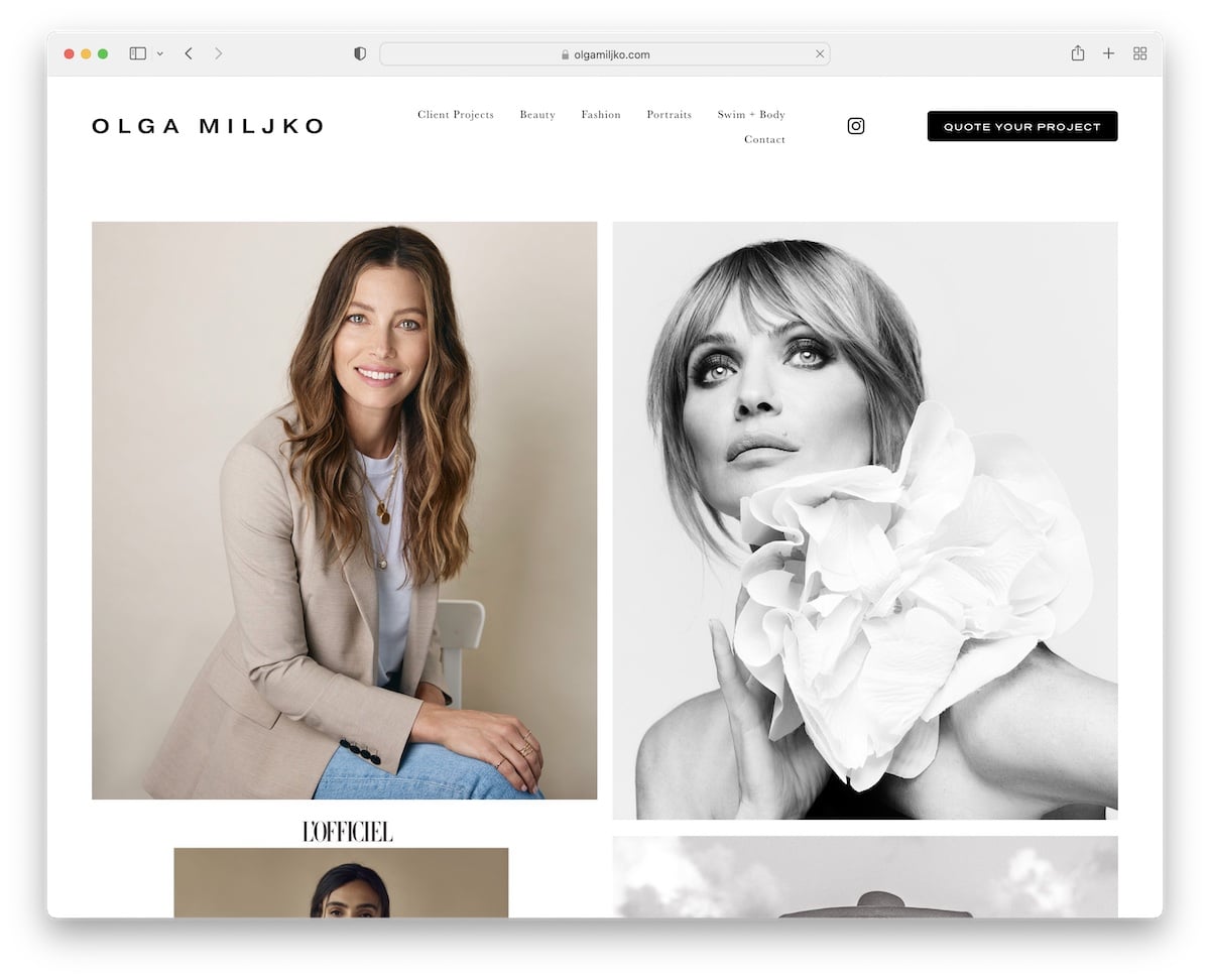
Olga Miljko’s Squarespace photographer website wastes no one’s time and goes straight to the point with a long, two-column portfolio grid.
Because of its lengthy nature, the site features a header that hides when you start scrolling and shows itself when you want to return to the top.
Additionally, all page sections (header, base and footer) have the same white background for a unified look.
Our favorite things about this site:
- Long and captivating portfolio grid layout on the home page
- No need to scroll all the way back to the top, thanks to the hiding/revealing header
- Light and clean design without any fluff or other nonsense
18. Shanley Cox
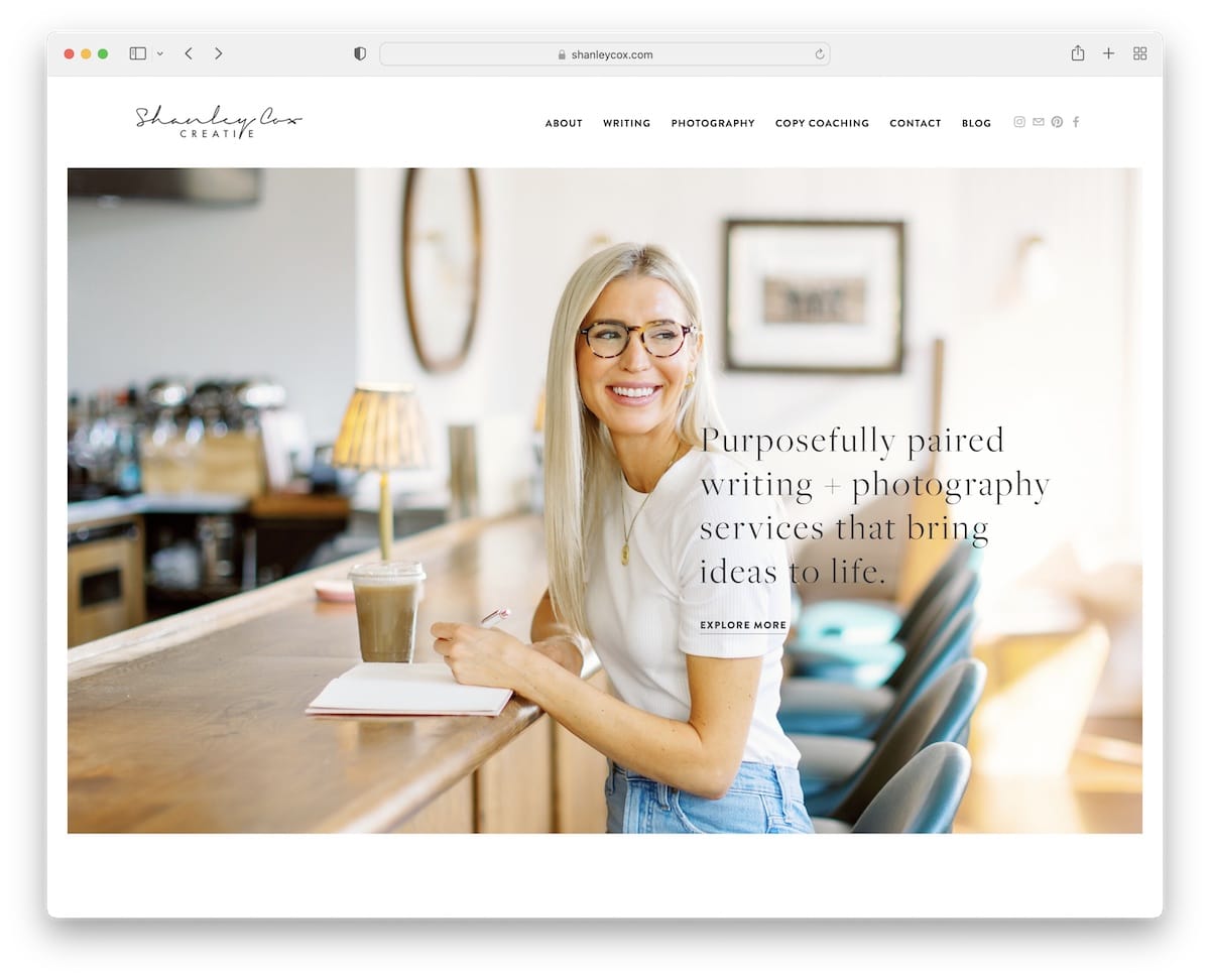
You immediately get that personalized touch when visiting Shanley Cox’s Squarespace website. (That’s all due to the image of Olga above the fold.)
The home page is stuffed with usefulness but maintains a smooth look, thanks to the decent amount of white space. It has a testimonials slider, a contact form and an Instagram feed.
It almost feels like a one-page site, but it’s not. The site contains other useful pages and sections that create a strong online presence.
Our favorite things about this site:
- The personalized touch that makes you feel like you know Shanley from somewhere
- Contact page on the home page for quick and easy business inquiries
- Testimonials slider that helps build trust (let your clients market your amazing services)
19. Scott Snyder
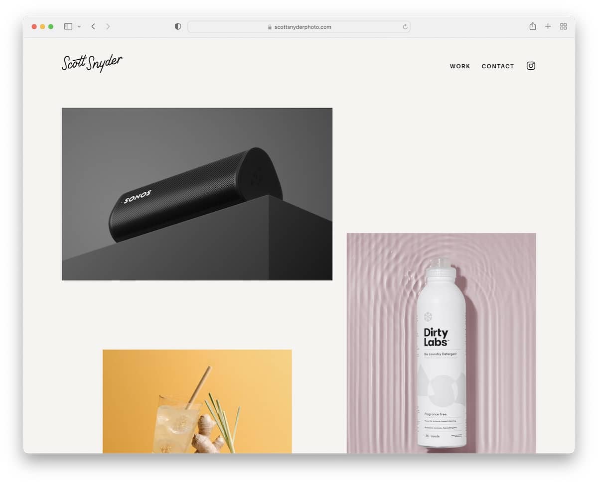
Scott Snyder is a charming Squarespace photographer website with an original home page portfolio grid featuring some static and some animated images. Not to mention, each image/thumbnail is also clickable, leading directly to the project page.
The header is basic and transparent, but it still hides for distraction-free exploring while reappearing on a back scroll.
Scott also dedicated an entire section to the brands he’s stoked to call clients to build credibility.
Our favorite things about this site:
- Portfolio grid on the home page with clickable thumbnails that link to project presentation pages
- Static and animated thumbnails, which add life to this photographer’s site
- Displaying client logos on the website adds to credibility (which can be a big selling point)
20. Alex Tran
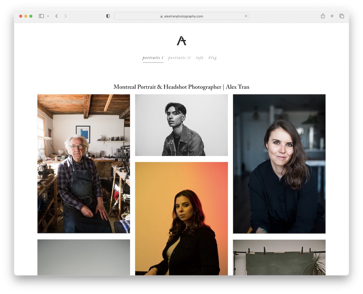
What’s pretty cool about Alex Tran’s website is that it doesn’t feature a large image or video above the fold or go straight into a portfolio grid, like most of them do.
Instead, it kicks things off with a title and then a short bio before a boxed three-column grid begins.
Another thing you’ll notice is that there’s no footer, so the site appears even more pristine.
Finally, the accordions display more information without wasting space, and the blog connects with everyone on a more personal level.
Our favorite things about this site:
- The hero area that speaks about Alex and his services – text first, portfolio second
- Layout without the footer for a squeaky-clean appearance
- Blog section where Alex writes about his work and more
Note: Don’t forget to check more amazing Squarespace photographer websites.
Squarespace One-Page Websites
21. Upstate Laundromat
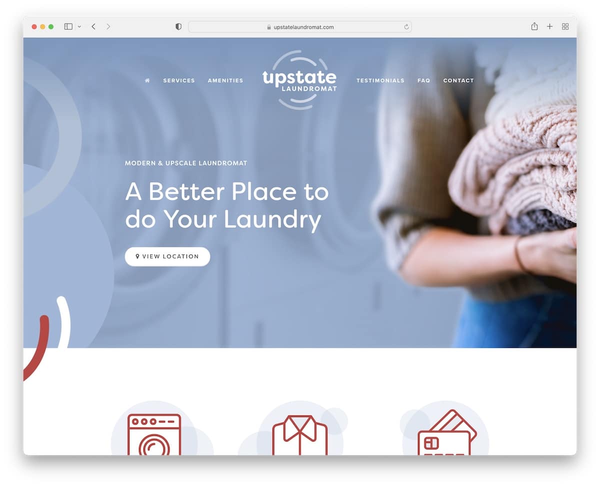
Upstate Laundromat delivers all the necessary information in just a few scrolls apart. And that’s the magic of a single-page website.
Once you get to the below-the-fold part, the header magically appears at the top of the screen, so all jump links are at your fingertips.
Upstate Laundromat integrates Google Reviews, FAQs with accordions and Google Maps to showcase the exact location.
For the footer, the site keeps it simple with a subscription widget.
Our favorite things about this site:
- Floating header with jump links to get to the necessary section without scrolling
- Integrated Google Maps to showcase the business location
- FAQs section with accordions so potential users can quickly get answers
22. Kantwon
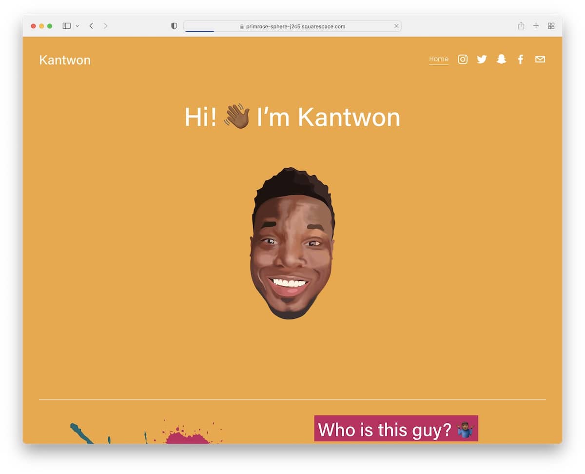
Kantwon is one of the more fun Squarespace website examples we have encountered. If you want your site visitors to remember you, take inspiration from Kantwon.
The color scheme is very energetic, and emojis in the text make the overall experience much more awesome.
Why be so serious when you can personalize the web design and make it truly yours, just like Kantwon did?
Our favorite things about this site:
- The lively color scheme that keeps your eyes focused on the content
- Using emojis in the text creates a more personalized way of expression
- Social media icons in the header and the footer, so everyone can easily connect
23. Sharam
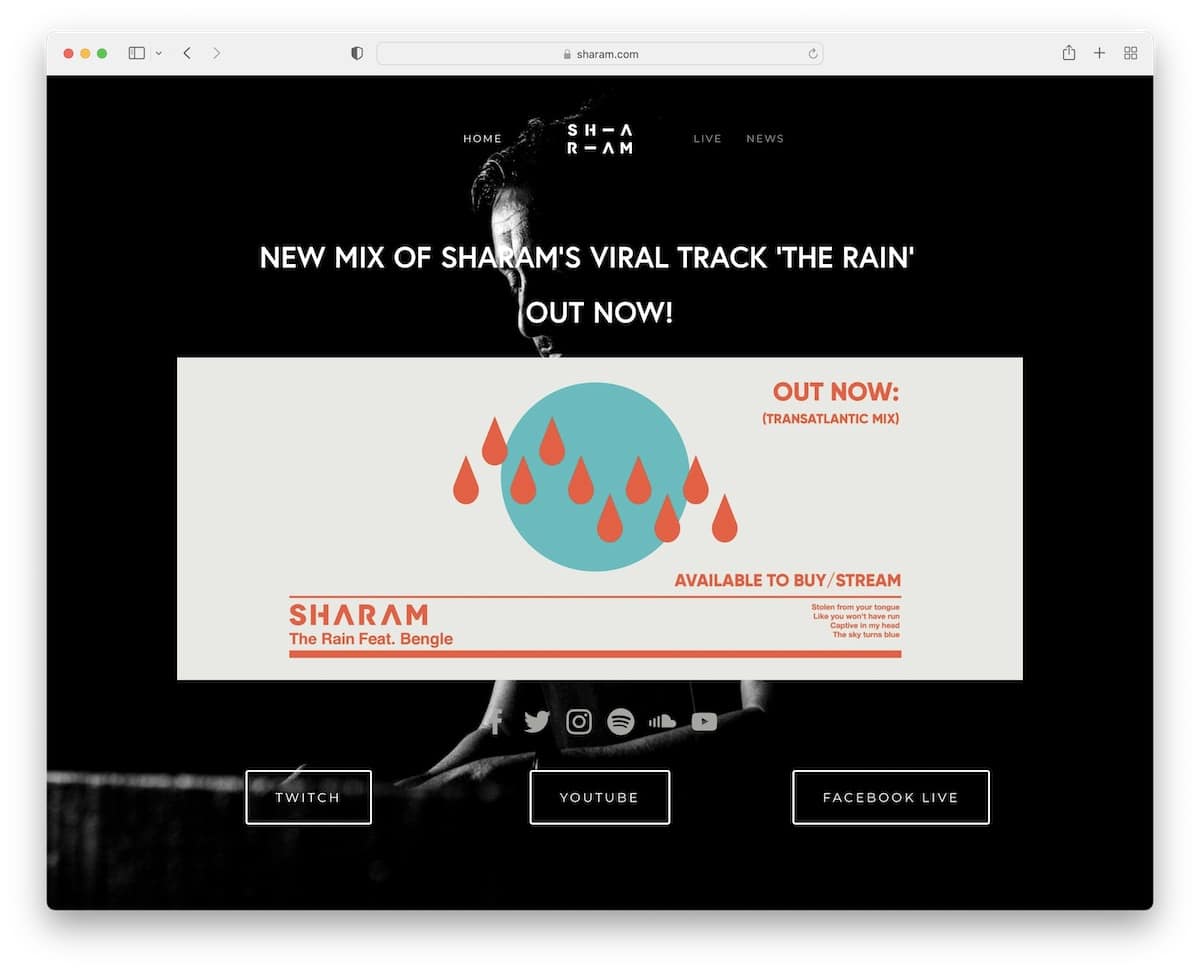
Sharam’s Squarespace website example rocks a full-screen image above the fold with overlayed text and a clickable image that takes you to the latest tune.
But the most important aspect of this musician’s site is its dark design. You can easily go against the grain by switching from light to dark (or even integrating a day/night mode switcher).
From the sticky menu and post carousel to the tour dates section and social media – it’s all there and easy to reach.
Our favorite things about this site:
- The strong and lasting first impression due to the use of dark website design
- Blog post carousel to quickly find the latest news
- Full-screen above the fold section with background image
24. Jauz
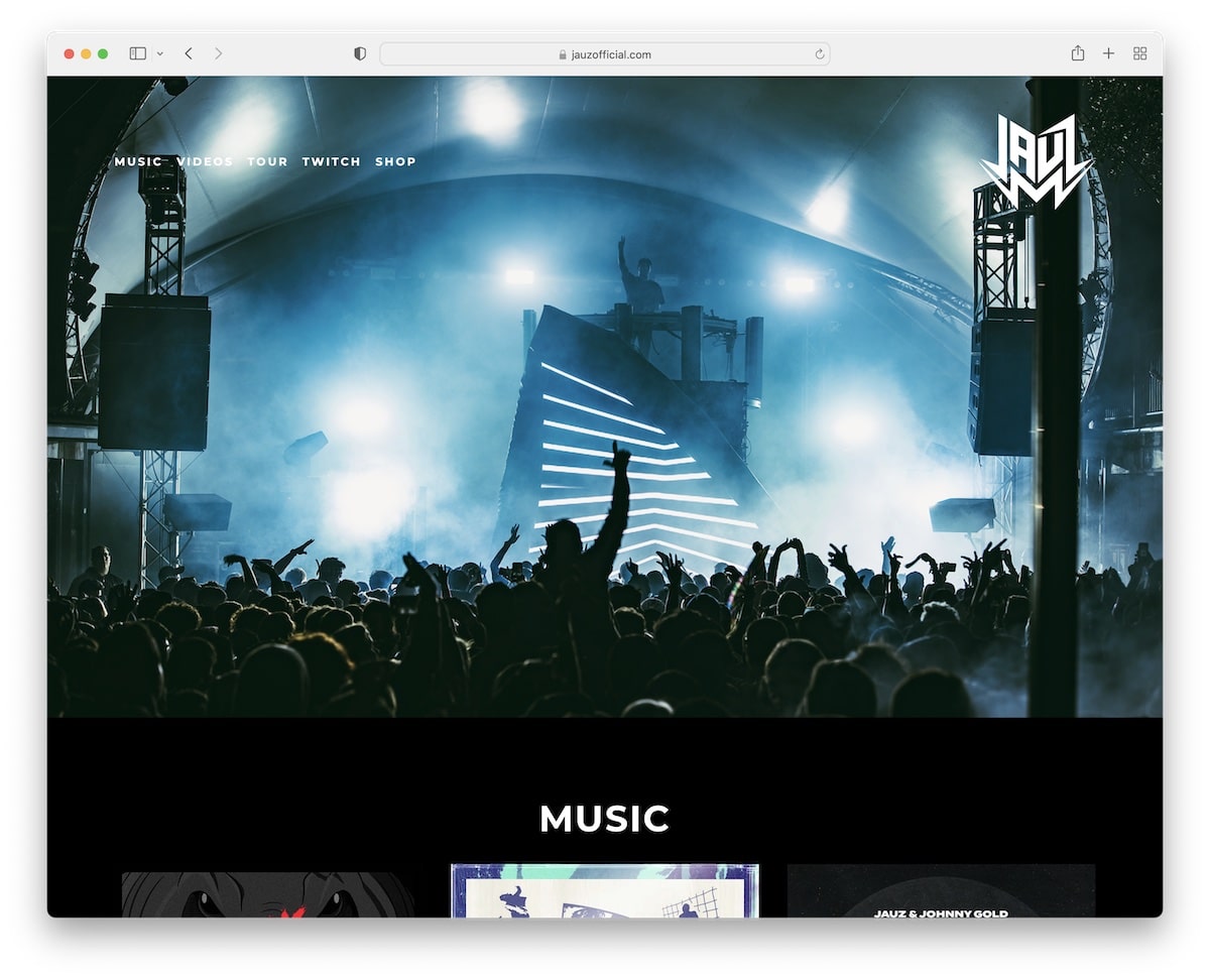
Jauz is another superb Squarespace one-page website example with a black design that really makes it stand out from the masses.
It’s also another site that has an image-only above-the-fold section, no text and other clutter.
There’s more.
Jauz’s website has an embedded video, a parallax background, a list of tour dates with buttons for tickets and RSVP and a subscription form, to name a few.
Our favorite things about this site:
- Simple yet impactful above-the-fold area with only an image (no overlaid text or CTA button)
- Embedded video with a link to Jauz’s YouTube channel
- A full list of tour dates with CTA buttons for tickets and RSVP
25. Bureau Des Eaux & Boissons
Built with: Squarespace
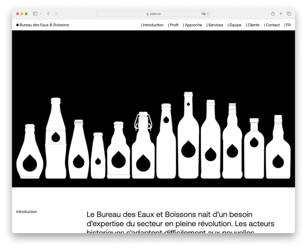
The light and dark contrast of Bureau Des Eaux & Boissons’s Squarespace site boosts readability and exploration, keeping visitors around for longer.
Handily, the header floats at the top of the screen, so you can easily jump from section to section, doing little to no scrolling.
What’s more, Bureau Des Eaux & Boissons also has a language switcher in the navbar to view the site in French or English.
Our favorite things about this site:
- The dark and light contrast that makes all the content and text pop more (also thanks to the smart use of white space)
- Jump links in the floating navigation to get to the desired information faster
- Language switcher for website localization and globalization
Note: Don’t forget to check more amazing Squarespace one-page websites.
Squarespace Real Estate Websites
26. The Coloradan
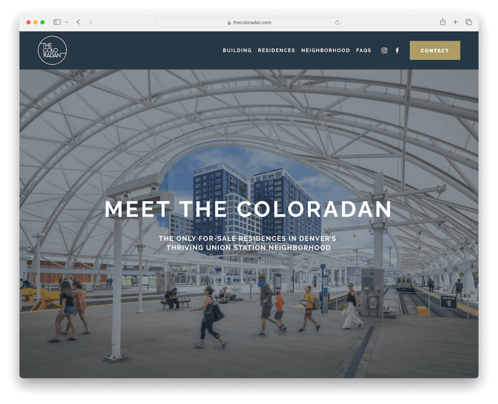
The Coloradan starts with a solid header with menu links, social media icons and a contact button. Then, it has a large hero image with an overlaid title and text to hook the visitor.
We also really enjoy the large sections with images and text, making every detail clearly visible.
On the building pages, a nice slider greets you with more images besides the main photo of the property.
Our favorite things about this site:
- A slider that displays more building images for our viewing pleasure
- Solid color header to bring forth the links, icons and buttons
- Large, CAPS typography makes skimming through home page content quick and smooth
27. Continuum Development Company
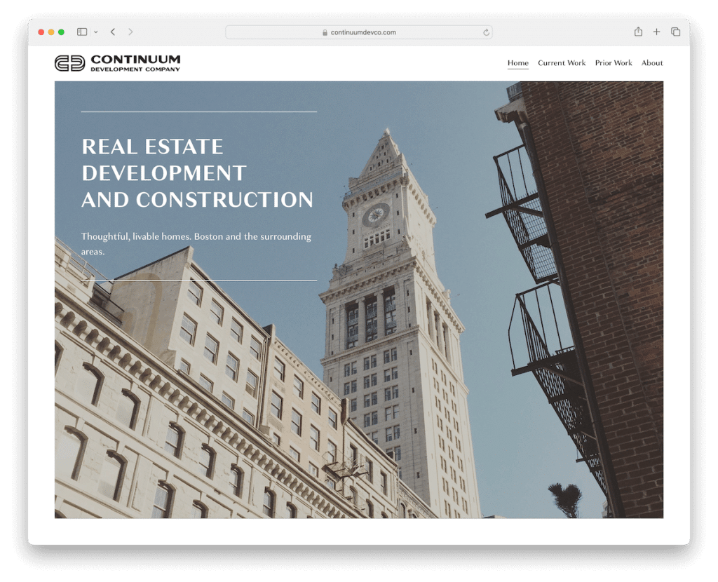
Continuum Development Company is a beautiful Squarespace real estate website with an impressive framed home page section.
It only features a hero image and a minimalist header and footer. The former has menu links, and the latter has business details and a contact link.
The project pages have simple presentations with a one-page-like layout, also including Google Maps for location showcase.
Our favorite things about this site:
- Simple yet impressive home page design with a large hero image, header and footer
- Quick links on the projects page to avoid scrolling
- Contact page with a basic form and Google Maps, plus an option to call the company directly
28. At Home Real Estate
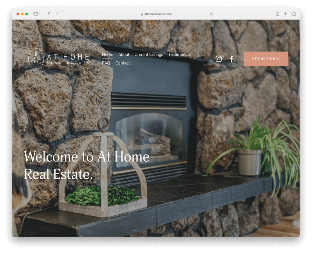
At Home Real Estate aims to spark interest immediately with the full-screen background image, keeping it clean with a transparent header and overlaid text.
The content that loads on scroll makes browsing much more exciting. This is accompanied by plenty of white space, images, CTA buttons, and larger typography.
At Home Real Estate also has a special section (and a dedicated page) for testimonials to build trustworthiness.
Our favorite things about this site:
- The use of a high-quality full-screen background image above the fold
- Larger typography that ensures easy and quick exploration
- A basic footer section with a business address and a clickable telephone number
29. Alex Miller
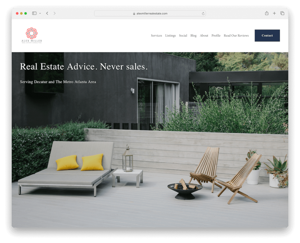
Alex Miller’s Squarespace real estate website treats you to a simplistic design with larger images, making visitors crave for more.
The site has plenty of internal pages for a thorough presentation of services, listings, about, etc. There’s even a blog, which can be highly beneficial in bringing in more business deals.
Lastly, Alex also added a subscription form to the website, a contact form and integrated Google Maps.
Our favorite things about this site:
- Various internal pages that together create a comprehensive business presentation
- A newsletter subscription form to collect potential prospects’ emails
- Dedicated reviews/testimonials page
30. Jenelle Tremblett
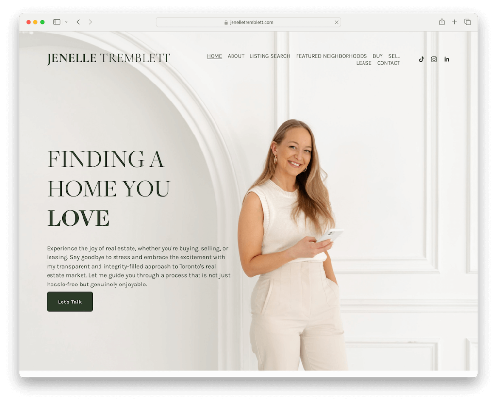
Jenelle Tremblett has a transparent header not to distract the hero image, but it solidifies and sticks to the top of the screen when you start scrolling. There’s also a drop-down menu for a more organized navigation.
The overall design is light and grippy, with excellent property presentations. The latter features handy tabs to view the image slider, map, street and aerial views and the additional walk score.
What’s also cool about Jenelle’s site is that instead of inserting an Instagram feed, she uses TikTok, which you don’t see that often on a real estate site.
Our favorite things about this site:
- Transparent header that turns solid and sticky for that neat initial look yet keeps things handy
- The inclusion of a TikTok feed makes the vibe livelier
- Comprehensive property presentations with plenty of extra views
Note: Don’t forget to check more amazing Squarespace real estate websites.
Squarespace Coaching Websites
31. Burntout To Badass
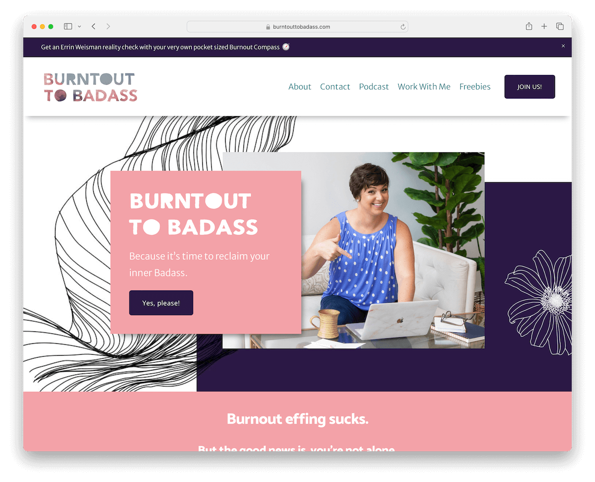
Burntout To Badass captures attention with a popup right away, but it then also has a notification bar, promoting the same thing one more time.
This coaching site’s design is lively and energetic, with catchy detailing and animations (the animated stats are awesome!) that spice things up.
Plus, it loads content while scrolling, keeping the visitor’s eyes peeled.
Lastly, Burntout To Badass’s home page has a structure similar to a sales page, with a strategic section structure, testimonials, CTA buttons, etc.
Our favorite things about this site:
- Cheerful and dynamic design that makes you want to scroll to see what’s next
- Fantastic animations and detailing that contribute to a better user experience
- Top bar notification that promotes a special offering (with an option to close it by pressing on “x”)
32. Ashley Chymiy
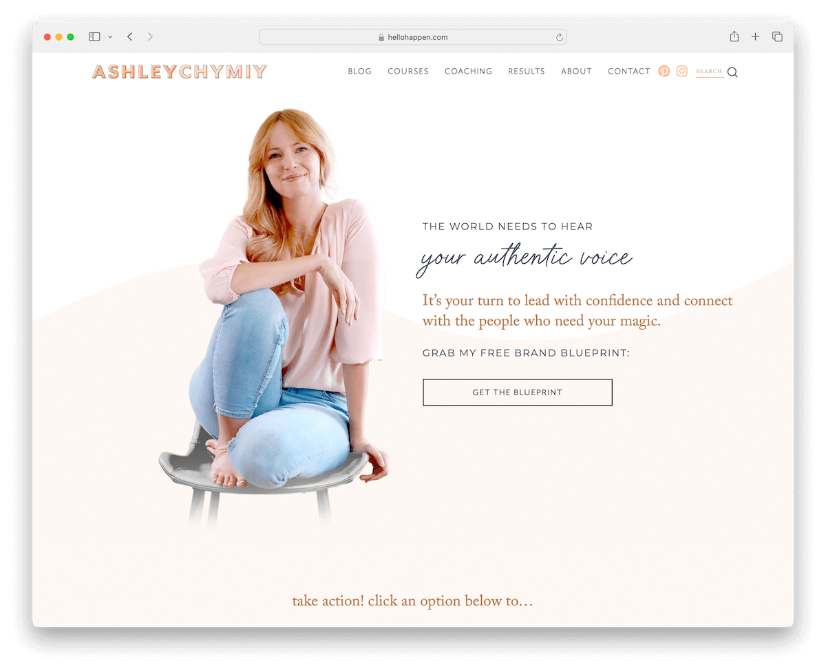
Ashley Chymiy’s Squarespace coaching website example is light and feminine, creating a personalized atmosphere that makes the experience more enjoyable.
You’ll immediately notice the parallax scrolling background sections, a slider, and an Instagram feed, which make the page fun yet practical.
The opt-in form for a freebie is worth mentioning, which is a smart way to build an email list.
Our favorite things about this site:
- Personalized web design that creates a pleasant atmosphere and browsing experience
- An opt-in form for growing an email list by first offering something
- Extensive online course/enroll pages with every little detail, pricing, and more
33. Alli Rizacos
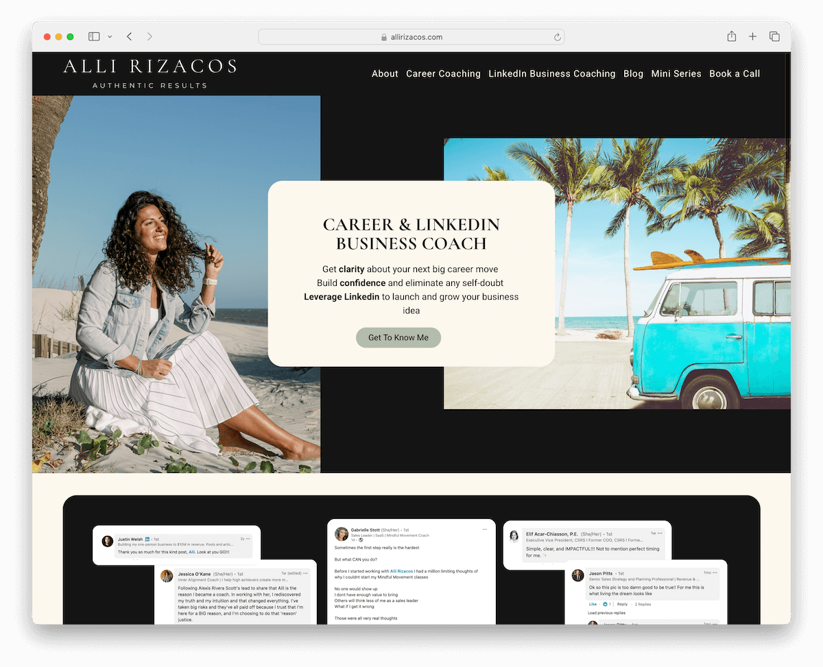
Alli Rizacos’s website has a mobile-like feel thanks to the rounded edges. But what really makes this coaching site pop are the dark, contrasting sections that complement the rest of the look.
Also, using a screenshot of some of the messages Alli received from her clients is unique. However, there’s another section dedicated to testimonials via a slider for even more reliability.
It doesn’t end here. Alli takes boosting credibility to the next level by adding a logo slider of brands she worked with.
Our favorite things about this site:
- Mobile-like design appearance, enhanced with rounded edges
- A unique way of displaying testimonials through a screenshot of the social media messages
- Dark sections and elements make the site pop more with all its amazing content
34. Bright Space Coaching

Instead of an image or a solid color background above the fold, Bright Space Coaching makes it special with a video background.
This Squarespace coaching site has a light and lively design, with large sections, testimonials, blog and an opt-in form.
You’ll also notice the header featuring the main and secondary menus, where the latter pushes the core offerings.
Our favorite things about this site:
- A video background section for increased engagement and visual appeal
- Main and secondary menus to easily find what one’s interested in
- Large footer with quick links and additional links for the core offerings
35. Abundant Artist Coaching

Abundant Artist Coaching is a simple yet impactful Squarespace website that makes the content shine with little to no distraction.
Both the header and the footer stick to the minimalist vibe, with the essential links for quick access.
Moreover, the dark CTA buttons are hard to miss, while the brand logo section promotes authority.
What’s more, Whitney also keeps it simple without using too many pages – just Home, About and Work With Me. And then the Podcast link opens Apple Podcasts in a new tab.
Our favorite things about this site:
- Minimalist and elegant aesthetics with strong attention to detail
- Simple header and footer with only the essential (navigation) links
- Dark, contrasting CTA buttons with a hover effect, which makes them even more clickable
Note: Don’t forget to check more amazing Squarespace coaching websites.
Squarespace Landing Page Examples
36. The Gutsy Mama Project
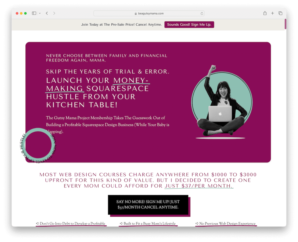
The Gutsy Mama Project launches with a popup that promotes the offering from the start. There’s also a notification bar at the top in case you accidentally close the popup without taking action.
The design might feel stuffed at first glance, but everything is very readable and easy to digest.
This Squarespace website also has some animations, sticky elements and accordions for FAQs, ensuring a fun adventure.
Our favorite things about this site:
- Popup and notification bar at the top of the screen that promote the offering
- A strategically structured layout that’s easy to skim through, although it’s stuffed with content
- A handful of animations and effects that make scrolling less boring
37. Tatum Hamernik

Tatum Hamernik’s Squarespace landing page example is all about sticking to simplicity. It’s one of those websites that has the same background color across all sections – header, base and footer – which is something we really enjoy.
Moreover, it has a hero image with overlayed reviews with star ratings, so everyone instantly understands the hype. But there are more reviews available down below via a slider.
Note that Tatum Hamernik also has About and Contact pages for practicality.
Our favorite things about this site:
- Unified background color for the header, base and footer, making the website look very smooth
- Reviews and ratings in the hero section for an instant boost of hype
- An addition of a testimonial/review slider with star ratings to build trust
38. Soundboy Pro
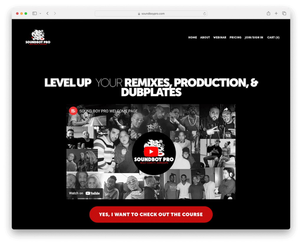
Soundboy Pro is all about creating a strong and lasting first impression with its black website design.
This Squarespace landing page example rocks bold text, an embedded video and a contrasting CTA button above the fold, making it highly actionable.
Furthermore, instead of using traditional testimonials, Soundboy Pro takes it to the next level with video ones – can’t beat these.
The layout also features a parallax image and a contact form to get in touch easily.
Our favorite things about this site:
- The dark design is always a pleasure to see because it’s not as common, making amazing landers like Soundboy Pro stand out even more
- Embedded video testimonials easily beat all the classic ones, even if they are long and the video version is short
- Red, contrasting CTA buttons that are hard to miss and ask for clicking
39. The Everyday Athlete
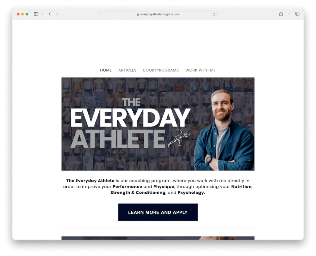
The Everyday Athlete promotes a free webinar through its somewhat large popup once it loads. (You can close it by pressing anywhere outside the popup or the “x” sign.)
The design is simple and clean with a boxed layout, so everything is centered and more focused.
Remember, while the home page works as a landing page, there are additional internal pages for articles, programs, and more. And on the coaching page, you’ll also find plenty of before-and-after images, which can significantly boost conversions.
Our favorite things about this site:
- Simplistic appearance with a light grey background and contrasting dark text and CTA buttons
- A boxed layout that keeps all the content centered and our attention on it more focused
- Before and after images, which help persuade and show that the services really work
Note: Don’t forget to check more amazing Squarespace landing page examples.
Squarespace Restaurant Websites
40. Tacos Poncitlan
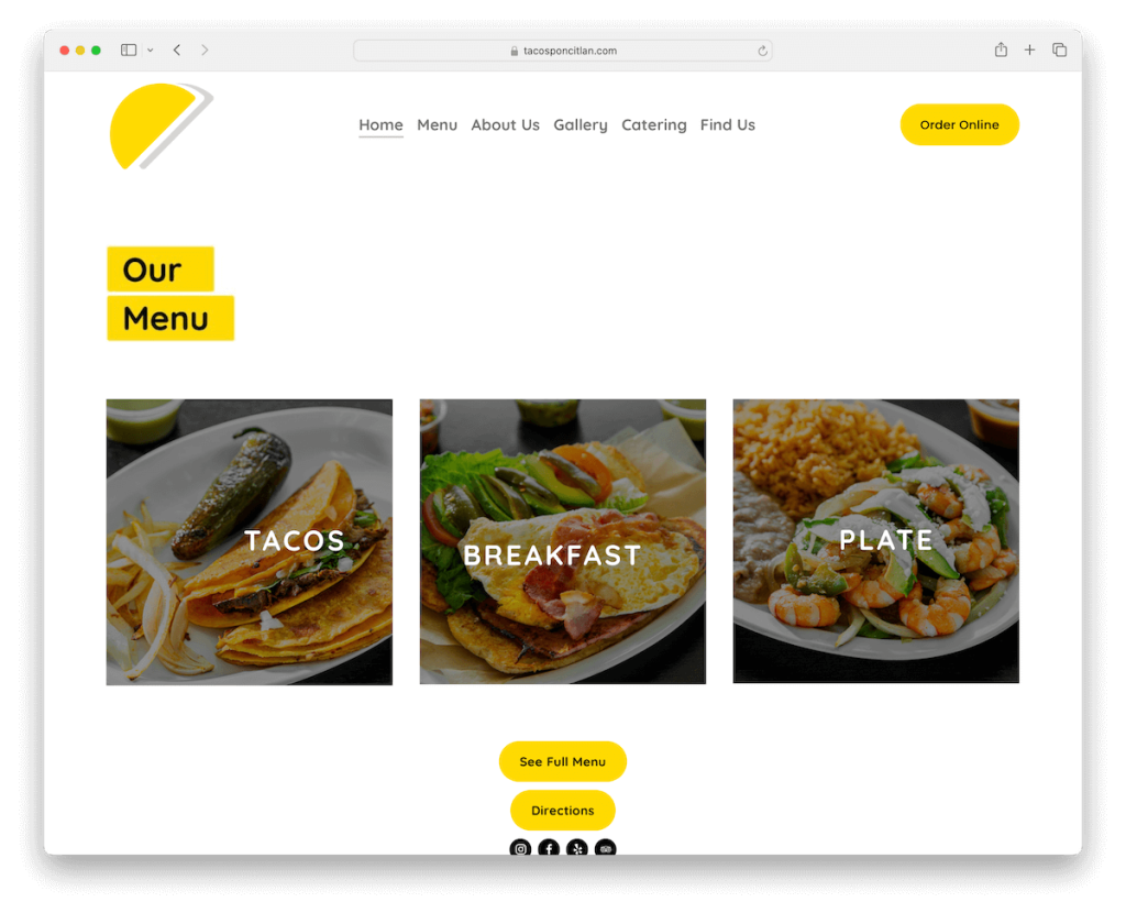
The Tacos Poncitlan website is simple from top to bottom. Thus, all the dishes, menu items, and other helpful content receive the shine they deserve.
It also has a carousel for displaying dishes and another one for the gallery.
The header is sticky to ensure all menu links and a CTA button for online orders are always at your fingertips.
Finally, for the location display, Tacos Poncitlanhas integrates Google Maps with links to reviews and a larger map that both open in new tabs.
Our favorite things about this site:
- The use of carousels, which, like sliders, display content beautifully while saving website space
- CTA button in the sticky navigation bar for improving conversions
- A detailed menu page, but, sadly, without pricing (but you can find them on the separate online order page)
41. The Saucy Cow
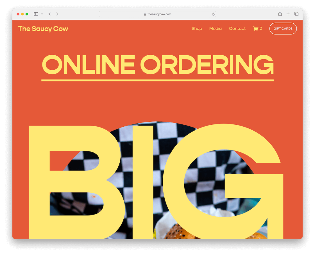
The Saucy Cow is big, bold and vibrant – a Squarespace restaurant website that screams, “Hey, check me out!”
Massive topography, plenty of white space, vivid red color scheme, well, this one is something else.
And the best way to get the most out of it is to visit it and enjoy the site in all its glory.
Our favorite things about this site:
- It has massive design elements, particularly typography, that grip everyone
- Right below the transparent header is an action link for online ordering before the main hero area
- Animated sliding text for another layer of engagement
42. Fields Good Chicken

Fields Good Chicken is a Squarespace restaurant website that’s pretty chaotic with its animated full-screen image background above the fold. But it sure does capture the attention.
The header is transparent with an order button and a hamburger menu, which opens in a full-screen overlay.
Besides, Fields Good Chicken also has a catchy footer reveal feature, which you don’t see every day. Plus, it’s dark, so it pops nicely.
Our favorite things about this site:
- Heavily animated above-the-fold area that’s meant to trigger everyone’s interest
- The hamburger menu keeps the header clean-looking, yet the entire navigation is just a click away
- Unique footer reveal feature that has a surprising yet pleasant effect on the user experience
43. Boogie’s Burgers
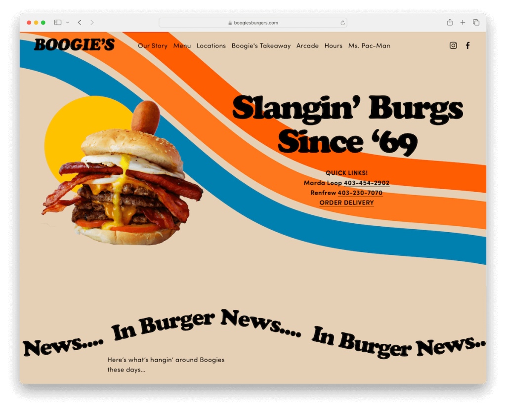
Boogie’s Burgers is a lively restaurant site with great detailing and some animation that keep the excitement high.
It has a transparent header that sticks and turns solid on scroll, so the drop-down menu and social media icons are always reachable.
Also, while the main color scheme is more earthy-like, the site still uses plenty of colors, emojis and other cool traits.
In short, Boogie’s Burgers is a very serious website with plenty of fun that together create an epic online presence.
Our favorite things about this site:
- Lively, energetic, yet modern and professional design that stands out from the masses
- The sticky header is always a plus, so the navigation is always just a click away
- Dark, contrasting footer with open hours, clickable telephone numbers and quick contact link
44. Aquarius
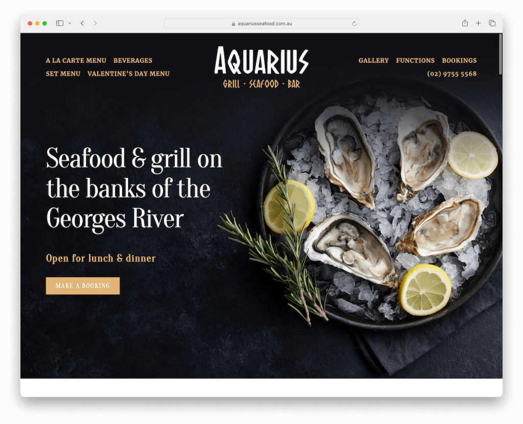
Aquarius sports a beautiful hero image with overlayed text and a CTA button for bookings. The header is transparent so it doesn’t get in the way, yet still delivers the necessary navigation and a clickable phone number.
This Squarespace restaurant template mixes dark and light sections, creating a dynamic atmosphere and a more mouthwatering experience.
The gallery page has a lightbox feature and the online booking system opens in a popup for quick reservations.
Our favorite things about this site:
- A mix of dark and light sections that make the website appear more dynamic
- Fully integrated online booking or table reservation system that’s easy to use
- A location and dishes gallery with the lightbox functionality for more immersive viewing
Note: Don’t forget to check more amazing Squarespace restaurant websites.
Squarespace Wedding Websites
45. Weddings By Lisa Nicole
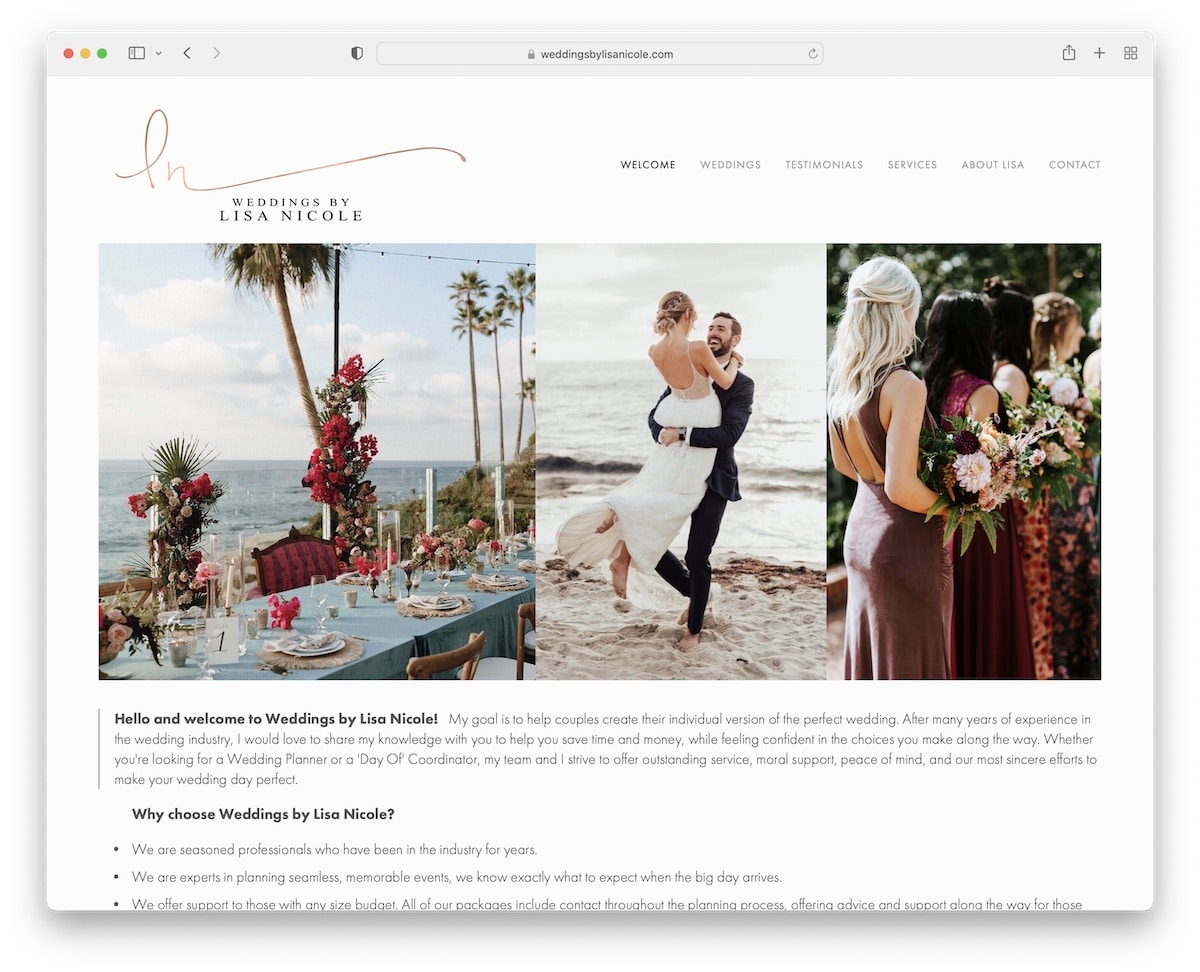
Weddings By Lisa Nicole has a light design with an image slider above the fold to quickly get familiar. But then there’s another slider at the bottom with text sandwiched in between.
This Squarespace site has multiple internal pages for wedding presentations, testimonials, services, and more.
In addition, it also includes a contact form with additional fields to get to know potential clients better.
Our favorite things about this site:
- Image-only slider for a delightful viewing experience and quickly getting to know Lisa’s work
- Extensive single-wedding pages with plenty of images in a single-column
- A contact form with additional fields is useful because you can learn more about potential clients in a single email
46. Alison Bryan
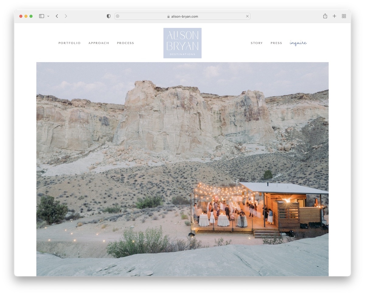
Alison Bryan’s site is elegant to the core. It has a minimalist design yet large image and video background sections with a parallax effect that keep engagement high.
The header floats at the top of the screen, while a lovely testimonials slider with images adds to customer trust.
But one of the best things about this Squarespace wedding website is the extensive wedding pages, where you can check plenty of images in an enjoyable grid.
Our favorite things about this site:
- Large image sections with the parallax effect and video backgrounds
- Personalized testimonials slider with images
- Wedding pages that reveal heaps of images from the actual D-day for your viewing pleasure
47. Bridal Bliss
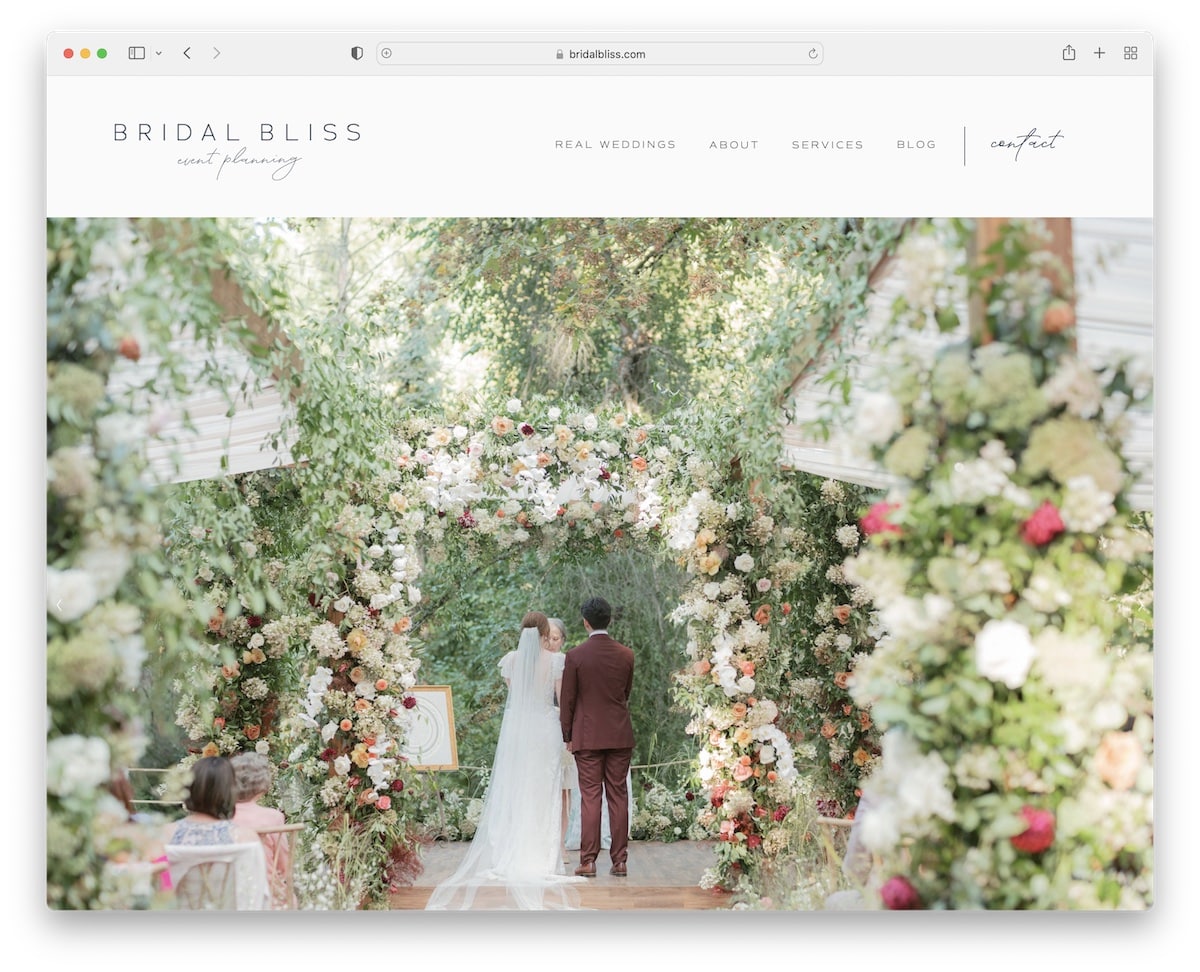
Bridal Bliss has a full-screen image-only slideshow above the fold that WOWs you right from the get-go. Gorgeous.
The design is modern and neat, with lots of white space that creates a content-popping effect.
Besdies the already plenty of amazing content, Bridal Bliss also has an Instagram feed in the footer with lightbox gallery effect to swipe through posts.
Our favorite things about this site:
- The full-screen image-only slideshow above the fold makes you sit back, relax and enjoy the content
- Light and minimalist design that has plenty of white space, so all the text, visuals and CTA buttons come forth
- Instagram feed with lightbox functionality to enjoy each post individually
48. Engaged & Inspired
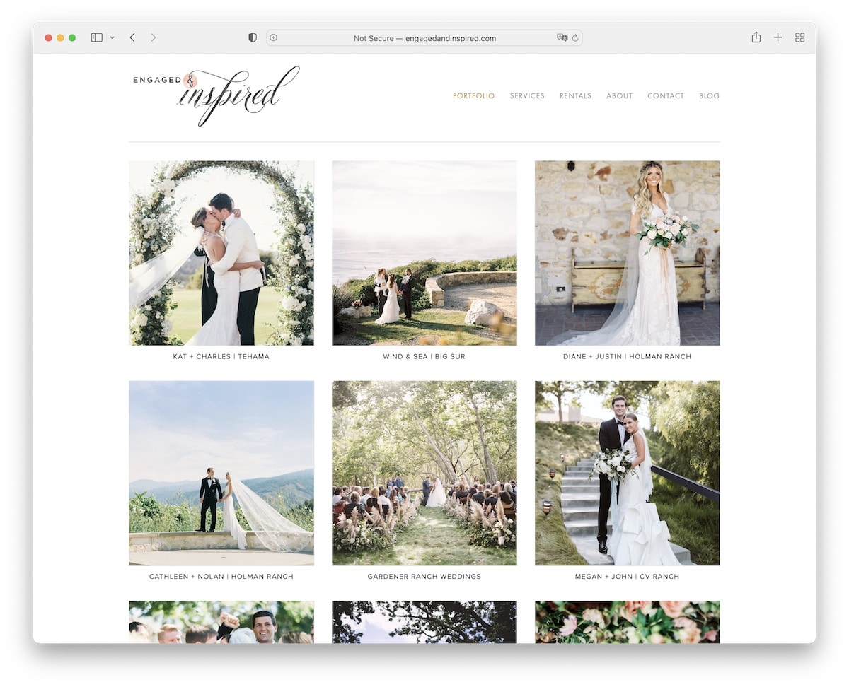
What Squarespace wedding websites have in common is their light and soothing design, which allows users to indulge in the content without distraction.
Engaged & Inspired is no different.
The home page is a three-by-four portfolio grid with a very basic header and footer. Yup, it’s all about the content.
The services page includes a detailed package presentation and pricing, the contact form has many extra fields, and the blog posts are storytelling through (mainly) images.
Our favorite things about this site:
- Minimalist throughout all the sections and pages to keep the attention on the content
- Detailed package presentations with pricing, which is oh-so-helpful
- Blog posts from wedding events with a solid collection of images
49. Piper & Muse
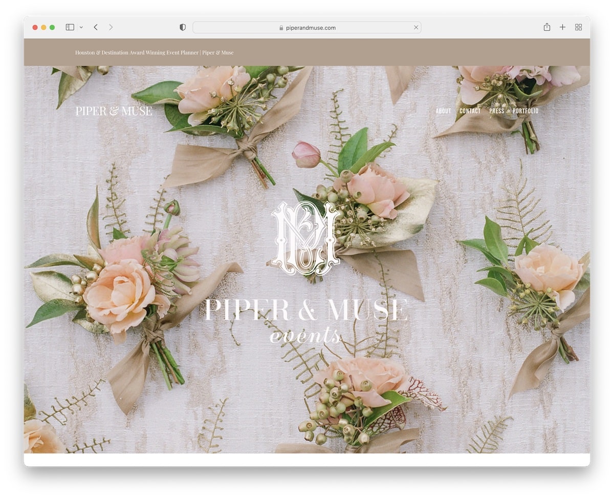
Piper & Muse has a top bar, a transparent header and then a parallax hero image, which combined offer a solid start to this top-notch Squarespace wedding website.
There are more large parallax image sections for an added layer of depth and engagement, with details, links and more in between.
One thing that particularly stands out is the full list of folks who make each wedding happen, with links to their businesses.
Our favorite things about this site:
- Large parallax image sections for a boost in visual appeal
- Top bar notification that lets the visitor immediately know what the business is all about
- Extensive contact form and integrated Google Maps with a clickable marker that opens the exact location in a new tab
Note: Don’t forget to check more amazing Squarespace wedding websites.
What Makes A Good Website Design?
A good website isn’t all about the good looks.
At the same time, it’s also not all about the functionality.
It’s a mix of both, delivering the ultimate user experience to help visitors quickly access the necessary information, items, or services they’re after.
Distractions are a no-no. And simplicity is a yes-yes.
Here are some more things worth considering when you’re after building that perfect website:
7 Qualities Of A Good Website Design
- Purpose: A website should have a clear purpose. Not everyone knows what your brand or business is all about. Thus, your web design should support and highlight your goal. In other words, visitors should immediately understand what the site’s about (don’t make them wonder).
- Responsive design: This is an absolute must. A mobile-friendly website design ensures that all your content looks and works great on any device and screen – desktop, tablet, and smartphone. (But Squarespace templates are all responsive by default, so no worries here.)
- Loading times: No one likes a slow website, especially not today when all the major platforms and apps load instantaneously. You must do whatever it takes to ensure your site is lightning-fast. (Pro tip: optimize images!)
- Readability: Your website must be easy to digest, from readable text to effective use of white space. Feel free to use images, videos, bullet points, headings, and other elements to make the website more enjoyable. (Just be careful not to clutter the design, or it’ll have the opposite effect.)
- Appearance: Those first seconds may make or break a deal. Besides the fast loading time, your website should also be visually appealing, sporting a clean layout with consistent branding and a harmonious color scheme. (Make that first impression strong and lasting.)
- Call-to-actions (CTAs): What rarely anyone mentions is that when it comes to CTA buttons, you’ll need to invest a bit extra time to test and optimize them. In other words, you’ll need to find the perfect balance of color, size, and text to make them the most clickable. But in general, contrasting button designs work because they stand out more.
- Trustworthiness: Don’t forget to include trust elements, like customer testimonials, reviews, secure payment icons, etc. Not to mention, a professional, smooth-operating website without errors also boosts credibility.
Hint: Squarespace and its templates do most of the work for you.
Build Your Own Professional Website With Squarespace
Squarespace makes it very easy to build a pro-level website without needing technical skills.
In short, it’s a solution for everyone (unless you need something more advanced with even more control – then we recommend using WordPress to build a website).
Why Squarespace is really good, particularly for beginners, is because you can run your business website, blog, or online store from one location. There is no need for separate accounts for hosting, domain and website-building platform.
After you create an account on Squarespace, select the package that best fits your needs and don’t forget about the 14-day free trial.
Then, pick a template that resonates with you best, or answer a few questions and let Squarespace recommend the best designs.
Check out some of the Squarespace templates you can use for your page:
As the collection above shows, you can easily and quickly build a bunch of different websites with Squarespace.
And if you want to add your creative twist, just go for it. Customizations and edits are effortless.
Squarespace has everything you need to succeed online, whether you’re a small business, artist, blogger, or entrepreneur.
You got this!
Was this article helpful?
YesNo