18 Best Squarespace Coaching Websites 2024
Welcome to our selection of the best Squarespace coaching websites, where inspiration meets innovation.
If you’re looking for stellar web design that catches the eye and effectively communicates your coaching services, you’re in the right place.
Squarespace has become a go-to platform for coaches across various niches, offering neat, user-friendly website options that stand out in the digital landscape.
In this article, we’ll check some fine coaching sites, showcasing examples that excel in aesthetics, functionality, and user experience.
Whether you’re a life coach, a business mentor, a fitness expert, or anything in between, prepare to be inspired by these masterpieces.
Take your web design aspirations to the next level.
This post covers:
Best Squarespace Coaching Websites
From innovative layouts to compelling content strategies, each site on our list has been chosen for its ability to provide both aesthetic delight and practical functionality.
1. Burntout To Badass
Built with: Squarespace

Burntout To Badass stands out with its vibrant color scheme, igniting energy and inspiration from the first glance.
A top bar notification grabs attention, while the simple header invites action with a clear CTA button.
The site also engages with animated stats and seamless content revealed as you scroll.
Testimonials glide in a dynamic slider, and a comprehensive footer showcases an Instagram feed, quick links, and a handy search bar.
Dive into detailed course pages, where pricing clarity meets strategic CTA placements for an effortless user journey.
Note: Let your coaching site speak your personality through colors, details, elements, etc.
Why we chose it: For its blend of energetic design, user engagement features, and strategic navigation.
2. Ashley Chymiy
Built with: Squarespace

Ashley Chymiy’s Squarespace site captivates with an original blend of simplicity and creativity.
A newsletter popup offers valuable resources from the get-go, drawing users in to share their email.
The transparent header elegantly frames content, while the catchy carousel reveals the latest blog insights.
Experience depth with the parallax image sections, and explore a dedicated reviews page showcasing client testimonials, complete with visuals and project links.
Uniquely, Ashley forgoes a traditional contact form, inviting visitors to connect directly through Instagram, fostering a personal touch.
Note: Integrate client testimonials/reviews (the more personal, the better) to build trust and credibility.
Why we chose it: For its creative design and personal engagement approach.
3. Alli Rizacos
Built with: Squarespace
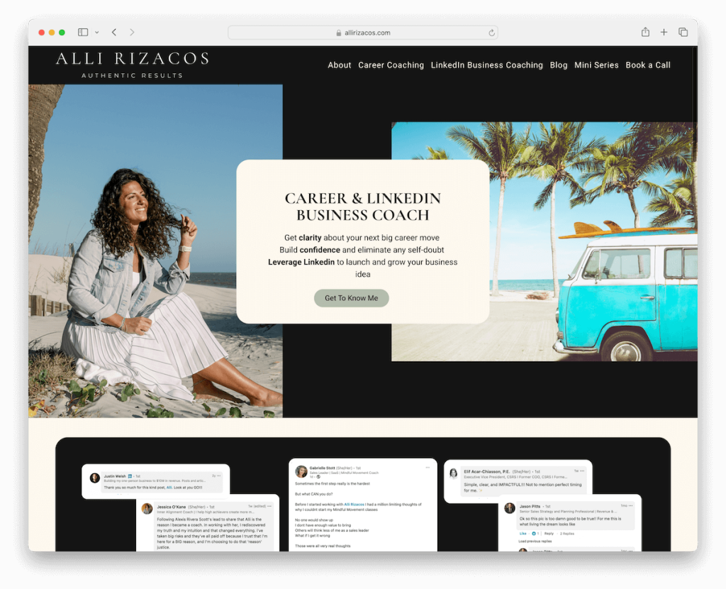
Alli Rizacos’ coaching site impresses with its sleek design, balancing dark and light hues for visual depth.
Rounded edges mimic a mobile interface, enhancing usability. Moreover, testimonials and a logo slider showcase Alli’s esteemed clientele, affirming credibility.
A simple newsletter form encourages ongoing connection, while dedicated blog and podcast pages enrich the content offering.
A 3rd-party booking wizard simplifies appointments, and the absence of a traditional contact page guides focus to direct engagement methods.
Note: Start collecting emails as soon as possible, either with a popup or a subscription widget, so you can (later) implement strategic email marketing.
Why we chose it: For its modern look and seamless integration of functionality, offering easy interaction and learning.
4. Bright Space Coaching
Built with: Squarespace
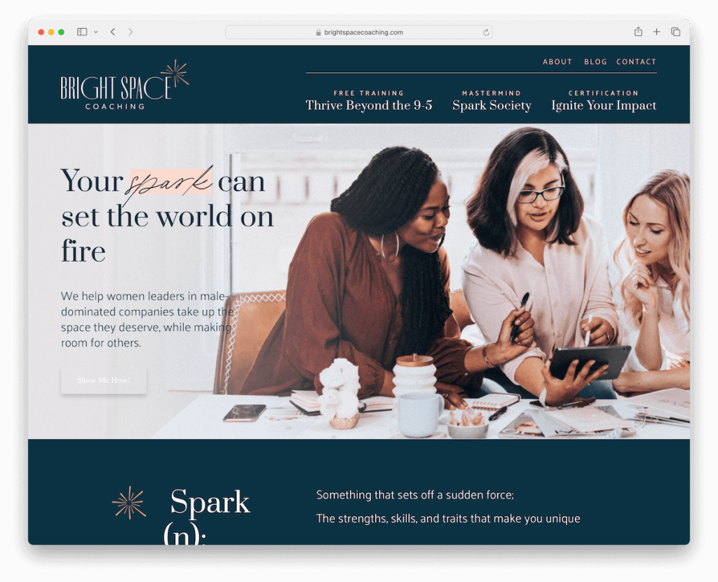
Bright Space Coaching’s site welcomes visitors with a calming color scheme, reflecting its supportive ethos.
Its layout features a main and secondary menu for intuitive navigation.
Scrolling animations add a dynamic touch without overwhelming, guiding users through client testimonials, insightful blogs, and a detailed about page.
The footer is generously sized yet minimalist, providing essential menu links and social icons for easy access.
This design harmonizes functionality with serene aesthetics, crafting a space that invites exploration and connection.
Note: Take your online presence to the next level with a regularly updated blog.
Why we chose it: For its serene design and thoughtful navigation, offering an online sanctuary for personal growth and connection.
5. Celia Peachey
Built with: Squarespace
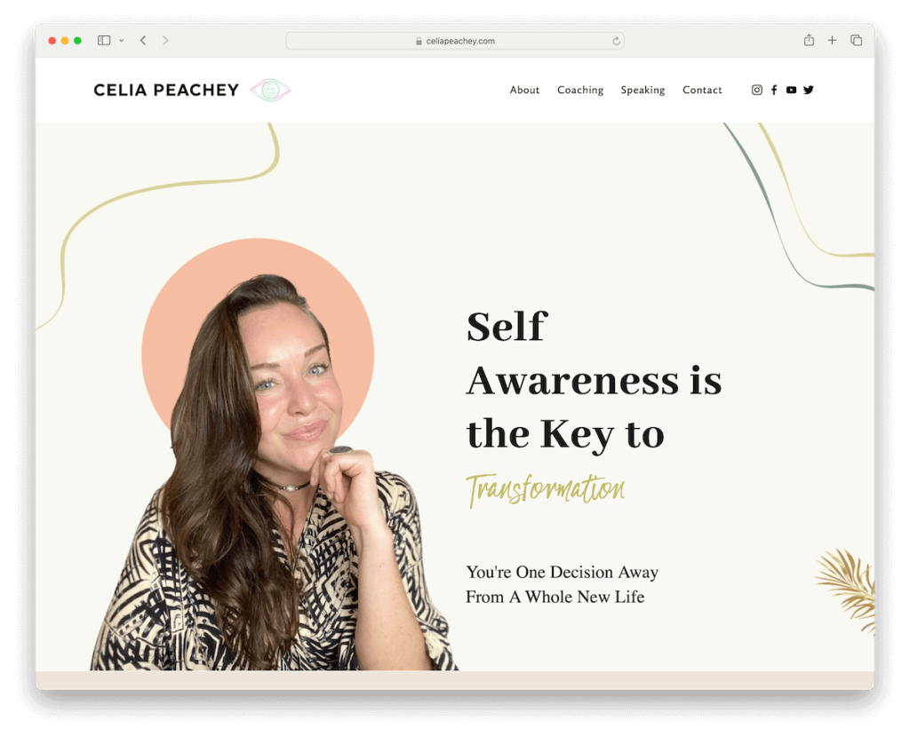
Celia Peachey’s coaching site triggers attention with a full-screen opt-in form, promising valuable insights through a free blueprint.
Its clean, creative design, peppered with catchy details, sets a welcoming tone. The layout is neatly organized with the necessary information, so everything is within reach.
A full-screen slider showcases inspiring quotes, adding a personal touch, while a full-width Instagram feed vividly connects her journey with her audience.
The site’s structure includes a practical four-column footer and easy-to-navigate accordions for FAQs, blending aesthetic appeal with user-friendly functionality.
Note: Add more content to your website by integrating social media feeds.
Why we chose it: For its immersive engagement and creative flair, blending inspirational content with convenient resources.
6. Kylie James Coaching
Built with: Squarespace
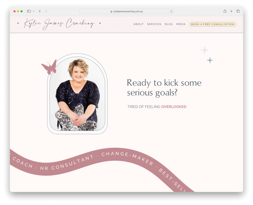
Kylie James Coaching’s Squarespace site balances elegance and function with its simple header and direct CTA button.
The website is sprinkled with animated text and charming details, capturing visitors’ attention at every turn.
An embedded podcast section offers a deeper dive into Kylie’s expertise, while heartfelt testimonials build trust.
The services page is rich with information, featuring FAQ accordions for clarity and a booking button for easy client action. (But adding pricing would make it even better.)
Note: Be as transparent as possible about your services so potential clients know what to expect.
Why we chose it: For its elegant simplicity and engaging content, making it easy for users to connect, learn, and take the next step in their coaching journey.
7. Abundant Artist Coaching
Built with: Squarespace
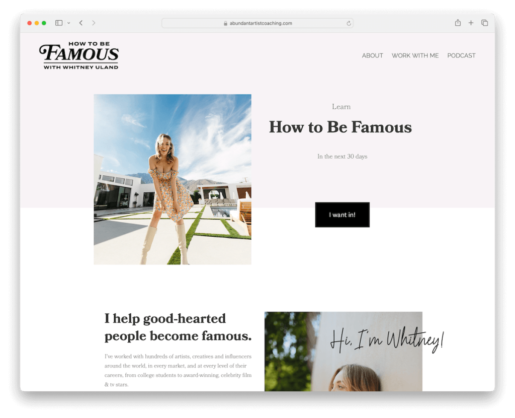
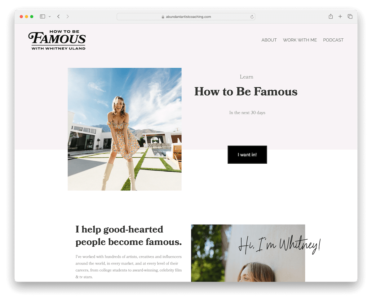
Abundant Artist Coaching site epitomizes modern minimalism with a design that speaks volumes through its simplicity.
The clean header and footer frame the content elegantly, ensuring a focus on what matters most.
As you scroll, content loads smoothly, maintaining a sleek user experience. Meanwhile, dark, contrasting CTAs stand out, guiding users with ease.
A proudly displayed section of client logos attests to credibility, while menu links offer flawless transitions to 3rd-party platforms for podcasts and courses, seamlessly integrating external resources.
Note: Use a simple and clean web design so your content and services can pop more.
Why we chose it: For its minimalist yet creative design and catchy user experience.
8. Yes & By Marin
Built with: Squarespace
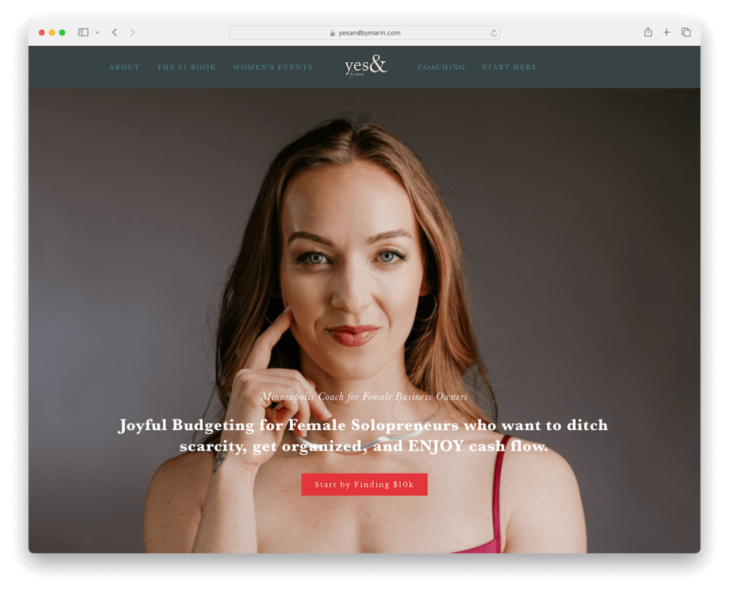
Yes & By Marin’s Squarespace site engages visitors with a popup promoting an upcoming workshop, blending informative content with a call to action.
The full-screen hero section features a welcoming shot of Marin, adding a personal touch that fosters connection.
A streamlined header and footer keep navigation simple, providing quick access to menu links, contact details, and social media.
The inclusion of a testimonial slider, a free call booking option, and an embedded promotional video further enrich the user experience, offering multiple pathways to link.
Note: Keep your business more organized and clients’ lives easier with an online booking system.
Why we chose it: For its personal touch and practical design, offering an inviting way to discover Marin’s coaching services.
9. Kelsey Abbott
Built with: Squarespace
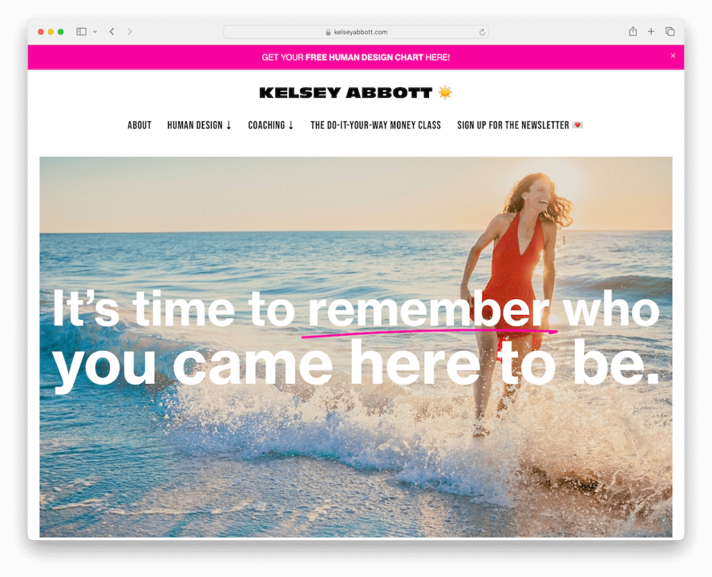
Kelsey Abbott’s Squarespace coaching site has a study in thoughtful design, beginning with a top bar notification.
The minimalist header, featuring a drop-down menu, cleverly disappears as you scroll down to maximize screen space and reappears on a back scroll for easy navigation.
The site artfully balances light, colorful, and dark sections, creating a visually appealing journey.
Accordions neatly tuck away extra information, maintaining a clean aesthetic, while a newsletter subscription prompt offers a seamless way to stay connected.
Note: Improve your site’s UX by creating a disappearing/reappearing header for better navigation.
Why we chose it: For its dynamic navigation and vibrant design that makes browsing visually stimulating.
10. Dog Biz School
Built with: Squarespace
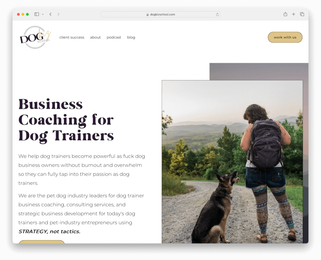
Dog Biz School’s Squarespace site rocks a clean, straightforward design that works great on desktop and mobile.
A prominently placed CTA button in the navbar encourages action, while the sticky header ensures navigation ease no matter where you are on the page.
As you scroll, content loads dynamically, keeping the experience fresh and engaging. Moreover, a unique comparison table vividly illustrates the benefits of their coaching, enhancing decision-making.
There’s also a dedicated page for client success stories that adds credibility. Finally, a feature-rich footer offers quick links and social media icons.
Note: A CTA button (with a contrasting background) in the navigation bar can significantly boost conversions.
Why we chose it: For its clear, user-friendly design and innovative features that effectively communicate value.
11. Tower To Tree
Built with: Squarespace
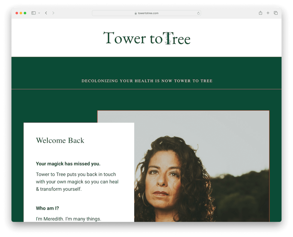
Tower To Tree site has a minimalist boxed layout, emphasizing content through large, distinct sections.
The clean header, free of any menu, fosters a focused viewing experience.
Each element, from the prominently embedded video to the concise subscription form, is thoughtfully placed to draw attention.
An in-depth Squarespace sales page clearly outlines offerings and pricing, guiding potential clients to take action.
Finally, the simple footer, set against a contrasting red background, adds a bold and memorable finishing touch.
Note: Be as transparent as possible when presenting your services, coaching, courses, etc. – and don’t forget to add pricing.
Why we chose it: For its minimalist design that highlights content beautifully, offering a focused and impactful UX.
12. Coach Farrah
Built with: Squarespace
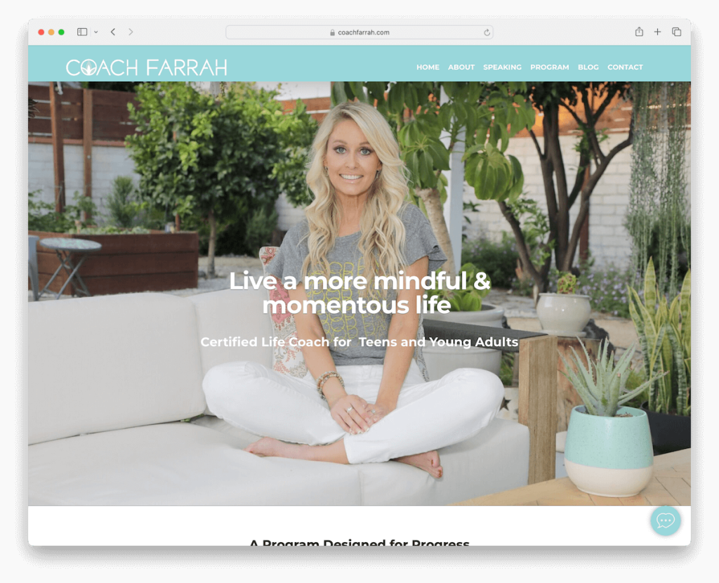
Coach Farrah’s Squarespace coaching website is a neat example of light design and seamless functionality.
The floating header and chat widget offer constant navigation and instant communication, ensuring users feel supported at every scroll.
An “As seen in” section bolsters credibility, showcasing her recognition in prominent media.
The minimalist footer invites engagement and connection with a clear CTA button and social icons.
Moreover, personalized testimonials share real success stories, while an integrated blog provides valuable insights.
Note: Start a blog within your niche and show everyone you’re a real expert in your field.
Why we chose it: For its user-centric design and credibility-building features.
13. Work With Tiffany
Built with: Squarespace
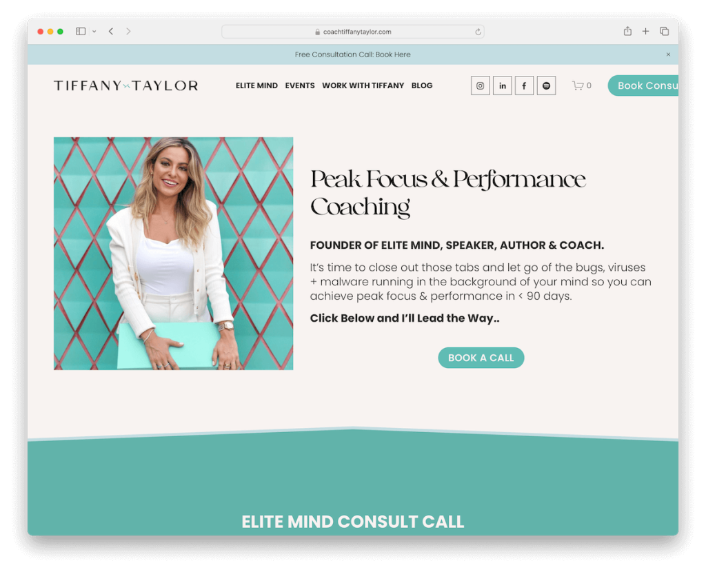
Work With Tiffany’s Squarespace site immediately engages visitors with a top bar notification, offering a free consultation call to hook interest from the start.
Its clean header efficiently packs menu links, social icons, and a CTA button, streamlining user navigation.
The inclusion of a certificate slider lends credibility, while the text-heavy design remains surprisingly readable, thanks to the strategic use of white space and a harmonious color scheme.
Last but not least, the Instagram feed at the bottom keeps the site vibrant and connected to Tiffany’s updates.
Note: Promote your special offering with a top bar (possibly on a contrasting background so it pops more).
Why we chose it: For its clear call-to-action and thoughtful design, ensuring an informative yet engaging experience.
14. Lindsay Maloney
Built with: Squarespace
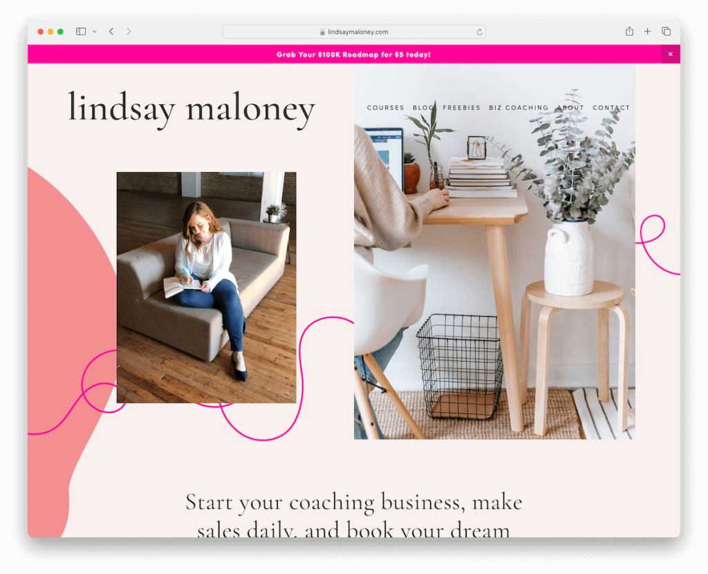
Lindsay Maloney’s coaching site radiates energy with its lively color scheme and attentive detailing, instantly capturing the eye.
A top bar notification provides timely updates, while the drop-down navigation ensures effortless browsing through her rich content, including coaching, courses, and podcast pages.
The testimonial slider, minimalist yet bold, showcases client success stories.
An advanced application form page invites prospective clients to take the first step toward working with Lindsay.
Note: Make your navigation more organized and practical with a drop-down.
Why we chose it: For its energetic design and useful features, offering an engaging and straightforward pathway to explore her coaching services and resources.
15. Zynnyme
Built with: Squarespace
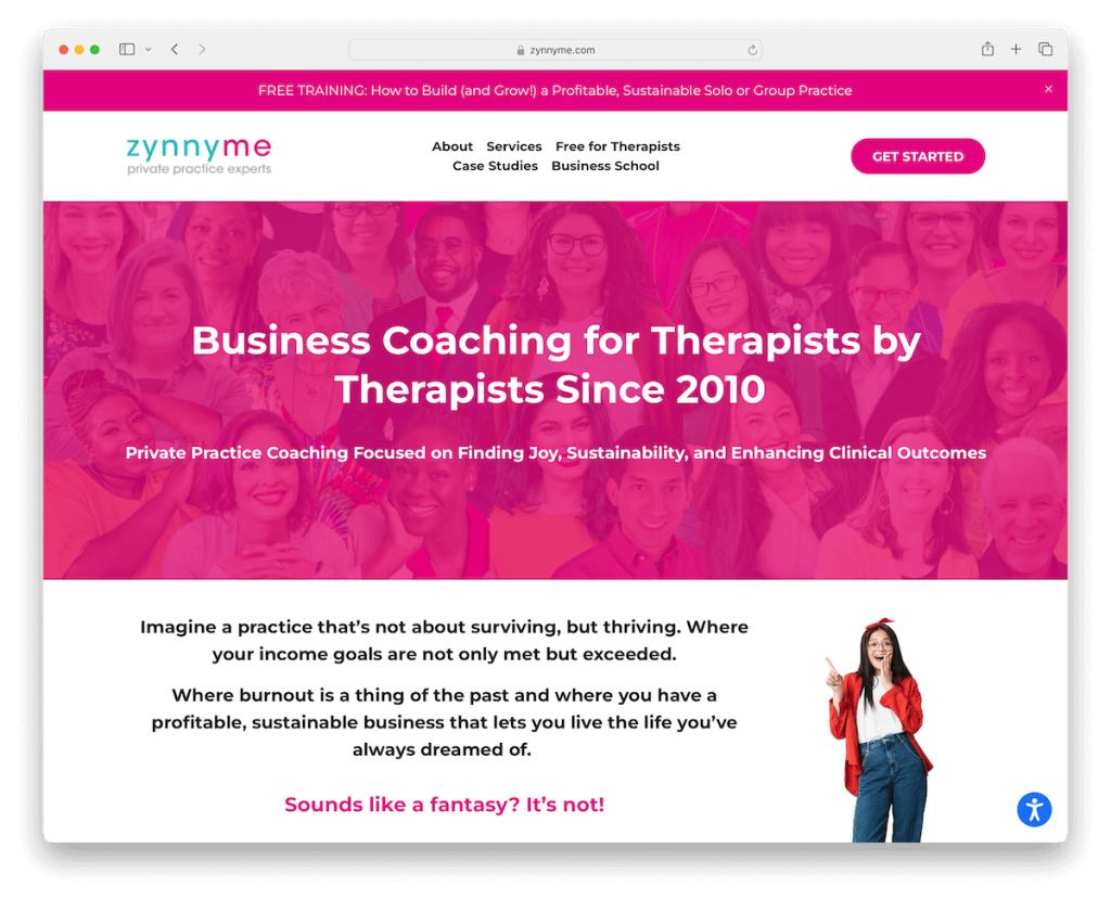
Zynnyme’s Squarespace coaching site triggers attention with its soft, inviting pink contrast and easy-to-read text.
A unique slider showcases glowing testimonials, complemented by a dynamic testimonial notification popup in the bottom left corner for added credibility.
Thoughtful accessibility adjustments ensure the site is welcoming to all users.
Furthermore, the contact page features an intuitive Typeform, while fantastic team pages include personal videos, adding a human touch.
An amazing case studies page vividly demonstrates their impact, completing this engaging online presence.
Note: Let everyone get the most out of your website by integrating an accessibility configurator.
Why we chose it: For its aesthetic appeal, user accessibility, and compelling content.
16. Hayley Luckadoo
Built with: Squarespace
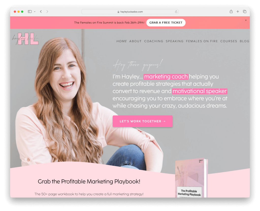
Hayley Luckadoo’s Squarespace site captures attention with its top bar notification, featuring an eye-catching animated gradient background that sets a vibrant tone.
The site offers many resources, including online courses, an insightful blog, an engaging podcast, and a members’ area for exclusive (course) content.
An Instagram feed seamlessly integrates her social presence, enriching the site with a personal touch.
The feature-rich footer provides comprehensive navigation options, and a contact form with a drop-down ensures tailored communication, making every interaction smooth and personal.
Note: Fill your website with useful resources and possible freebies. (These can improve your conversion rate.)
Why we chose it: For its dynamic design and comprehensive offerings.
17. Coach Wende
Built with: Squarespace
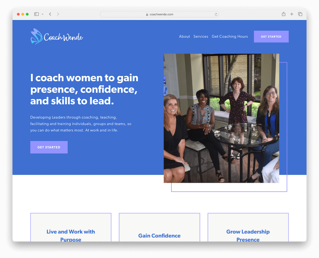
Coach Wende’s site is a masterclass in minimalist elegance, featuring a header and footer that embody sleekness.
The clean design is punctuated with modern elements that draw the eye without overwhelming, maintaining a crisp, professional aesthetic.
A straightforward newsletter subscription form invites ongoing engagement, while a simple contact form makes initiating work with Wende seamless.
The extensive about page highlights her media features and details her credentials and affiliations, establishing trust and authority in her coaching domain.
Note: Go personal and insightful on your About page.
Why we chose it: For its refined look and informative depth, combining pro-level presentation with personal credibility.
18. Claire Pearson Coaching
Built with: Squarespace

Claire Pearson Coaching’s site engages from the outset with a notification popup and a top bar banner.
The navbar houses a clear CTA, guiding users to their next step. In addition, a floating header ensures ease of navigation as content unfolds upon scrolling.
A contact form directly on the homepage, alongside an online booking system, declutters the process to connect and engage with Claire, creating a seamless, inviting user journey.
The dark contrasting footer, featuring a subscription form, anchors the site with a bold touch.
Note: Go the extra mile and integrate a full online booking system into your website.
Why we chose it: For its strategic engagement tactics and seamless navigation.
How To Make A Coaching Website With Squarespace
Creating a coaching website with Squarespace doesn’t take much time because of how easy the platform is to use. Here’s a tutorial to get you started:
FAQs About Squarespace Coaching Websites
How customizable are Squarespace templates for coaching websites?
Squarespace templates are highly customizable, allowing coaches to tailor their site’s look and feel to match their branding. You can modify layouts, colors, fonts, and add custom CSS for deeper customization.
Can I integrate booking systems directly into my Squarespace coaching website?
Yes, Squarespace supports direct integration with booking systems like Acuity Scheduling, which is part of Squarespace. This integration facilitates easy booking and scheduling of coaching sessions directly on your website.
Can I sell digital products or services directly from a Squarespace coaching site?
Yes. Squarespace provides robust eCommerce capabilities to sell digital products, services, and subscriptions directly from your site, complete with secure payment processing.
How does Squarespace perform in terms of SEO for coaching websites?
Squarespace sites are designed with SEO in mind, featuring clean HTML markup, automatic sitemaps, customizable page titles, and meta descriptions. However, for optimal SEO performance, you should also utilize Squarespace’s SEO tools and best practices to enhance your site’s visibility.
Can I add a blog to my coaching website on Squarespace?
Yes, adding a blog to your Squarespace website is straightforward. Blogging can be a powerful tool to share valuable content, showcase your expertise, and improve your site’s SEO.
Will my Squarespace coaching website look good on mobile devices?
Squarespace templates are inherently mobile-responsive, meaning your coaching website will automatically adjust to look great on any device.
Was this article helpful?
YesNo


