Net MRR Movements Brings Clarity to MRR Movements

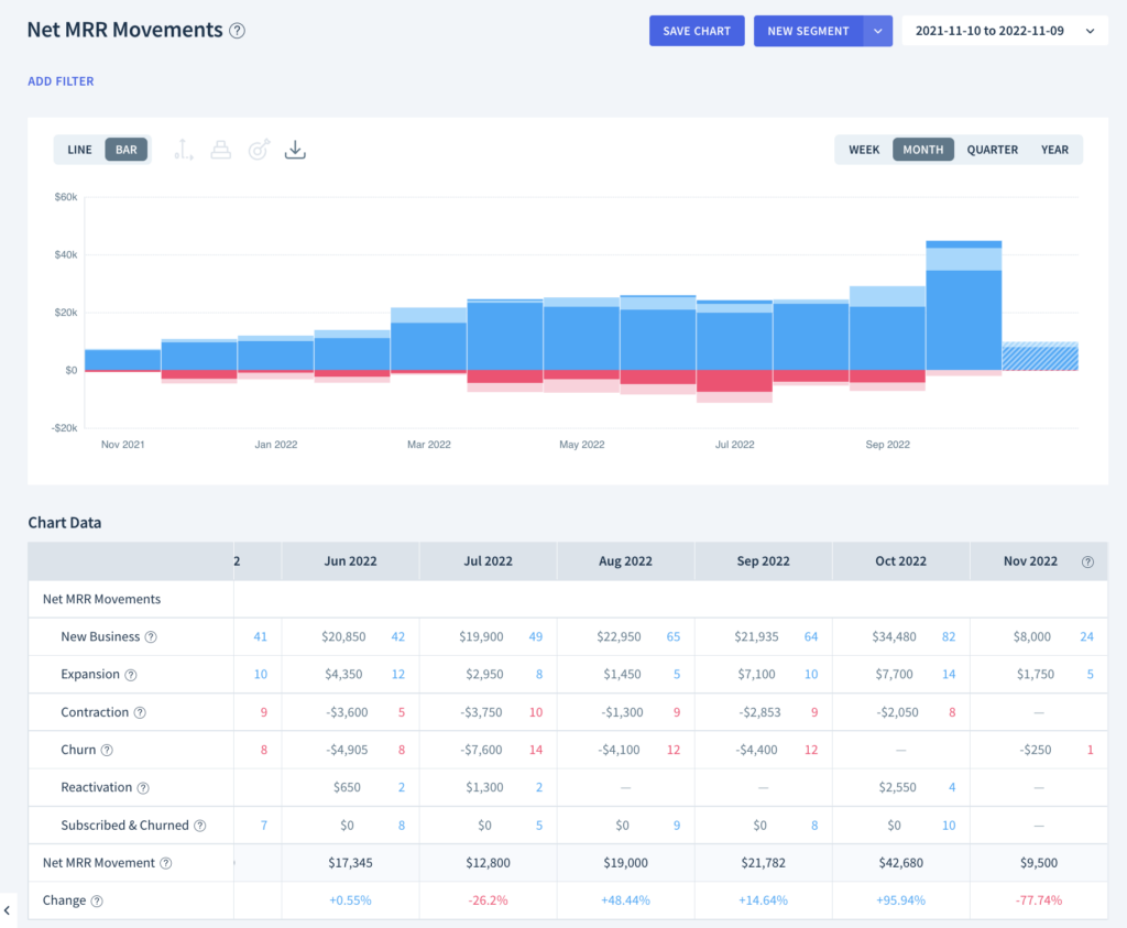
The new Net MRR Movements chart makes it easy to see the total impact of the MRR movements for each of your customers and the individual customer count for each MRR movement.
Selling seats is often the core value metric for subscription businesses. Think about Salesforce or Adobe, rather than Snowflake or Twilio and their usage-based model.
Per seat pricing can be the way to go if you can count on steady usage of the product and your customers like predictability in their billing. Tomasz Tunguz from Redpoint has a useful matrix on when to use usage or seat-based pricing here.
It’s not for every company, but seat-based pricing can be the best way to grow expansion revenue and work towards net negative MRR churn, where you’re growing organically even if you’re not signing new accounts.
By the way, we don’t use a seat-based pricing model for our subscription analytics, because we think your entire company (sales, marketing, product, customer success…) can make better decisions with our platform – we like to refer to it as the democratization of data (but that’s a story for another time).
Our MRR Movements chart shows all changes to your MRR, split by New Business, Expansion, Churn, Contraction, and Reactivation. If MRR often fluctuates for your customers, by adding or removing seats for example, it can be difficult to see the overall change for each customer in a given time period. That’s where Net MRR Movements comes in.

How Does Net MRR Movements Work?
The new Net MRR Movements chart shows you the sum of these MRR movements for each account. For example, if a customer removes 1 seat from their account this would be shown as a contraction, but if they then add 5 more seats within the same time period the net change will be shown as net expansion – the total MRR for those 4 seats. The grouping of MRR movements will adjust depending on how you also adjust the time interval.
Just like all the charts you have access to in ChartMogul, you can drill into the underlying activities that comprise each metric. With Net MRR Movements you can see the total number of customers as well as the number of activities for each net movement.
Let’s take a look at another example. When we examine the contraction events in the MRR Movements chart, you can see that Jordan Thompson downgraded their Startup Monthly plan.

When we check out the expansion events in the MRR Movements chart, you can see Jordan Thompson also added an Enterprise plan for $600 MRR in the same period.

So it’s not bad news after all! The new Net MRR Movements chart shows us the combined effect of these two movements – an increase of $550 MRR.

Net MRR Movements has been one of the most requested features we’ve had in the last few months, and we hope that it helps you make better decisions about your business.
Get in touch and let us know what you think about Net MRR Movements and what you think we should build next.


