Standard Webpage Sizes (Which Is Best?)

Welcome to our comprehensive guide to standard webpage sizes, a key topic in the ever-evolving web design and development space.
The importance of understanding and mastering webpage dimensions cannot be overstated. Whether you’re a professional web designer or a developer in the making, you’ve found the perfect starting point.
In this article, we will delve deep into standard webpage dimensions.
We’ll explore how they vary across different devices, from the smallest smartphones to the largest desktop monitors, and discuss the significance of responsive and adaptive design in creating a seamless user experience.
By the end of the article, you’ll have all the knowledge and insights to ensure your websites look great and function flawlessly on every screen and device.
Become well-versed in the art and science of webpage sizing, your essential skill in today’s digital toolkit.
This post covers:
What Is The Standard Webpage Size?
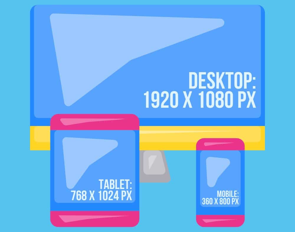
A “standard webpage size” concept is a bit fluid and varies depending on the context. In the past, web designers often aimed for sizes that would look good on the most common (usually largest) screen resolutions.
However, with the advent of responsive web design, the focus has shifted to creating webpages that adapt and look good on any device, regardless of screen size.
Historically, a common standard for desktop webpages was a width of about 1024 pixels, accommodating the once-popular 1024 x 768 screen resolution.
Over time, as larger and wider monitors became more common, this standard shifted to wider widths, like 1280 pixels and, now most common, 1920 pixels (1920 x 1080 px) for full HD resolution. (But the maximum width for desktops is 1440 pixels (more and more also use 2160 pixels for ultra HD).)
On the contrary, the most common mobile webpages are often designed for the width of 360 pixels – for the majority of smartphones.
The approach is different for mobile devices due to the variety of screen sizes. Mobile webpages are often designed for widths of 360 pixels (360 x 800 px) (standard for many smartphones).
Today, web designers typically use a combination of fluid grid layouts, flexible images, and CSS media queries to create webpages that adapt to the viewer’s device, whether it’s a small mobile phone, a tablet, a laptop, or a large desktop monitor.
Why Does a Webpage Size Matter?
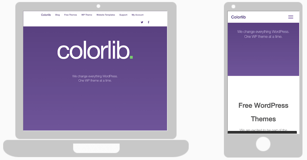
From a dimension perspective, the size of a webpage is crucial for several reasons:
Standard Website Dimensions For Desktop, Mobile Phones & Tablets
Let’s now break things down further, checking what are the standard webpage sizes for desktop screens, mobile phones and tablets.
Standard Webpage Size for Desktop Screens
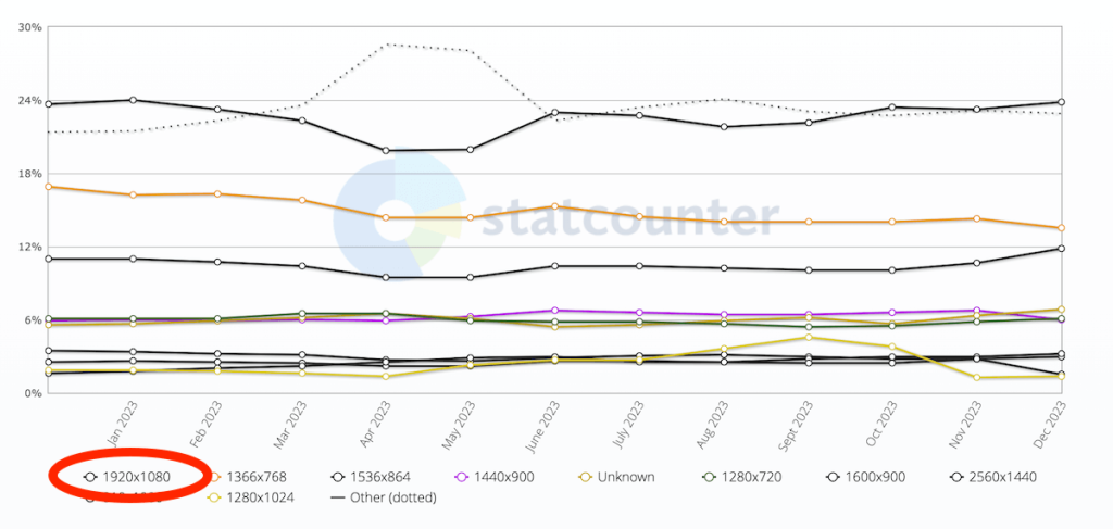
The typical maximum width dimension for standard webpages on desktop screens is set at 1920 pixels (1920 x 1080 px).
According to Statcounter, 24% of desktops use this dimension, followed by 1366 x 768 pixels at around 16%.
Because of the various screen dimensions and resolutions, it’s best to create a website that doesn’t have a set maximum width to avoid the inconvenience of a poor-performing website.
Usually, it’s set to 100%, so it easily adapts to smaller and larger screens. (But the content must be high-quality so it doesn’t look pixelated on big desktops.)
Standard Webpage Dimensions for Mobile Phones
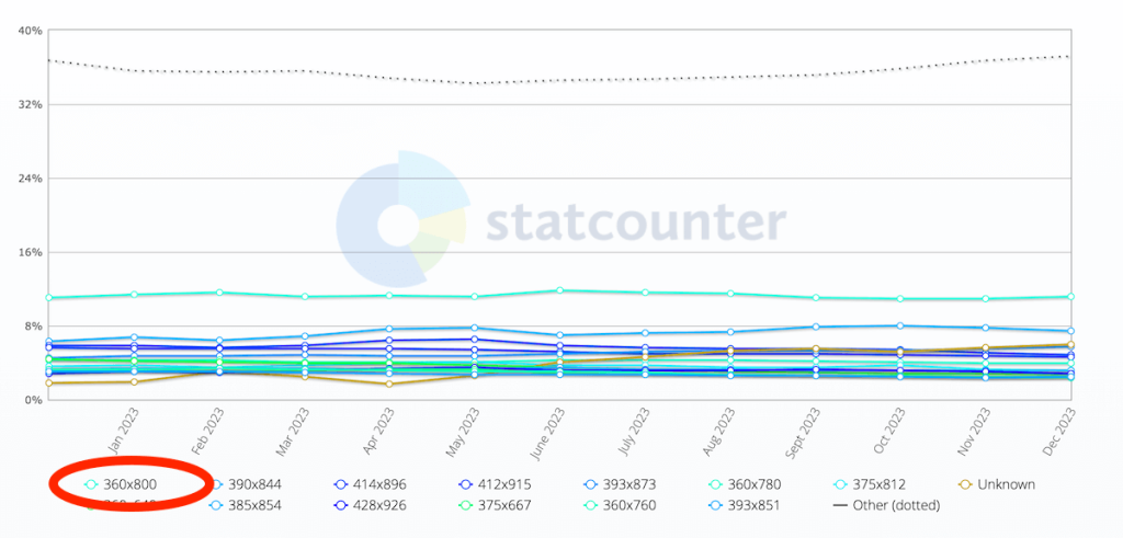
Regarding mobile screens, the most common standard webpage width is set at 360 pixels (360 x 800 px), which is used by 11% of devices.
The second most popular resolution is 390 x 833 px at 7%.
Because of the smaller screen size, it’s extra vital that you create a responsive webpage that guarantees smooth readability and usage.
Standard Webpage Size for Tablets/iPads
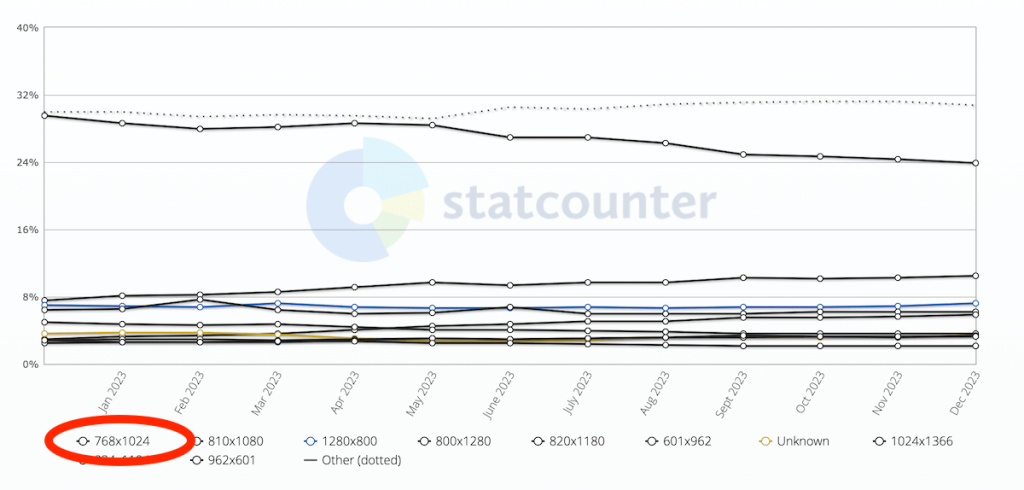
The standard webpage size for tablets and iPads is 768 x 1024 pixels – used by a whopping 23% of devices – the second most popular is 810 x 1080 pixels at 10%.
While tablets and iPads have more space than smartphones, it’s still key that the website acclimatizes to the screen size.
Scrolling left and right or pinching the website doesn’t call for an improvement in UX – it causes the complete opposite.
Luckily, there are endless responsive WordPress themes available, allowing you to create a top-notch website that works on desktops, smartphones and tablets flawlessly.
Additionally, you can also use website builder software and ensure outstanding site performance right from the get-go.
Things to Consider When Deciding on Your Website Size

Deciding on the size of your website in terms of its dimensions is a pretty big deal.
It’s not just about how it looks; it’s about ensuring it works well for you and your visitors.
Let’s chat about a few key things you should consider:
1. Type Of Content
What are you planning to showcase on your website?
If it’s lots of visual content like photos or videos, you might want a broader layout to really make those images pop.
If it’s more text-based, like blogs or articles, you’ll want a design that makes reading easy and enjoyable. (It helps to keep it minimalist with a bit more white space.)
2. Frequency Of Adding New Content
Planning to update your website often with new posts or products?
Your design should make adding new content a breeze without making the site feel cluttered or overwhelming. That extra space is usually very beneficial.
Think about how your content will grow over time.
3. Number Of Pages
Are you going for a simple site with just a few pages or something more complex with many sections?
The more pages you have, the more you’ll need to consider navigation and how users will move around your site.
You should always have the following in your mind: you want everyone on your website to find their way around easily without feeling lost.
Hint: A larger size is better if you want a one-page website.
4. The Amount of Information
How much info are you planning to put on each page?
Pages crammed with text, images, and other elements can feel chaotic and could slow down your site.
On the other hand, too little content might not engage your visitors enough (that’s why I mentioned earlier that too much white space might not be a good idea).
Finding that sweet spot is key.
What Is a Responsive Web Design?
Responsive web design is a modern approach to web development that ensures a website looks and functions well on any device, regardless of its screen size or resolution.
Here’s how it works:
- Flexible grids: The responsive website layout is based on a fluid grid. Instead of using fixed units like pixels, the layout adapts to the screen size using relative units like percentages. So, a column might be designed to take up 50% of the screen width, whether that screen is 360 pixels wide (like a smartphone) or 1920 pixels wide (like a desktop).
- Flexible images: Just like the layout, images and other media on a responsive website are also adaptable. They scale up or down in size to fit the screen they’re being viewed on, ensuring they always look right and don’t slow down page loading on smaller devices.
- Media queries: These are a key part of CSS that allow designers to apply different styles based on the characteristics of the device the website is being viewed on, most commonly the width of the browser.
Why Use Responsive Web Design?

In this day and age, every website should be responsive to enjoy the ultimate results it deserves.
Without a mobile-friendly base, you can pretty much forget about the success you want to achieve.
Why? Okay, here are some of the reasons:
1. Better Usability
Responsive design ensures your website is user-friendly on any device.
This adaptability makes navigating, making purchases and reading content a breeze for your visitors, whether they’re on a handheld or desktop device.
With more and more mobile users accessing the web, a mobile-friendly site is an absolute MUST.
2. Better Search Engine Visibility
Search engines favor websites that provide a good user experience, which includes being mobile-friendly.
A responsive website is more likely to rank higher in search results, making it easier for potential visitors to find you.
Who doesn’t want to be seen more?
3. Less Technical/Coding Work
Opting for a responsive design means you’re essentially building a single website that works seamlessly across all devices.
This approach significantly reduces the technical effort and coding required compared to maintaining separate website versions for different devices.
4. Recommended By Google
Google explicitly recommends responsive design.
Following this guidance is beneficial as Google is a major driver of internet search traffic, and adhering to its recommendations can positively impact your website’s search performance.
And this is especially important if most of your website traffic comes from mobile.
5. Consistent User Experience
A responsive website delivers a uniform experience to your visitors no matter the device they use.
This consistency in design and functionality helps build trust and engagement with your audience.
Appear as professional as possible across all channels.
6. Less Maintenance
Similar to the technical/coding work mentioned above, with a single responsive site, maintenance becomes much simpler.
You won’t need to spend time updating and fixing multiple site versions, allowing you to focus more on content and strategy.
7. Traffic And Conversion Boost
A well-designed, responsive website typically sees increased traffic and higher conversion rates.
By catering to a broader range of devices, you’re widening your potential audience and enhancing their onsite experience, which can lead to more engagement and conversions.
Let’s face it: No one will click the CTA button if it’s hard to find on a mobile device. And that’s what a responsive layout prevents from happening.
Conclusion
Choosing the best size for your website depends on your audience and your content.
The key takeaway? There’s no one-size-fits-all answer.
Okay, it is: A responsive design.
- Remember, the most common desktop screen size is 1920 x 1080 pixels, which gives a lovely, wide canvas for web design.
- For mobile phones, a size of 360 x 800 pixels is pretty standard, offering a compact yet versatile space for viewing on the go.
- And for tablets, 768 x 1024 pixels is a typical sweet spot, balancing portability with a bit more screen real estate.
The beauty of web design today is in its flexibility and responsiveness.
Your website must look fantastic and function perfectly across all these devices (that’s what your goal should be anyway).
It should make everyone feel right at home, whether browsing on a desktop, tapping on their phone, or swiping on their tablet.
FAQs About Standard Webpage Sizes
What is the standard size for a desktop webpage?
There’s no one-size-fits-all standard, but a common practice is to design for the most common screen widths of 1080 pixels for desktops. However, designers often use responsive design to accommodate various sizes, typically between 1024 px and 1920 px wide.
How webpage sizes adapt to mobile devices?
Responsive design, uses CSS media queries to adjust the layout, font sizes, and other elements based on the screen size. The most common mobile screen width is 360 px, followed by 390 px and 393 px.
What are the most common screen resolutions for web design?
Popular screen resolutions include 1920 x 1080, 1366 x 768, and 1536 x 864 for desktops and 360 x 800, 390 x 844, and 393 x 873 for mobile devices. Designers often use these resolutions as reference points.
How does responsive design affect webpage size?
Responsive design allows a webpage to dynamically adapt its layout and content based on the screen size and orientation. It ensures usability and readability across different devices without needing multiple site versions.
How does the aspect ratio of a device affect webpage size and design?
The aspect ratio of a device significantly impacts webpage design. Common aspect ratios like 16:9 (widescreen) or 4:3 (standard) dictate how content is laid out and viewed. Designers create layouts that adapt fluidly to different aspect ratios so the website looks good and remains functional across various devices.
What are the best practices for ensuring webpages load quickly on all devices?
Optimize images, use efficient coding practices, minimize the use of large scripts and frameworks, leverage browser caching, and consider using content delivery networks (CDNs). Aim for simplicity, minimalism and efficiency in design and coding.
Was this article helpful?
YesNo

