Time For A Website Redesign? 7 Ways To Know

Designing a website is quite a project. You need to consider your brand, what you want to achieve with your site, and what your visitors or customers want to see.
That’s a lot of thinking. So, it’s understandable that most people only review the design of their website very rarely. In some cases, not at all. As a result, websites often become less effective over time.
So, how often should you be considering a website redesign?
The answer depends on several different factors. These include the current performance of your existing layout, the emergence of new technology, and changing styles in design.
In this guide, we’re going to explore these topics (and more) and help you pinpoint the right time to redesign your website.
Why You Might Need To Update Your Website Design
Design isn’t only about the look of your website— It dictates the entire user experience, from navigation to accessibility.
Over time, designers have become better at adapting their work to the needs of the end user. As these new ideas are put into practice, the principles of good design start to shift. What was considered a perfectly good design five years ago may seem outdated today, leaving users unimpressed.
At the same time, technology is always moving forward. Web standards change rapidly, as do design practices. If your site doesn’t take advantage of the latest optimization techniques, you could find yourself lagging behind the competition.
Here’s the full list of problems associated with outdated website designs:
- Poor user experience: Older designs often include navigation elements that seem outdated to current users, and content can be slow to load.
- Higher bounce rate: When users don’t enjoy the experience of navigating your website, they may simply leave. Leading to our next point —
- Lower conversion rate: If potential customers don’t like your site, they are less likely to go through with an online purchase or even enter their email address.
- Decreased mobile compatibility: Mobile browsers have come a long way over the past few years. Older websites don’t take advantage of the new upgrades and may become incompatible with new browser versions.
- Lower search engine ranking: Google and other search engines tend to promote sites that show excellent performance. As outdated sites tend to fall behind here, they rarely receive top billing in search results.
- Reduced credibility and trust: People don’t trust websites that haven’t been updated for a long time, perhaps because it suggests neglect. And that’s not really an appealing vibe.
- Security vulnerabilities: In some cases, that lack of trust is justified. Websites that have been designed with outdated standards may have security holes.
- Higher maintenance costs: Avoiding a full redesign might seem like a way to save money. But in truth, fixing old designs and hosting poorly optimized content is a recipe for unnecessary expense.

How Often Should You Redesign Your Website?
There is no fixed answer to this question, but as a ballpark figure, you can expect any website design to last for between two and five years. This assumes that the design is crafted with care, using up-to-date design principles and current technology.
The same design can continue functioning for many more years. However, it might not meet visitors’ needs in the same way as a new design. As time passes, the problems are only likely to grow.
Of course, these are just general trends. To determine whether your specific website needs an overhaul, you need to consider how your current design is holding up.
Here are seven telltale signs that it’s time to make some changes:
1. Your Website Business Performance Isn’t Hitting Your Benchmarks
Unless you’re just blogging for fun, your website likely has a purpose — such as attracting views or making sales. And you probably have certain business goals related to that purpose.
Over time, it becomes clear what a realistic target looks like. How many visitors or new customers can you aim for this month? Probably the same as last month, plus a few more. This becomes your benchmark.
Maybe you don’t hit the benchmark every month, but you’re generally trending in the right direction. Your website continues to grow. This trajectory might continue for years.
Then, one day, the graphs start flatlining. A few months later, they begin to decline. Fewer people visit, make purchases, or sign up. Users stop returning, and Google doesn’t send you the same amount of organic search traffic. You feel like a pilot watching the dials as your airplane falls from the sky.
What’s happening? If you haven’t changed the design of your website for several years, it could be the root of the problem.
Most companies that see consistent growth tend to update their site quite regularly. They run a redesign project every few years, taking into account all the good parts of their existing design and refining the parts that need work.
The performance indicator isn’t foolproof by any means. There could be other reasons why you’re not seeing the results you desire. But when your website hasn’t been updated for some time, it can be a useful smoke signal.
Get Content Delivered Straight to Your Inbox
Subscribe to our blog and receive great content just like this delivered straight to your inbox.
2. Your Website Has Fallen Behind Competitors And Your Industry
Continued growth doesn’t always mean success. When you’re running a business, growth in comparison with that of your competitors is also important.
If you have a suspicion that your site is starting to look a little old, consider running some competitor analysis. Look at the performance of similar companies that have redesigned their site in the past couple of years. You can do this using a free tool like Website Grader.
Are they doing better than you? If they are, you might have to take action if you want to stay in the race.
It’s also worth looking higher up the food chain. Study the website of the leading brand in your niche. What do you like about the look, feel, and performance of their site?
Make a note of everything that catches your eye, then compare it with your own website. If your site seems tired, it could be time to start the redesign process. (The notes you take here can be really helpful when drafting your redesign strategy.)
Industry Benchmarks
Of course, not every website has a like-for-like competitor. And not every site owner has the skills, time, or resources to perform a comprehensive analysis.
In such cases, industry benchmarks can provide a helpful shortcut. Some key metrics to look at include:
- Average conversion rate: What proportion of users are signing up or making a purchase?
- Organic traffic: How many visitors are coming to the site through search and social?
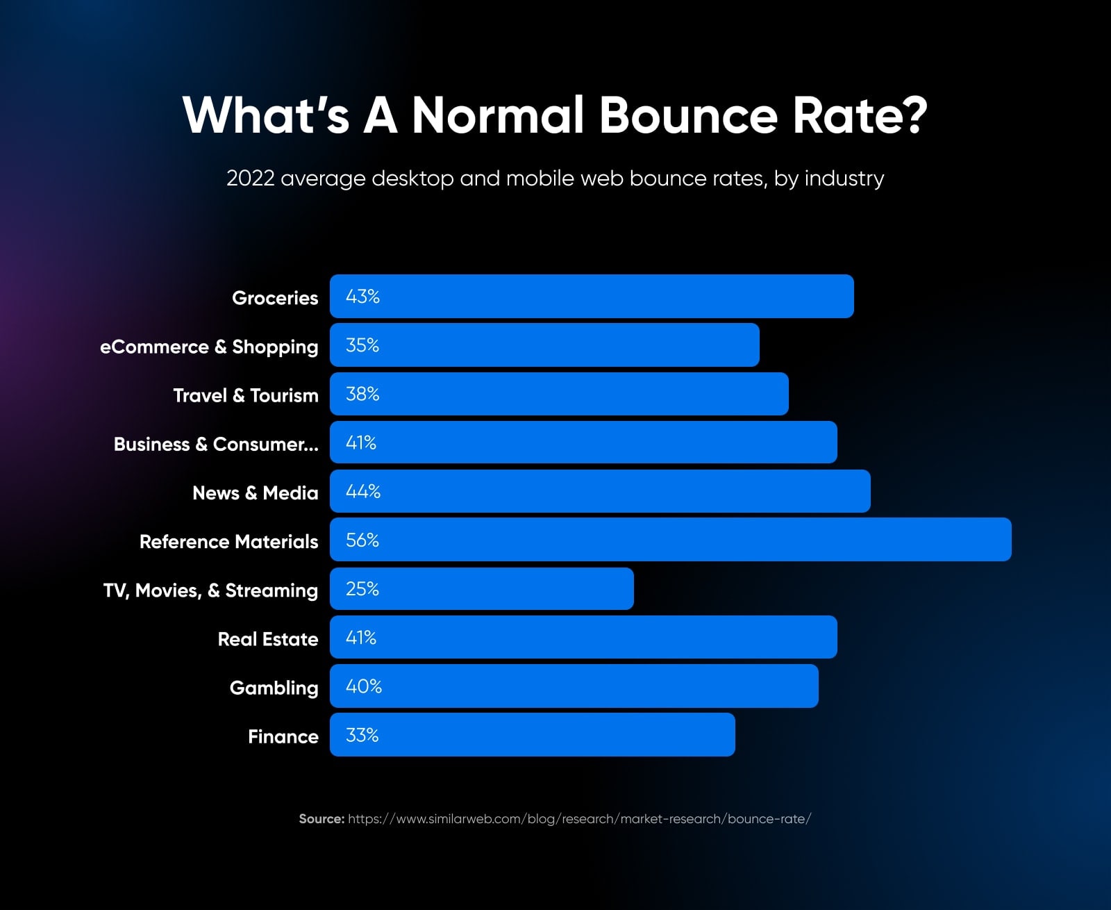
- Bounce rate: What proportion of visitors leave straight away?
- Average time on site and pages per session: How long are visitors hanging around?
Once you have gathered this data, compare your own figures with industry benchmarks.
The results of this analysis can be pretty revealing. Failing to reach industry benchmarks, particularly if your site is well established, can hint at the need for a redesign.
Performance Benchmarks
Not all benchmarks are tied to outcomes. The technical performance of your site can be just as important.
According to Google, the bounce rate of the average page increases by 32% when load time extends from one second to three seconds. In other words, almost a third of visitors will leave your site immediately if your design elements aren’t properly optimized.
What’s more, search engines like Google tend to promote sites that use current best practices in web design. For instance, a site with a responsive design (able to adapt to different screen sizes) is more likely to rank than a website with an inflexible layout.
With these impacts in mind, it’s worth keeping an eye on the following performance metrics:
- Page load speed: It shouldn’t take any longer than two seconds. Test with Pagespeed Insights.
- Mobile responsiveness: Google’s Mobile-Friendly Test reveals whether your current site design works well on smartphones and tablets.
- Accessibility: Older designs often score poorly when it comes to accessibility. This makes it harder for some users to use your site, and search engines don’t approve.
- Legibility: The average time it takes someone to read your content can reveal whether your color palette and typography is causing problems with legibility.
- SEO performance: In some cases, search engine optimization efforts can be hindered by an outdated front end.
A sub-par result in one of these categories implies that the design of your website could be improved. If you’re lagging behind in more than one area, you should probably consider starting again from scratch.
3. Your Branding And Design Style Has Changed
There are times when redesigning your website isn’t a necessity on technical or performance grounds. Sometimes, you just want to freshen things up.
This particularly applies when businesses make a change to their overall brand.
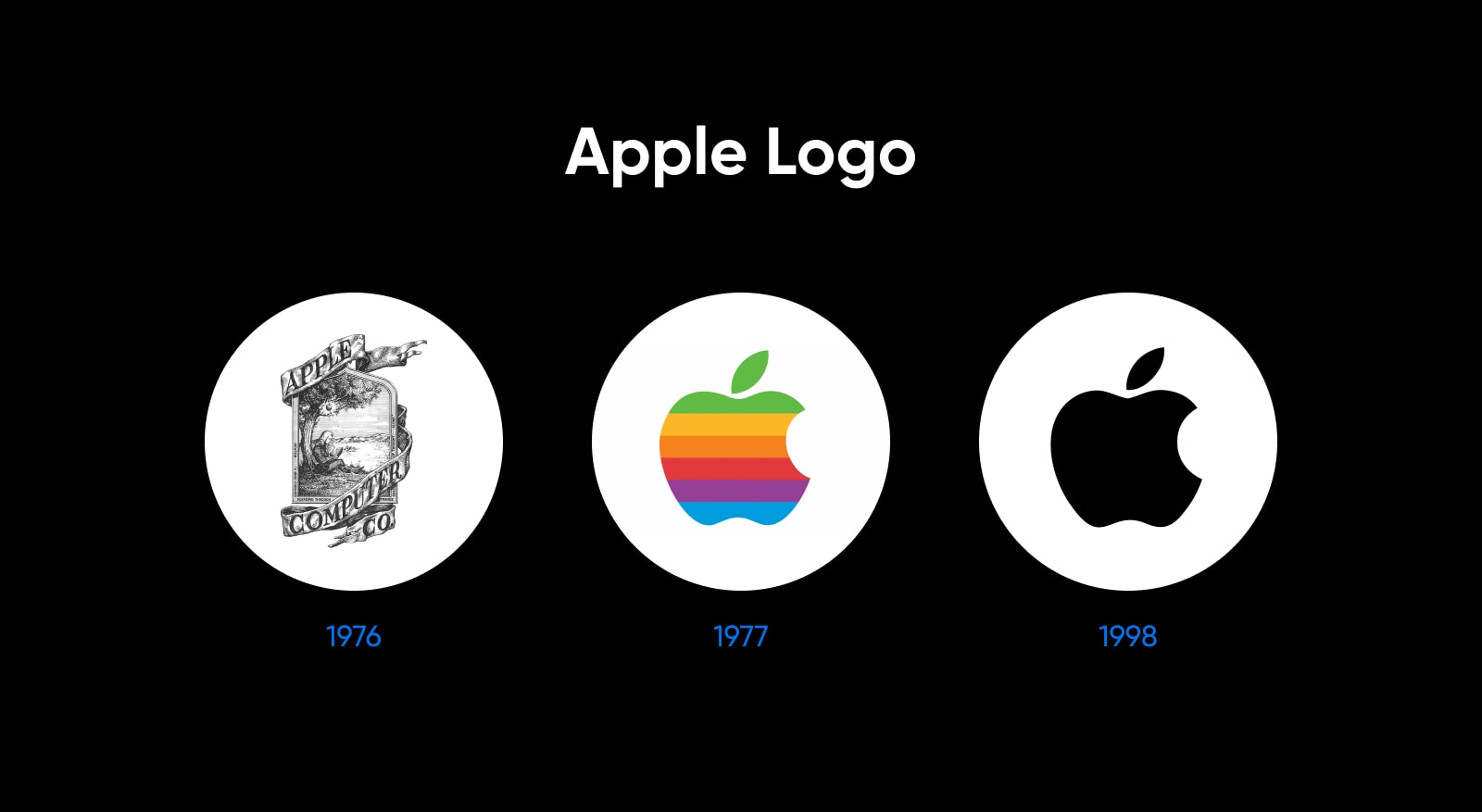
Take the example of Apple. Back in the late 1970s, this technology giant used a multi-colored fruit as a logo. As time passed and new design trends emerged, the company later decided that a sleek, monotone icon would be more fitting.

With the earlier logo, a website that was similarly vibrant might have seemed appropriate. But when the logo was replaced with something more subtle and sophisticated, it became necessary for other parts of the brand to change.
If you visit Apple’s website today, you can see that it’s essentially all white, with shades of dark gray. It matches the logo, and reminds visitors of the brushed aluminum and glossy black screens that are the company’s design trademark.
Look at your own online presence. Does it complement your brand in the same way?
A mismatch might seem insignificant, but multinational companies spend millions of dollars on branding for a reason.
The Importance Of Visual Branding
Research by Edelman found that consumers are more than twice as likely to make purchases with brands they trust. They tend to remain loyal and become advocates among their friends, too.
To build trust, you need to make a good first impression. Research tells us that the average consumer takes only 0.05 seconds to form opinions about your website. And 94% of these first impressions are related to visual design.
Some consumers (46.1%) even gauge the credibility of your brand based on the visual appeal of your website — including the general layout, your choice of typography, and color schemes.
What this tells us is that looks really do matter. Unless visitors like what they see, they won’t even take the content of your website into consideration.
4. You Need New Tools, Technology, And Integrations
Adding useful features to your website is a good way to improve user experience and drive conversions. Anything that can make it easier for visitors to interact with your brand has the potential to drive fresh growth — whether that’s a pop-up chatbot or a calendar system for booking appointments.
If you’re using a CMS (content management system) like WordPress, you can introduce this type of functionality very easily by installing a plugin. Many platforms now also provide website integrations, allowing you to hook up your favorite apps.
The problem is, these new additions might just break your old design.
In theory, website templates should be fairly flexible. However, many are designed with specific features in mind. If you add an online store to a design made for blogging, you could start seeing some pretty strange stuff:
- Weird alignment of visual elements.
- Broken links.
- Images not appearing at the right size.
- Text formatting not working.
- Things working fine on desktop, but breaking up completely for mobile users.
If these gremlins start appearing, you will almost certainly need to redesign your site, at least to some extent.
Changing Your CMS
Unfortunately, there is no easy way to transfer website templates between different content management systems.
While a professional design agency could probably recreate your existing look, it’s usually a better idea to start from scratch and build something that fits with your new system. At DreamHost, we have a team of experts who can help you with this.
Don’t have the budget for a custom build? Simply look for a premade template that works natively with your chosen CMS.
5. UX And Functionality Are Outdated
Many sites with ancient designs suffer from usability problems. Internet users today have very different expectations from those of users ten years ago. What seemed cutting-edge back then can now appear antiquated, confusing, or completely unusable.
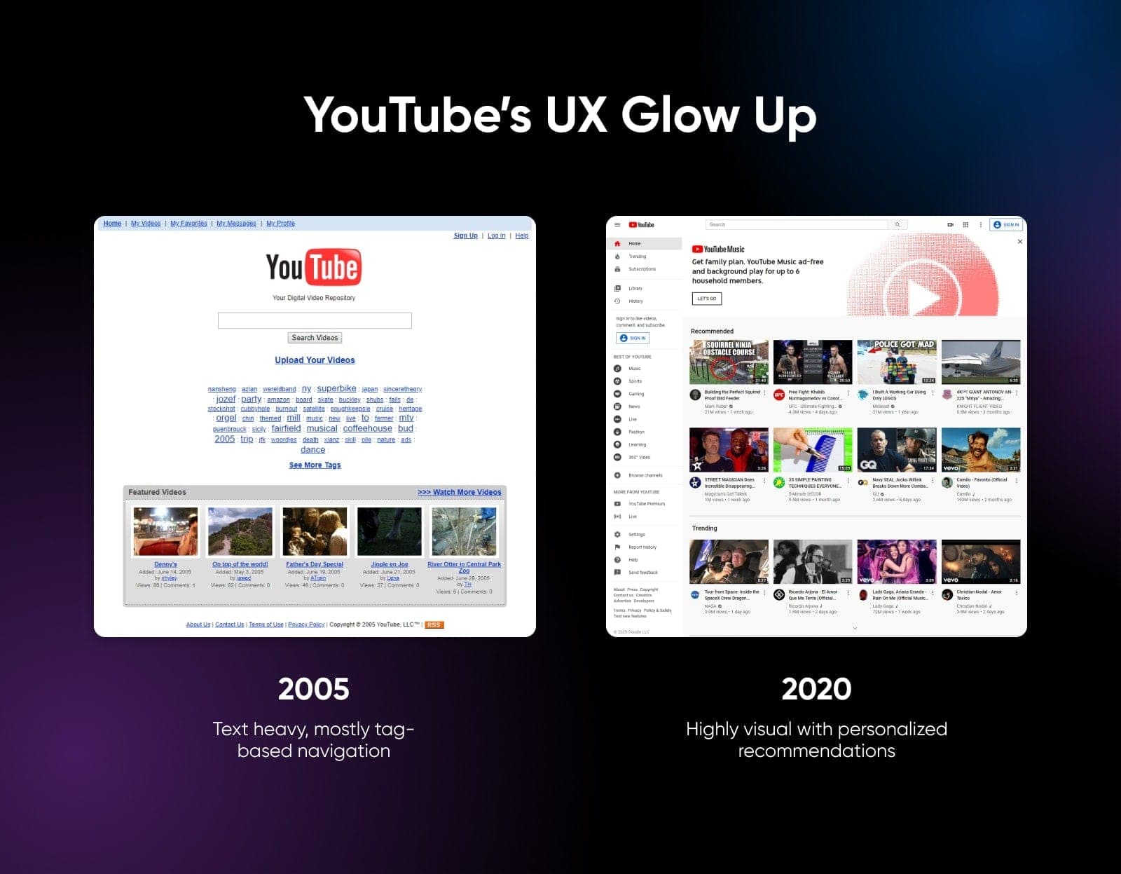
Here’s a comparison of how YouTube looked in 2005, versus how it looks in more modern times:

Quite a glow-up, right? On the old YouTube, you had to search for what you wanted or click on a tag. Today, users are presented with an endless list of personalized suggestions, with visual previews that play when you hover over the thumbnail. It’s much easier to use.
This might be an extreme example, but many sites with older designs could be improved in a similar vein.
Mobile-Friendly Design
According to 73.1% of professional web designers, non-responsive design is the primary reason why people leave your website.
Why? Because 65.49% of global website traffic comes through mobile devices, and sites that aren’t mobile-friendly tend to provide a poor user experience.
The vast majority of web designers today understand the importance of responsive design. However, this wasn’t always the case. Some websites built more than five years ago are not optimized for mobile devices. That goes for templates and themes, too.
Changing Design Trends
As time goes by, new theories emerge about the best way to create sites that are both visually appealing and intuitive for the end user.
Consider the example of skeuomorphism. Popular in the early 2010s, this design trend was about creating visual elements that mimicked real-world objects — such as a bookshelf for digital reads. Designers thought that familiar visual cues would make it easier for users to navigate.
Fast forward to the present, and you will only find traces of skeuomorphism in modern web design. Many users see it as old fashioned, and would rather interact with a simple icon than a perfect recreation of a real-world object.
In fact, they might not even realize that the realistic object is something they could interact with.
It’s worth paying attention to these details as you assess your current website. Does your site feel cutting-edge, or more like a relic? If you’re not sure, compare your site with those of top brands in your industry.
6. Your Goals Are Shifting
Did you know that Netflix started life as a DVD rental company, and X (aka Twitter) was originally meant to be a podcast directory?
As some of the world’s biggest online brands have proven, reshaping your business or project around a new concept can help you achieve success. But it usually involves redesigning your site. To understand why, we needed to get inside the mind of your ideal customer.
Imagine your accountant one day decided to become a wedding photographer. How do we know they are qualified for the job? Perhaps if they could point you to a classy portfolio site full of stunning images, you might consider booking them.
Now imagine the same person simply uploaded their portfolio to their existing accountancy website. It would look silly. It would look unprofessional. And that’s exactly what your potential customers will think if you don’t adapt your site.
In addition, you might have to add new types of content or different features. Our accountant-turned-photographer would need a portfolio section and a system for capturing bookings.
Reshaping the design of your site for such changes is essential if you want to provide a good user experience on all devices.
7. Your Users Are Confused Or Frustrated
In business, they say the customer is always right. The same goes for visitors to your website.
Users don’t care if your current design was recently crafted at great expense. What matters is being able to access the features they want, without having to battle against bugs or wade through an ugly interface.
The problem is that most visitors won’t tell you directly if your design is broken. The majority will simply bounce. However, a few helpful souls might ask for help and mention the difficulties they face when using your site.
This type of feedback is priceless. In the short term, it can flag up minor problems that need fixing. But you should also pay attention when multiple users keep mentioning the same problems again and again.
This is a sure sign that something is fundamentally wrong with your site, and you might need to make more sweeping changes.
Survey Your Users
Assuming your site has a decent number of regular visitors, it could be worth prompting your users to leave feedback through a pop-up survey. Alternatively, you could send out a survey to people on your email list.
Ask them questions like:
- Do you find the site easy to use?
- Is the site visually appealing to you?
- Can you usually find what you’re looking for on the site?
- Are there any parts of the site you find frustrating to use?
Surveys like these always tilt a little toward the negative, because users with a gripe are more motivated to reply. However, it’s worth studying the answers carefully.
As with support requests, surveys can reveal whether users are generally happy with the look and usability of your site. Repeating the process once a year can help you to track how attitudes are changing as your design grows older.
Heat Maps
Another way to assess your current design is by gathering data through heat mapping software. These tools track all the ways that users interact with your site, including clicks, scrolling, hovering, and so on.
Heat map data can reveal whether users are interacting with the parts of your site that are critical to your business goals — or ignoring them completely. If you’re not seeing enough action, it might be time to switch up your design.
It’s Just Due (5+ Years)
Maybe none of the above applies to your website, but it’s coming up to five years old. We would still recommend refreshing the design of your site.
Even when there are no visible signs of reduced performance, older designs often have problems stacking up beneath the surface. Being proactive ensures that your site won’t suddenly break one day after an update, or descend the search rankings because you’re using old technology.
How To Approach Redesigning Your Website
Deciding whether your website needs a new coat of paint is one thing. But how do you actually redesign it? Here’s a quickstart guide for successful website redesign:
1. Gather Data
If you want your new look to have the desired outcomes for your brand, it’s vital to have a solid redesign strategy. This starts with defining your redesign goals and identifying your target customers or readers.
Use the results of your competitive analysis to guide your work here, and use heat maps to figure out the most important parts of your existing design.
You could also create some customer personas to get a deep understanding of who your fresh design should be aimed at.
2. Seek Inspiration
Once you have a strong grasp on your aims, start thinking about what kind of site you want to build.
The best place to start is by looking at other websites in your niche (and elsewhere). Screenshot the ones that you like and save them as inspiration. Whether you’re working with a professional design team or handling the design process yourself, these reference images can be really instructive.
3. Create A Draft Sitemap

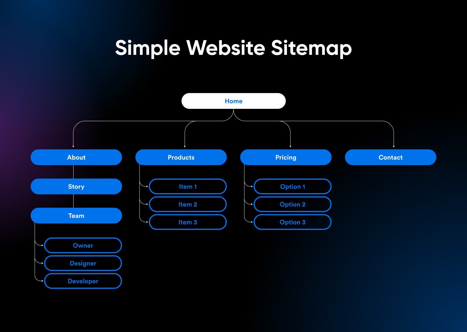
How users navigate your site is a critical part of the whole redesign plan, so it’s a good idea to review the underlying structure of your site. (This particularly applies if you’re planning to introduce new features.)
Is there a more intuitive hierarchy you could adopt? If so, draft a new sitemap. This will help you or your design team to build a user interface that aligns with your business objectives. You want to make sure that visitors can find content and buyers can locate products.
4. Develop Your New Design Concept
Now you have the skeleton of your site in place, you can start dressing those lovely bones.
Your new design should be an extension of your style guides and brand guidelines. If you don’t have these yet, now is a good time to create them.
The aim here is to ensure that your redesigned site matches the general vibe of your organization. Once you have some concepts in place, try asking for feedback from members of your target audience and then refine your plan.
5. Build, Launch, And Iterate
Finally, we can enter the main design phase. Build out the first draft of your new design (including the mobile version). Run it through the performance tests we mentioned earlier, and be sure to try out every element.
Once you’re feeling confident, you can launch your redesign. Be sure to gather feedback from earlier users, and use these insights to make adjustments. Effective web design is rarely a one-shot process; iteration is the key to success.
Upgrade More Than The Design
Redesigning a website is a significant project. But as we have discovered, putting off the short-term pain can lead to much bigger problems. If your site seems to be lagging behind the competition, you might as well bite the bullet and reap the rewards.
If the entire process seems too much, you can always ask our expert designers to handle the redesign for you. With over 20 years in the business, our team knows how to craft a new site that perfectly matches your brand and goals.
And don’t forget, the most beautiful website won’t achieve anything unless you have the right hosting. All our plans come with a 100% Uptime Guarantee, one-click installers, and 24/7 support.
Sign up today to see what great hosting can do for your freshly updated site!
DreamHost Makes Web Design Easy
Our designers can create a gorgeous website from SCRATCH to perfectly match your brand and vision — all coded with WordPress so you can manage your content going forward.


