19 Best WordPress eCommerce Examples In 2023

In this article, we will dive deep into some of the best WordPress eCommerce examples out there.
So, if you’re dreaming about setting up an online store or revamping your existing one, welcome.
These aren’t just any sites; they’re the crème de la crème, showcasing stunning designs and clever functionality that will make you go, “Wow, I want that for my store!”
Instead of spending hours scouring the web to gain inspiration, we did all the hard work instead of you.
We cover everything from simple to more creative websites with eCommerce functionality for your convenience.
Whether selling one or 1,000s products, we have something for everyone.
This post covers:
Amazing WordPress eCommerce Examples
Are you ready to see what’s possible with WordPress?
Here are some exceptional eCommerce sites that truly stand out in the digital marketplace.
Let’s explore!
1. Bike-Room
Built with: WordPress
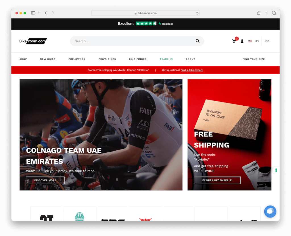
The Bike-Room website stands out as a shining example of WordPress eCommerce excellence. Its user-friendly design includes a proactive newsletter subscription pop-up, ensuring visitors stay informed about the latest deals and news.
The prominent Trustpilot banner at the top instills immediate trust, showcasing customer satisfaction.
The site’s mega menu offers effortless navigation through its extensive product range, while the search bar with live results makes finding specific items a breeze.
Additionally, the intuitive country and currency switcher caters to a global audience, offering a personalized shopping experience.
These features collectively make Bike-Room a paragon of eCommerce sophistication and user engagement.
Note: Building an email list can take your eCommerce business to the next level – so use a pop-up strategically and gain more subscribers.
Why we chose it: Bike-Room exemplifies the best in WordPress eCommerce with its seamless user experience, robust customer trust features, and advanced global shopping functionalities.
Here are other beautiful WooCommerce website examples that push the limit of what is possible with WordPress.
2. Terzetto
Built with: WordPress
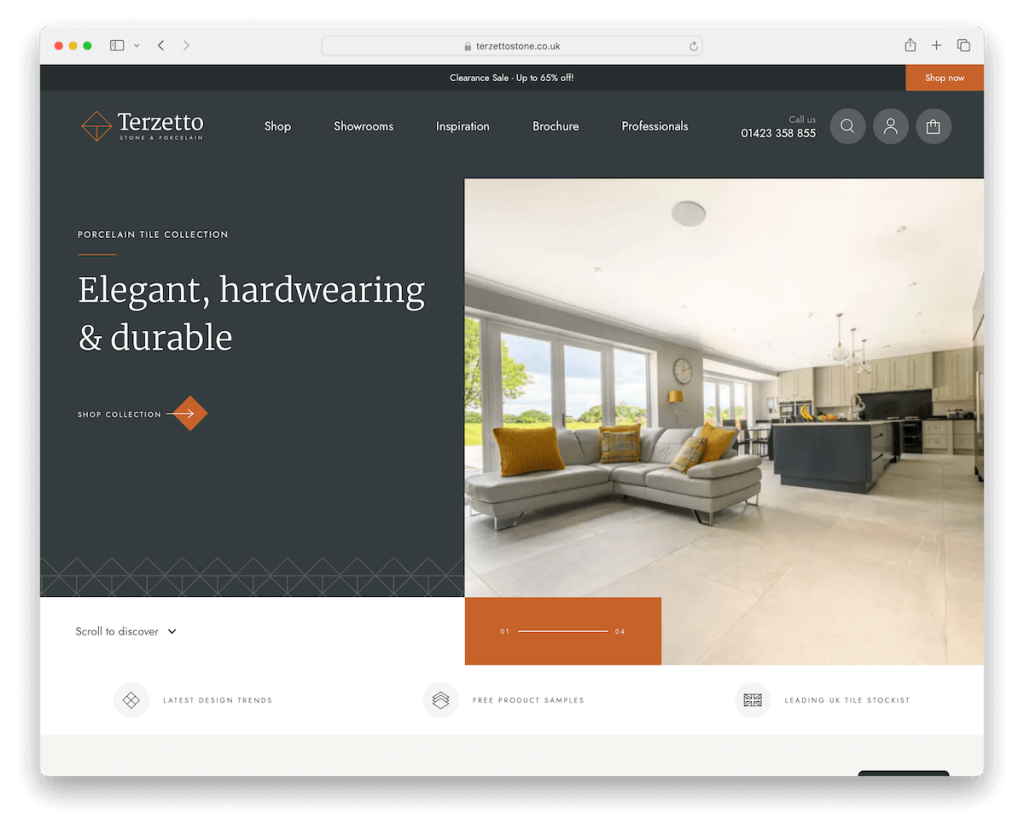
Terzetto’s website is a marvel of modern web design and functionality. Its striking split-screen slider immediately captures attention, guiding visitors through its offerings with style.
The intuitive scroll-down button and a cleverly designed header reappearing on the back scroll enhance user navigation.
The site’s mega menu provides expansive yet organized browsing options, while the full-screen search offers a seamless product-finding experience.
Multiple carousels elegantly showcase various products and content, and the well-organized three-part footer efficiently presents essential information.
This combination of aesthetic appeal and functional prowess makes Terzetto’s website a fantastic WordPress eCommerce example.
Note: Immediately capture your visitors’ attention with a modern and intriguing slider above the fold.
Why we chose it: Terzetto sets a high bar with its elegant, user-friendly design and innovative features like split-screen sliders and full-screen search.
3. American Equus
Built with: WordPress
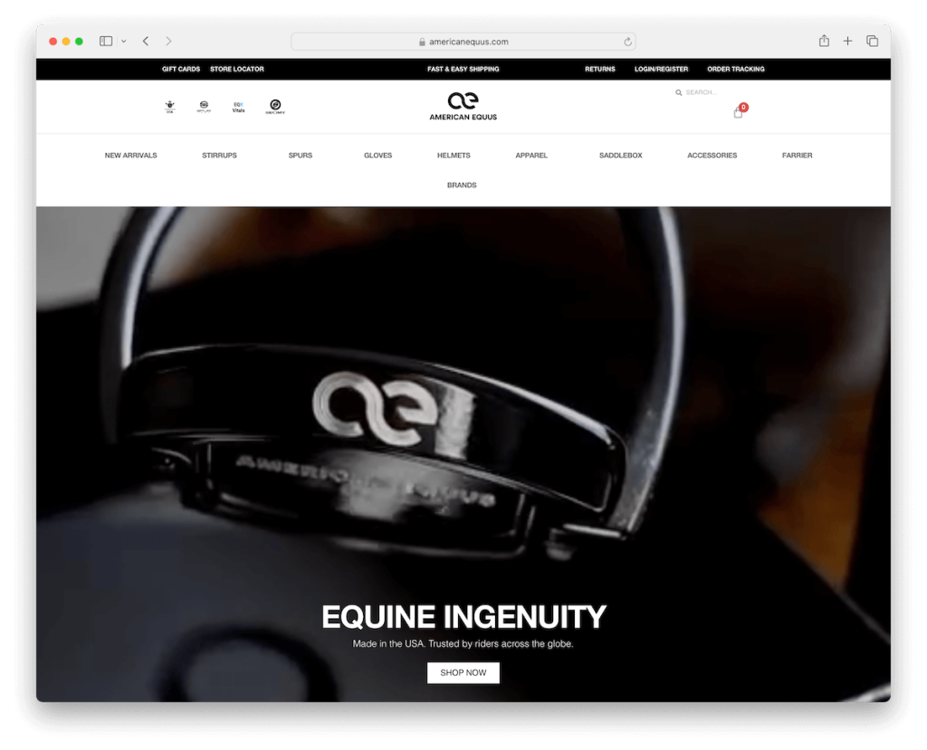
American Equus’ website captivates visitors with its large, immersive video presentation that vividly showcases their products.
The site features a multi-part floating header, providing quick access to important links, along with convenient search and cart icons, enhancing the shopping experience.
Its full-screen website layout is visually striking and user-friendly, utilizing large images to effectively highlight product details.
The design is complemented by a clean, contrasting footer that neatly organizes information and navigational elements.
Note: A video presentation can help potential customers visualize your product better and increase sales.
Why we chose it: American Equus excels by showcasing an immersive video presentation and a user-centric design that elevates how users shop online.
4. Lejasa
Built with: WordPress
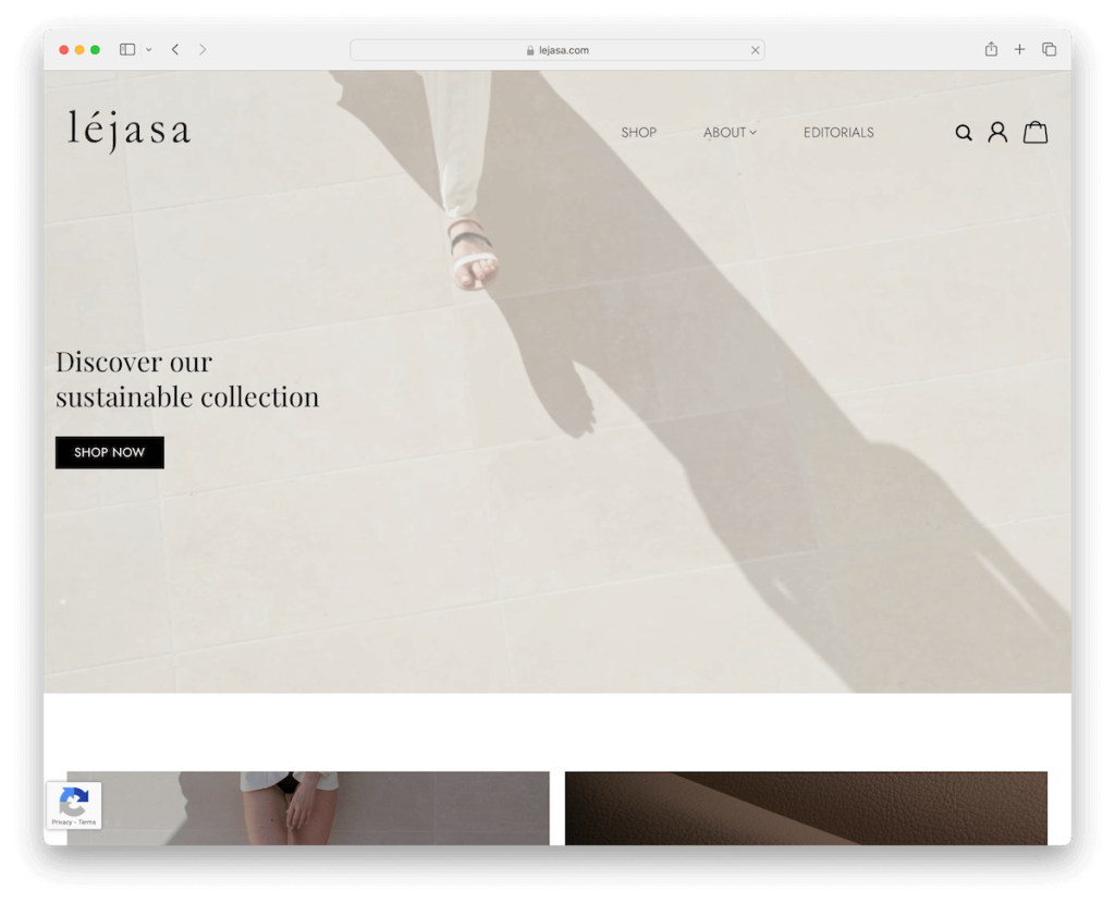
Lejasa’s website is a striking example of WordPress eCommerce done right, featuring a delightful video background above the fold that immediately engages visitors.
The transparent header blends seamlessly with the site’s look, complemented by a simple, intuitive drop-down menu.
User experience is further enhanced with easily accessible search, account, and cart icons in the navbar.
Visitors are treated to a visually dynamic experience thanks to the parallax effect, adding depth and motion as they scroll.
Additionally, the convenient back-to-top button ensures easy navigation, allowing users to return to the top of the page effortlessly. (But the menu floats, so that might not even be necessary.)
Note: Create a cleaner appearance with a transparent header and a simple menu, but ensure all the essential links and icons are always at your customers’ disposal.
Why we chose it: Lejasa’s website is a superb WordPress eCommerce example due to its visually stunning video background and seamless, user-focused design features.
5. Montvel
Built with: WordPress
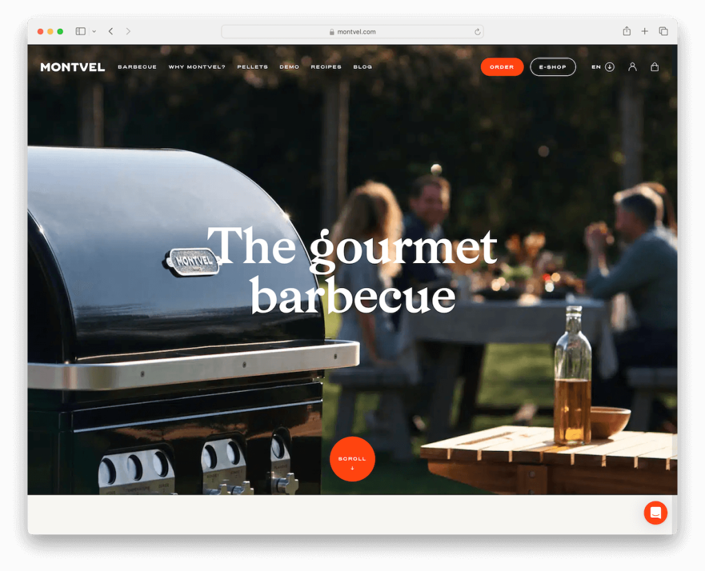
Montvel’s website is a remarkable WP eCommerce example, distinguished by its thoughtful design elements.
It opens with an actionable notification bar at the top, instantly capturing visitors’ interest.
The full-width image banner above the fold and a transparent header create an inviting and modern appearance.
Moreover, a handy language selector caters to a diverse audience, enhancing accessibility. The site’s ample white space, complemented by large, readable typography, ensures a clean and uncluttered user experience.
Engaging video presentations, live chat functionality, smooth scrolling animations, and a contrasting footer contribute to a seamless and interactive shopping experience, setting Montvel apart in the digital marketplace.
Note: An actionable top bar with a contrasting/vibrant background color can capture more eyeballs.
Why we chose it: Montvel impresses with its clean design, user-friendly features like live chat and language selector, and engaging visual elements.
6. Create Tattoos
Built with: WordPress
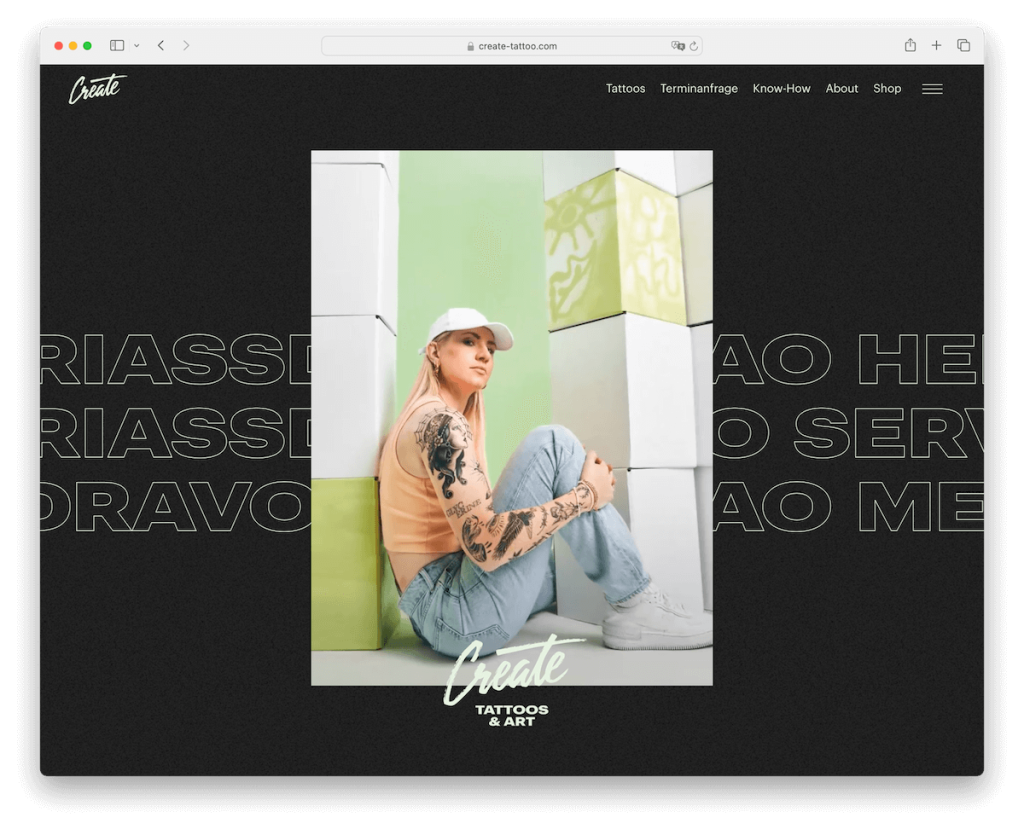
Create Tattoos’ website greets visitors with an animated image collage, capturing the essence of creativity and style inherent in tattoo art. Rolling text in the background adds to the visual intrigue, providing a dynamic backdrop.
Navigation is streamlined with a menu featuring essential links and a full-screen hamburger menu for a modern touch.
The site’s dark design theme, complemented by transparent headers and footers, creates an edgy, contemporary feel, perfectly aligning with the business’s artistic and bold nature.
This unique mixture of aesthetics and functionality makes Create Tattoos’ website a memorable eCommerce destination.
Note: One way of doing things differently is to adopt the dark layout approach, creating a strong and lasting first impression.
Why we chose it: Create Tattoos’ website uniquely blends artistic animated elements and a sleek, dark design for a magnetic user experience.
7. Randolph
Built with: WordPress

Randolph’s website is a shining example of a WordPress eCommerce platform exemplifying sophistication and ease of use.
The site features main and secondary multi-column drop-down menus, offering an extensive yet organized navigation experience.
A prominent slider on the homepage highlights key products and offers, complemented by a clear call-to-action (CTA) button in the navigation bar, guiding users effectively.
Product carousels display a diverse range of offerings, allowing for easy browsing.
The large footer is a treasure trove of information, including additional links, social media icons, and a newsletter subscription form, ensuring users stay connected and informed.
Note: Create product carousels for different categories so customers can quickly browse through the most popular ones.
Why we chose it: Randolph’s website is a top example of comprehensive navigation, engaging visual elements, and easy-on-the-eyes layout, enhancing the overall shopping experience.
8. Desi Daru
Built with: WordPress
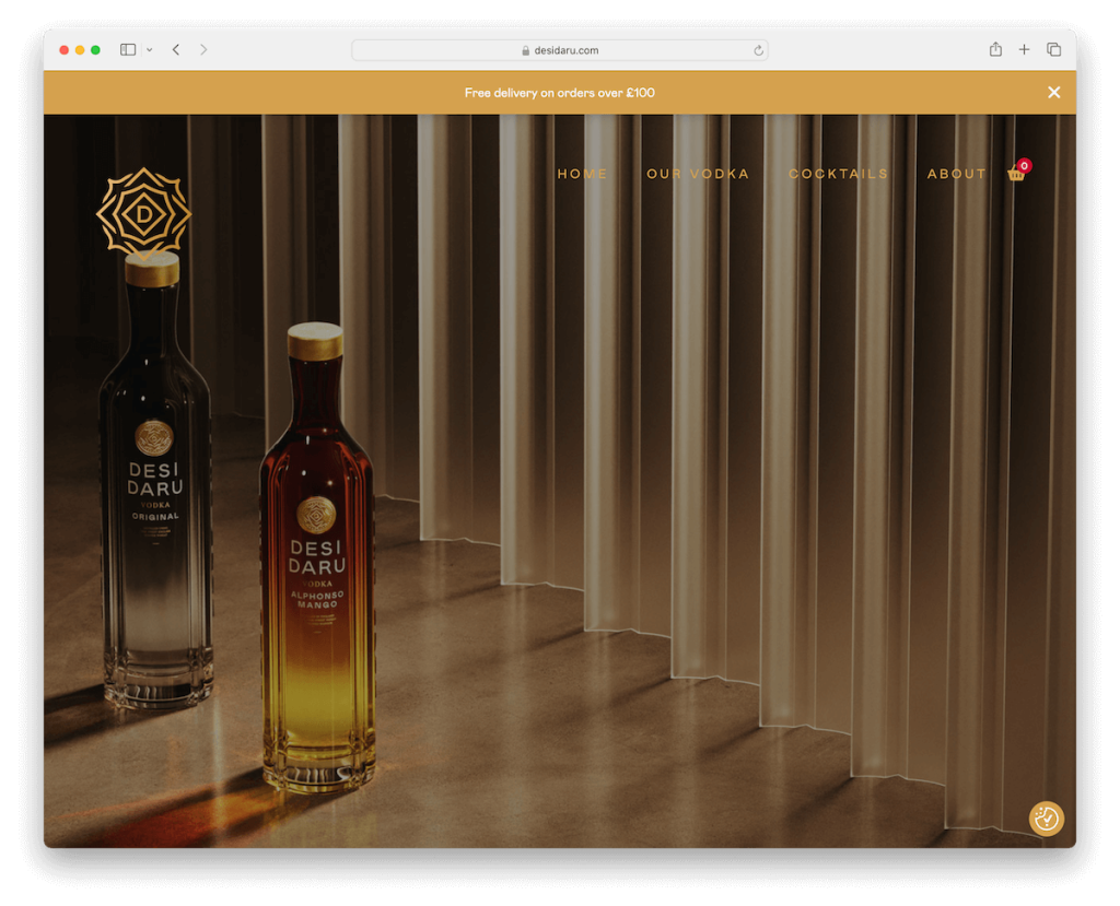
Desi Daru’s website features a captivating full-screen image background above the fold, free from any text or call-to-action (CTA) buttons, allowing the visuals to speak for themselves.
A transparent header with a four-link menu and a cart icon adds to the sleek, unobtrusive design.
The site’s dark theme enhances the visual depth, embodying the brand’s unique character. Notably, the triangular footer breaks the mold of traditional design, adding an arty touch.
The sticky top bar notification ensures the visitor doesn’t miss it but can close it if it disrupts browsing.
This unique combo of elements makes Desi Daru’s website a distinct eCommerce experience.
Note: Let your visuals do the talking by creating a full-screen image background (or video) above the fold.
Why we chose it: Desi Daru’s website distinguishes itself with its impactful full-screen imagery and innovative, dark-themed design that prioritizes visual storytelling.
9. Evotion Pro
Built with: WordPress
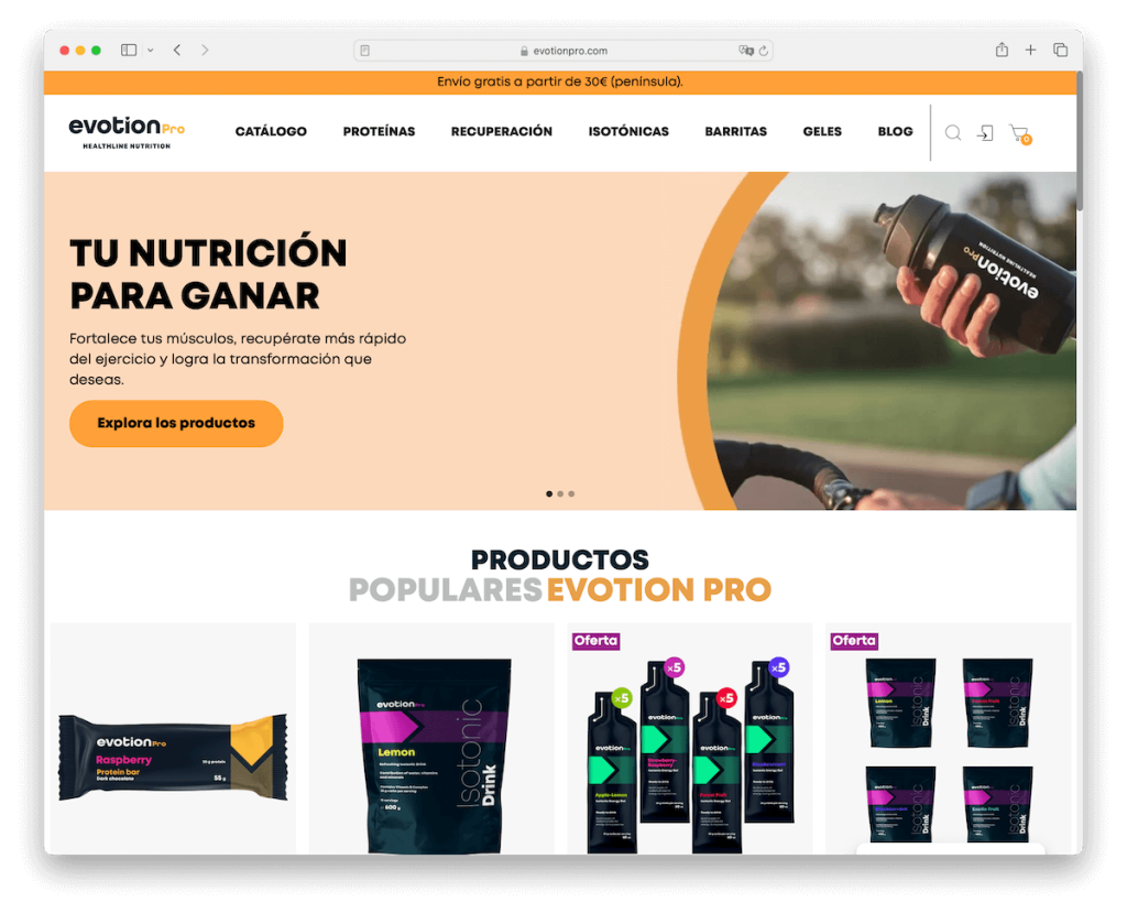
Evotion Pro’s website is an exceptional WordPress eCommerce example, showcasing various interactive features that enhance the UX.
The site is adorned with catchy animations that capture attention and add dynamism to browsing. A standout feature is the testimonials slider, offering feedback and building trust with potential customers.
Each product page is extensive and informative, providing detailed insights and encouraging informed purchasing decisions.
Integrating an Ajax cart streamlines the shopping process, allowing for seamless additions to the cart without page reloads. The search bar with instant live results also makes product discovery efficient and user-friendly.
Note: Don’t forget to include customer feedback on your website and build trust, which can increase sales.
Why we chose it: Evotion Pro has engaging animations, detailed product pages, and user-centric features like the Ajax cart and live search.
10. Terratinta
Built with: WordPress

Terratinta’s website is a remarkable WordPress eCommerce example, distinguished by its aesthetically pleasing green-themed design.
The site integrates a WhatsApp chat feature, offering immediate customer support and enhancing user engagement. Its stylish slider effectively showcases products and promotions, drawing visitors’ attention.
Implementing a mega menu facilitates effortless navigation through the site’s extensive offerings.
Notably, the design incorporates rounded corners, providing a mobile-friendly touch that enhances the overall user encounter.
Also, the website’s header, footer, and base share the same background color (it’s green!), creating a seamless and cohesive visual experience that speaks to the brand’s attention to detail.
Note: The mega menu and the eCommerce site go hand in hand nicely, so use it to your advantage and improve how your visitors browse your site.
Why we chose it: Terratinta impresses with its harmonious green design, seamless navigation, and integrated WhatsApp chat for bettered user interaction.
11. Impuzzables
Built with: WordPress
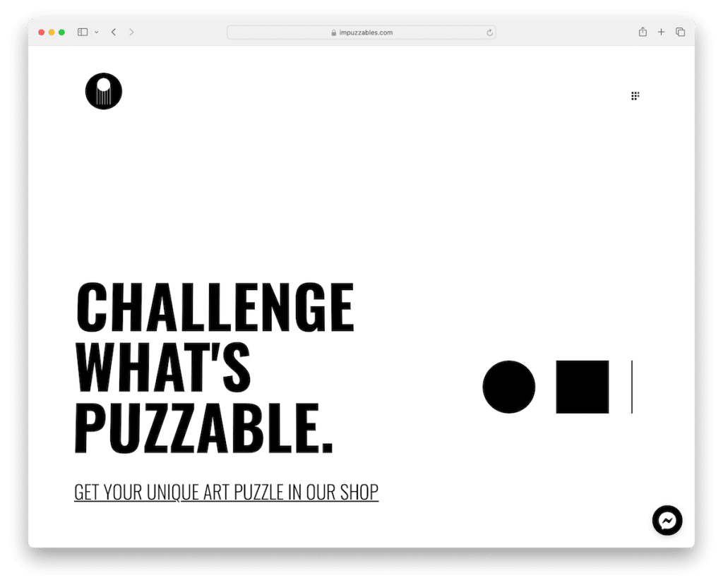
Impuzzables’ website has a minimalist yet bold approach, particularly in its above-the-fold section.
The site features a simple hamburger menu overlay, offering clean navigation. This design is complemented by ample white space, which swells the site’s aesthetics and focuses attention on the products.
The footer contrasts with the rest of the site through a basic but effective background, creating a distinct end to the page.
Moreover, Facebook Messenger chat integration provides a convenient communication channel for customers. Additionally, animated text throughout the site adds a dynamic, engaging element to the user experience.
Note: One method that always works when in doubt about how to approach your website design is doing it simple and minimalist.
Why we chose it: Impuzzables has a minimalist layout, effective use of white space, and engaging features like animated text and Facebook Messenger integration.
12. Next Friday
Built with: WordPress
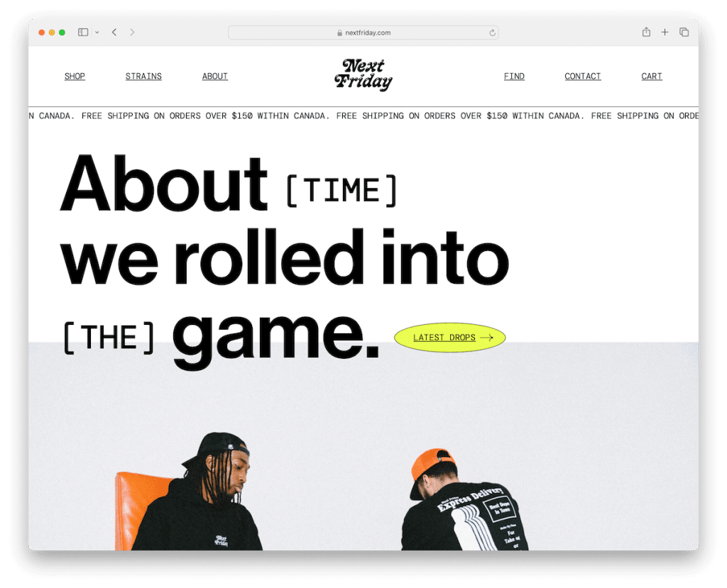
The Next Friday website sets itself apart through innovative design elements and special effects. A notable feature is the custom mouse cursor (see it for yourself – I’m not allowed to tell), which enhances user interaction and adds an original touch to the browsing experience.
The site cleverly employs framed elements, like around the footer, creating a visually striking design that makes content and sections pop more.
The product pages are also thoughtfully crafted, featuring a sticky product description that remains visible as users scroll and check the images.
These creative design choices reflect a blend of functionality and original flair, making the Next Friday website a memorable eCommerce destination.
Note: Details matter, and one cool way of surprising your visitors and potential customers is by creating a custom cursor.
Why we chose it: Next Friday is a prime WordPress eCommerce example for its creative use of special effects, custom cursor, and unique design elements that beef up user experience.
13. Le 7eme Continent
Built with: WordPress
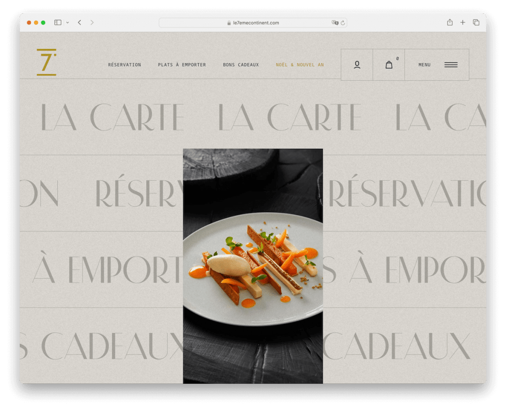
Le 7eme Continent’s website is a remarkable WordPress eCommerce example, attracting visitors with its innovative homepage design.
The site features a unique rotating text background that doubles as an interactive menu, changing the central image upon hover, which adds an attractive visual element.
Additionally, it offers dual navigation options: a traditional top navbar and a modern hamburger menu, catering to diverse user preferences.
What’s also worth mentioning is the creative and pleasing scrolling experience, which transforms website navigation into a journey of discovery, making each visit encourage deeper exploration of the site’s offerings.
Note: You can greatly improve the site scrolly by using white space in combination with various effects to WOW your visitors.
Why we chose it: Le 7eme Continent scored an inclusion to this list for its artful and engaging design, particularly its unique rotating text background and interactive homepage experience.
14. Zeuss
Built with: WordPress

Zeuss’s website has a split-screen homepage for users to select between male and female sections first thing. This intuitive approach is enhanced with categories that reveal further details upon hover, making the browsing experience more action-based.
The site features a convenient live chat option at the bottom, ensuring easy customer support access. A prominently placed login button at the top facilitates quick user access.
Furthermore, the engaging video background adds a dynamic aesthetic.
Its unique blend of horizontal and vertical scrolling and content that reveals itself as you scroll creates an immersive and captivating online shopping journey.
Note: Maximize how visitors interact with your website by blending vertical and horizontal scrolling with other catchy effects.
Why we chose it: Zeuss sets a high standard with its clever split-screen selection, dynamic scrolling, and sweet video backgrounds, enhancing the user experience.
15. Garten Eden
Built with: WordPress
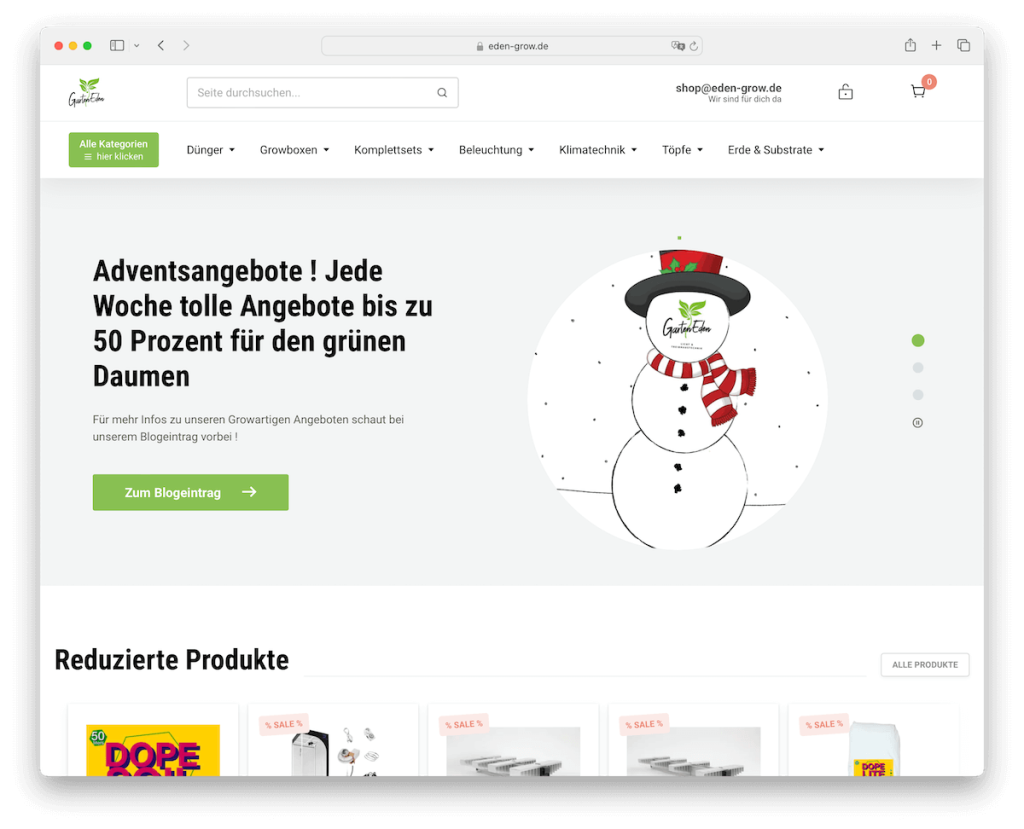
Garten Eden’s WordPress eCommerce website blends functionality with elegant design. The site features a slider that smoothly combines text with call-to-action (CTA) buttons, guiding visitors through their journey.
Its extensive mega menu offers an expansive yet organized view of the products, enhancing navigation.
Additionally, the comprehensive hamburger menu includes multi-level drop-down options, ensuring that even the deepest sections of the site are easily accessible and user-centric.
The integration of live search results adds to the efficiency and user-friendliness of the site. Product offerings are showcased through well-structured carousels for various categories, making browsing easy and visually appealing.
Note: If your store features multiple categories and sections, incorporate a multi-level drop-down menu for quick navigation.
Why we chose it: Garten Eden shines with its interactive slider, extensive mega and hamburger menus, live search, and well-organized product carousels, enhancing the overall shopping experience.
16. SleepHalo
Built with: WordPress
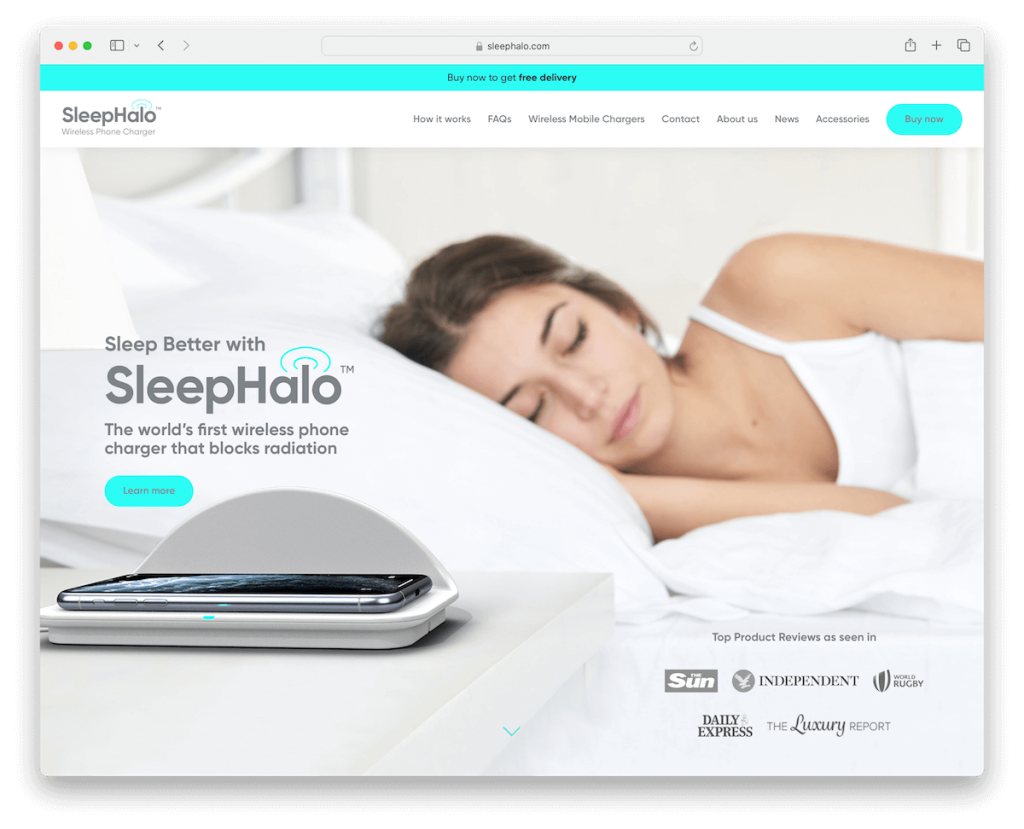
SleepHalo’s website differentiates with its landing-style homepage that efficiently captures visitor attention.
The navigation bar smartly includes a prominent buy now button, streamlining the purchase process and enhancing user convenience.
As users scroll, a strategically placed pop-up emerges in the bottom right corner, offering a quick and easy path to purchase the product, effectively boosting conversion rates.
The site is further enhanced with an embedded promotional video that provides an engaging product overview.
What’s more, the cool animation vividly demonstrates the product’s functionality, creating an informative and visually appealing experience that effectively communicates the product’s unique value proposition.
Note: Make a buy now button always available by placing it into a floating navigation bar/header.
Why we chose it: SleepHalo stands out for its effective landing-style design, promo video, and intuitive purchase features, simplifying the user’s shopping journey.
17. Karalyte
Built with: WordPress
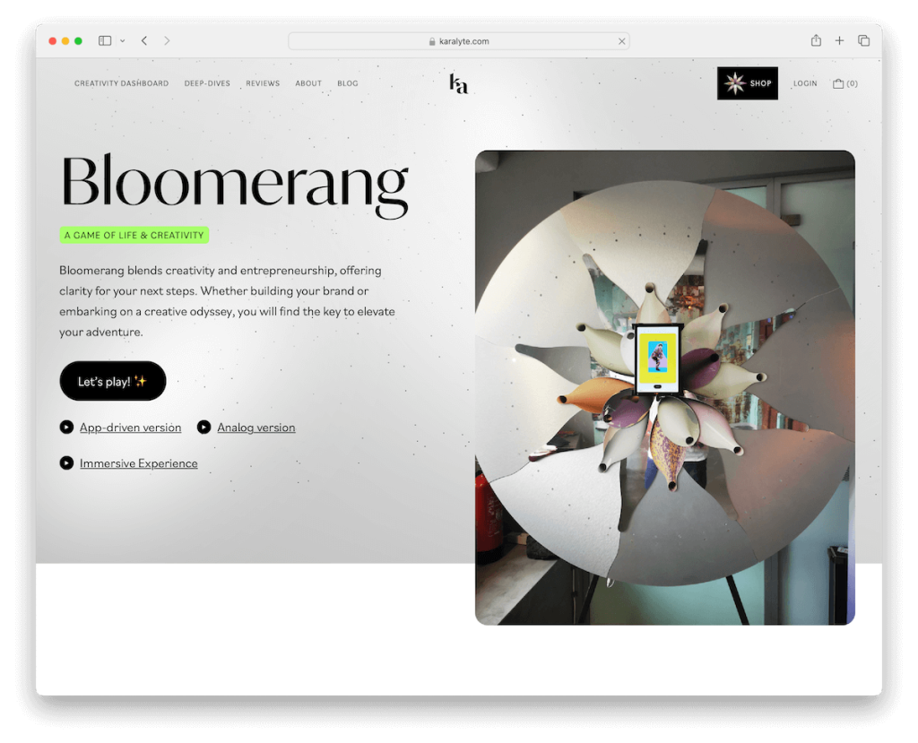
Karalyte’s website is noteworthy for its mobile-inspired design that perfectly adapts to current browsing habits.
The site features a transparent navigation bar that smartly disappears when scrolling down, reducing visual clutter, yet reappears when scrolling up for easy access. (This dynamic approach to navigation enhances the user experience.)
The website’s vivid colors create a visually striking and engaging environment, capturing visitor attention effectively.
It cleverly incorporates a primary and secondary menu in the shop section, offering comprehensive navigation options without overwhelming the user.
Uniquely, the site opts out of a traditional footer, embracing a minimalist approach that aligns with its modern, clean aesthetic.
Note: Even though your website might use solid, monotonous colors, spice things up with vivid insertions to trigger interest and excitement
Why we chose it: Karalyte brings to the table a mobile-inspired design, dynamic navigation, vivid color scheme, and novel approach to layout and menus.
18. Romagnoli
Built with: WordPress
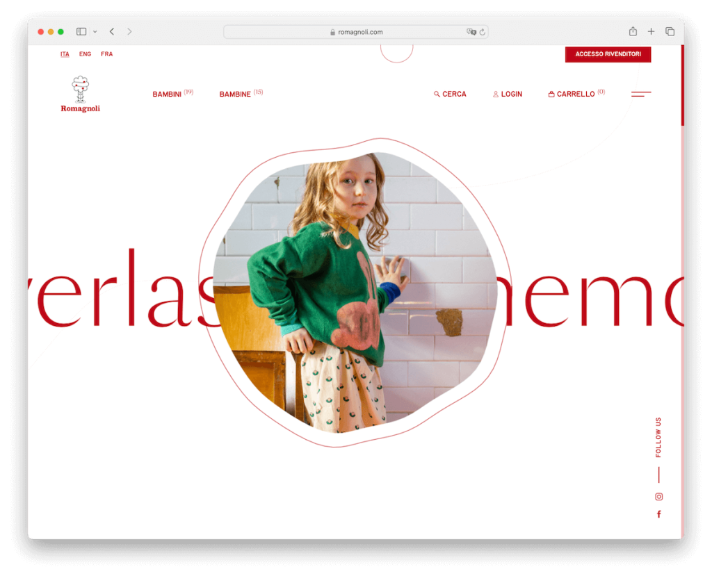
Romagnoli’s made an impression on us with its attention to unique branding details. But there’s more.
The site charms visitors with rotating background text and animations that add lively flair to the user experience.
A parallax effect is skillfully used throughout the site, creating a sense of depth and engagement as users scroll through content.
The sticky and transparent navbar ensures seamless guidance while maintaining the site’s sleek look. Similarly, the simplistic footer design complements the overall minimalistic approach.
Finally, the bold hamburger menu is a functional element and statement feature, aligning perfectly with the site’s modern design ethos.
Note: Ensure your website speaks your branding through its design so visitors can feel right at home.
Why we chose it: Romagnoli thrives with its unique branding, engaging animations, parallax effects, and sleek, user-friendly navigation design.
19. The Cool Hunter
Built with: WordPress
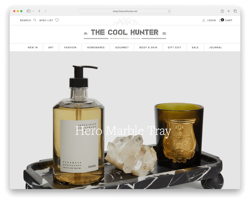
The Cool Hunter website is a stellar example of WordPress eCommerce excellence, combining functionality with sleek aesthetics.
Its hallmark feature is a captivating, large slider showcasing clickable slides that immediately engage visitors. The site’s design is strikingly minimalist, emphasizing a clean, uncluttered look that effectively highlights products.
It includes a mega menu for easy navigation and a floating header that ensures key links are always accessible.
The unique search function, appearing on the right side with live results, intensifies user experience.
Additionally, its product displays are enhanced with hover effects, revealing secondary images, adding an interactive element that boosts the shopping experience.
Note: A search function with live results can improve user experience on an eCommerce site significantly.
Why we chose it: The Cool Hunter represents a top-notch WordPress eCommerce example with its seamless blend of innovative features, user-friendly design, and enticing visuals.
How To Make An eCommerce Website With WordPress
- Choose a domain and hosting: Select a memorable domain name (use a domain name generator) and reliable hosting service. For eCommerce, consider hosting plans that offer enhanced security and performance. (Check these epic WooCommerce hosting providers.)
- Install WordPress: Most hosting providers offer one-click WordPress installation. Follow their process to install WordPress on your domain.
- Select an eCommerce plugin: WooCommerce is the most popular choice for WordPress eCommerce. Install and activate it from the WordPress plugin directory.
- Choose a theme: Pick a WooCommerce WordPress theme that suits your brand.
- Customize your store: Configure your store settings in the eCommerce plugin – set up product categories, tax details, shipping options, and payment gateways.
- Add products: Create product listings with images, descriptions, prices, and other relevant details. Organize them into categories for easier navigation.
- Optimize for SEO: Use SEO plugins and best practices to optimize your product pages and content, improving your site’s visibility in search engines.
- Launch and market your store: Once everything is set up, launch your store. Utilize social media, email marketing, and other digital marketing strategies to attract customers to your new eCommerce site.
But for more details, refer to our in-depth guide on how to make a WordPress website.
WordPress eCommerce Website FAQs
How do I set up an eCommerce site on WordPress?
To set up an eCommerce site on WordPress, you must first install WordPress on your hosting account. Then, choose an eCommerce plugin like WooCommerce – install and activate it. Configure your store details, add products, set up payment methods, and design your store using a suitable theme.
Can I use WordPress for a large-scale online store?
Yes, WordPress, particularly with WooCommerce, can handle large-scale online stores. It’s scalable and can manage many products and high traffic. However, it’s essential to have robust hosting, efficient plugins, and possibly a custom-built theme to ensure site speed and security.
Is WordPress eCommerce secure?
WordPress eCommerce sites can be very secure, but security largely depends on user practices. Regularly updating WordPress, themes, and plugins, using strong passwords, employing security plugins, and having a reliable hosting service are vital to maintaining a secure online store.
How customizable is a WordPress eCommerce site?
WordPress offers high levels of customization. With 1,000s of plugins and themes, you can tailor almost every aspect of your eCommerce site. Everything can be adjusted to fit your needs, from layout and design to functionality like payment gateways, shipping methods, and product management.
Does WordPress support different payment methods?
Yes, WordPress eCommerce sites, especially those using WooCommerce, support various payment methods. These include credit/debit cards, PayPal, bank transfers, and even emerging options like cryptocurrencies. The availability of specific payment methods can depend on the plugins and extensions you use.
What are the costs involved in running a WordPress eCommerce site?
The essential costs include hosting and a domain name. Optional expenses may include premium themes, plugins, payment processing fees, and tools for security, SEO, and marketing. While WordPress and WooCommerce are free, the total cost depends on your specific needs and the scale of your site.
To get even more inspiration, here are eCommerce website examples based on other platforms like Shopify, Magento, and BigCommerce.
Was this article helpful?
YesNo


