17 Best Weblium Websites For Inspiration 2023
Welcome to our list of the best Weblium websites to help you gain additional inspiration when building yours.
What’s also cool is that you’ll see how much good stuff can be achieved and created with this easy website builder full of powerful features.
You’re in complete control from start to finish.
However, you’ll save yourself plenty of time with any of their templates, which you can customize and brand according to your project’s needs.
Whether you want to build an agency, business or personal website – Weblium has you sorted 100%
Best Weblium Websites & Design Ideas
1. Atom Mobility
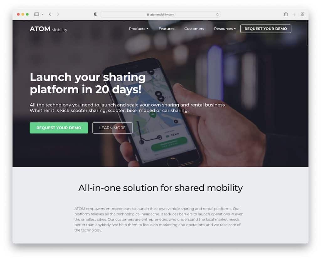
Atom Mobility has a strong hero section with text and call-to-action (CTA) buttons that reveal everything you need to know.
But the real start of the show is the typewriting text effect. The home page is also split into multiple sections that guide the users through the amazingness of Atom Mobility.
Note: You can always spice things up with cool effects and animations (just don’t overdo it).
2. Salon Nika

Salon Nika is a free Weblium website that doesn’t give you the feeling it’s free. It has a clean and modern responsive web design with integrated Google Maps for location and parallax effect for added depth.
(But the flower animation above-the-fold is secretly my favorite feature.)
Note: You can use Weblium’s free solution to create a QUICK website.
3. MyOxygen
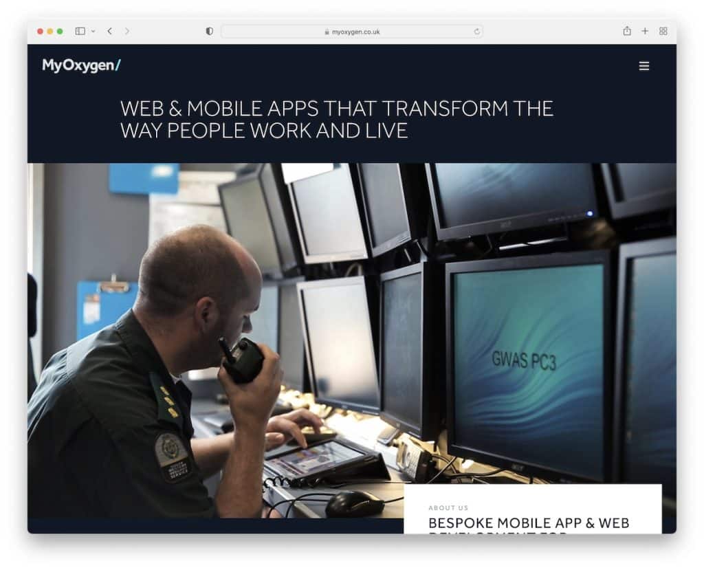
Regardless of how “boring” you think your industry is, you can always get creative and build an awesome website.
MyOxygen is an excellent example with a floating header section, sidebar menu, clients’ section and certification.
Note: Make people trust you more by including past and present clients and certifications.
4. DeviceVoice
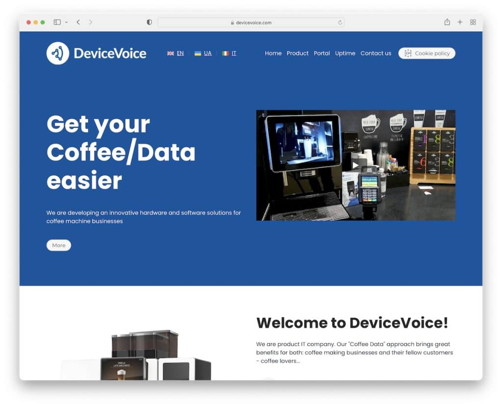
DeviceVoice offers you to watch a video presentation if you want to learn more about the product as soon as the page loads.
But you can also learn more and see pricing by hitting the CTA button. The animated statistics and autoplay video are cool additions for added engagement.
We also like the “Meet our team” section that shows everyone who’s behind the brand.
Note: Don’t hide; show your team so that people can trust you more.
5. Gradual
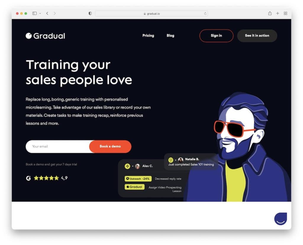
Gradual is a very up-to-the-minute-looking Weblium website with awesome detailing to ensure a great user experience.
The lead capture and star reviews above-the-fold are done very smartly. Two more unique elements are the progress bar and the auto-sliding client testimonials.
Note: Build trust by adding reviews and testimonials to your website.
6. Onyx Education

We’re adding Onyx Education because of its amazing dark design, which Weblium websites rarely use.
But these guys do it the right way. Moreover, the website is pretty simple and clean, ensuring the visitor gets everything he/she needs at first glance.
Note: Differentiate yourself from the masses with a simple design tweak – go DARK.
7. Condor Investment

Condor Investment is a professional one-page Weblium website with a lot of white space, images and text for comfortable scrolling and learning information.
Also, the fact that they display the simple three-step process of how to work with them gives everyone a better idea of what to expect (and prepare in advance).
Note: If there’s a special process of how a client gets to work with you, display it so that everyone can get ready.
You can also check our list of the best one-page website builders if you require more options.
8. Ryptic Room Escape
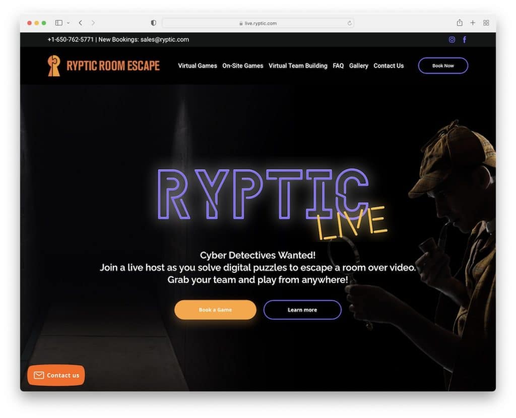
We found another dark Weblium website, Ryptic Room Escape. The name, the business and the design go very well hand in hand.
The home page has a very single-page feel to it that lets you experience their escape room through multiple sections, testimonials and FAQ.
Note: Make your web design represent your business and branding in the best possible way.
9. Campaign Studio
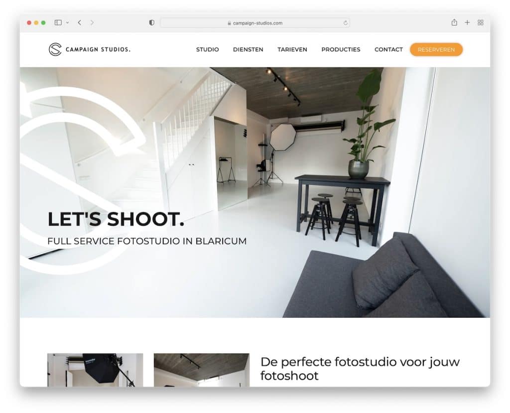
Campaign Studio is a great example of a minimalist website showcasing the studio, the services and the portfolio. (The lightbox gallery lets you view the images without leaving the current page.)
What’s also cool is that they feature pricing on the home page with CTAs for immediate reservations.
Note: Adding pricing on the home page is handy if you don’t have a lot of options.
Don’t miss the best portfolio websites to gain even more creative ideas for your project.
10. Fred

Vending machines and food delivery services need a great website, too, and Fred is an excellent Weblium example.
The home page showcases various food options, benefits, a timeline, client and video testimonials, you name it.
But even though you’ll find a lot of content, the white space, color and design choices make the experience very pleasing.
Note: Whenever you can, use video testimonials because they’re a lot more credible.
11. Manilla Athletics
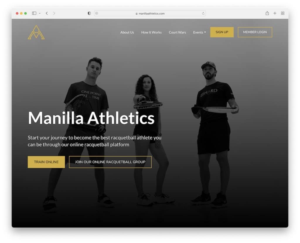
Manilla Athletics is a semi-one-page website with a terrific dark-ish design that keeps you locked to the screen for the whole scrolling time.
We like the full-screen image of the team behind the brand and the awesome embedded promotional video.
There’s also a cool timeline of how the training works, a free session claim and pricing plans.
Note: Keep the user excited about your training services just by viewing the website.
12. Foks
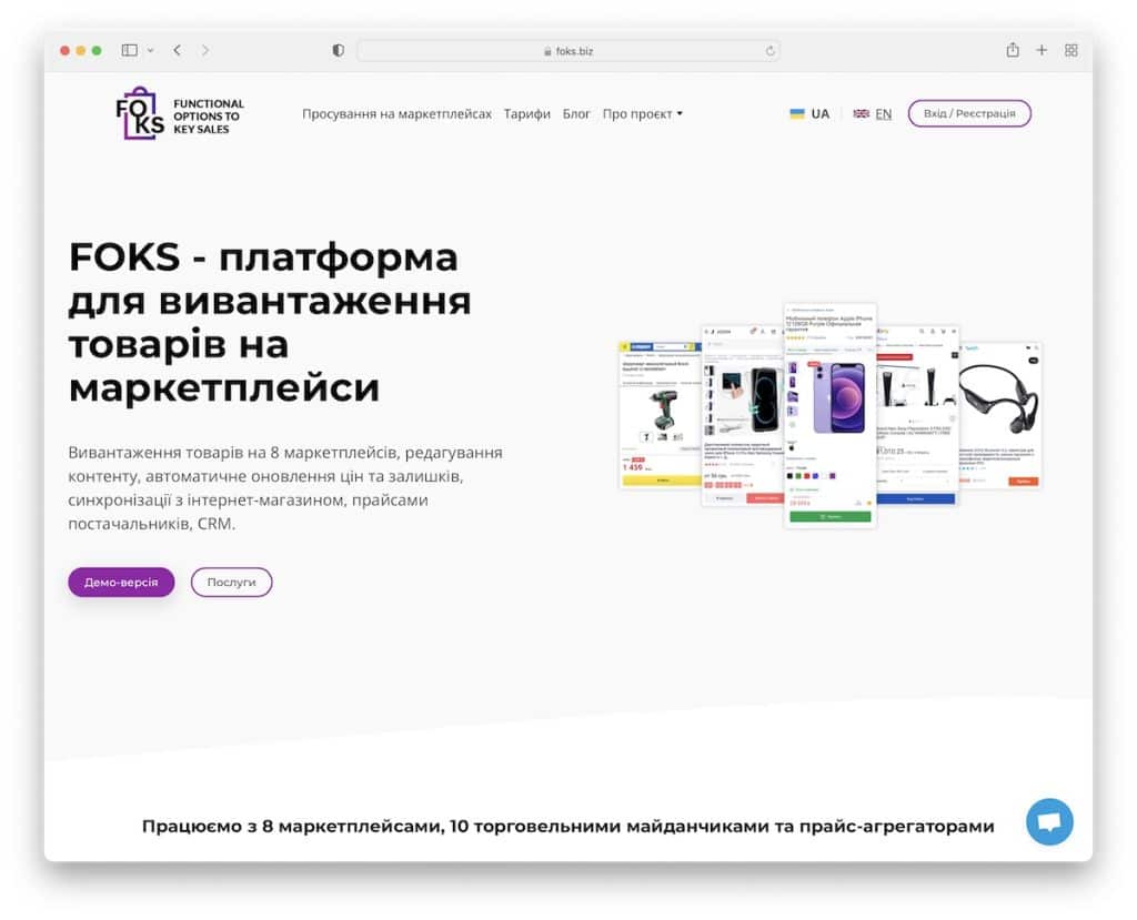
With a lot of stuff to offer and many benefits, Foks’ “long” home page keeps things clean and user-friendly.
The sticky header is always available if the user wants to visit different pages and CTA buttons are cleverly placed in strategic locations.
Note: Focus on simplicity, especially if you have a lot of content to share, so you don’t cause distractions.
13. Reteam
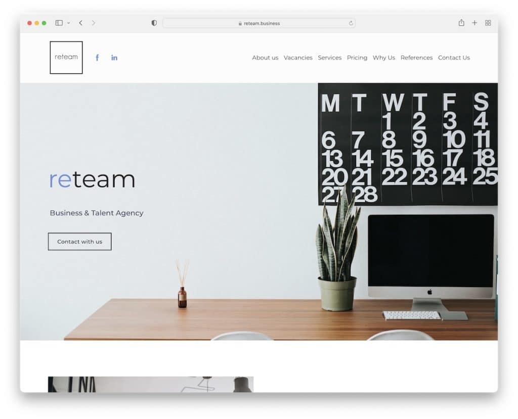
Reteam’s single-page website has a minimalist design that puts its team, services and pricing first.
They also feature a slideshow with some of their clients and references/testimonials just before the contact form.
Note: If you’re unsure about your website design, go simple and clean – because it always works.
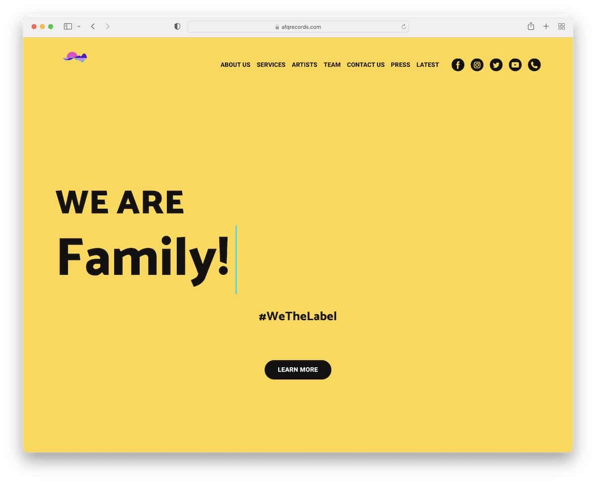
14. AFQ Records
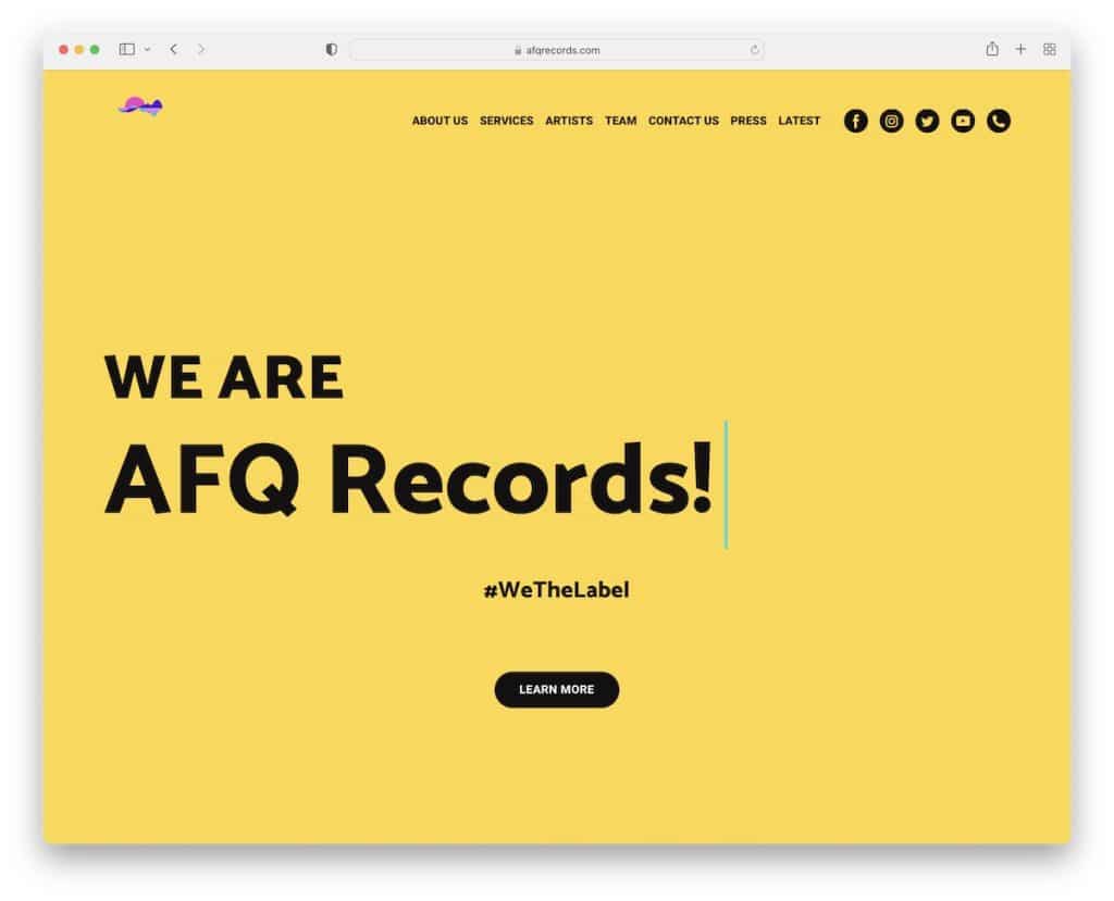
Solid color background with a typewriter effect is enough to make AFQ Records website something else.
They also have the cool parallax effect, great structured sections, a partners slider and a contact form – all on the home page (which could easily work as a one-page site).
Note: Keeping your hero section simple and vivid triggers attention, undoubtedly.
15. 32Puntos

32Puntos is a professional Weblium website example with a single-page form. The light navbar takes you to sections without the need to scroll (the only thing missing is the floating function – it’d be so handy).
The founders also reserved a spot for themselves with a quick introduction and LinkedIn profile icons.
Note: Make your website the company’s ambassador and use it to build your business.
16. Independent Business Association
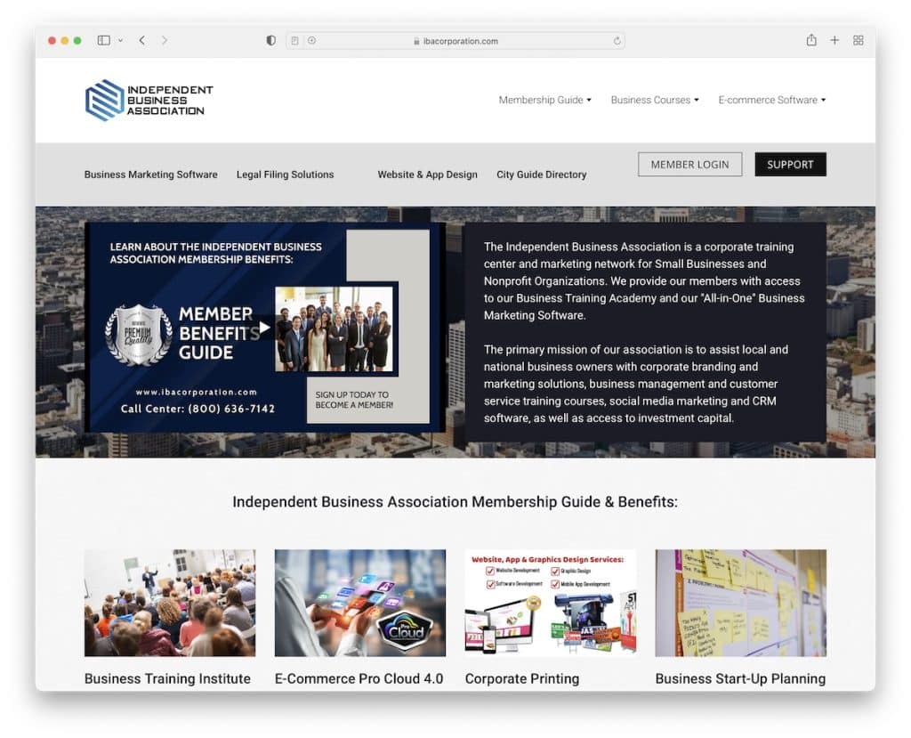
Business Association’s one-page website allows you to educate yourself about the company in a few scrolls. Or you can take the drop-down menu that’ll take you to the desired information with a click.
The addition of the parallax effect really does the site well by lifting up the user experience.
Note: Use a drop-down menu to dissect your website into tiny chunks/sections for a more refined search.
17. I Can Illustrate
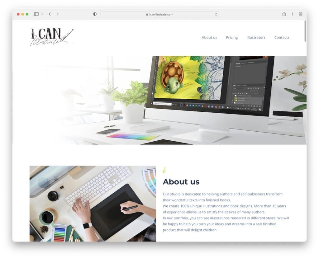
I Can Illustrate is a studio of illustrators with a sweet online portfolio (with lightbox) to get to learn them better before hiring one for your project.
They also break things down nicely in the pricing section, so the potential client knows exactly what he/she gets.
And they also do a great job introducing each team member, so you know who’s behind the I Can Illustrate.
Note: Be as transparent as you can with pricing, sharing everything, so there won’t be any surprises.
Was this article helpful?
YesNo


