Why Are Hyperlinks Blue? The Short Story

Hyperlinks links are blue because in the early days of the internet, web browsers used blue as a default color. Blue was chosen for the way it stood out against the gray backgrounds of early computer screens, and it’s still the most reader-friendly hyperlink color in use today.
What Computers Used for Links Before They Were Blue
Before hyperlinks became the familiar blue we see today, computers used a few different methods to highlight clickable links.
Believe it or not, there was a time before the World Wide Web, which officially launched the world’s first website in 1991. Okay, many of you probably remember this mythical time. I, born in 1992, do not.
Before 1991, we had early hypertext systems that just didn’t take off the way the WWW would. Like Ted Nelson’s 1960s system, Xanadu. And Apple’s HyperCard, released in 1987.
These didn’t rely on color at all to indicate linked text. Instead, they used underlined, bold, or italicized text, and sometimes reversed the text color (white on black) to make links stand out.
When Tim Berners-Lee, inventor of the World Wide Web, published the first-ever website on NeXT, he didn’t give a lot of thought to hyperlink color.
As he said in a Q&A posted on w3.org, “There is no reason why one should use color, or blue, to signify links: it is just a default….Blue came in as browsers went color – I don’t remember which was the first to use blue.”
Berners-Lee continued the thought by saying, “My guess is that blue is the darkest color and so threatens the legibility least.”
He actually appeared to prefer green over blue, saying “I used green whenever I could in the early WWW design, for nature and because it is supposed to be relaxing.”
Early web users had to visit the web on a line-mode browser, which didn’t even have clickable links!
Trying CERN’s Line Mode Simulator
If you really want to feel like we’re back in the olden days of the World Wide Web, you can use this line mode simulator from CERN, the European Organization for Nuclear Research.
I tried it for fun. I learned that back then, links were almost impossible to pick out from the rest of the text. In the simulator, you see a pointer hand instead of a cursor when you’re hovering over a link.

But before graphical browsers like Mosaic, there was no such indicator. The only clues were the numbers in brackets next to a word. These numbers indicated the presence of a link in text-based web browsers like Lynx.
Instead of just clicking the link and being whisked to another page, you had to type the number of the link you wanted to visit in a special input area at the bottom of a webpage.
Complicated stuff!
The First Blue Hyperlink
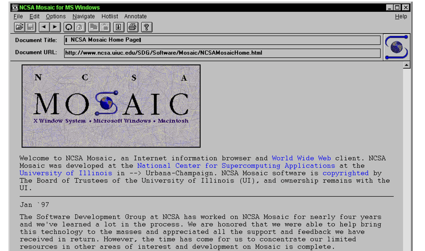
In 1993, a groundbreaking web browser called Mosaic became widely available. Mosaic is where blue hyperlinks were born.

Unlike the line mode browser with its glaring green on a black background, Mosaic brought users a gray background. Against this color, blue made sense as a hyperlink color choice. Mosaic’s developers didn’t base the decision on science or research. They just thought it looked nice.
Mosaic also introduced:
- Clickable links
- Images and text appearing together on the same page
- A graphical, point-and-click interface
- Icon buttons
- A bookmark feature
In other words, Mosaic changed the world: Mosaic changed the world—it was the first widely used browser where you could click a hyperlink, and that hyperlink was blue.
That’s a strong first imprint.
Had the developers chosen red, green, orange, or some other color for hyperlinks on a gray background, there’s a chance that color would have become the standard for hyperlinks today.
Were Other Colors Used or Considered?
Developers did test out a few other colors for hyperlinks.
Here’s a quick breakdown of the different color + background combinations that were tested in the late 1980s and early 1990s:
- HyperTIES (1983): This hypertext system used light blueish-green (cyan) hyperlinks on a black background. Not exactly easy on the eyes, but not the worst combo in the universe either.
- Windows 1.0 (1985): Featured underlined hyperlinks, but they stayed black like the rest of the text. That said, this operating system used dark blue in headings and borders. Another early association between blue and interactive elements on a webpage.
- ViolaWWW (1992): An early web browser that displayed hyperlinks as underlined black text on a gray background. No blue in sight.
- Mosaic (1993): Initially, Mosaic used black underlined hyperlinks, like ViolaWWW. But in version 0.13, which was released on April 12, 1993, the default anchor representation changed. It became blue with a single solid underline for unvisited links and dark purple with a single dashed underline for visited links.
Mosaic’s change from black to blue hyperlinks resonated with users. And since Mosaic was the first widely adopted graphical browser, it set the standard for blue hyperlinks across the web.
Even today, blue remains the default color for unvisited hyperlinks on web browsers like Chrome, Safari, Firefox, and Edge. Purple is still the color used for visited hyperlinks.
Why Blue Hyperlinks Became the Standard
While there’s no single, definitive reason why blue became the standard for hyperlinks, there are several contributing factors.
First, blue was rarely used in body text. Unlike black, the standard text color, or red, which was often reserved for warnings and alerts, blue didn’t really have a place in the body copy.
This made it a natural pick for hyperlinks. Blue stood out without clashing with the main text.
Second, blue is one of the most universally recognizable colors. According to a deep dive into color hues by the data visualization tool, Datawrapper, blue is the most easily recognized color for both those without colorblindness and those with red-green colorblindness.
Since most colorblind people are either red or green colorblind, this means blue is the most widely recognizable color for the largest number of users.
Finally, Mosaic’s example led the way for browsers like Netscape Navigator and Internet Explorer to follow suit. Good web design has always been about maximizing usability and consistency.
So, web developers found value in keeping blue as the standard. Over time, blue became recognized the world over as the color of clickable links.
What is the Blue Hyperlink Color Code?
The blue (unvisited) hyperlink color codes are as follows:
- Hex: #0000EE
- RGB: rgb(0, 0, 238)
- CSS Code: a { color: #0000EE; }
For purple (visited) hyperlinks, the color codes are:
- Hex: #551A8B
- RGB: rgb(85, 26, 139)
- CSS Code: a:visited { color: #551A8B; }
If you want to use the same hyperlink colors most major web browsers use, these codes are all you need.
Should Websites Use Other Colors for Hyperlinks?
Websites can and do use other colors for hyperlinks all the time, so yes, this is a totally acceptable thing to do.
Sometimes, the typical blue and purple hyperlink colors just don’t go with your website and branding. And that’s okay.
The key is to make sure users can instantly understand what’s a link and what isn’t.
The color should be distinct. If there’s an ambiguity or you’re unsure whether colorblind readers would be able to discern the link text from the body text, use an underline beneath the hyperlink text.
You can also use a box that appears only when the user’s cursor hovers over a link. That’s what Amazon does on its main menu.

When your website is user-friendly, distinct links and all, your users can fully enjoy the experience of navigating your site. If it’s not user-friendly, they may get frustrated and ditch their browsing for a website that is thinking about usability.
You can avoid pickles like this by following the Web Content Accessibility Guidelines (WCAG) for hyperlinks, which say, generally, to:
- Use underlines for maximum flexibility. If you want to be flexible with your color options while staying WCAG-compliant, always underline links in their default state. Underlined links don’t have to meet strict contrast requirements, so this gives you more design flexibility for your site.
- Avoid depending on color contrast alone. WCAG recommends not using color alone to distinguish links from body text. Instead, combine underlines, bold text, or icons with color to make links stand out.
- Not match link colors to body text. While underlined links can technically be the same color as regular text, this is not ideal for usability. Make sure your links are visibly distinct.
Wondering how to make sure your link colors have enough contrast for WCAG guidelines? Use the WCAG link contrast checker.

Just enter the hex codes for your link color, body text color, and background color, and the checker will tell you if your link design meets WCAG standards.
Or, you can just stick with trusty hyperlink blue.