10 Required Website Navigation Design Tips + 5 to Avoid


Your website navigation is one of the most important pieces of your website design. If your users can’t easily navigate your website to find what they’re looking for (i.e., information on your products or services), you might as well not have one.
However, a well-designed and functional website navigation can vastly improve a user’s experience on your website, leading to an influx in website visitors, longer time spent on your website, and more sales.
You just need to know the right design tips—plus some major don’ts that can lead to users clicking that exit button faster than you can say “home page.” Read on to discover how to create an easy-to-use website navigation for your visitors.
What is Website Navigation?
Website navigation is the main menu or main links that website visitors use to navigate your website. Common menu items include an “About” page, products or services, and contact information, but they’ll vary widely depending on what type of business you run.
Though we’ll walk you through a few different types of website navigation, this is most commonly found at the top of a website. For example, this is the navigation you’ll see if you scroll up to the top of this blog post:

Your website navigation should strategically lead visitors to the most important parts of your website. For example, a software company would want to showcase its features or different aspects of its product, whereas an ecommerce website would want to include its main product categories.
It’s important to design a simple but effective website navigation that makes it a breeze to find exactly what a website visitor needs—even from their very first visit to your site.
4 Types of Website Navigation
There are four main types of website navigation that you’ll see used on a website.
Horizontal Navigation Bar
The most common type of website navigation is the horizontal navigation bar that lives right at the top of a desktop website. This typically includes the company’s logo and main navigation links in a straight, horizontal line.
Here’s an example of what this might look like:

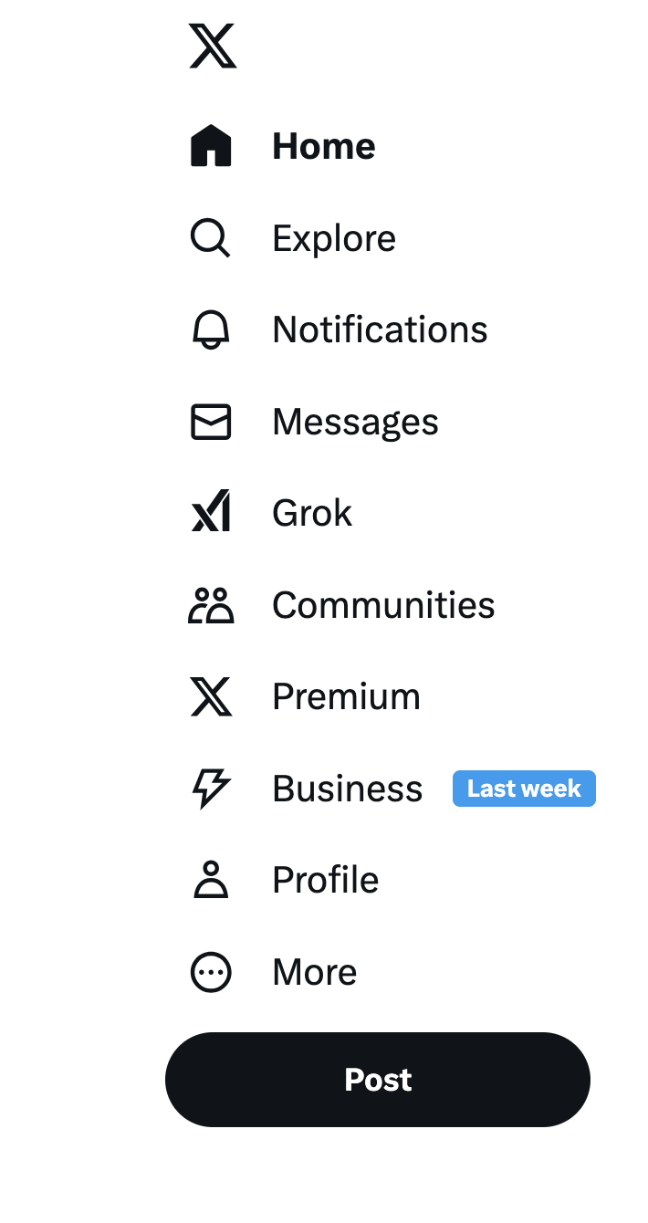
Vertical Sidebar Navigation
Less common, we have a vertical sidebar. This type of menu includes the company’s logo and main navigation links in a column or dropdown on the website.
Here’s an example of what this could look like on a website:
Hamburger Menu
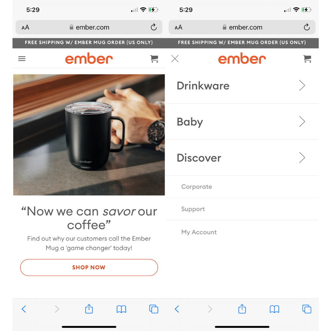
On mobile websites, we typically see a hidden menu that’s accessible via a hamburger menu icon, named due to the three parallel lines giving the look of a hamburger (i.e., bun, burger, bun). If you access a website on mobile, a hamburger menu tends to provide the most user-friendly experience.
Take a look at what this looks like. On the left, we see the hamburger menu in the top left corner of the website. Tap to open it, and you’ll see the interface on the right:
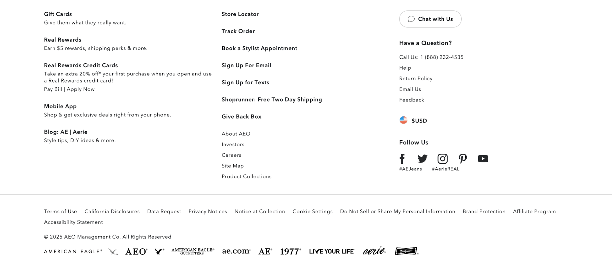
Footer
Finally, every website also has a footer at the very bottom of the site with important links. This type of website navigation usually includes all of the same links from the main menu, but might add even more options.
Because the main menu at the top of a website needs to be cleaner, footers are used as more of a catch-all for important navigation links.
Here’s an example of what a footer menu might look like:
10 Essential Website Navigation Design Tips
Make sure your audience can easily navigate your website. Keep these design tips in mind as you create or make any changes to your website navigation.
1. Keep It Simple and Minimal
A website’s navigation menu does not, and should not, be anything complicated. It should be a simple menu that showcases the most important pages of the website so that visitors can immediately find the information, products, or services they’re looking for.
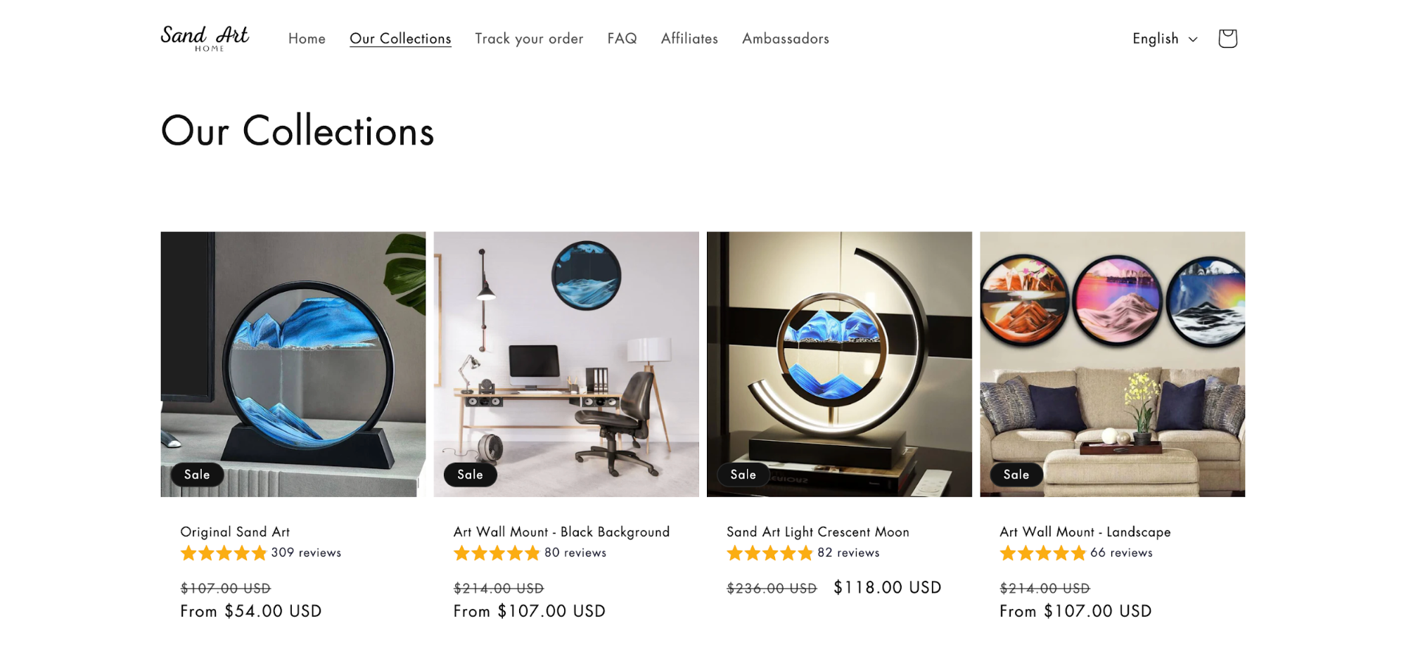
Take a look at this website’s top navigation bar:
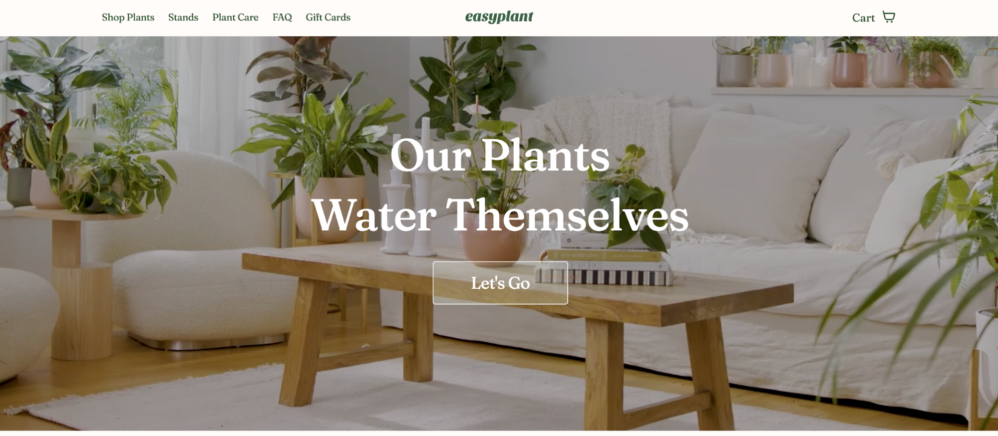
There are six simple links:
- Shop Plants: Leads to the brand’s in-stock plants, its main product
- Stands: Leads to plant stands that visitors can also purchase
- Plant Care: Provides educational resources to help customers with their purchases
- FAQ: Shares answers to common questions
- Gift Cards: Lets customers purchase gift cards for friends and family
- Cart: Customers can easily access any products in their cart from the main menu
These lead website visitors to anywhere they need to go to use the website. It’s a basic white banner with easy-to-read links. It’s simple, minimal, and effective.
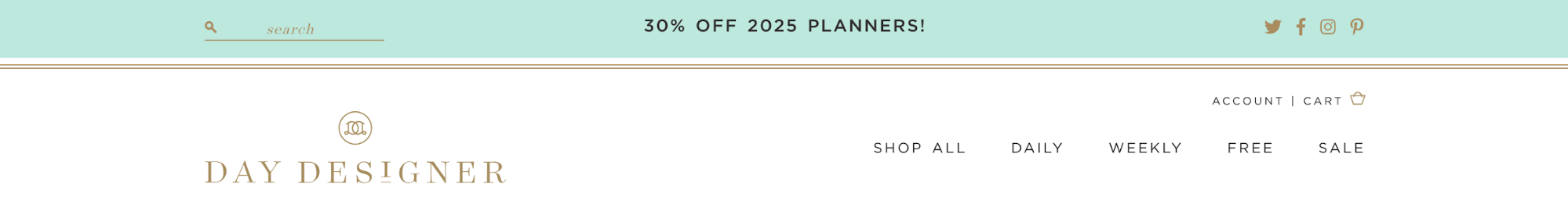
2. Create Visual Separation
Many websites have some sort of image or graphic at the top that helps grab attention and draw visitors into the site. However, you don’t want your menu to get lost in the fray.
Instead, create some kind of visual separation. For example, use a different color for your navigation bar than you do for the rest of the website content you have above the fold (i.e., before a user starts scrolling).
Take a look at the website below. Its navigation bar sits at the top with a white background, then the rest of the website is separated with a light orange background.
Another option is to use a line or similar element to draw a literal separation between your website navigation and the rest of the content. Here’s an example of what this might look like.
Bottom line: your website navigation should be clearly defined and easy to see in contrast with the rest of your site.
3. Ensure It’s Easy to Use
Some websites have a lot of content to share with its visitors. And in wanting to make all of its content as available to their audience as possible, these websites come up with convoluted methods for placing it within their navigation bar.
Don’t do that.
Your menu should be so easy to use that someone accessing the internet for the first time could do so without any issue.
What does that mean?
Your website navigation should include only the main links or link categories within the navigation bar. Any dropdown menus should appear automatically without extra clicks and should be simple to maneuver.
Here’s a great example of what not to do below. Lush is a skincare company with a number of product categories. Instead of using strategic dropdown menus or scaling those categories down into the most important, Lush has instead added a side-to-side scroll bar for users to run through to access endless product categories.
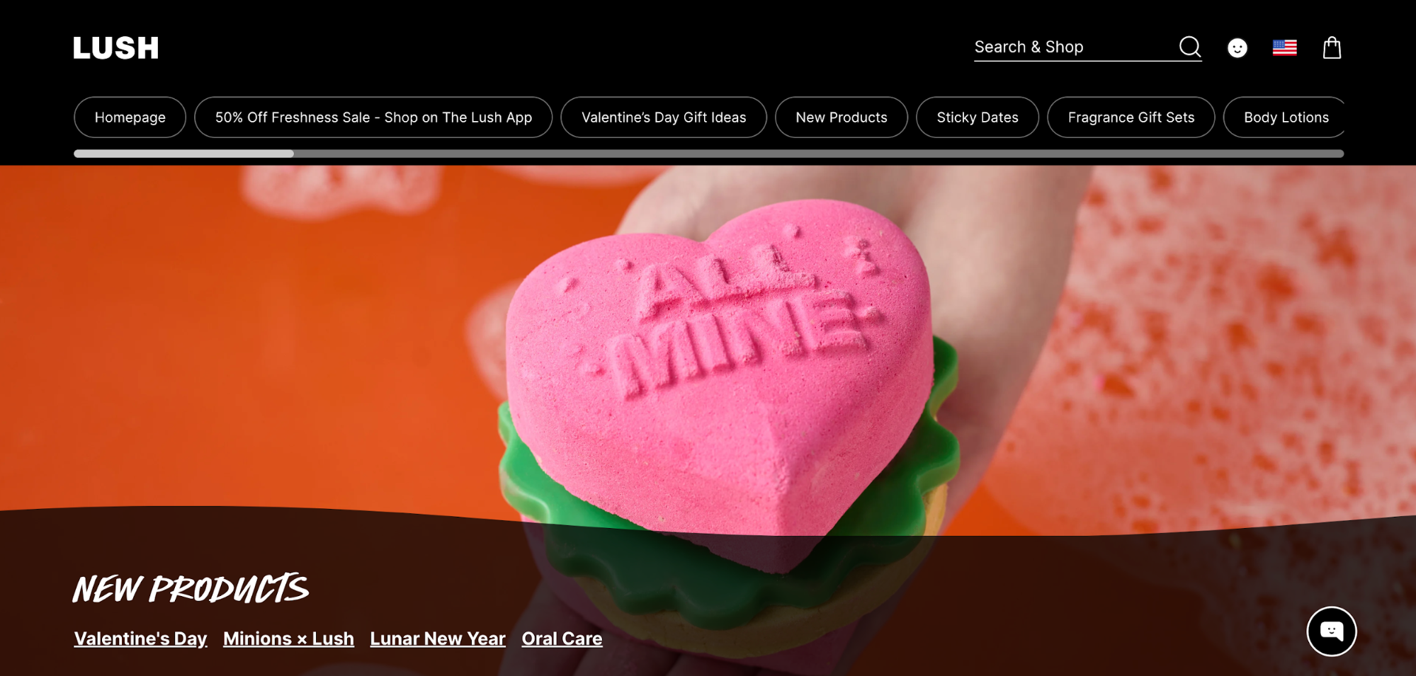
This is complicated and difficult to use, making it even more difficult to find what a customer might be looking for. If it’s difficult to find what they’re looking for, they’re not going to bother trying—they’re going to leave your website and go to a competitor’s.
Instead of trying to be too creative, keep it simple and make it so easy to use that a baby could do it.
4. Highlight the Current Page
As visitors navigate through your website, you want to make sure they don’t get lost. To make sure they always know what page they’re on, create a way to highlight the current page or category.
For example, this website below underlines the current page so users can easily refer back and avoid clicking on the same page again.
You can also have the current page highlighted in a different color than the rest of the navigation bar. This is a simple design change that can make a big improvement in the user experience.
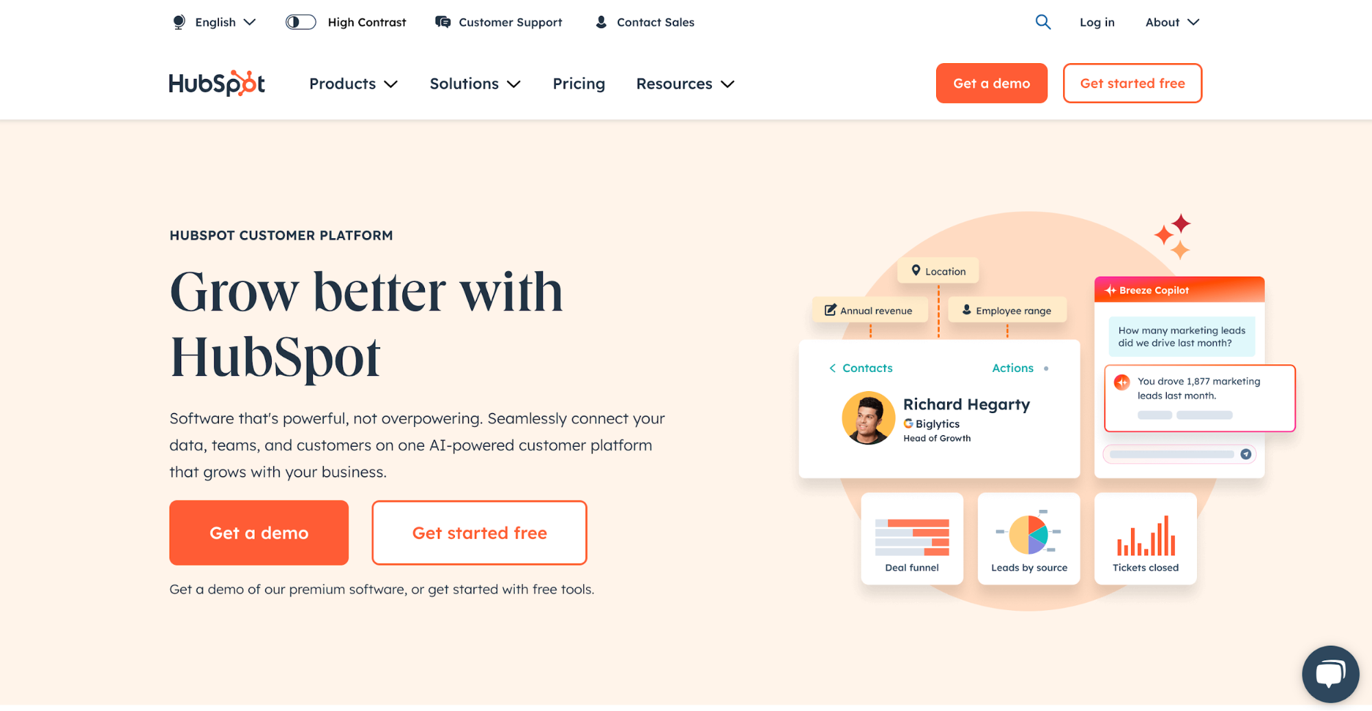
5. Add a Call to Action
When a user visits your website, what is the ultimate action that you want them to take? You should include a button for that action within your website navigation to make it as easy as possible for them to do so.
This example below has two main calls to action—one for enterprise companies to talk to sales about a large plan, and another for any other users to go ahead and get started creating an account.
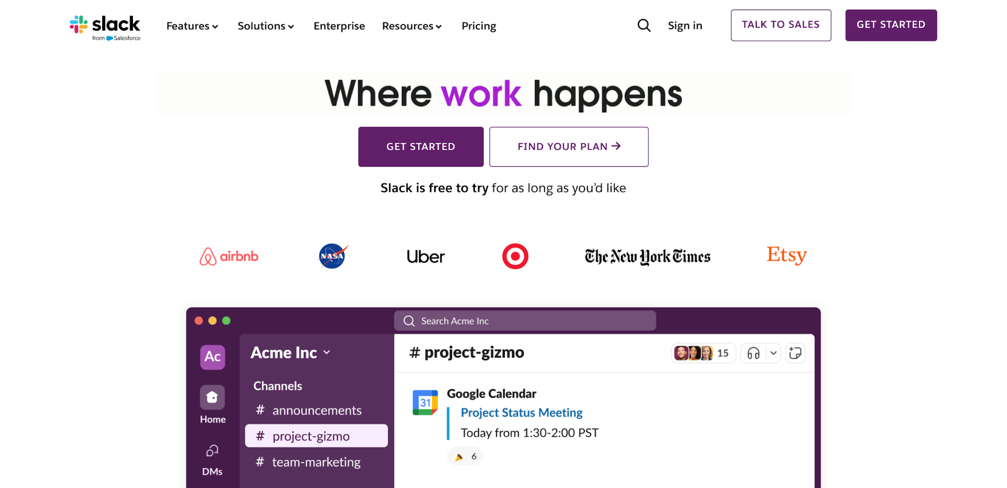
For an ecommerce website, you’d want to include a link to your shopping cart within your navigation bar. For a service-based website, a button enticing your website visitors to contact you or to learn more.
6. Order Links by Importance
Place the links in your navigation bar in the order of their importance, or if you have several of the same caliber, in the order that you think your customer would be most interested in.
Let’s take a look at a hypothetical website for a cleaning company. Your web pages include a landing page sharing details about your company (About), a page about your services (Services), a page sharing the locations you service (Locations), and a page for people to contact you (Contact).
A good order for those in your navigation bar would be:
- Services
- Locations
- Contact
- About
While you want to share your company’s background and story, none of that is quite as important as providing details about what your business does, who it helps, and how someone can get in touch.
7. Label Your Navigation Clearly
Don’t get “cutesy” with your menu labels. There’s no need to be labeling your menu pages with things like “Our Story” or “Go Shopping.”
Label your pages clearly, getting straight to the point of what people can expect by clicking on each page. Here’s a great example of this done well on the Massage Envy website.
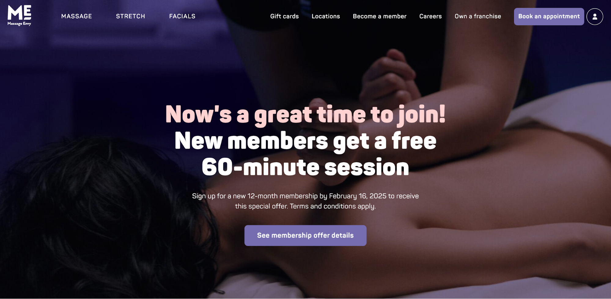
The first three menu labels clearly outline services that potential customers can get, while the remaining labels clearly indicate the additional information visitors can discover by clicking on each page.
8. Use a Sticky Menu
A sticky menu is one that stays visible as the user scrolls down the page. This makes it easy for someone to still access any of the navigation links, no matter how far down the home page they’ve started scrolling.
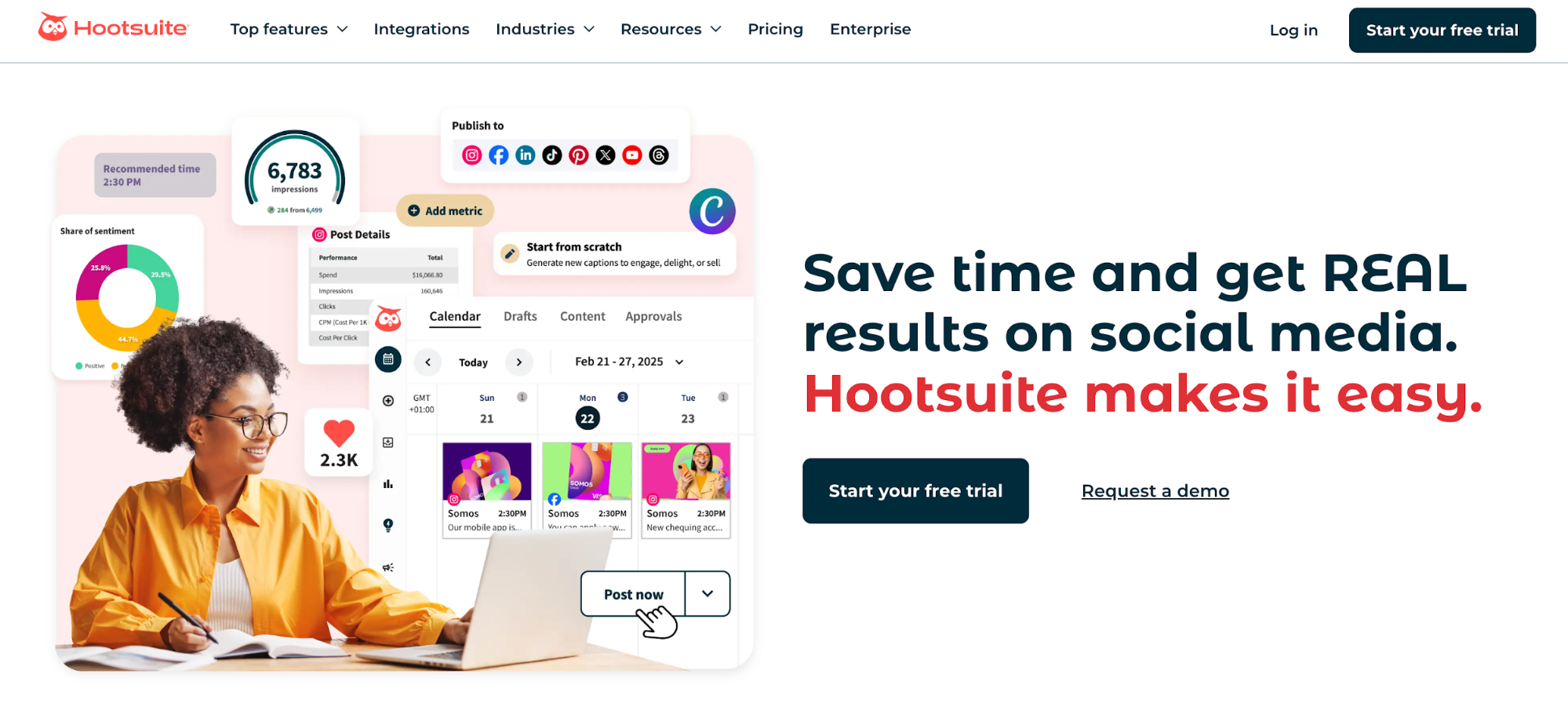
Take a look at this website below. It doesn’t include a sticky menu—so someone who has scrolled halfway down the page, like we have in the screenshot below, has to then scroll all the way back up in order to click to a different page.
A sticky menu stays with the user as they scroll, so no matter where they are on the page, they can navigate to other areas of the website to learn more. A sticky menu improves the user experience, while not having one makes using your website more difficult.
9. Add a Search Bar
Make it easy for people to find anything they want on your website, regardless of whether it’s sitting right in your top navigation bar or not, by letting them search for it themselves. Adding a search bar to your main menu gives some agency to your website visitors, which can only add to their experience with your site.
Plus, websites that have a lot of product pages or a lot of blog posts can benefit greatly from giving its visitors the ability to search for exactly what they’re looking for.
10. Link Your Logo to Your Homepage
Finally, make sure to link your logo back to your homepage. Main menus don’t tend to include a “Home” link, but you still want to give users a way to get back home should they wish to.
Adding a link back to your homepage via your brand logo provides the perfect solution.
5 Website Navigation Mistakes to Avoid
Now that you know how to create a well-designed navigation bar for your website, let’s cover a few faux-pas that some businesses commonly make. These can hinder the overall user experience, so you want to avoid them at all costs.
1. Menus That Aren’t Immediately Accessible
Your menu should be immediately visible and accessible to your users without users needing to click to open it.
Take a look at this navigation bar below. A hamburger menu that requires a click to open makes sense on a mobile device—but not on a desktop website.

And here’s another example where users have to click the word “Menu” in the top right corner of the website to actually access the menu.

By requiring additional clicks to access menu links, you’re making it harder for people to use your website. Instead, just let your menu sit at the top (or side) of your website for easy access.
2. Menu Overload
Don’t overload your website visitors with too many options. Your website navigation should include only the most important and most pertinent links that your visitors need.
Menu overload occurs when you include too many links in your navigation bar, too many links in your dropdown menu(s), or, like we see in this example below, too many menu bars.
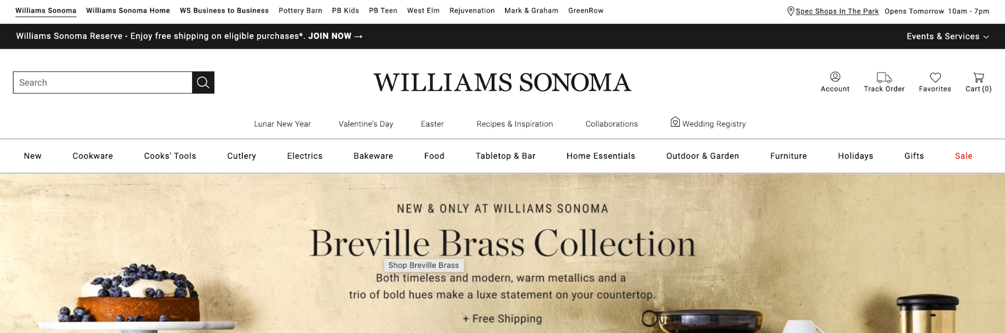
We know that large companies like Williams Sonoma have a lot to offer its customers. But there are three different menu bars, plus some additional links alongside the logo. This creates a messy and difficult-to-use navigation that could easily be simplified to improve the experience.
3. Mini Dropdown Menus
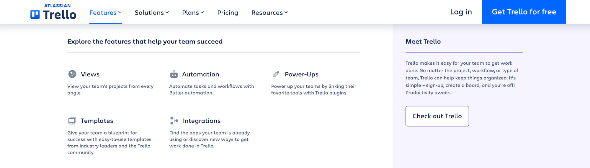
If you’re going to use dropdown menus, don’t make them too small. Teeny little dropdown menus make it difficult for the user as they can easily move their mouse out of it, causing the dropdown to close, or have difficulties choosing the right option.
Take a look at this dropdown menu example. It’s extremely short and is wrapped right around the links. Users need to be extremely precise in their clicking and mouse usage to properly navigate it.
Make it easier on your website visitors by creating a larger dropdown menu. You have two options.
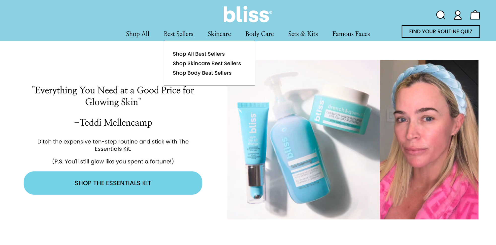
First, this website provides a great example of how you can create a simple dropdown menu that isn’t too small to easily navigate. The icons and subtitle give context for the links and make the clickable area larger.
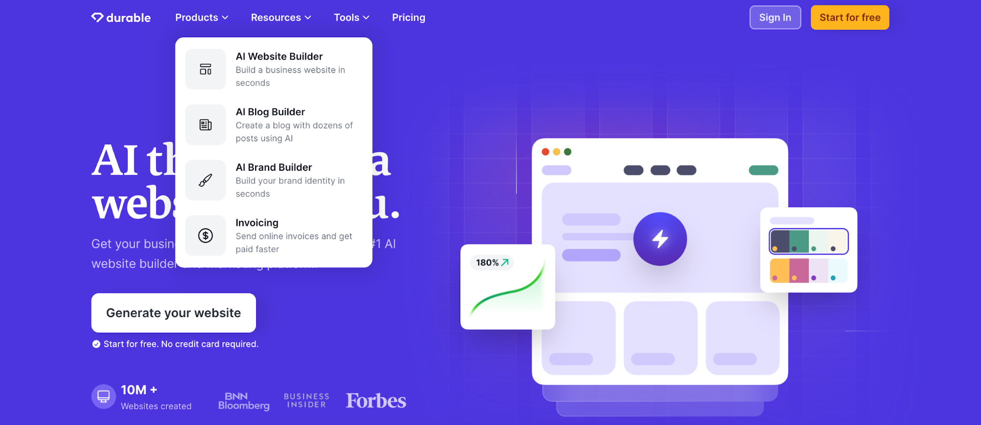
Or, you can create what’s called a mega dropdown. This is a wide-screen or full-page dropdown that provides a number of related links, along with other information like images, downloads, blog links, and more.
Here’s an example of what a mega dropdown could look like.
Use dropdowns strategically, while also making them easy to use.
4. Social Media Icons
Don’t crowd your navigation bar unnecessarily. Many websites will add extra links to things like their social media platforms. The footer is a perfect place to include these, but you shouldn’t have them in your top-level navigation.
Here’s an example of a website that has done this. In order to add social media icons, they’ve had to add another entire navigation bar, which creates a messier experience.
5. Menus That Are Hard to See
Your website design shouldn’t be getting in the way of your navigation bar. Websites that include a full screen image or video—even underneath their navigation—run the risk of their menu links fading into the background.
Take a look at this navigation bar for example. Because the menu sits right on top of the background image, some of the links (like the About Us page on the top right side) are nearly impossible to see.

This is another reason creating visual separation between your menu and the rest of your website design is so important. You want your navigation to stand out so that it’s easy to find and all of your links are readily available.
Create a Well-Designed Website Navigation
Don’t let your website navigation get you down. When creating your website, you now have the tools to put together a well-designed and easy-to-use navigation menu for your visitors. Improve your user experience by employing these ten tips—and knowing which ones to avoid.