How to Avoid the Performance Pitfalls of Web Fonts
Web fonts bring personality to your site, but they also add weight.
And if your fonts take too long to load, users are left staring at a blank screen. Even worse, your site might look unstable as text shifts unexpectedly.
This also hurts Core Web Vitals — the metrics that directly affect your search ranking and user experience.
Here, every millisecond matters.
So, how can you keep your choice of web fonts without sacrificing performance?
Let’s break it down, one step at a time.
But first, what exactly are web safe fonts and web fonts?
What Are Web Safe Fonts?
Web safe fonts are the tried-and-true options that work everywhere. They’re fonts most devices already have, which means you can count on them to load quickly.
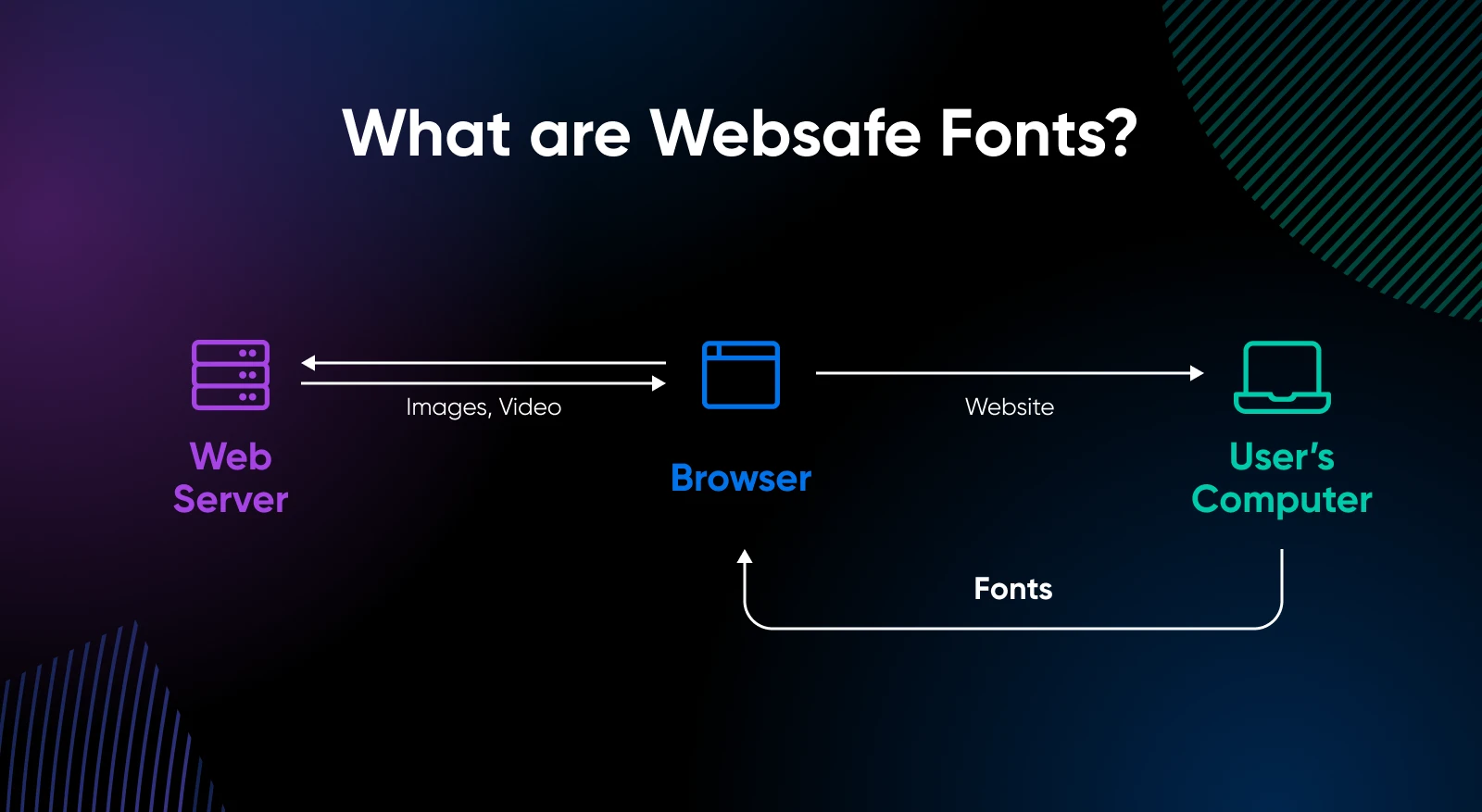
Here are the web safe fonts you can use:
- Arial
- Times New Roman
- Verdana
- Trebuchet MS
- Courier
- Impact
- Georgia
- Comic Sans MS
Even with limited choices, a skilled designer can use these fonts creatively.
But, websafe fonts are often overused and give your website a “similar” feel — even when you’ve put a lot of effort and money in designing the website.
So how do you make it look prettier?
With web fonts.
What Are Web Fonts?
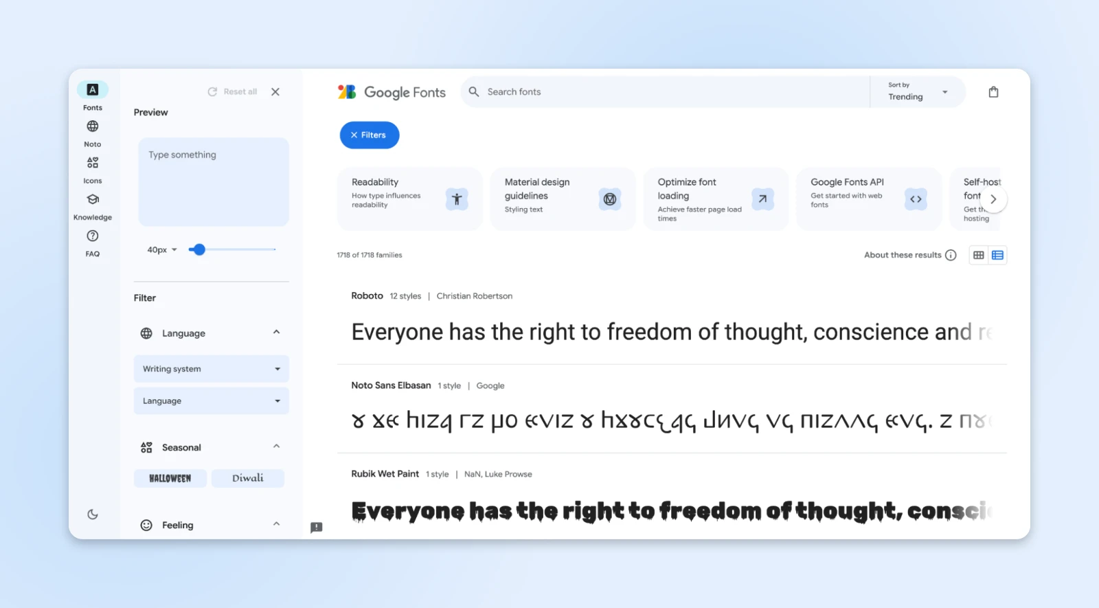
Web fonts let you move away from the often overused websafe fonts.
Instead of relying on fonts available on a user’s device, web fonts can be downloaded from an external source like Google Fonts or directly from your server onto your user’s device (temporarily).
This allows you to use any custom font that matches your brand or design needs.
We have also curated the best Google fonts to help you get started.
When a user visits your site, the web font is temporarily downloaded and applied to the text using the @font-face rule in CSS.
Web fonts then begin to behave like local fonts — They auto-adjust to the screen sizes while keeping your website looking sharp.
Fonts have also evolved over time to have more efficient storage formats. Similar image formats, fonts have TTF, WOFF, WOFF2, and EOT.
- Embedded OpenType (EOT): Compatible with older versions of Internet Explorer (below IE9). Not compressed by default, but GZIP compression can be applied.
- TrueType (TTF): Supported by older Android browsers (below version 4.4). It’s uncompressed by default but can be GZIP-compressed.
- Web Open Font Format (WOFF): Supported by most modern browsers and includes built-in compression.
- Web Open Font Format 2 (WOFF2): Compatible with browsers that support it, featuring custom compression algorithms that reduce file size by around 30% compared to other formats.
The modern formats offer compression for better performance and help keep your site’s design both functional and visually distinct.
What Are Core Web Vitals (CWV) Metrics?
Here’s the thing: Google wants all of its users to have an excellent experience.
Whichever website or app gives Google’s users the best experience will get more “love” from Google’s algorithms.
And how’s this “experience” measured?
Google launched Core Web Vitals in early 2020 for just that purpose.
CWV is a set of three metrics that tell Google how your website or app performs for the users they send there.
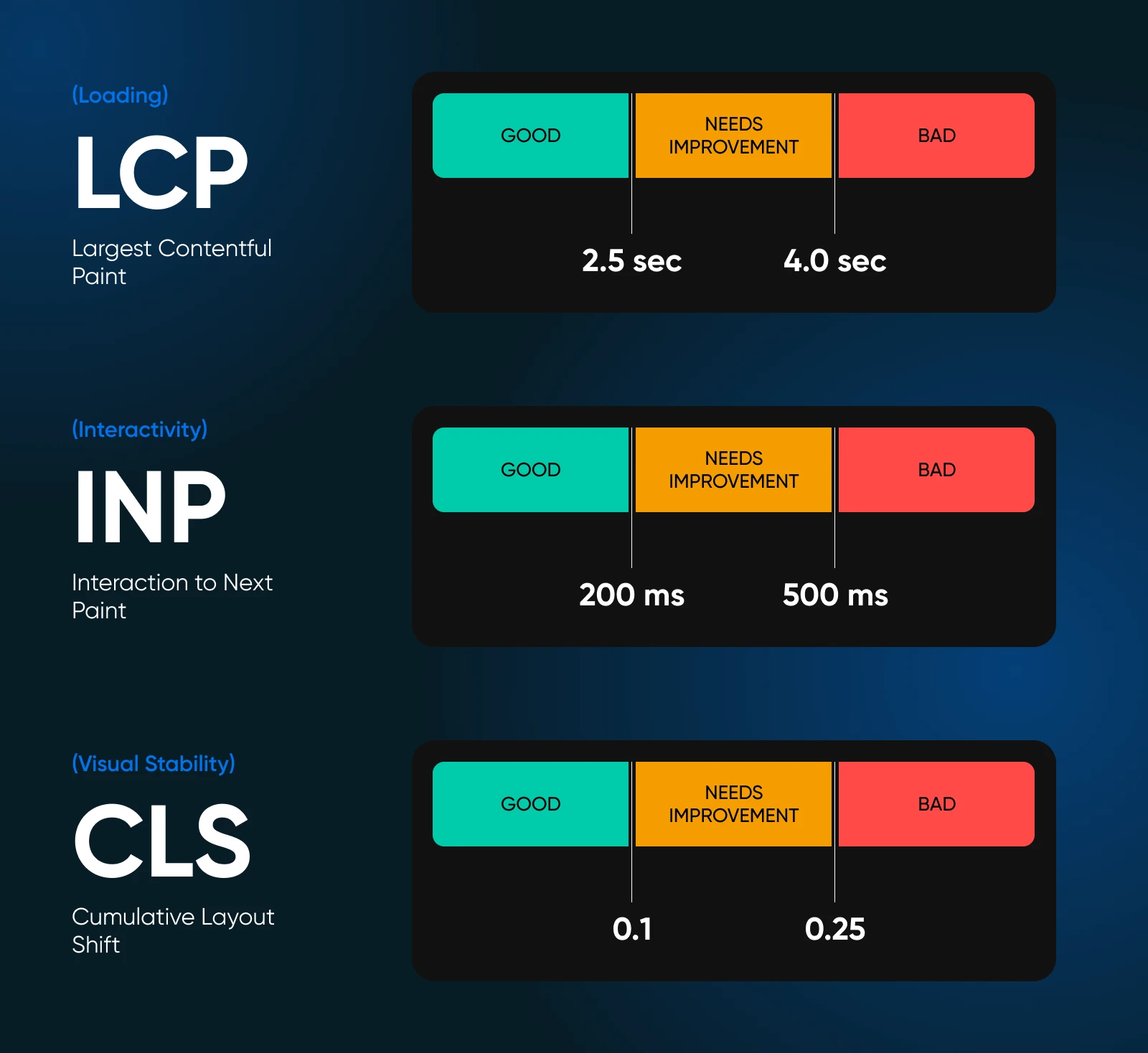
Higher scores on these metrics can help you rank higher on Google. Let’s quickly go over these metrics.
Largest Contentful Paint (LCP)
LCP measures how long it takes for the largest visible element on your page to load.
This is generally an image or video but could be a large block of text or an embedded video.
The faster this happens, the better your site performs in the eyes of both users and search engines.
A good LCP score means users aren’t left waiting for your main content to appear.
Interaction to Next Paint (INP)
INP measures the time between a user’s interaction (like clicking or tapping) and when the page responds visually.
It gives a more accurate picture of interactivity than FID, as it considers the full user journey rather than just the first interaction.
A low INP score means your site feels responsive, improving user engagement and satisfaction.
Cumulative Layout Shift (CLS)
CLS measures how stable your page is while loading.
When elements move around unexpectedly, it frustrates users and makes the page feel unreliable.
A low CLS score means your page loads smoothly, without layout shifts that disrupt the user experience.
How To Optimize Web Fonts for Better Core Web Vitals
So, what’s all the fuss about web font performance?
Why can’t we just add web fonts and call it a day? Well, you can.
But as we’ve talked about before, web fonts aren’t local. They are fetched from a server, downloaded, and applied to your site, and that’s where the problem lies.
It takes time.
And if it takes too long, it affects your Core Web Vitals and website conversion rate.
Let’s look at some ways to optimize web fonts for better core web vitals.
1. Preloading Fonts
You want your fonts to be ready the moment the page starts loading.
So when the page is ready for the user, so is the font.
That’s called preloading.
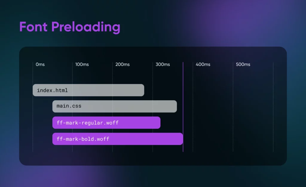
Preloading tells the browser, “Hey, this font is important. Please load it right away.”
Let’s say you’re using the popular Google font, Roboto.
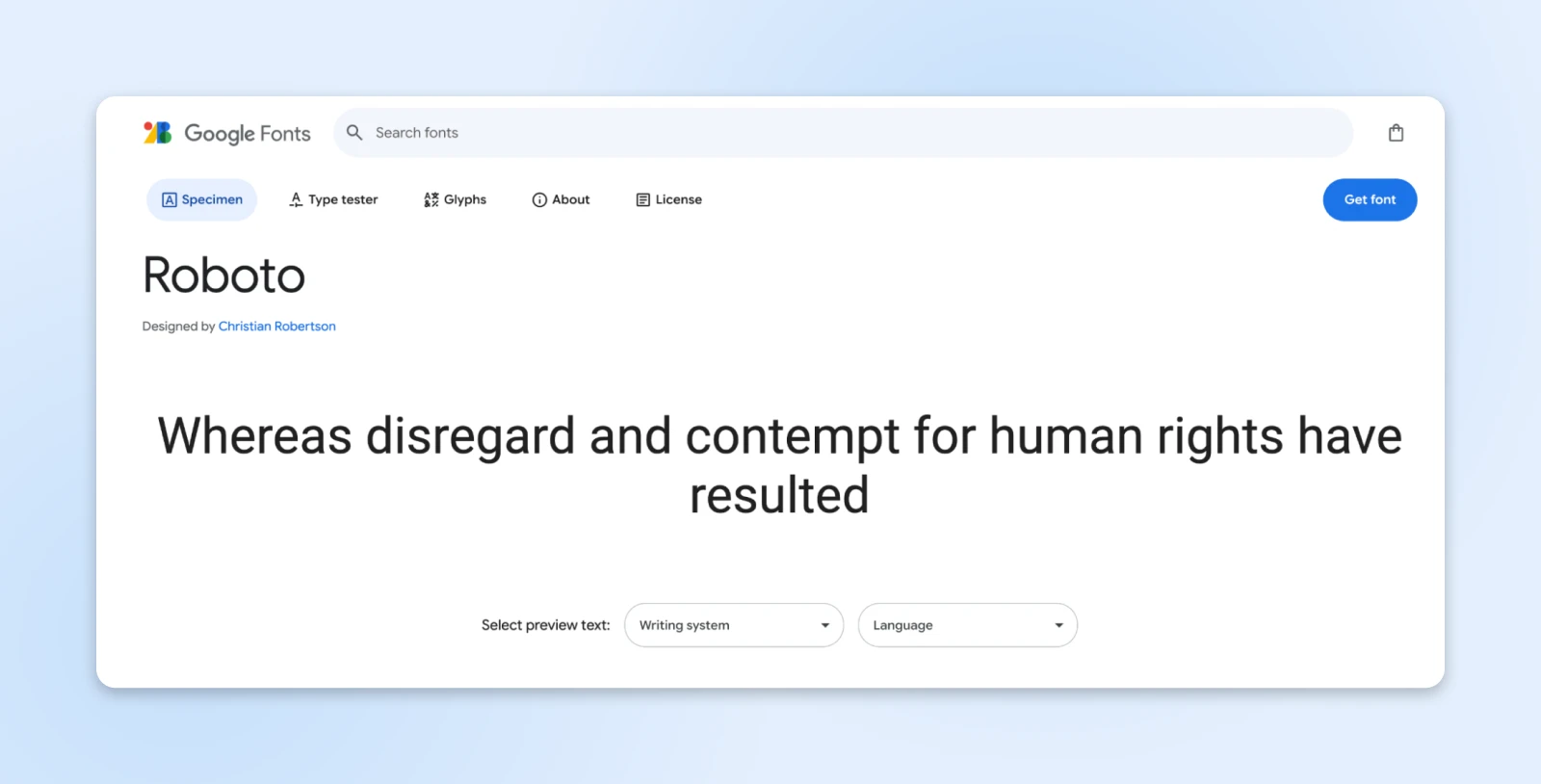
You need to add a single attribute to your HTML code to preload the font: rel = “preload”
<link rel=”preload” href=”https://fonts.googleapis.com/css2?family=Roboto:wght@400&display=swap” as=”font” type=”font/woff2″ crossorigin>
After this, the browser knows to prioritize downloading Roboto, so your text appears styled with the right font faster.
This reduces the time it takes for the largest text block (LCP) to render, so users see the final version of your site sooner.
2. Control Font Load Behavior With the Font-Display Property
However, preloading could increase the initial load time by a little since the fonts are given priority.
The font-display property lets you control how your text behaves while custom fonts are still loading.
This can help you avoid the dreaded Flash of Invisible Text (FOIT), where users see blank spaces, and the Flash of Unstyled Text (FOUT), where the page appears with fallback fonts for a second and immediately switches to custom fonts.
The font-display property has four ways to manage text behavior: block, swap, fallback, and optional.
Let’s look at the two that you’d need.
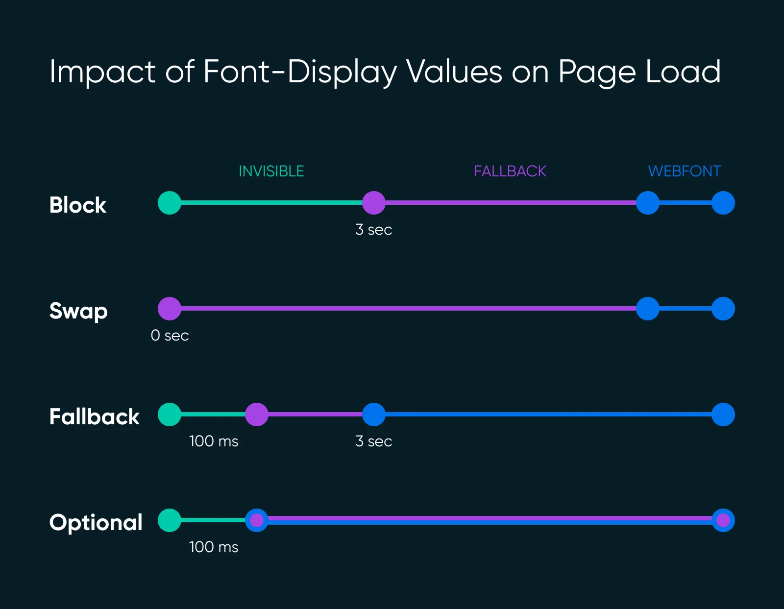
font-display: swap — This option is the safest bet for most sites. It ensures text appears immediately with a fallback font and swaps to the custom font once it is ready.
@font-face {
font-family: ‘Roboto’;
src: url(‘https://fonts.gstatic.com/s/roboto/v27/KFOmCnqEu92Fr1Me5Q.ttf’) format(‘truetype’);
font-display: swap;
}
Here, the fallback font (like Arial or another system font) will load instantly, keeping the page readable.
When Roboto is downloaded, it replaces the fallback font without leaving a blank space on the screen.
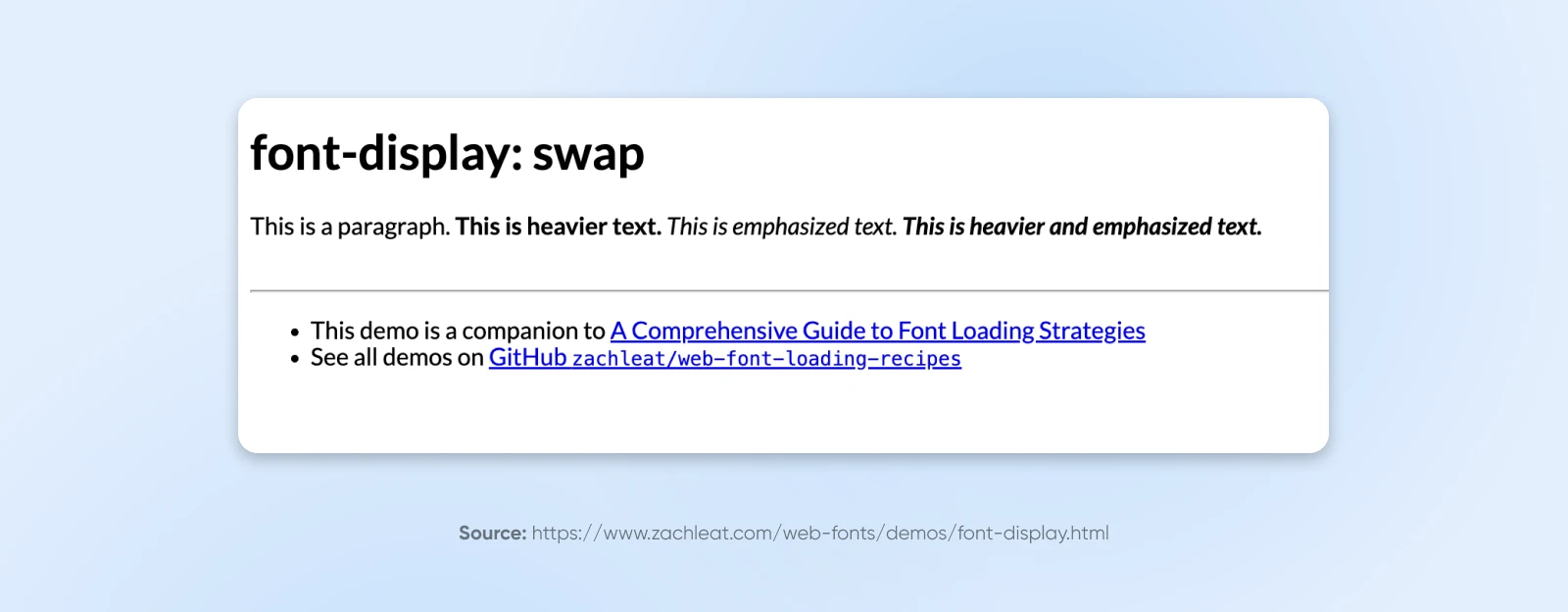
Here’s a demo of what font-display swap behaves like in the real world.
font-display: optional — If you’re concerned about speed, this tells the browser to skip the custom font if it doesn’t load fast enough. This works when you don’t mind if the fallback stays in place.
@font-face {
font-family: ‘Roboto’;
src: url(‘https://fonts.gstatic.com/s/roboto/v27/KFOmCnqEu92Fr1Me5Q.ttf’) format(‘truetype’);
font-display: optional;
}
This option makes sense when performance is more critical than design, making it perfect for a site that’s all about speed.
Here’s an example of what this looks like in the real world. You won’t notice the switch here since most fonts load quickly enough.
However, the optional argument is great in case your font server goes down or slow.
3. Subsetting Fonts
Most fonts come with hundreds, even thousands, of characters.
Chances are, you only need a small portion of those. Removing those is called font subsetting.
That’s right, you can remove unnecessary characters to reduce the size of the font file.
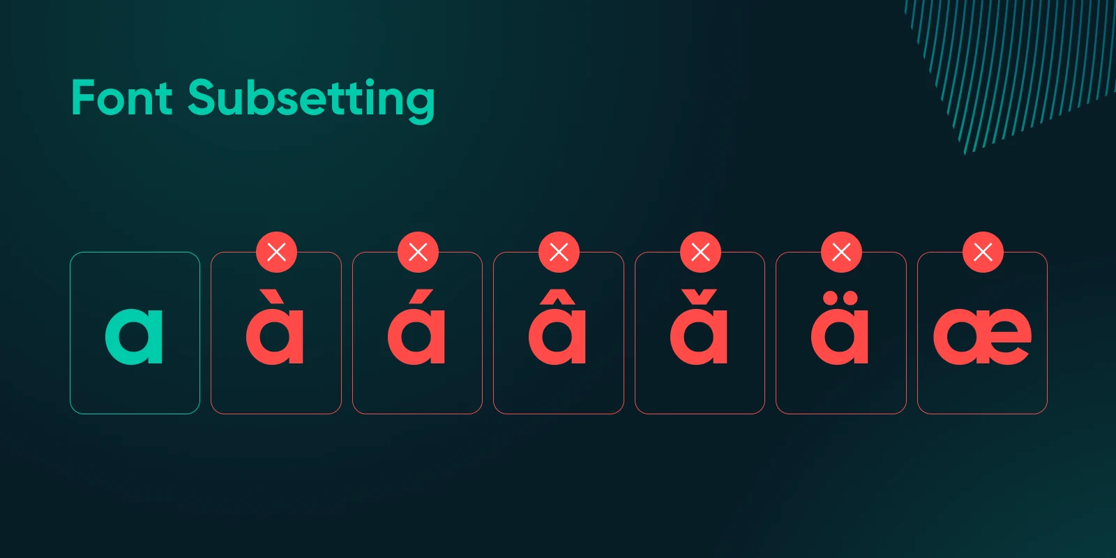
Suppose your site only needs English characters.
A tool like FontTools can help you subset your font to only include the characters you’ll actually use.
This means all Unicode characters that aren’t necessary in the English language can be removed to save the file size.
Unicode
The Unicode Standard is an international encoding system. It assigns a unique number to every character in every language so the character can be displayed across devices, platforms, and languages.
Read More
This reduces the file size from, say, 80 KB to 30 KB.
Smaller files mean faster downloads, improving both LCP and CLS since the font loads quickly and doesn’t shift the layout.
Here’s an example of how you’d remove everything other than English characters using FontTools:
pyftsubset Roboto-Regular.ttf –unicodes=U+0020-007F
Now, your Roboto font only contains the basic Latin characters needed for English text, making it much faster to load.
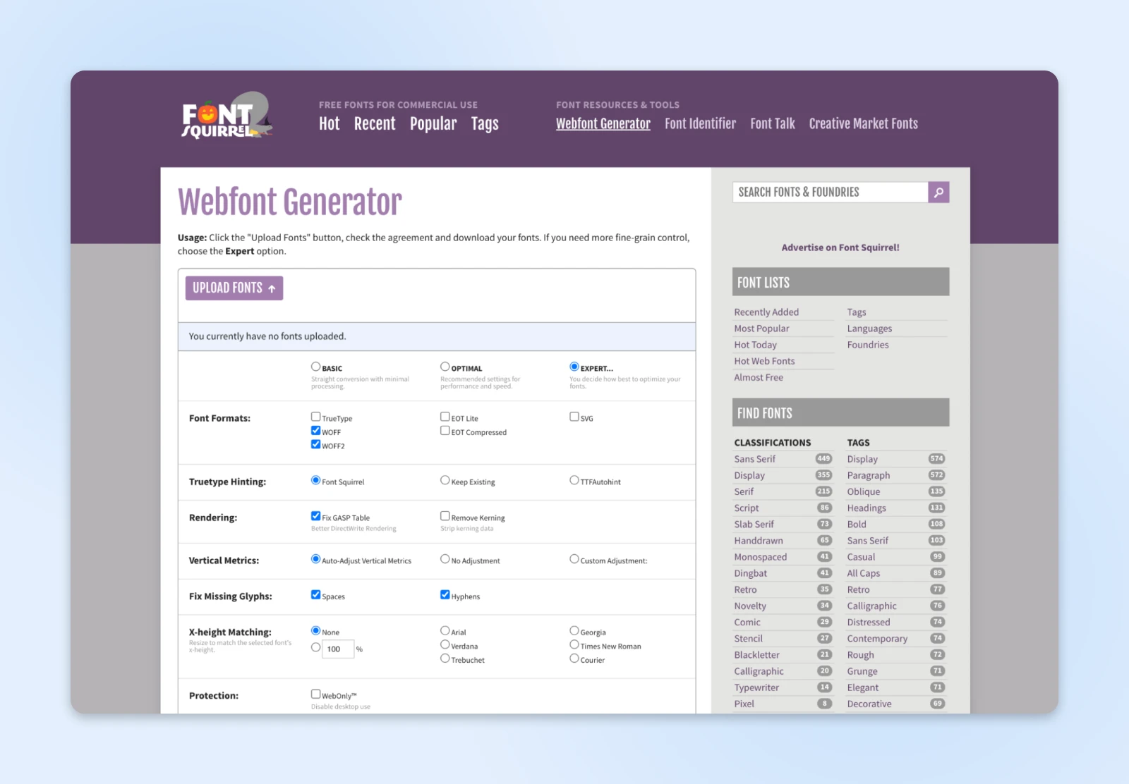
If you prefer a GUI-based approach, you can also try font-squirrel. Once you upload a font file, you get quite a lot of customization options to add or remove
4. Compressing Fonts
Modern font formats like WOFF2 offer compression that can reduce font size by up to 30% compared to older formats like TTF.
Using the most compressed version of your font can significantly reduce its impact on page load time.
For instance, here’s how you can ensure you’re using WOFF2:
@font-face {
font-family: ‘Roboto’;
src: url(‘roboto.woff2’) format(‘woff2’),
url(‘roboto.woff’) format(‘woff’);
font-weight: 400;
}
This way, browsers that support WOFF2 will use it by default, reducing load times while still displaying a crisp, high-quality font.
However, if a browser can’t use WOFF2, it defaults to WOFF.
5. Base64 Encoding
This is another commonly used practice to optimize your web fonts.
However, you need to be cautious about when to use Base64-encoded fonts.
Base64 encoding is most useful for small fonts or icons.
If it gets overused though, you can bloat the CSS, increasing the page load time more than just using the font itself.
If you want to use Base64 encoding for an icon font, you’d first convert the font file to Base64 format. Here’s how it might look:
@font-face {
font-family: ‘CustomIcons’;
src: url(‘data:font/woff2;base64,d09GRgABAAAAAAn4ABAAAAAAB…’) format(‘woff2’);
font-weight: normal;
font-style: normal;
}
This method works well for small icon fonts you use frequently throughout the site.
The CSS file loads with the embedded font, eliminating an extra HTTP request.
However, avoid this for large body fonts, as it can slow down initial page rendering.
6. <link> vs. CSS @import for Fonts
<link> and @import have a significant difference in load performance.
The <link> tag loads fonts asynchronously, meaning it doesn’t hold up the rest of your page from rendering, while @import is a bit slower.
Use <link> whenever possible.
“For 90%+ of the cases you likely want the <link> tag. As a rule of thumb, you want to avoid @import rules because they defer the loading of the included resource until the file is fetched.” Ilya Grigorik, Engineer and Technical Advisor to the CEO at Shopify
It loads fonts independently, allowing the rest of the page to load without waiting on the font file.
<link rel=”stylesheet” href= “https://fonts.googleapis.com/css2?family=Roboto:wght@400&display=swap”>
This is the preferred method for loading Google Fonts or similar external font services.
Placed in the <head> section of your HTML, it ensures the font starts loading early without blocking other resources.
Avoid @import for critical fonts.
@import waits until the CSS file is fully loaded, which can increase load time and hurt LCP.
@import url(‘https://fonts.googleapis.com/css2?family=Roboto:wght@400&display=swap’);
Using @import for fonts only works for secondary or less critical fonts. As a practice, avoid it for anything on the first screen of content.
7. Reduce Visual Shifts/CLS With Font Matching and Size Adjust
Visual shifts — or cumulative layout shifts (CLS), as Google calls them— occur when the layout changes unexpectedly, often due to font swaps.
To minimize this effect, choose fallback fonts that closely resemble your custom font’s style and dimensions.
The CSS size-adjust property also lets you control the fallback font size, reducing visual shifts when the custom font loads.
If your custom font is Roboto and a fallback font, adjust its size to match Roboto, making the transition almost seamless.
@font-face {
font-family: ‘Roboto’;
src: url(‘roboto.woff2’) format(‘woff2’);
font-display: swap;
size-adjust: 100%;
}
Here, Roboto’s fallback (e.g., Arial) maintains consistent size, reducing any noticeable movement when Roboto fully loads.
Once you align the size and spacing of the fallback with your custom font, you ensure that when Roboto replaces Arial, the shift is minimal, keeping CLS low and improving the user experience.
8. Find the Right Place To Host Web Fonts
Self-hosting your fonts doesn’t always mean faster performance.
Many third-party options also perform well—and sometimes, they can even load faster.
The Web Almanac found that certain sites using third-party fonts rendered faster than those with self-hosted fonts.
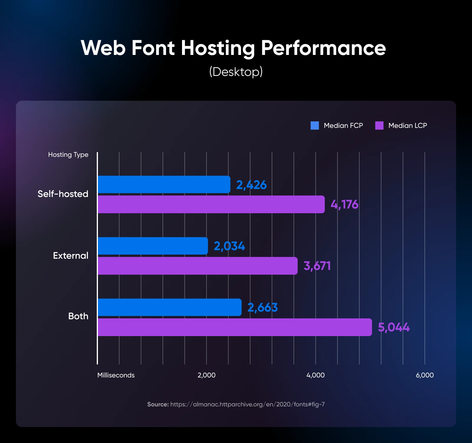
Ultimately, font performance depends less on hosting choice and more on three key factors:
- Content Delivery Network (CDN): Ensures faster delivery by serving fonts from multiple locations worldwide.
- HTTP/2: Boosts loading speed by handling multiple requests in parallel, reducing latency.
- Web Caching Policy: Caches fonts efficiently, so they don’t need to be re-downloaded with each visit.
Instead of getting stuck on the hosting debate, focus on setting up these essentials to keep your fonts loading smoothly, no matter where they’re hosted.
How To Simplify Web Performance Optimization
If the techniques above feel too hands-on, a plugin like Jetpack can make it easy.

Jetpack, developed by Automattic (the creators of WordPress), is an all-in-one solution built specifically for WordPress sites.
It combines essential features for security, performance, and marketing, all managed from one platform.
Even if you are non-technical, Jetpack can help improve site speed, strengthen security, and enhance the user experience. (No complex setups necessary!)
Create the Perfect Balance Between Beauty and Performance
Web fonts give your site a unique, beautiful look.
However, without the right tweaks, they can also slow it down and frustrate users.
While we’ve covered essential font optimization techniques, fine-tuning performance involves countless technical details.
And getting the best results can feel overwhelming.
That’s where DreamHost’s professional web development services come in.
We’ll make sure your site is beautiful and optimized for speed and user experience.
Let us handle the technicalities while you focus on building a site that truly stands out.

Pro Services – Development
You Dream It, We Code It
Tap into 20+ years of development expertise. Just let us know what you want for your site – we’ll take it from there.
Learn More
This page contains affiliate links. This means we may earn a commission if you purchase services through our link without any extra cost to you.


