6 Classic ‘90s Websites (+ 6 that Are Still Up)

Have you looked at websites from the 1900s lately? As in, from the 1990s, when websites were born?
The very first website launched on August 6, 1991, and nothing has been the same ever since.
Let’s take a walk down memory lane together, shall we? Grab a cup of tea, your favorite snack, and whatever mood you happen to be in, because trust me—you’ll be laughing by the time this listicle is over.
1. The Very First Website Ever

Let’s start at the very beginning, the very first place to start.
Okay, okay, I’m done now.
But seriously, it wouldn’t be fair to talk about 1990s websites without showcasing the first-ever website invented. Which, by the way, is still live on the web today. For archival, historic purposes, but still.
In the late 1980s and early 1990s, English computer scientist Tim Berners-Lee was working on a few projects that would change the way our world works—forever.
The projects were:
- The World Wide Web: With this system, Berners-Lee dreamed we—as in, people around the entire world—could share information, communicate, and work together on a decentralized, open platform. The WorldWideWeb was the first internet browser, but you could only use it on a NeXT computer—Steve Jobs’ macOS predecessor that cost $6,500 in 1991. Which is equivalent to about $15,000 in the 2020s economy. Not exactly a household item.
- Hypertext Markup Language (HTML): The language Berners-Lee used to build and format web pages, which started with a handful of simple tags like <html>, <title>, and <h1>. All of which we still use today.
- The URL System: URLs—or Uniform Resource Locators—are what Berners-Lee imagined could function like physical addresses, with each resource on the web being identified with a unique yet standardized format.
- HTTP: Short for Hypertext Transfer Protocol, HTTP is the communication protocol for transferring hypertext documents between web servers and browsers. In slightly simpler terms, it’s the system that lets browsers and servers share and display web pages.
We use all these elements of the web today. What would we do without the work of Berners-Lee and his many colleagues and co-collaborators?
The world would look a lot different, that’s for sure.
But as the very first website ever published, Berners-Lee’s August 6, 1991 website set the standard for all websites in that decade.
Especially in the first half of the 1990s.

2. Apple’s 1994 Website
Lemme tell you a story.
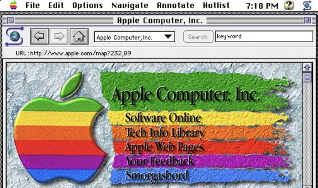
Once upon a time, Steve Jobs accidentally ate a box of crayons for a snack, puked it up, and used that as the inspiration for this 1994 Apple Computer, Inc. homepage.
Just kidding, obviously. And also, Steve Jobs actually wasn’t with Apple in 1994, so we can’t blame this web design colortastrophe on him.
Also, note that this early Apple website is displayed on a Mosaic browser instead of the plainer WorldWideWeb one.
Mosaic had two things going for it.
First, it could display graphics and text on the same page. Mind-blowing, I know. This heralded a whole new era of 1990s style, largely in the form of spectacular clashes of color and text.
Second, users could boot it up on computers that cost less than those expensive NeXT computers—it was compatible with Unix-based systems and later Windows and Macintosh.
For example, standard Unix workstations like those from Sun Microsystems or Silicon Graphics, and later, Windows PCs such as a Compaq Deskpro or IBM PS/2, and Apple Macintosh computers like the Macintosh Quadra.
Relics of the past, in other words, like Mosaic itself, which has long been replaced by the likes of Chrome, Safari, and Firefox.
RIP, Mosaic.
3. Amazon Books

There is nothing—literally nothing—about this tragically drab page that even holds a whisper of a resemblance to today’s overpoweringly mighty Amazon.com e-commerce superstore.
But I kind of love it, and here’s why: it’s a reminder that once upon a day, Amazon was all about books. And I love books.
Like any good bookstore website from the 1990s, the copy on this page is wordy, pleading, and oddly sweet: Please come often! We think it’s very cool! These are books we love!
A sharp contrast to the incisive copy of today, no?
Again, I’m a little obsessed.
4. Microsoft

Welcome to Microsoft’s World Wide Web server, where you can burn your eyes on a brilliant sunset (?) overlaid with neon teal text!
You can’t say this 1994 homepage for Microsoft doesn’t scream 1990s.
Thankfully, it’s long-defunct. And looking at Microsoft’s current homepage is like a spa treatment for the eyes after staring at the 1994 version, which literally brands itself in the retinas after just a split-second stare.
5. New York Times

Of all the atrocities from the 1990s we’ve seen, this is by far one of the least horrible to look at. The classic font—or a version of it, anyway—is there for the New York Times logo, but that’s about all that remains in modern times of this 1994 look.
6. LEGO

Like many parents around the world, I have a soft spot in my heart for all things LEGO-related.
And that includes this charming 1996 version of the LEGO website. I mean, look at that cute little LEGO house that makes up the “This is Home” button. It’s darling! And the way the background looks like a classic gray baseplate.
It’s precious.
One thing that really screams ‘90s, though, is the clashing, slightly horrible, alternating color scheme found in the page title. I just want to go back in time and whisper to the web designer, Just pick one color, LEGO. It’ll be OK.
7. The White House

Welcome to the White House webpage, an elegantly oatmeal-colored interface where you can learn how to send the 1996 presidential team “electronic mail.” Someone tell the Oval Office staff that saying “email” is OK. Even back then, the term was pretty widely used.
But it doesn’t sound as fancy schmancy. I get it.
And honeslty? “Electronic mail” fits this webpage’s vibe better anyway.
8. FedEx

Nothing makes you feel confident in FedEx’s shipping prowess like a web image of a package falling off the face of the Earth, amirite?
Unfortunate messaging aside, this is one of the more eye-pleasing 1990s websites I’ve encountered. It’s not that hectic, the colors go together, and everything’s pretty easy for my eyes to absorb.
I’ll call it a win for 1996 FedEx.
9. Ultimate Star Treks Link Page

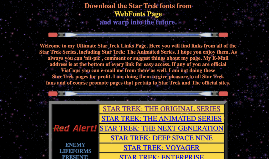
Star Trek fans rejoice! This 1990s webpage is still up and running, which means you can explore links about Star Trek to your heart’s content.
At least, I think that’s the point of the page?
I clicked a few of these links and they left me feeling more confused than when I first landed on this mishmash of a website. It’s got all the hallmarks of a garish 1990s website, from the clashing font colors to the wordy copy.
But, kudos to Drgn Slyr for keeping it up for all these years.
10. Berkshire Hathaway

Nothing says “multinational conglomerate holding company” like a plain, 1990s-style website with zero graphics, creativity, or fun.
But that’s exactly what you’ll find on BerkshireHathaway.com, a site that looks like it hasn’t had an overhaul since the early 1990s yet manages to stay up-to-date, content-wise.
I poked around on a web design subreddit and found a link to the actual, archived, 1996 version of the site. It’s pretty much the same as what’s up there now.
You kind of have to appreciate the simplicity of the site, boring as it may be. Page load times are dreamily fast and, I’m sure, incredibly easy to maintain.
But I wouldn’t call it user-friendly as far as aesthetics go.
11. Heaven’s Gate

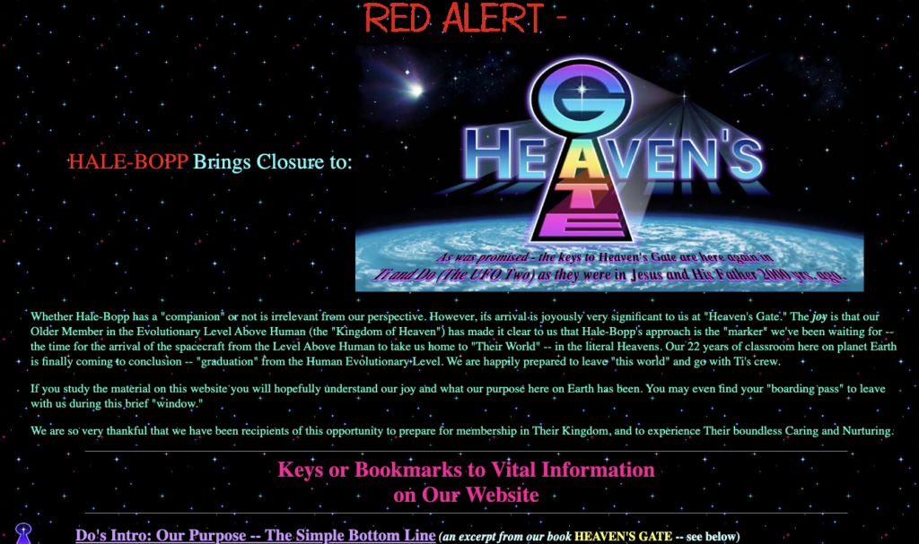
At first glance, this website looks like a fan site for a sci-fi movie or something. Sadly, it isn’t, and I can’t bring myself to say anything snarky about it because it’s really just tragic what happened to the 39 active members of the ufoist religious group, Heaven’s Gate.
You can dive into the rabbit hole here.
But their website is an on-point, 1990s-aesthetic dream. It’s giving Lisa Frank,
GeoCities, and early internet mystery vibes.
Those neon colors. That starry background. Those bold, clashing fonts and chunky buttons.
If you didn’t read the goodbye message on the page, you’d be hard-pressed not to find it strangely charming.
12. Coolmath Games

Back in 1997, a lady named Karen decided to make a very trippy website dedicated to making math cool.
Hence, Coolmath.com was born—and later Coolmathgames.com, which my 8-year-old visits practically daily in modern times, aka the mid-2020s.
Above, you’ll find the 1999 version of Karen’s surprisingly super-popular website.
Even though things look more up-to-date nowadays, there’s a hint of Karen’s 1990s flair in the contemporary website. A darker background, a list-heavy format, and bright graphics give it that classic feel.
Honestly, I’m here for it. And I don’t even like math.
What Defines a ‘90s Website?
Clearly, web design has come a long, long way since the 1990s.
Here’s a list of some features that make a 1990s website stand out:
- Neon colors and clashing backgrounds: Bright, often hard-to-read designs and web copy.
- GIFs everywhere: Spinning globes, “Under Construction” signs, and animated clip art galore.
- Table-based layouts: Content organized with rigid, blocky tables.
- Hit counters: Displays to count how many people visited the site.
- Marquee text and blinking elements: Scrolling or flashing text for extra fancy flair..
- Starry or patterned backgrounds: Visually overwhelming yet oddly charming.
- Basic fonts: Limited to system defaults like Times New Roman or Arial.
- Hyperlinked menus: Plain-text navigation with little design hierarchy.
Things are just so much easier on the eyes these days.
Looking back at the snafus of the 1990s makes you wonder, though.
What will web design look like in the 2050s? Will writers of the future look back at our oh-so-modern websites and cackle?
Or will design trend backward as it does in the clothing industry, with websites taking on a nostalgic 1990s flair?
Only time will tell.
Stay tuned for that 2050 listicle, folks.
Over and out.


