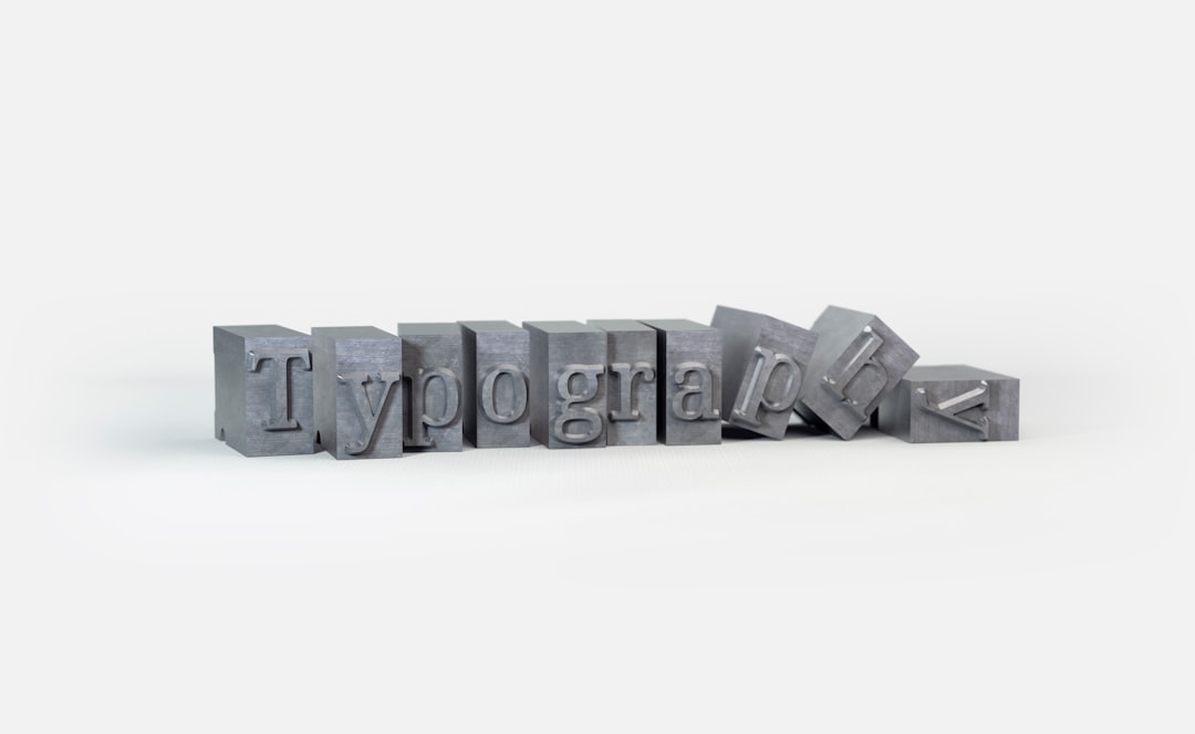
25 Must-Have Google Typeface Fonts for Every Project

Choosing the right font is crucial for creating a visually appealing and effective design. Google Fonts offers a vast library of typefaces, and I’ve carefully curated a selection of 25 stunning fonts that are not only versatile but also suitable for a variety of projects, whether it be web design, branding, or print media. Let’s explore these hand-picked fonts that can elevate your designs and make a lasting impression on your audience. From elegant serifs to modern sans-serifs, these fonts will provide the perfect typographic touch for your next creative endeavor.
Top Picks for Web Typography
Versatile Serif Fonts
Serif fonts are a timeless choice for web typography, offering a classic and elegant feel. They are particularly effective for long-form content, providing readability and sophistication. One standout is Merriweather, known for its readability on screens of all sizes. Playfair Display adds a touch of old-world charm, perfect for headers and titles. Lora combines a modern aesthetic with calligraphic roots, making it ideal for both body text and headlines. These serif fonts are not only visually appealing, but also versatile enough to be used across various digital platforms. Incorporating these fonts into your design can enhance user experience and create a cohesive, professional look. Explore the full range of Google Fonts to find the perfect serif for your project.

Modern Sans-Serif Fonts
Modern sans-serif fonts are a staple in web typography, known for their clean lines and minimalistic appeal. These fonts work well for digital interfaces, offering clarity and contemporary style. Roboto is a popular choice, providing geometric forms with friendly, open curves, making it versatile for any design. Open Sans offers a neutral yet approachable appearance, suitable for both text and headings. Montserrat captures the essence of urban typography, bringing a modern touch to any project. These fonts are highly legible, ensuring that content is easy to read on all devices. Leveraging these sans-serif options can help achieve a sleek, modern look that aligns with current design trends. Visit Google Fonts to explore these fonts and see how they can enhance your web projects with their versatile and dynamic attributes.

Creative Typography for Branding
Elegant Typeface Choices
Elegant typefaces are essential for branding projects that require a sophisticated and polished look. These fonts can elevate brand perception, conveying a sense of luxury and refinement. Cormorant Garamond is a timeless choice, offering delicate curves and fine details that add a classic touch. Playfair Display, with its high contrast and stylistic flair, is perfect for creating an upscale feel in logos and headings. Great Vibes delivers a flowing, cursive style ideal for adding a personal and elegant touch to invitations or boutique branding. These typefaces are not only visually striking but also versatile, allowing them to be used across various media, from print to digital. Incorporating these elegant fonts into your branding toolkit can help establish a strong, memorable identity. Explore these options on Google Fonts and see how they can transform your brand’s presence with their distinctive and graceful characteristics.

Unique Font Pairings
Unique font pairings are a powerful tool in creative typography, offering depth and contrast that can significantly enhance branding efforts. Combining fonts with differing personalities can create striking visuals that capture attention and communicate brand values effectively. For instance, pairing the bold and modern Oswald with the elegant Lora can result in a balanced and dynamic look. Raleway, with its sleek lines, pairs beautifully with the classic Roboto Slab, offering a contemporary twist on a traditional style. These combinations not only add visual interest but also help guide the viewer’s eye, improving readability and engagement. Experimenting with font pairings allows for creative expression while maintaining brand consistency. Google Fonts provides a wide array of typefaces to explore and mix, enabling designers to find the perfect pairing that aligns with their brand’s identity and messaging. Discover these possibilities to create compelling and memorable brand communications.

Essential Design Resources
Google Fonts in Action
Google Fonts offers a plethora of typefaces that come to life when applied in real-world projects. This resource is invaluable for designers seeking to enhance their creative typography toolkit. By integrating Google Fonts into web design, branding, or print materials, designers can achieve a cohesive and polished look. For example, using Noto Sans in a corporate website ensures readability and professionalism, while Lobster can add a playful touch to a restaurant menu. The real-time preview feature on Google Fonts allows designers to experiment with different styles and sizes, ensuring the best fit for their specific needs. Implementing these fonts is straightforward, with easy embedding options for websites or downloadable files for offline use. As part of your essential design resources, Google Fonts provides the flexibility to create engaging and accessible designs that resonate with diverse audiences. Explore how these fonts can transform your projects and deliver impactful visual communication.

Best Practices for Font Selection
Selecting the right font is crucial for effective design, affecting both aesthetics and readability. A thoughtful font selection can elevate your project, while a poor choice can undermine its impact. Start by considering the project’s purpose and audience. For web typography, prioritize legibility by choosing fonts like Open Sans or Roboto. Ensure consistency across different platforms, maintaining a uniform appearance. Limit your font choices to two or three to avoid visual clutter and maintain harmony. Pair fonts with complementary styles, such as a serif for headings and a sans-serif for body text, to create contrast and balance. Test your font choices across various devices and screen sizes to ensure accessibility and legibility. Additionally, consider the cultural connotations of fonts, ensuring they align with the intended message. By adhering to these best practices, your font selection will effectively enhance your design, conveying the right tone and improving user experience.