25 Best Blogs For Your Inspiration 2024

Welcome to our collection of the best blogs to help you gain new ideas when building yours.
We covered everything from super minimalist designs to more advanced ones, light and dark.
Also, you’ll find personal, travel, food, tech, and many other types of blogs, so there’s something for everyone.
Building a blog is easy nowadays; you don’t need coding and design experience to make it happen.
You can choose either a WordPress blog theme or a website builder for blogs and start immediately.
Now let’s together check these awesome blog examples.
Best Blogs & Examples To Inspire You
1. Deem Journal
Built with: Squarespace
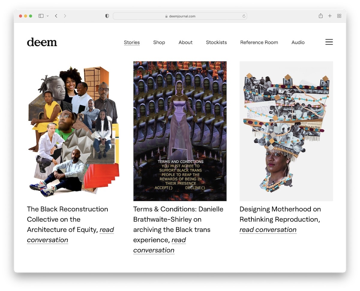
Deem Journal has a bold grid-style home page with multiple stories you can click on and read further.
The header disappears when you start scrolling but reappears on the back scroll. What’s also interesting is that this blog doesn’t have a footer.
Note: Remove the footer if you want to create a cleaner look.
2. Meiwen See
Built with: Squarespace
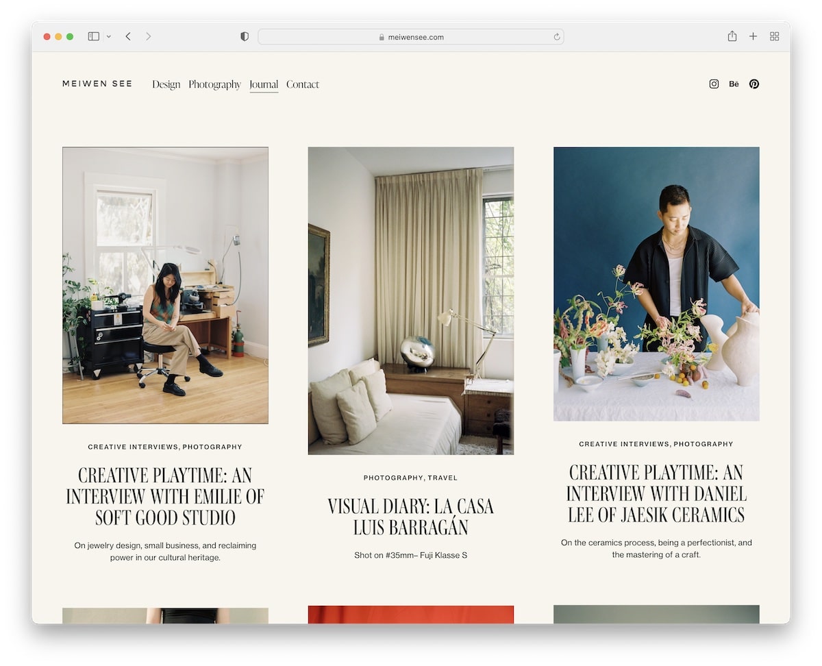
Meiwen See’s online journal is minimalist, with a modern design and some cool animations that spice up the experience.
While most thumbnails are static, one is animated, switching between two images for added engagement.
There’s also a very large section with a newsletter subscription form that no one can miss.
Note: Collect leads and turn them into loyal blog readers via email marketing.
3. One Mag
Built with: Squarespace
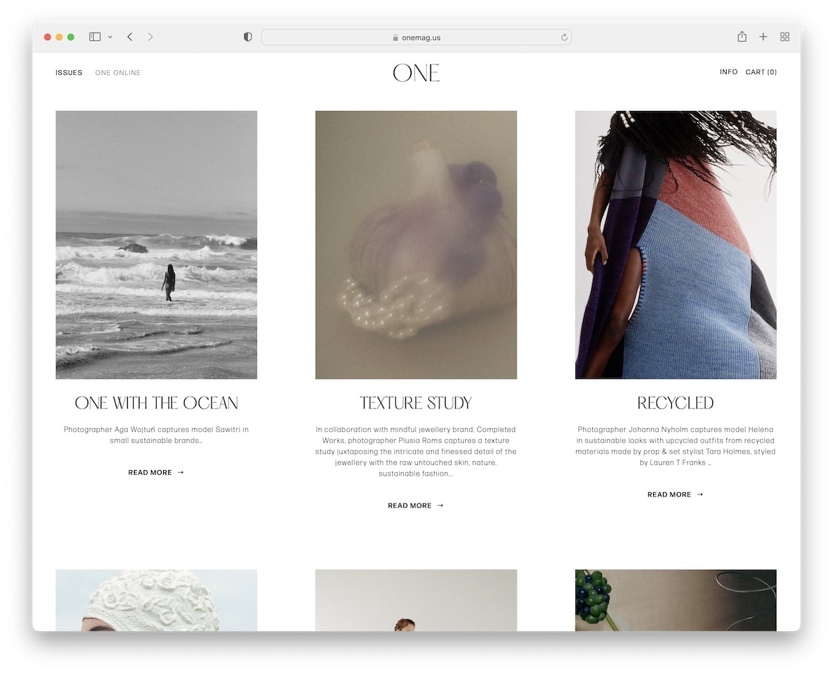
One Mag keeps things very clean with its blog section, ensuring everyone enjoys the content without distraction.
The header and footer feel one with the website’s base, giving it a more pristine look.
Note: Keep the flow intact from header to footer without making the two stand out.
4. Flourist Recipes
Built with: Shopify
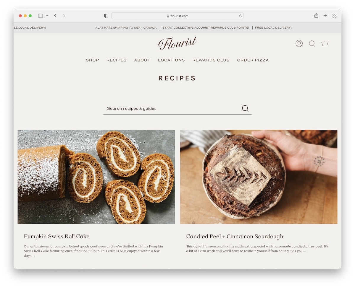
Flourist Recipes’s food blog design has two columns with a search bar at the top to find recipes and guides faster.
The page features a sliding top bar with notifications and a floating header with a mega menu for quick access.
Moreover, individual posts are very clean, with a sticky sidebar so you can click on related products and recent articles anytime.
Note: Use a mega menu if you have a lot of content going on.
You may also be interested in our guide on how to start a food blog today with WordPress.
5. Urban Beardsman
Built with: Shopify
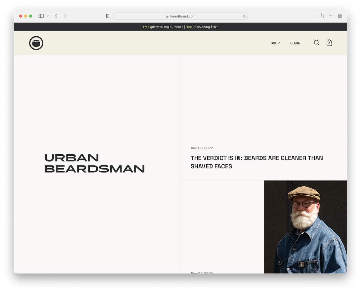
Urban Beardsman’s blog is unlike any other we added to this collection of epic examples.
It has a split-screen design with a sticky left section and a right scrolling section where you can find the latest posts.
Each post thumbnail also features a split design with the title and date on the left and the image on the right.
Note: A split-screen blog design (like Urban Beardsman’s) can work really well for brands.
6. Concept Kicks
Built with: Squarespace
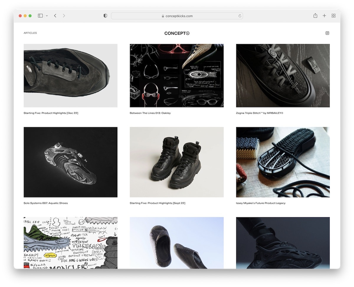
Concept Kicks runs a clean grid-style blog with a floating header focusing on the images and not so much on the text. Post titles are tiny compared to the visual content but work so well for this minimal look.
The blog also features a very simplistic footer with a menu and copyright text.
Note: Let everyone appreciate images more with larger thumbnails.
7. Zion Adventure Photog
Built with: Wix
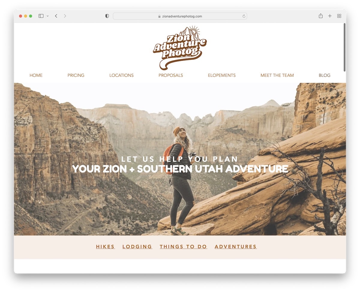
We’ve seen a few simple and clean blogs, but Zion Adventure Photog is the opposite.
It has a full-width parallax banner that continues with various sections that give access to must-read content.
Zion Adventure Photog also has a cool Instagram feed that opens posts in popups.
Note: Use your blog to build IG followers with a catchy feed.
8. Traveling Mitch
Built with: Squarespace
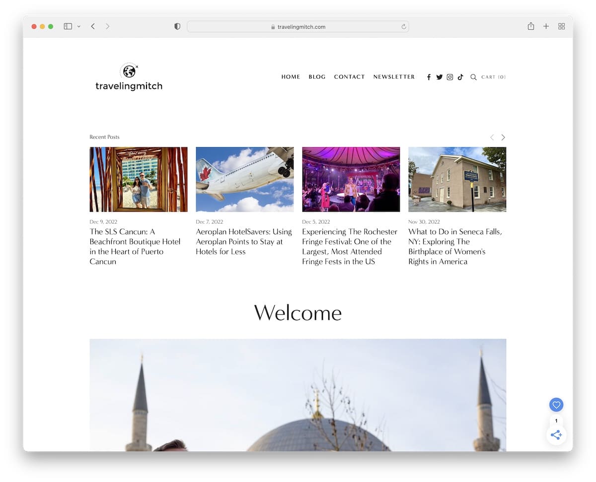
Traveling Mitch made his blog’s home page practical, using multiple sections to showcase recent posts and various categories.
But he also added a short introduction of who he is and his project with an image to make it more personal.
Note: Introduce and show yourself if you run a personal blog to get on a more (yup!) personal level with your fans.
9. The Good Trade
Built with: Squarespace
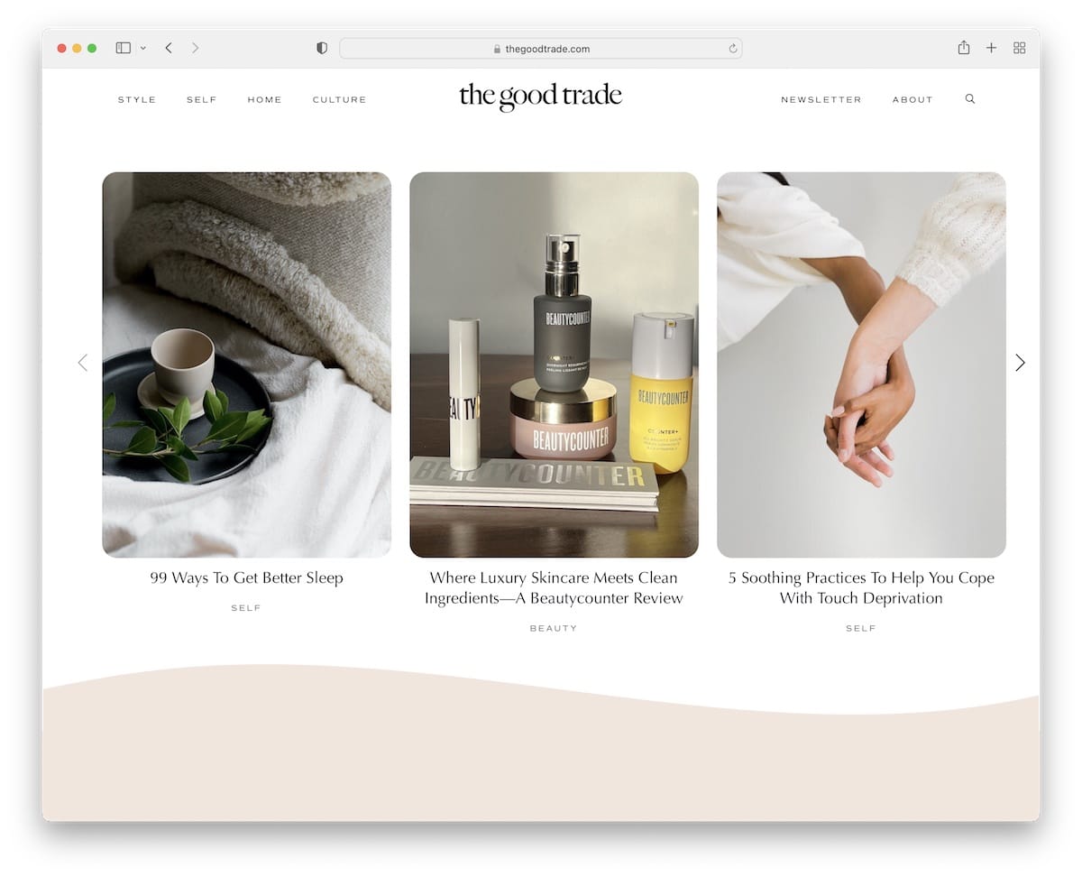
The Good Trade starts with three recent posts so that the visitor can start with fresh content. Next is a newsletter subscription form with text explaining how they use email marketing.
The Good Trade uses floating navigation with a drop-down menu to reach other pages and categories without the need to scroll back to the top.
Note: Put more shine on your latest articles by placing them above the fold.
10. Cookie And Kate
Built with: Magazine Pro Theme
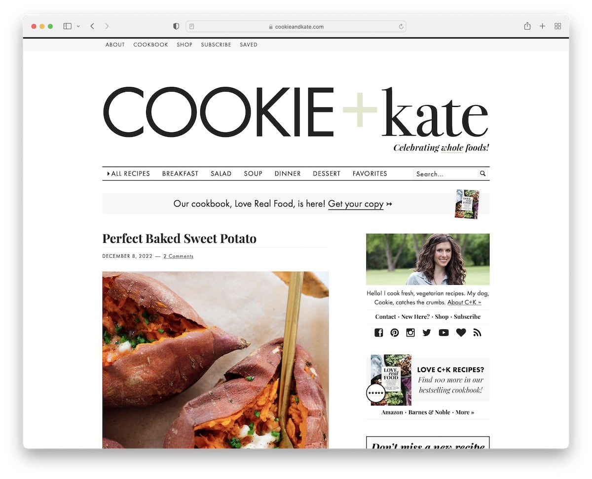
Cookie And Kate is a more traditional blog with a large header (with a menu and a search bar) and a top bar with additional links.
Each post’s excerpt is pretty extensive, revealing more than just a sneak peek. Furthermore, the sidebar consists of multiple widgets and an ad banner that sticks to your screen while you scroll.
Note: Give the reader a reason to click and read the full blog post with a longer excerpt.
Do you need more WordPress food blog themes? We have an entire collection ready for you.
11. Quotient Social Influencer Network
Built with: Squarespace
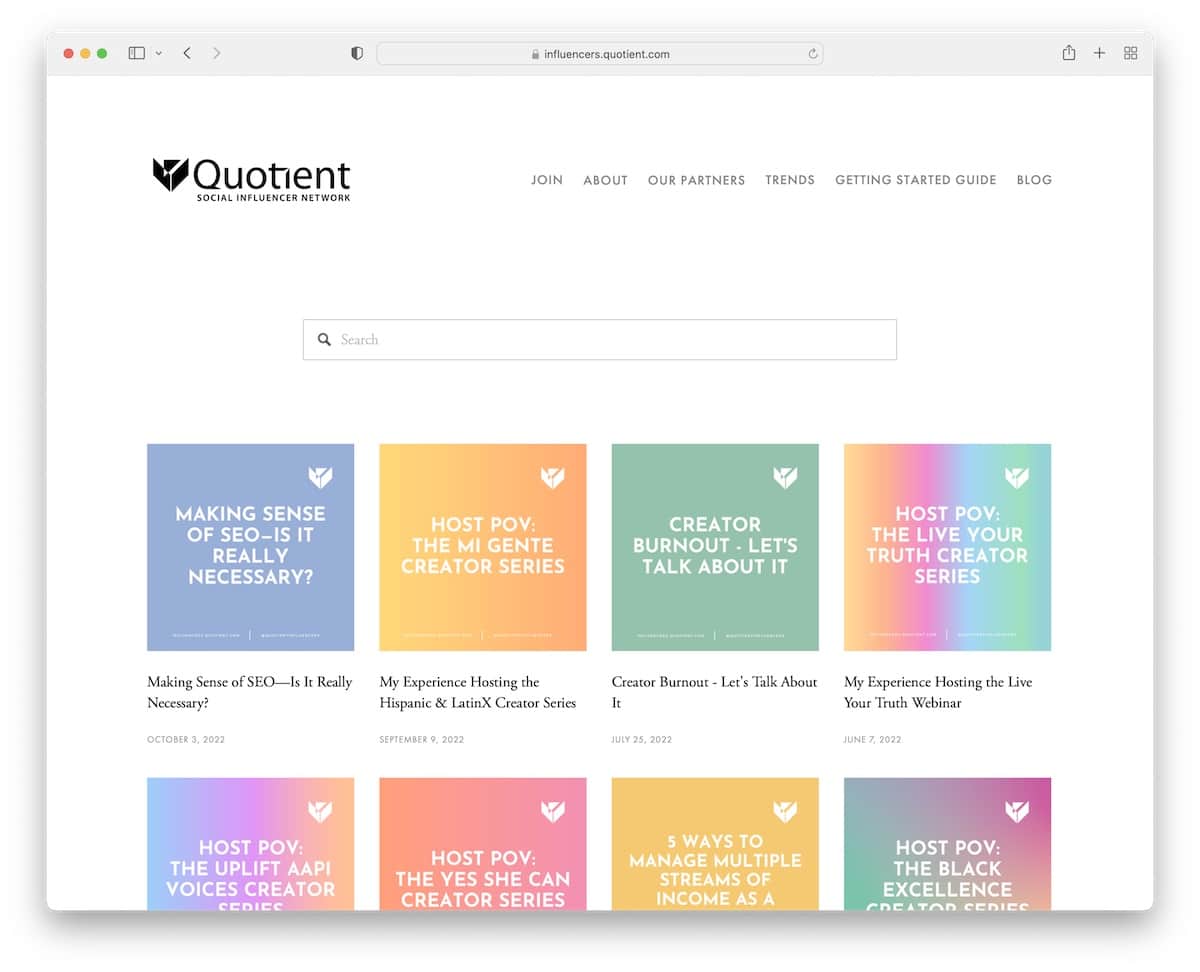
Quotient Social Influencer Network has a vibrant post thumbnail grid that keeps the minimalist appearance more dynamic.
The header is simple, with a menu with a cool hover effect, highlighting the current element and drop-down.
Also, the live search function makes finding desired articles quicker.
Note: Use the live search to boost your blog’s user experience.
12. Unlikely Dad
Built with: Squarespace

Unlikely Dad is a three-column blog with a right sidebar and a minimalist header. As for the footer, you’ll find a full archive of blog posts by month and social icons.
Individual posts give a cleaner look without the sidebar.
Note: A three-column blog with thumbnails, titles and excerpts gives the visitors more reasons to click and read.
13. Olivia Bossert
Built with: Squarespace

Olivia Bossert’s blog section features posts with a two-column layout featuring the date, the title and the read more button.
The header and footer are simplistic and blend nicely with the white background.
Note: Posts with huge thumbnails keep the minimalist design in balance.
14. HubSpot Blog
Built with: HubSpot CMS

With the massiveness of the HubSpot Blog, they know exactly what they’re doing to keep the readers around.
The layout is more magazine-like, with a white background and multiple sections and elements, delivering content in different categories.
The sticky header features a mega menu and a search function that opens a full-screen live search.
Note: Keep the design light and simple if you plan to push a lot of content.
15. Cover Mum
Built with: Squarespace
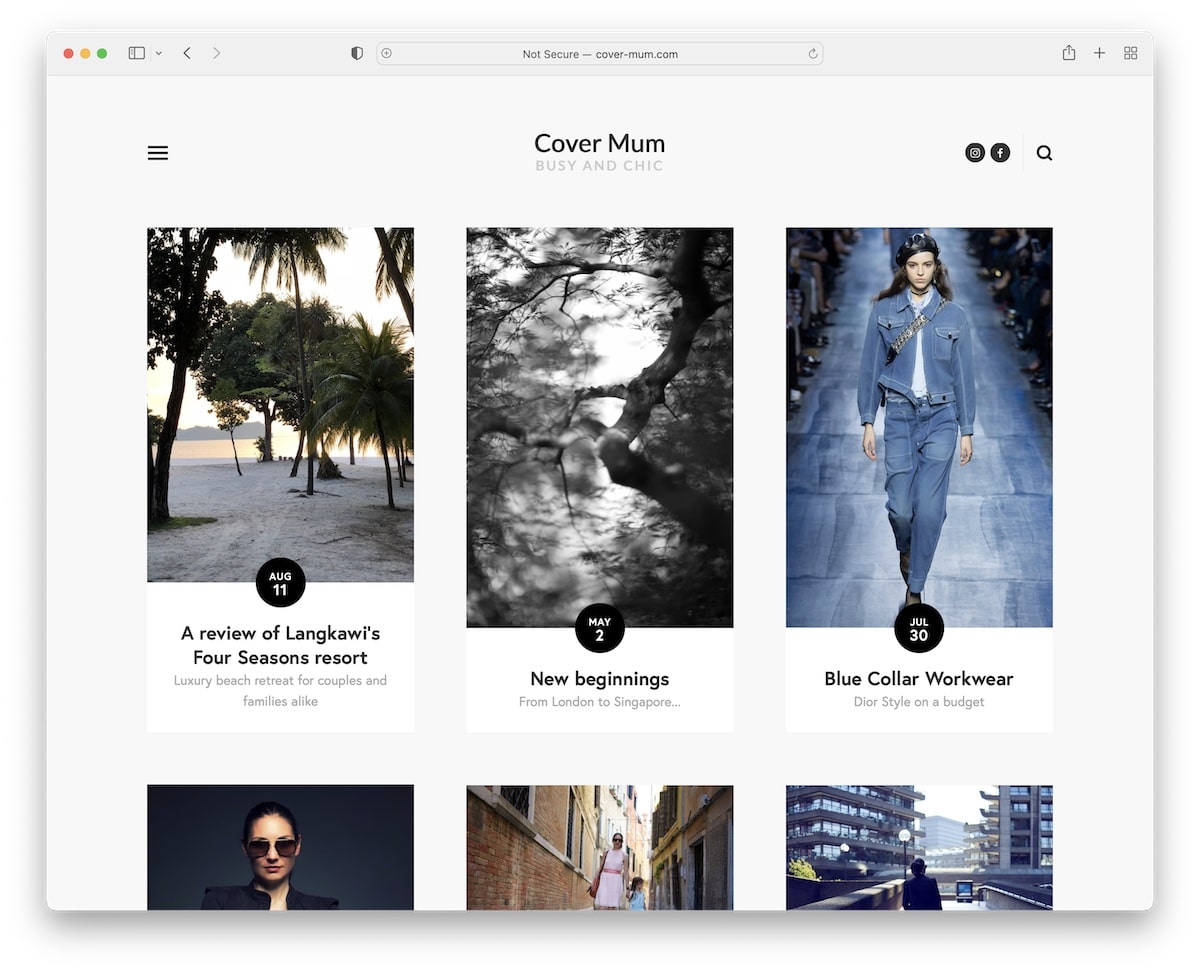
Cover Mum maintains its simplicity with a clean header, using a hamburger menu icon that slides in from the left sidebar.
The base of the blog features a three-column grid with a load more button.
And while the footer is clean, it also features a newsletter subscription and contact forms with IG and FB icons.
Note: Hamburger menu icon is great if you want to simplify the header.
16. The Verge
Built with: Chorus

Its dark design instantly makes The Verge different from other blogs on this list, which creates a more premium feel.
The home page is stuffed with much content, but its sectioned structure makes it more readable. Also, the sticky elements are unique and spice things up with their vivid background colors.
Note: If everyone uses a white or light blog design, you can do a black or dark one.
With these tech blog WordPress themes, you can also build a similar blog/magazine.
17. Minimalism
Built with: Kirby

We’ve seen a similar split-screen layout design in Urban Beardsmen, but – hence the name – Minimalism got rid of all the “fancy” stuff, keeping it minimalist to the core.
Text only.
The sidebar header/menu is another element that Minimalism does differently than most.
Note: Use a sidebar header for a more refreshing touch.
18. Girlboss
Built with: Shopify
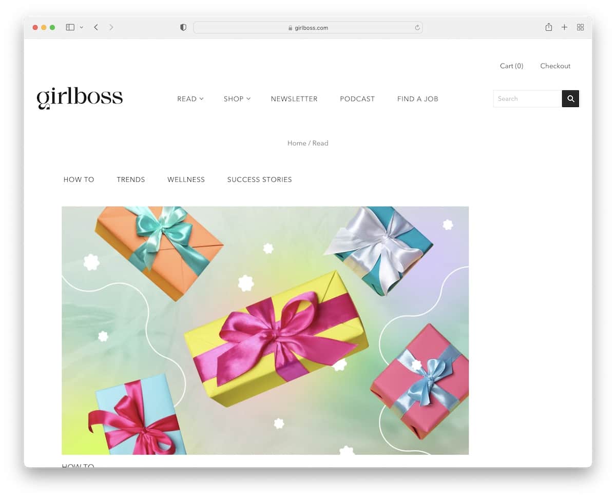
Girlboss knows how to do things with readability and cleanness in mind, even though you’ll find lots of blog posts on the home page.
There’s also a catchy “Get the Girlboss daily” section that promotes their newsletter. We also like the black background footer, while the rest of the website uses white.
Note: Make the footer stand out more with a bold background color.
19. He Spoke Style
Built with: Shopkeeper Theme

He Spoke Style is a beautiful blog/magazine website with bold, heavily image-focused elements. Every post thumbnail reacts on hover, so you know you’re clicking right.
Moreover, He Spoke Style has floating navigation with a mega menu to reach different page sections without scrolling back to the top.
Also, they use a top bar notification that you can close by pressing “x.”
Note: Use a top bar for special announcements, latest posts, etc.
20. Anywhere We Roam
Built with: Uncode
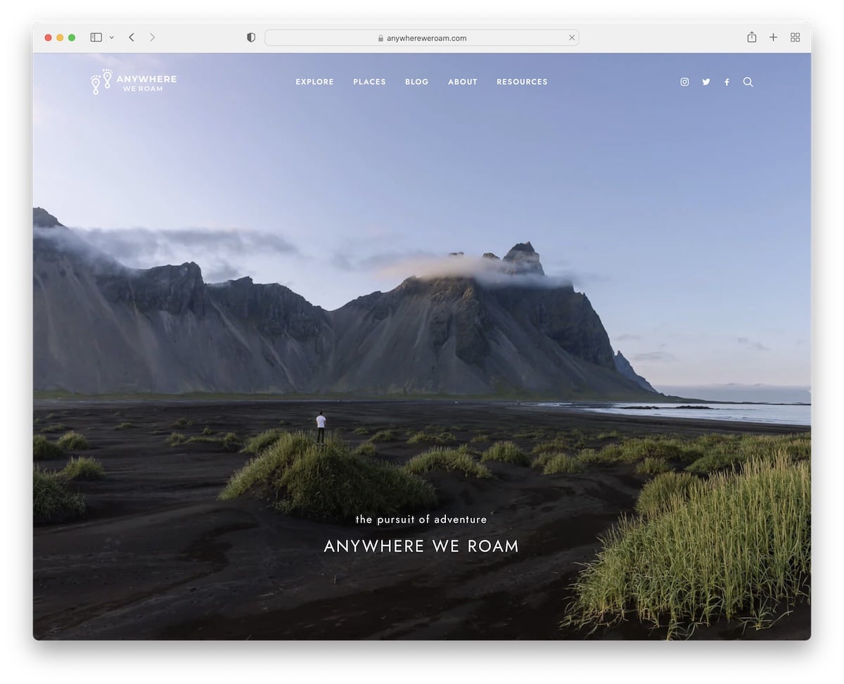
Anywhere We Roam starts with a full-screen image background, transparent header, and simple text.
The header sticks to the top and the blog continues with a great scrolling experience, thanks to a lot of white space.
You’ll also notice a bottom advertisement banner that you can freely close.
Note: If you’re using sticky ad banners, allow the reader to close them to kill the distraction.
21. David duChemin
Built with: X Theme

David duChemin’s blog has a very content-rich hero section with the top four banners (which he uses to promote his content/products), a header and a slider with parallax effect.
On the other hand, the footer only contains copyright text and social media icons.
The rest of the blog has a classic look with a right sidebar.
Note: Add a special section above the header if you want to push products, content and services.
Don’t miss checking some other excellent WordPress photography blog theme alternatives.
22. Photofocus
Built with: Elementor
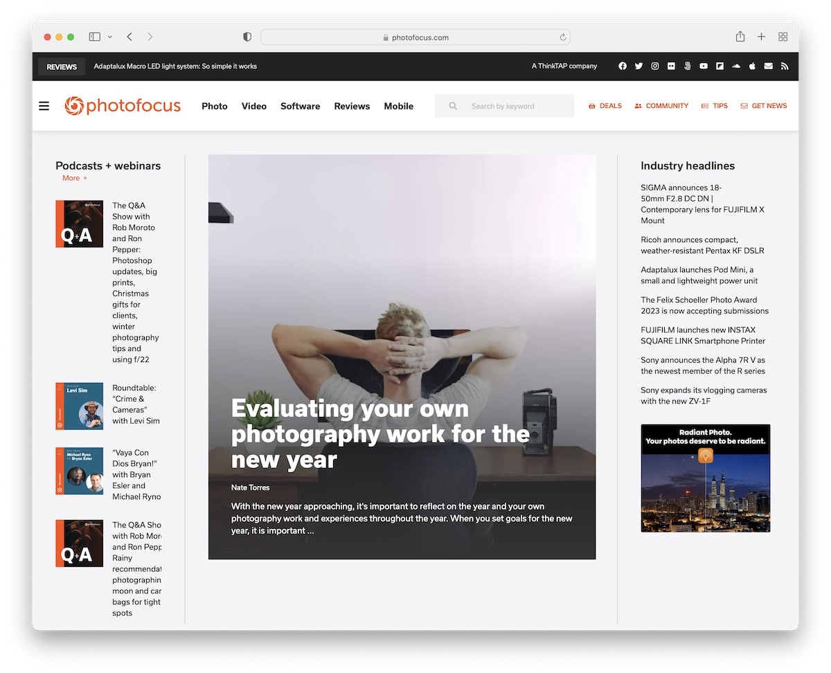
Photofocus is a modern blog/news page that, somewhat similar to David’s blog, starts with four banners promoting podcasts and webinars (but below the header).
The header features a hamburger icon that opens a full-screen menu overlay with a search bar and social icons.
The sidebar ends with a newsletter subscription widget that sticks to the screen when you scroll. There’s also a back-to-top button, but the floating header might be even more useful.
Note: Use a full-screen menu overlay where you feature other elements besides the navigation (like social links).
You may also be interested in checking our collection of WordPress blogs.
23. Abduzeedo
Built with: Drupal
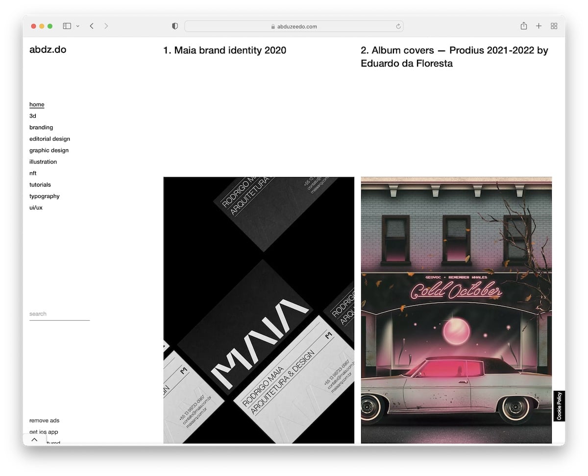
Two main things make Abduzeedo stand out: minimalist design and sticky sidebar header/menu.
Like Anywhere We Roam, it also has a sticky bottom advertisement that you can easily hide for a more distraction-free reading.
Also, Abduzeedo doesn’t have a footer.
Note: You can avoid adding a footer with a sticky sidebar header.
24. Help Scout
Built with: Gatsby
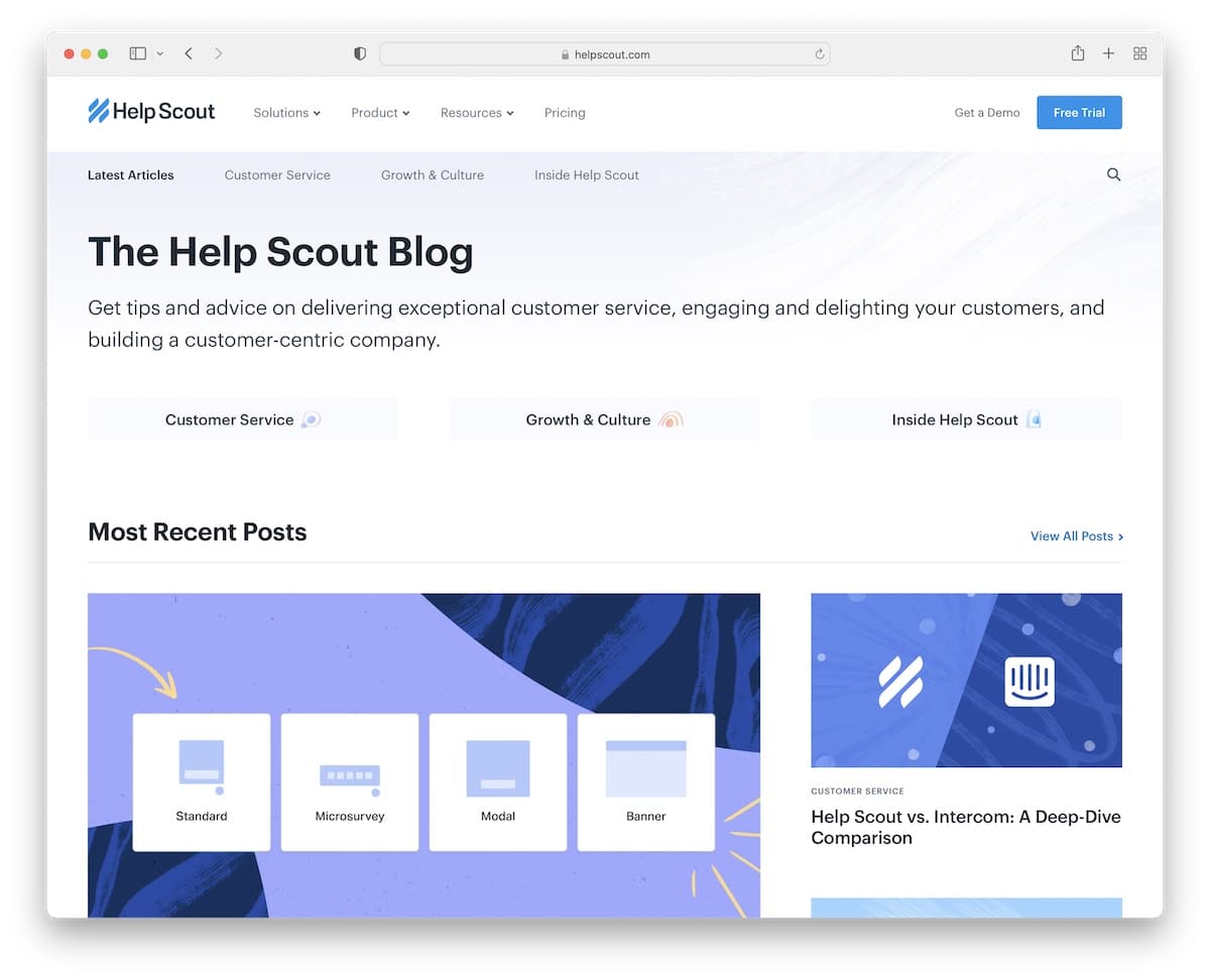
Help Scout’s blog has a modern and clean design with a title and text explaining what to expect from it.
It is broken down into multiple sections that cover recent posts, editor’s picks and some of the categories.
Individual posts don’t have a sidebar but feature floating sidebar social media icons.
Note: Get more people to share your content, get in touch, and more with floating sidebar icons.
25. Pando
Built with: Webflow
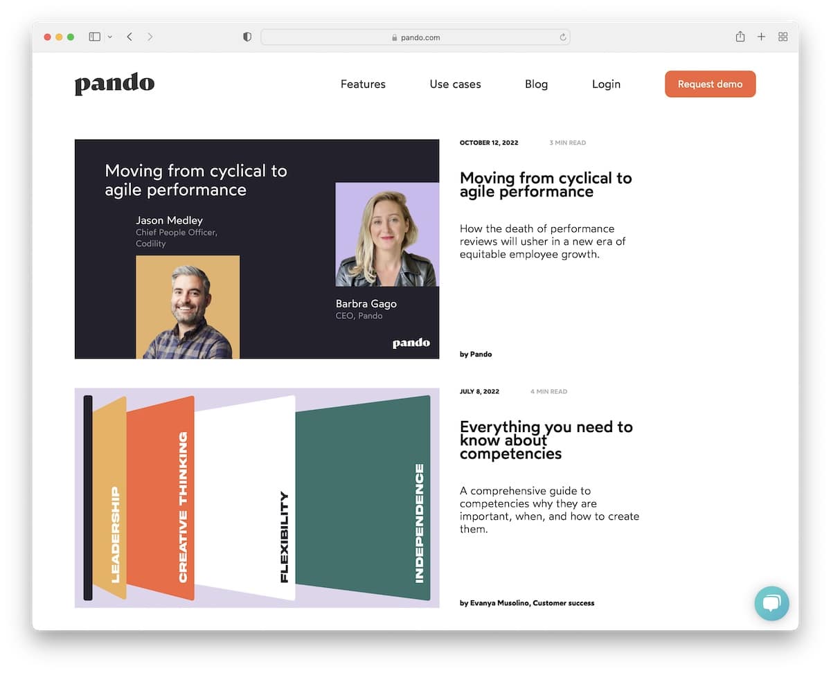
Pando keeps the header and the base of the blog on the same white background without anything separating them for a refiner presence. But the footer has a dark design that easily grabs the eye’s attention.
The blog features one blog post with a large thumbnail, title and excerpt per row.
Note: Emphasize your blog posts more Pando style.
Was this article helpful?
YesNo


