23 Best Food Websites (Examples) 2024
Are you ready to view the best food websites to enjoy great design and gain inspiration?
Trust us, our mouths watered more often than not when examining 100+ pages in the food industry.
With various types of websites, we covered as many as possible with this EPIC collection.
Whether you want to check beautiful food blog designs or top-notch business websites – we have something for everyone.
And if you are building a website yourself, we recommend picking a food WordPress theme.
You don’t need to code but still have complete creative freedom to build your dream food page.
Best Food Websites & Web Design Ideas
1. Brew Tea Co
Built with: Squarespace
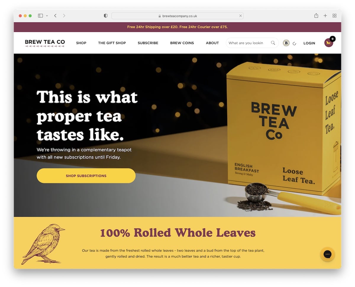
Brew Tea Co is a food website with a pop-up window promoting a special offer in exchange for an email.
The page has great branding that makes this responsive web design a pleasure to scroll through. It uses a handy mega menu and a footer with all the additional links and info (+ a newsletter subscription form).
We also like the live chat widget in the bottom right corner, which can promote sales.
Note: Provide the best customer service with a live chat function.
By the way, we’re sure you’ll also enjoy checking these Squarespace website examples.
2. Pierre Thiam
Built with: Squarespace
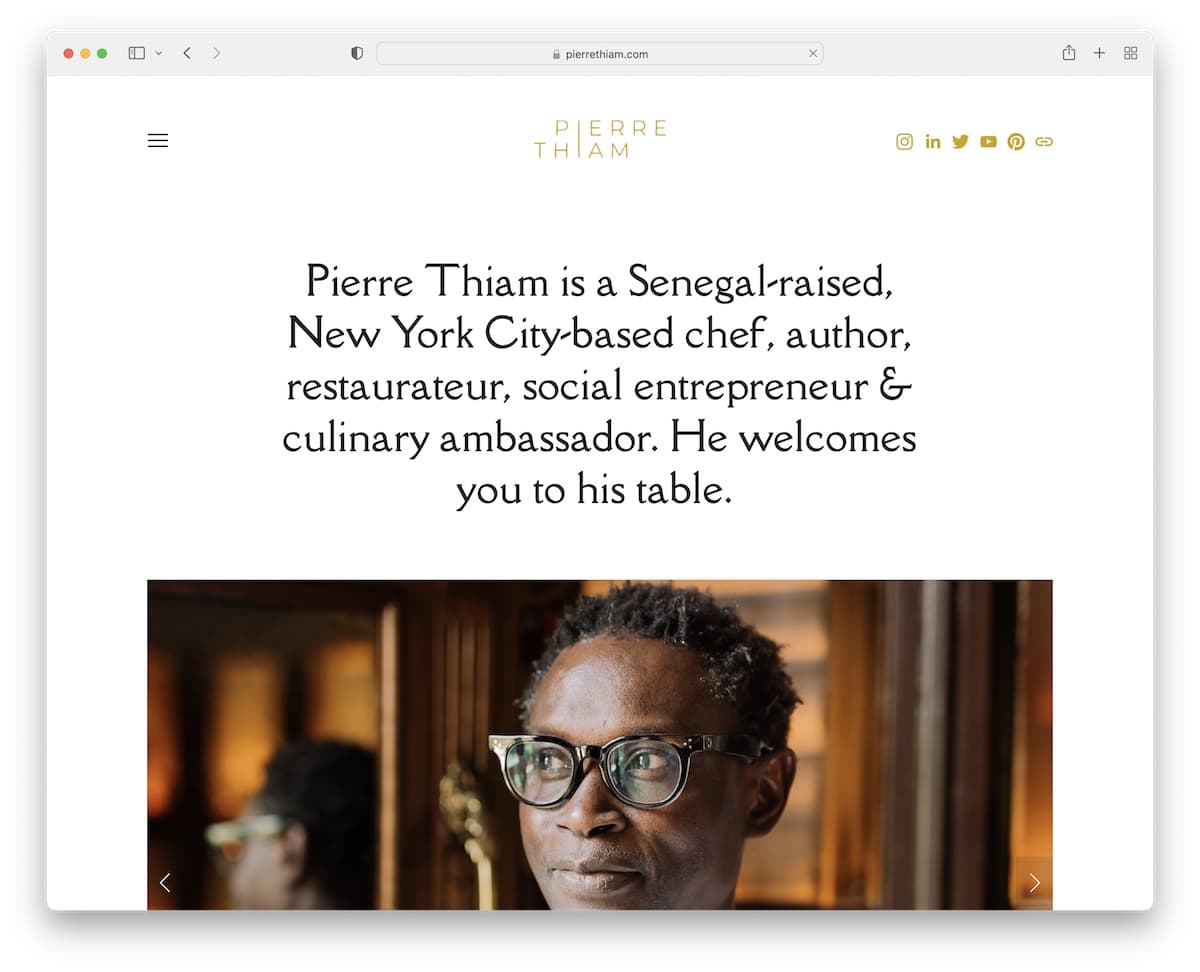
Pierre Thiam runs a minimalist website with a floating header and a hamburger menu that also has a call-to-action (CTA) button linking to the contact page. The header and the footer have social media buttons to connect with Pierre more easily.
Starting a food website with text and then a slider isn’t too common, which is a great strategy to make yours pop more.
Note: Show how sociable you are by having social media icon in the navigation bar (and footer).
3. Jones Bar-B-Q
Built with: Squarespace
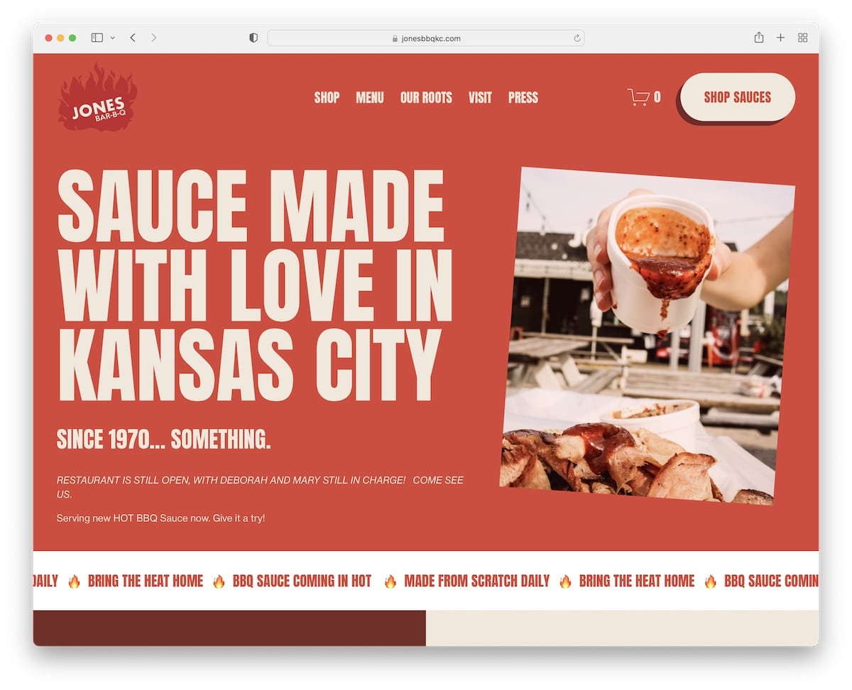
Jones Bar-B-Q has strong branding with catchy scrolling and lots of white space, so the content stands out more.
This food website example has a header that disappears on scroll but reappears when you scroll back to the top. (This is handy for better browsing because of fewer distractions.)
The sliding text below the hero section works as an attention-grabbing effect, with another before the subscription form promoting their Instagram page.
Note: Use your branding across your entire website to remind visitors of, well, your brand.
4. Kettle & Fire
Built with: Shopify
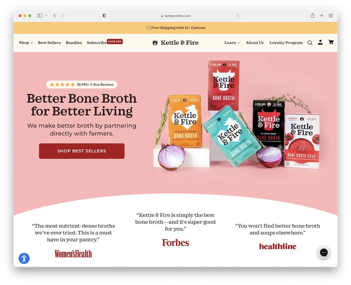
Kettle & Fire is a modern and trendy food website with a touch of minimalism to ensure the ultimate user experience.
The hero image features their best sellers with a CTA to the store and star reviews that prove the quality of the product.
Kettle & Fire ensures everything is easily reachable with the floating mega menu, with the footer providing other links, social media connection and a subscription form that promotes a coupon.
This website also has accessibility adjustments to modify how you want to view their website.
Note: Let your potential customers customize your website with the accessibility configurator.
5. Martha Stewart
Built with: Drupal
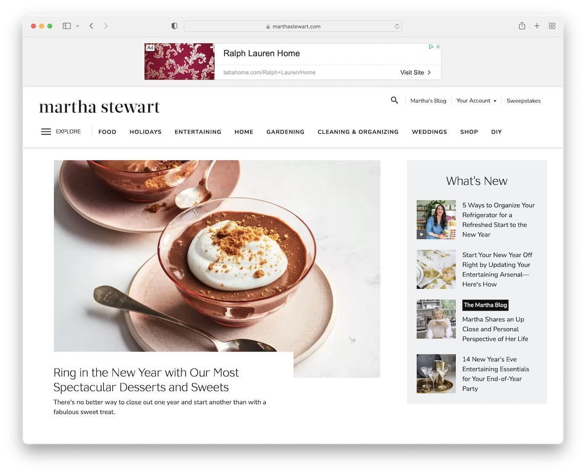
Martha Stewart is an online food magazine website with a light design and plenty of white space for a great readability experience.
It has one of the more unique menus that almost feels like a website within a website once the popup opens.
The page also has a sticky header, including the banner ad, so navigation is always available.
Note: Use a sticky header/menu and increase your food site’s user experience.
6. Flourist Recipes
Built with: Shopify
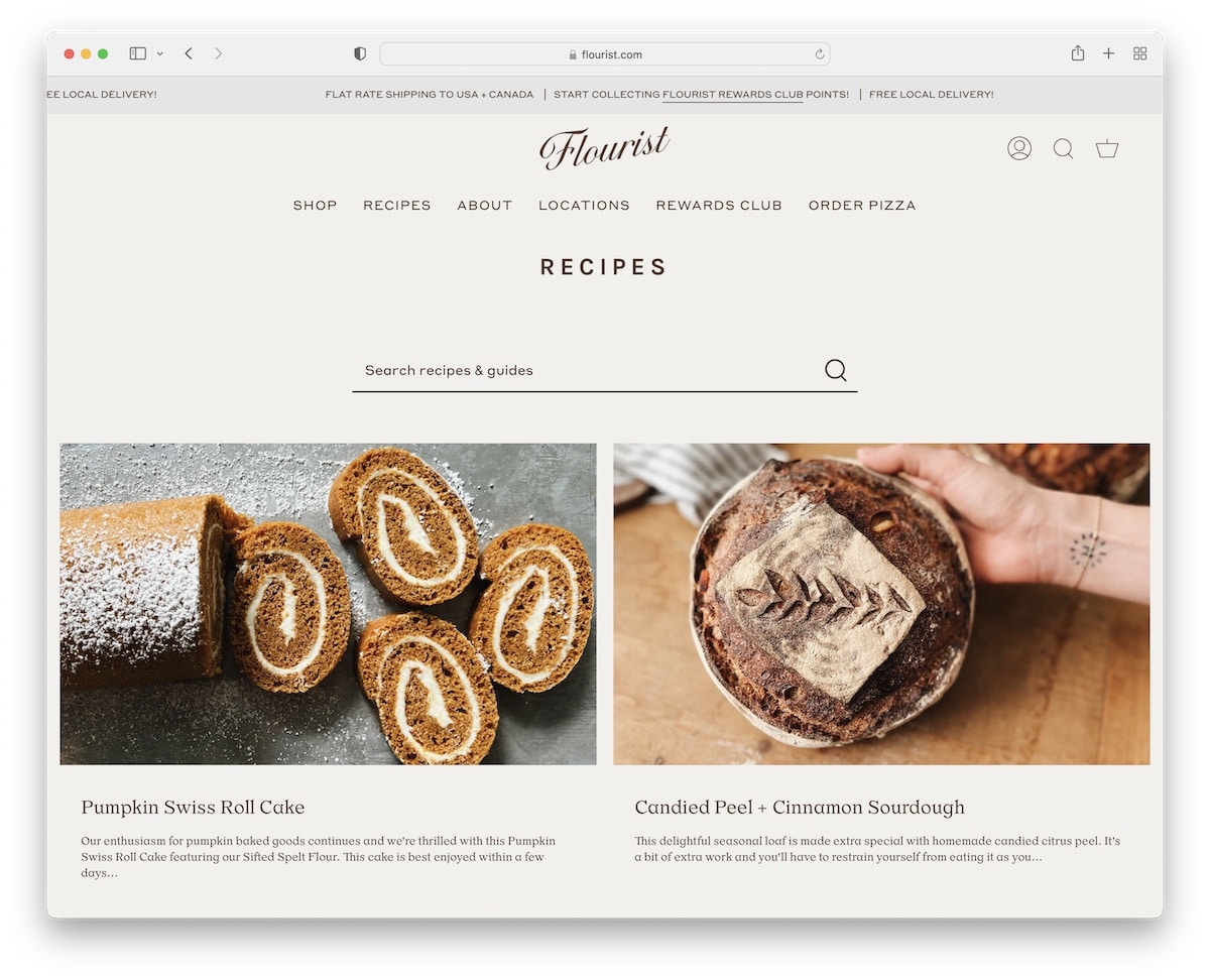
If the previous website had a magazine-like layout, Flourist Recipes has a blog look with a two-column grid structure.
The website features an animated top bar and a floating header with a mega menu.
The overall site design is minimalist, including the footer with three columns with menu and social links and a newsletter subscription form.
Note: Use a mega menu to add links and images to enhance your website’s navigation.
We also have a full list of the best Shopify websites for more terrific examples.
7. Cookie And Kate
Built with: Magazine Pro Theme
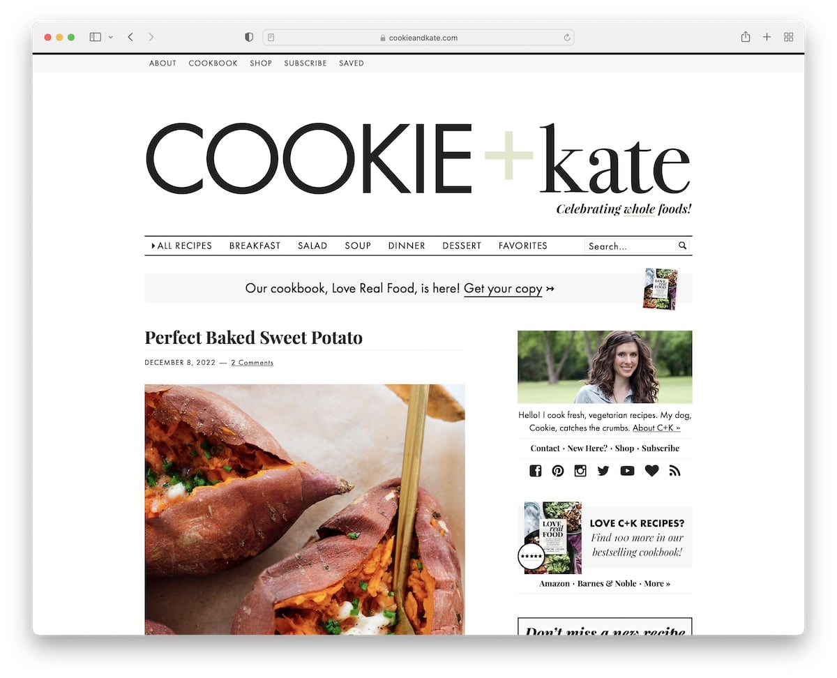
Cookie And Kate is a minimalist food blog website with top bar links, a large header with a logo and a navigation bar.
The blog has a right sidebar with a sticky banner ad to increase click-through rates.
What is unique about Cookie And Kate is the extensive blog excerpts, which are not often seen.
Note: Give more information and content about blog posts to make them more clickable.
Remember, you can build a similar website fast with any of these WordPress food blog themes. (However, our guide on how to start a good blog with WordPress will help you do it successfully.)
8. Laird Superfood
Built with: Shopify
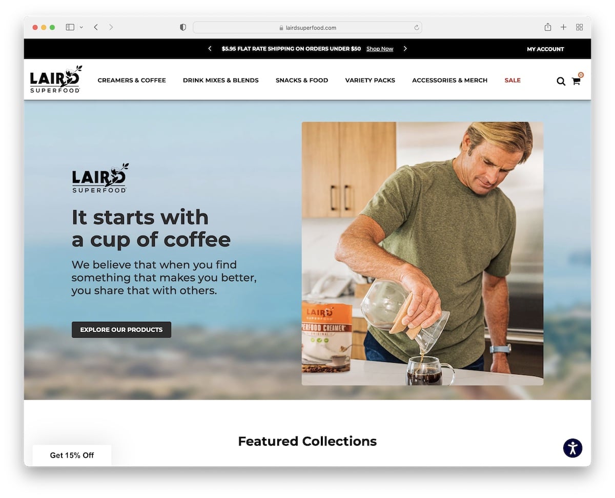
Laird Superfood has a top bar notification slider with links and the “my account” drop-down for quick profile access.
The navigation bar is simple but has a mega menu with links and images. From sliders and carousels to testimonials and accessibility adjustments, Laird Superfood thought of everything.
This food website also has an Instagram feed slider that features client images with an option to purchase the particular item the post features.
Note: Use an IG feed with shop functionality.
9. GT’s
Built with: Shopify
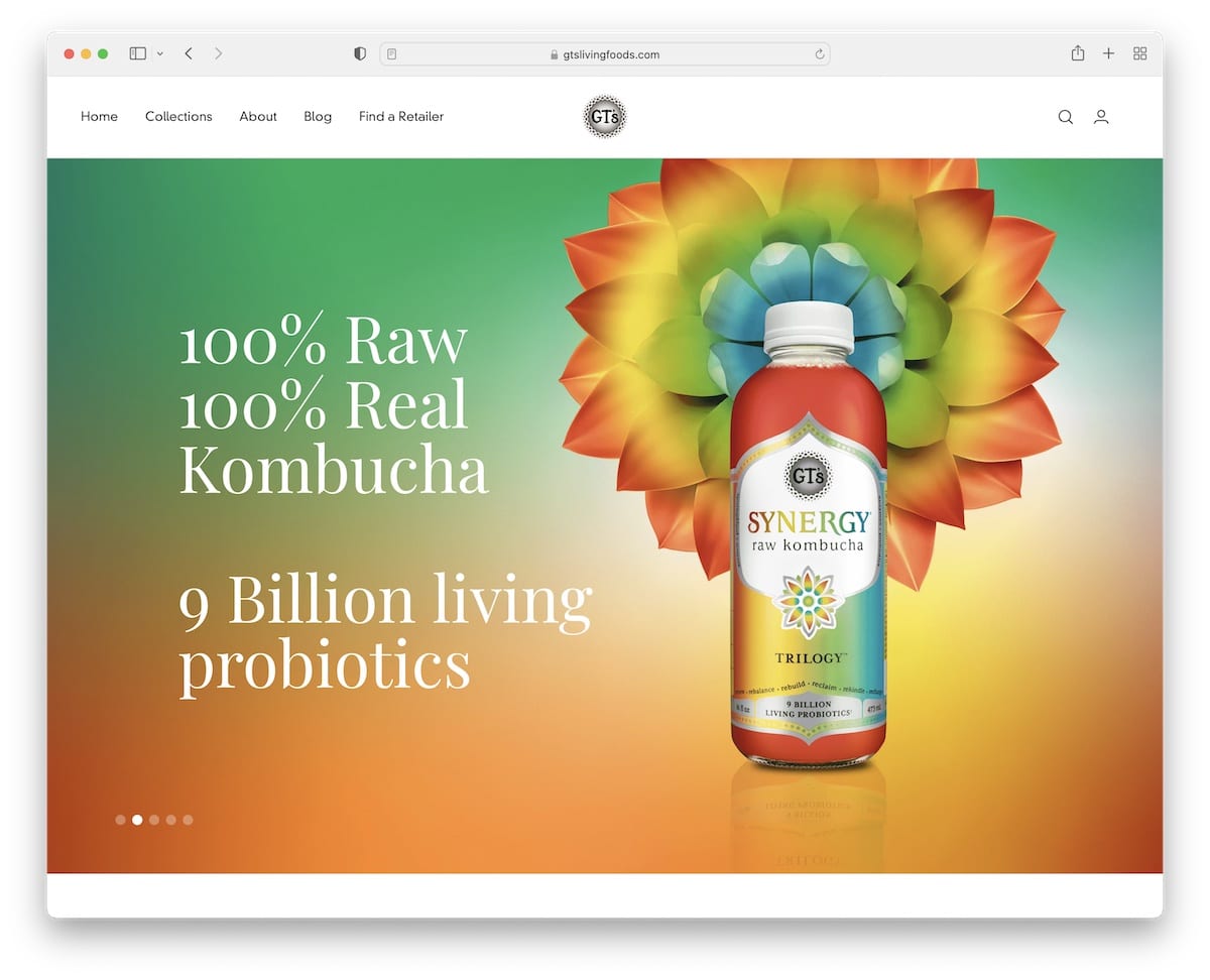
GT’s has a massive slideshow above-the-fold with titles and CTA buttons.
The header is minimalist, but the navigation has mega menu functionality, which is an excellent way to find the right items. Plus, there’s a sidebar search with live results for quick finds.
Moreover, the footer has five columns with menu links, social media buttons and a newsletter subscription widget.
Note: Grow your email list by inserting a subscription form (somewhere on your website).
10. Jus Jus
Built with: Squarespace
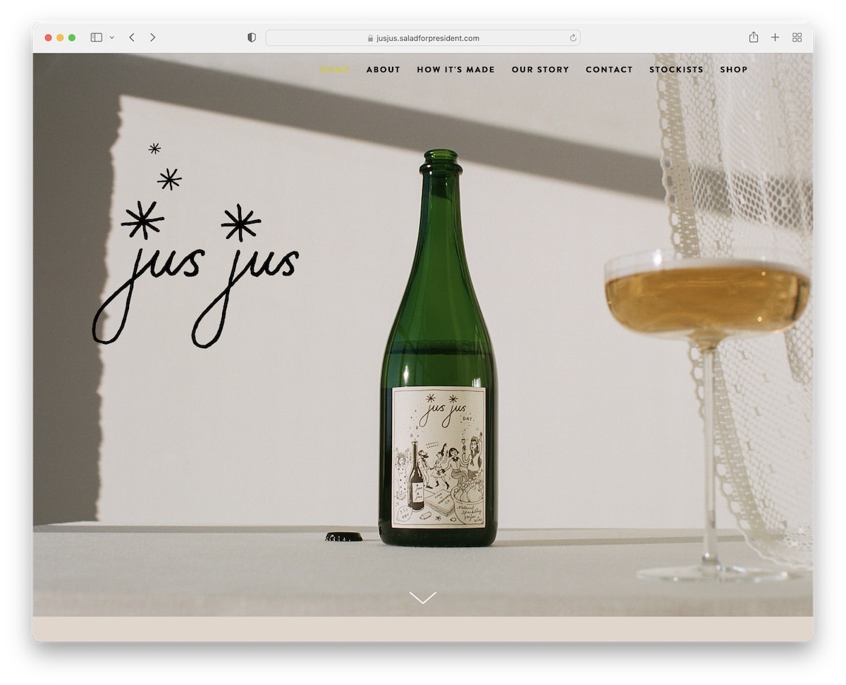
The large hero image with cool animation but no sales element differentiates Jus Jus from the rest of the food websites on this list. The header is transparent to keep the appearance cleaner even when you scroll.
The floating navigation lets you jump from section to section to learn about the brand. Even though Jus Jus uses a lot of text, it also uses a lot of white space, which creates an enjoyable atmosphere.
Note: Start your single-product website with a large image of the product. (And spice it up with animation.)
This website looks professional, but did you know you can build one using our Squarespace food website templates?
11. Bandits
Built with: Squarespace
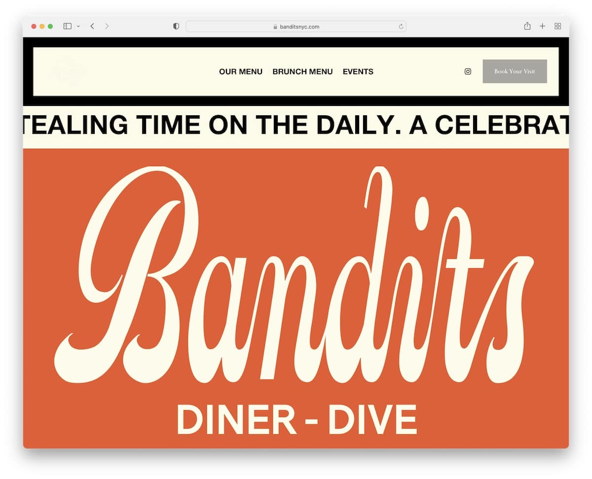
Bandits creates a bold first impression with large text on a solid background (the sliding text also contributes to this).
The header/menu disappears/reappears depending on your scrolling movement to always have access to it. The header also has a CTA button for bookings, which is very practical.
This food website doesn’t use a traditional footer but features an image of a cocktail and text to convince you to pay them a visit.
Note: Use a “book now” button in the (sticky) header.
12. ManiLife
Built with: Shopify
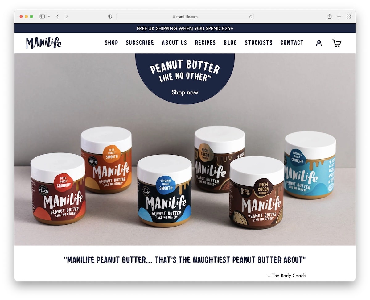
ManiLife has a full-screen image background slider with CTA buttons and, uniquely, client feedback text to make it less promotional.
The top bar promotes free shipping, while the header only reappears when scrolling back to the top.
ManiLife also has a featured products carousel, a testimonials slider and a section with authorities’ logos.
Note: Build social proof with testimonials, reviews and PR mentions/authority logos.
13. Ocelot Chocolate
Built with: Squarespace
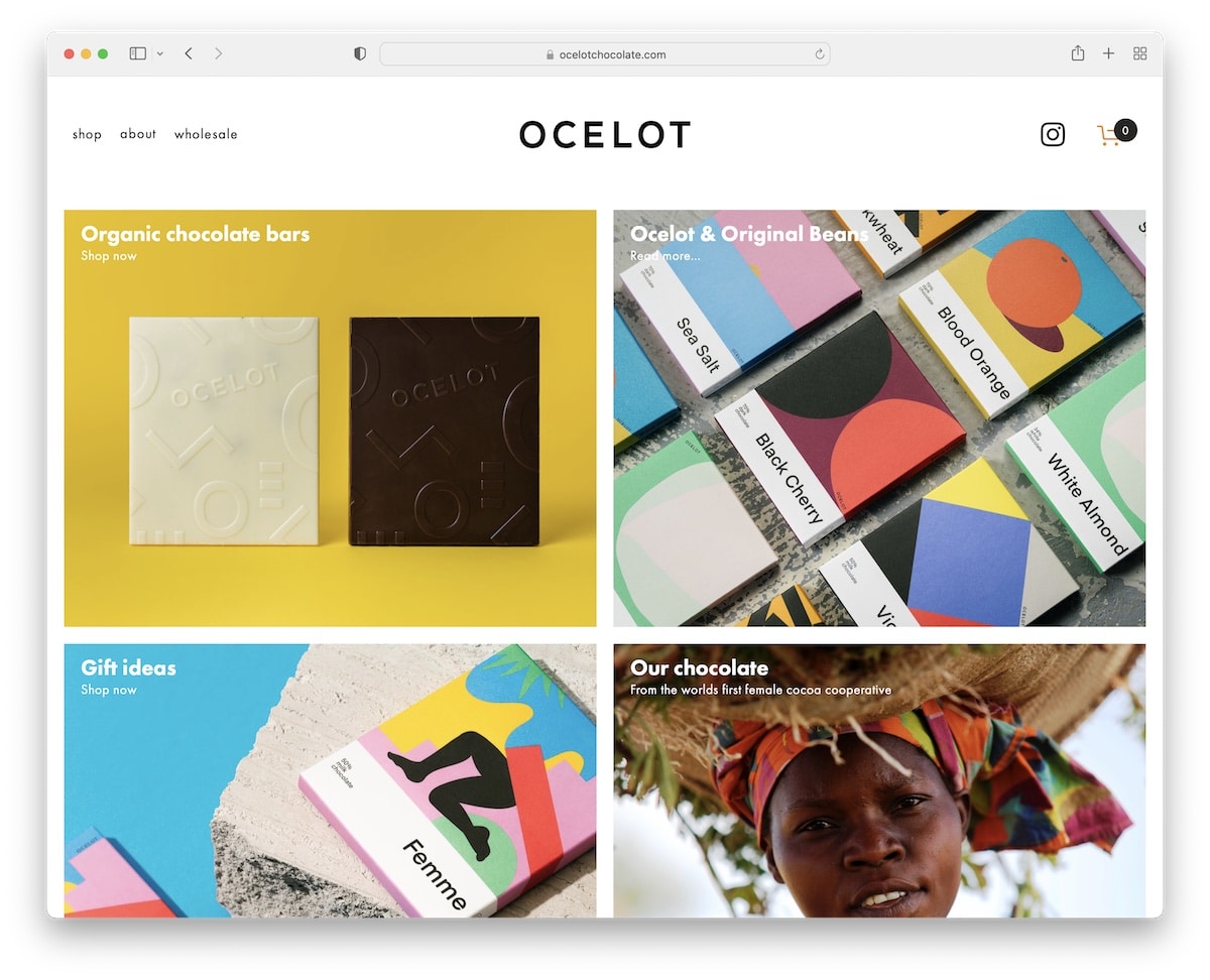
Ocelot Chocolate is a food website with an attractive grid layout that leans toward minimalism. The header is clean with a drop-down menu, IG icon and shopping cart.
Furthermore, the footer is also very basic, enhancing the simple flow nicely. (You may also be interested in viewing these gorgeous simple websites we curated.)
Note: Use a grid layout with large images to capture visitors’ attention.
14. Supernatural
Built with: Squarespace
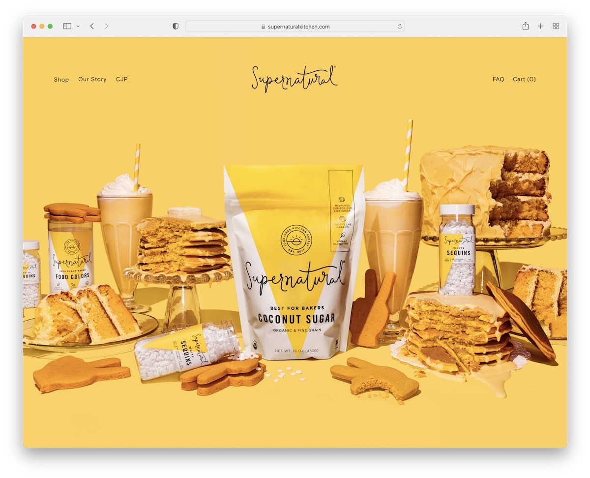
Supernatural uses a hero image with a parallax effect and a 100% transparent header with a drop-down menu.
The page has clean sections with titles, texts, links to promote their products, and an IG feed grid that opens posts in new tabs.
At the bottom is a simple footer with other handy links and a follow link for Instagram.
Note: A parallax effect adds engagement to your website for better UX.
15. Minna
Built with: Squarespace
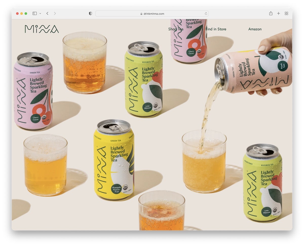
Minna is another good proof that a full-screen image (without text and CTA) can work really well in terms of grabbing visitors’ attention.
Also, they keep the navigation bar super clean for a distraction-free experience. The footer is equally clean with additional links, social media and a subscription form.
This food website is divided into multiple sections to present each product with an accommodating background. Plus, the three-post IG feed adds some extra content with posts opening in new tabs.
Note: Don’t know how to add more content to your website? Integrate an Instagram feed.
16. Oishii
Built with: Shopify
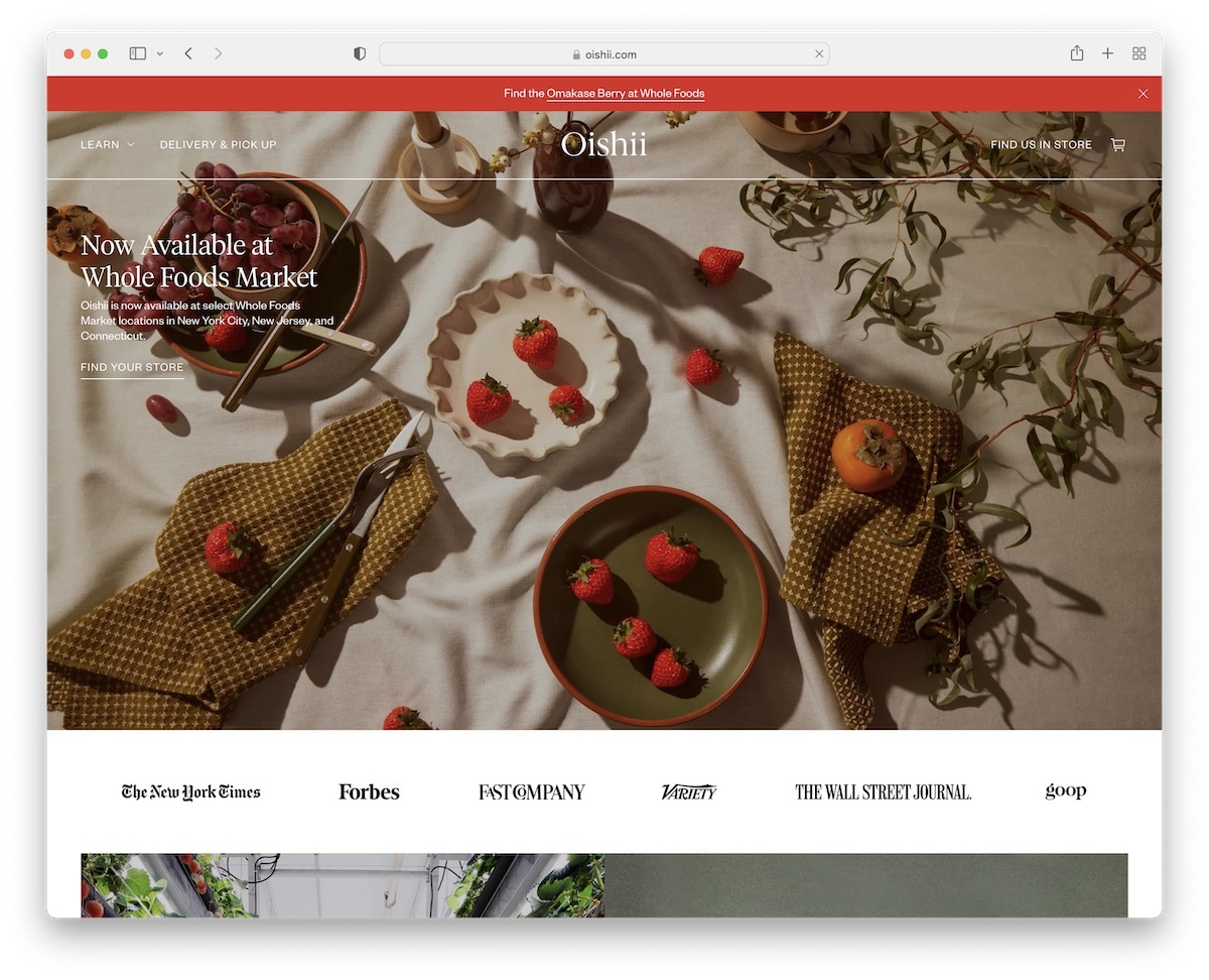
Oishii is a trendy food website that doesn’t seem to sell anything when scrolling the home page, which is a big plus. Sure, there are links to the shop, but they’re done with taste.
The top bar notification is easily closable by pressing “x,” while the header goes from transparent to solid (and floating) on the scroll.
Below the hero image is a banner with various authority logos linking to PR mentions.
Note: Don’t be too salesy; visitors may leave your website early.
17. A Perfect Plate
Built with: Squarespace
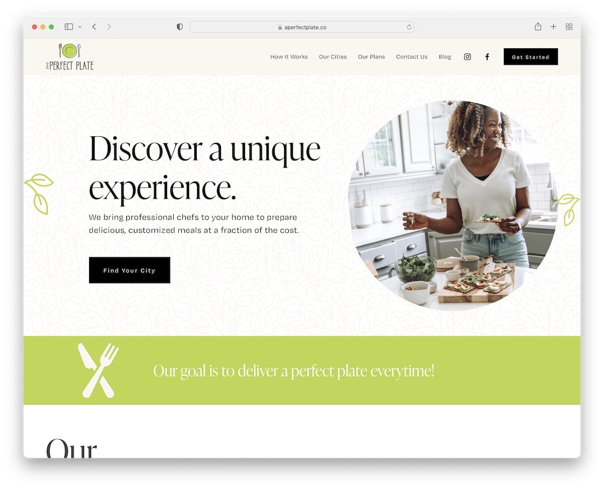
A Perfect Plate has an appetizing design with content loading on a scroll and a floating menu with a drop-down, social icons and a CTA button.
One practical feature is the accordions for “how it works,” which take much less space but still provide the necessary information.
Furthermore, a large section features a single client testimonial to build social proof.
Note: Accordions are a great way to introduce additional content and information without taking up extra space.
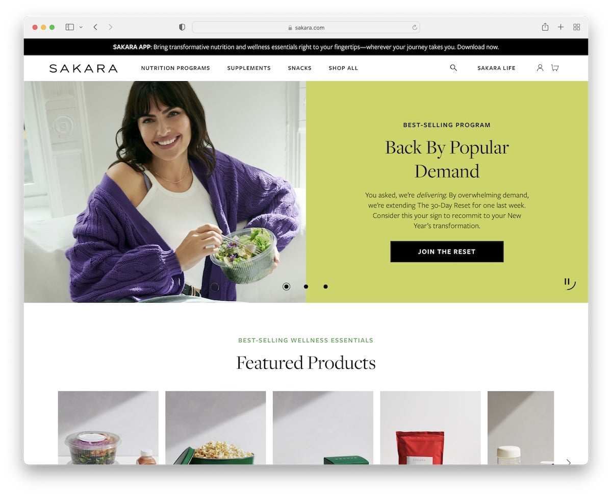
18. Sakara
Built with: Shopify

Sakara has a likable slider to pause, play, and swipe through at your command. Each slide has half an image and half a solid background with text and a CTA to make the information more readable.
The top bar and the header (with mega menu) both stick to the top of the screen, so you don’t need to scroll to access the menu – it’s always there. Additionally, the footer has multiple columns with an app download CTA, subscription and heaps more links.
Note: Allow users to control the slider (because they may find the sliding animation too fast).
19. A Fork & A Pencil
Built with: Squarespace
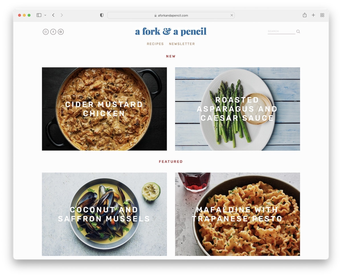
A Fork & A Pencil has a minimalist grid layout with parallax image sections and an Instagram feed with a “follow” button.
The header and the footer are also pretty plain but equip you with all the essentials for a better browsing and searching experience.
Lastly, the newsletter subscription form has reCAPTCHA to prevent spam.
Note: If you want to avoid spam (especially when using the contact form), use reCAPTCHA.
20. UpNature
Built with: Shopify
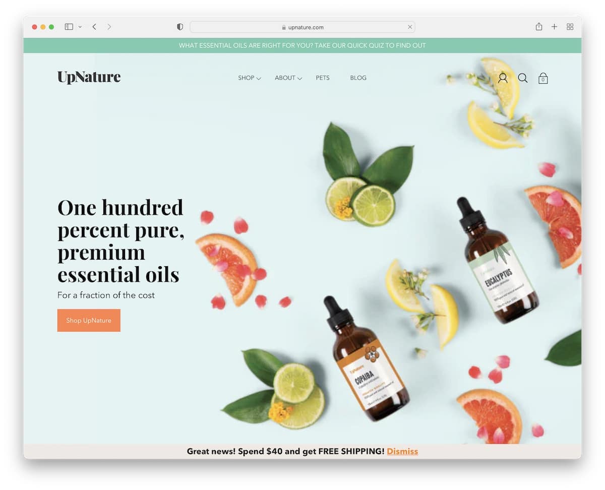
While many use a top bar on a contrasting background to make it stand out more, UpNature’s blends with the hero image nicely, not causing any distractions. However, only the header with the minimalist mega menu floats.
This food website has a clean, interchanging design (also check these winning clean websites), a testimonial slider, and an elementary footer.
Note: Use a top bar for special notifications, free shipping, deals, etc.
21. Feastables
Built with: Shopify
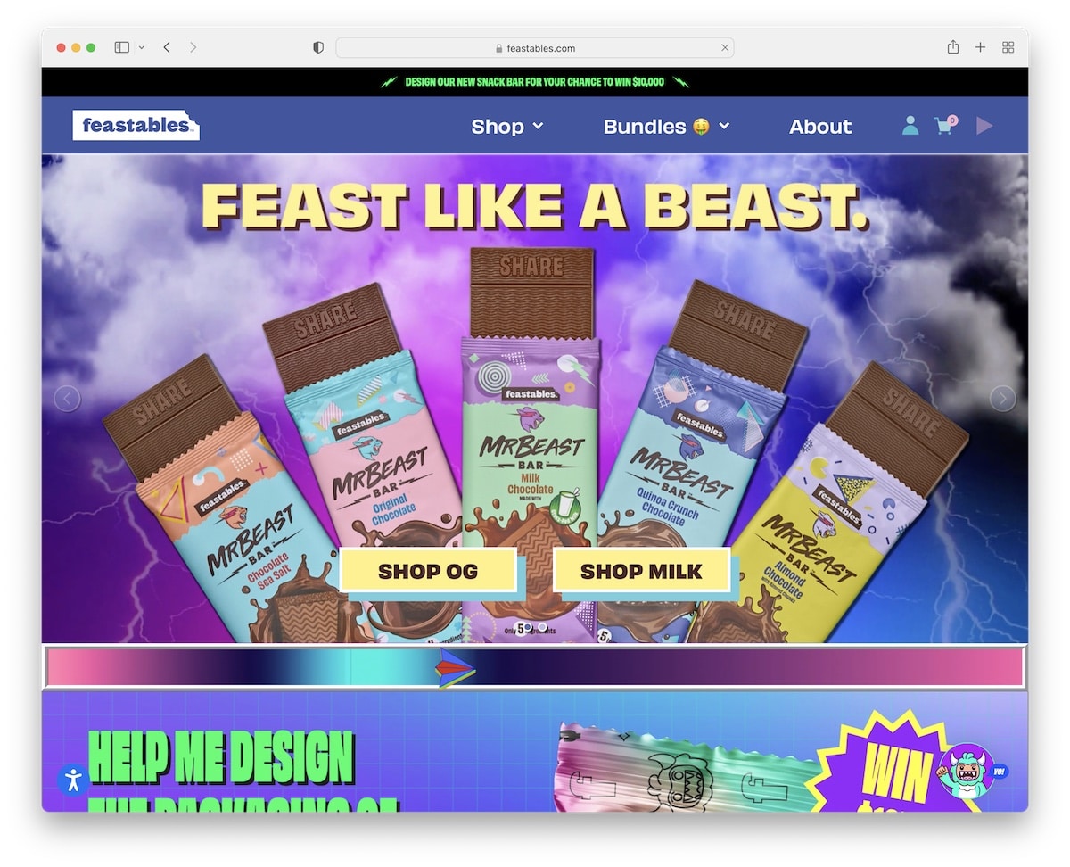
Feastables website proves that there are no limits when it comes to creativity and web design. Go as wild and as “crazy” as you want, creating a strong and memorable first impression just like Feastables.
The page has multiple animations and special effects that make it more absorbing and exciting, entice you to order the products.
Besides customer testimonials with star reviews, Feastables also has a slider with authority feedback. And if you click on the monster head in the right corner, you can play a game, which is something we haven’t seen before on a food website.
Note: Let your personality speak through a unique and artistic website everyone will discuss.
22. Oatly
Built with: Shopify
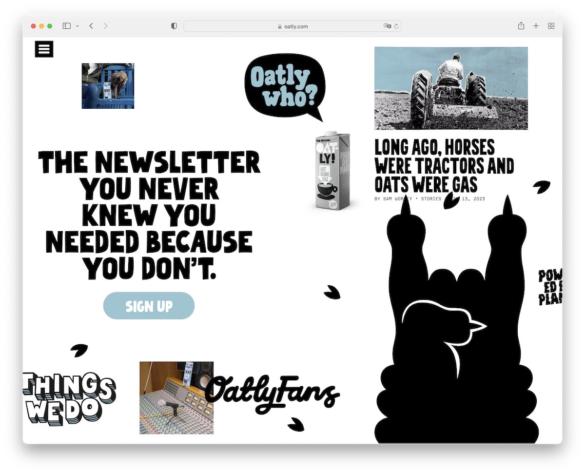
Like the Feastables page, Oatly’s home page is very original. Plus, instead of scrolling vertically, you scroll horizontally, and even though it’s loaded with content, it’s still a fun experience.
However, you can access other internal pages by pressing the hamburger menu icon in the top left corner, which offers additional links and social media icons.
Note: Make a website that scrolls horizontally instead of vertically, like all the rest.
23. Huel
Built with: Shopify
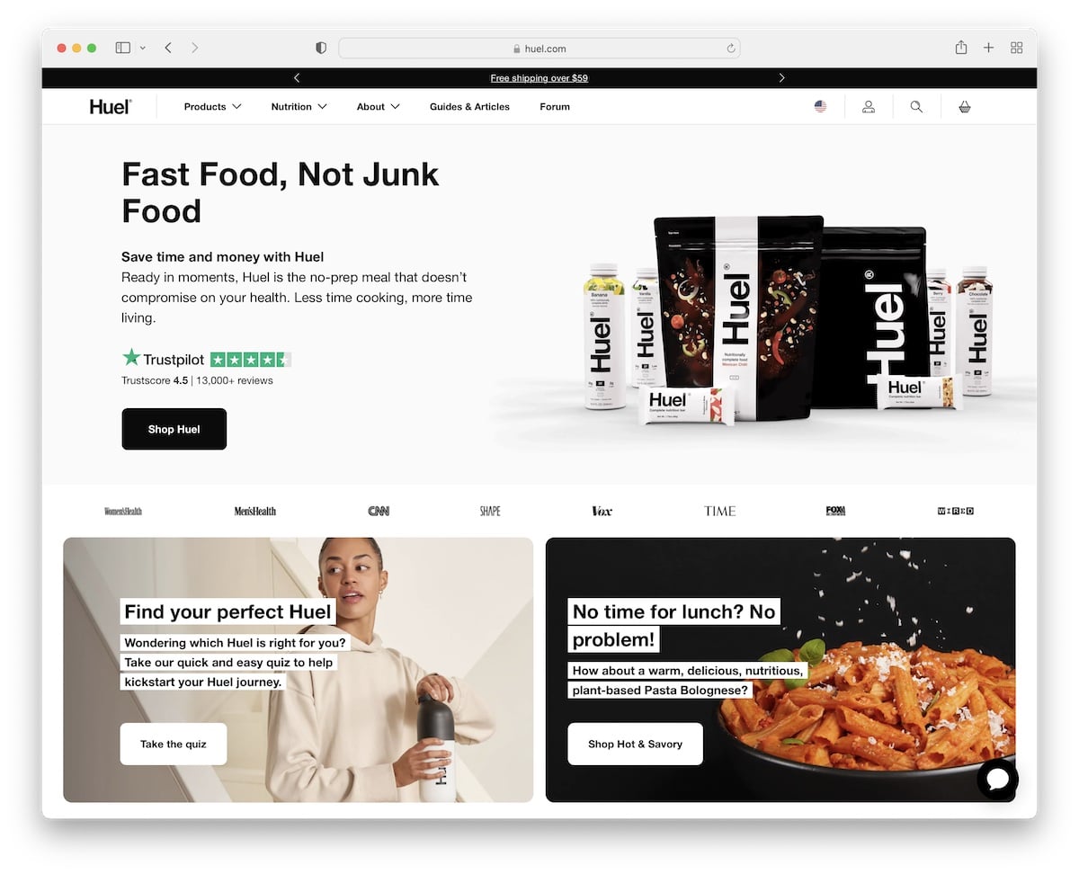
Because Huel is a global brand, they use the top bar to choose your location for a more personalized online browsing and shopping experience.
The hero image showcases the product with a title, text, a Trustpilot badge and a CTA button for the shop.
What will surely trigger your attention is the bottom pop-up bar that appears when you start scrolling. It wants you to join its ” hooligan” tribe.
The home page is content-rich, but the dark and light design makes scrolling and checking information a treat.
Note: Use a location (and a currency) switcher if you have a large global audience.
Was this article helpful?
YesNo


