22 Best Nonprofit Websites (Examples) 2024

Do you want to see the best nonprofit websites to inspire your creativity and generate new ideas for building your organization’s website successfully?
While we found many responsive web designs that differ quite a bit, most have one thing in common: Online donation form.
We picked these 22 as the best-of-the-best out of 100+ that we reviewed and studied in great detail.
Take the opportunity to check some really nice page layouts if you’re building a charity website.
Note: You can comfortably create yours with any of these WordPress themes for nonprofits. But you can also use a website builder for nonprofit organizations.
Best Nonprofit Websites For Inspiration
1. GlamourGals
Built with: Squarespace
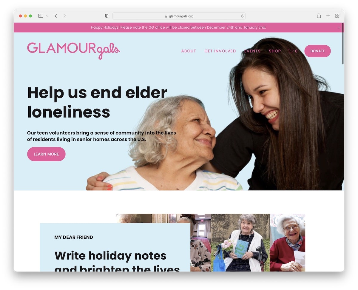
The GlamourGals site uses a header and top bar that disappears and reappears when scrolling down or up. This gives visitors a better experience while still ensuring they have everything at their fingertips.
Furthermore, they raise their potential with donation buttons in the header and scattered around the website.
GlamourGals also runs an online store, which contributes to their fundraising.
Note: Feel free to use donation buttons more than once (or at least in the header or hero section and footer).
2. FutureMap
Built with: Squarespace
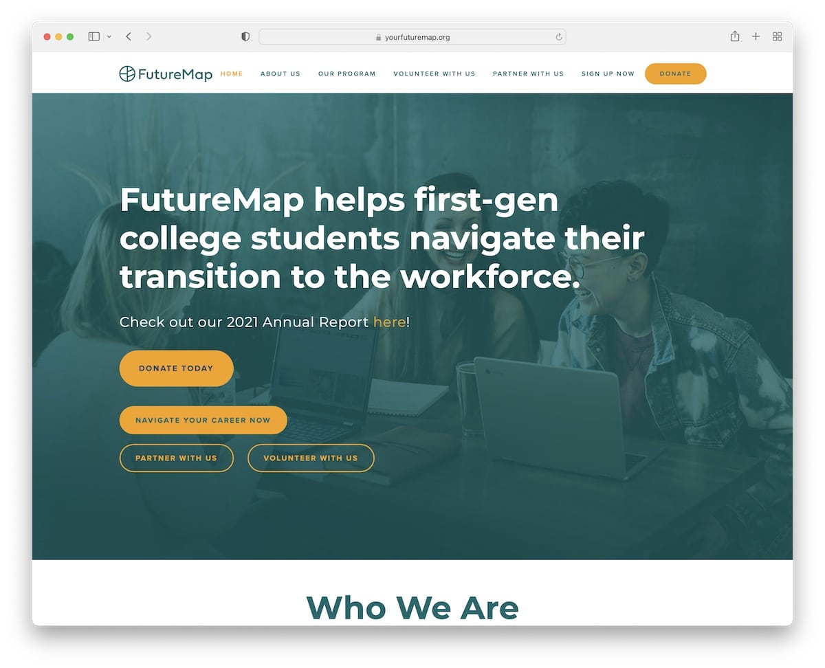
FutureMap has a professional yet modern design with a sticky header that includes a CTA button for donations.
Their hero image features a title, text and four CTA buttons, which isn’t something many do.
FutureMap also has a logo slider that showcases some of the nonprofits, universities and companies they partner with.
Note: Use your partners’ logos (in a slider) to show who you work with.
3. Global Health Innovations
Built with: Squarespace
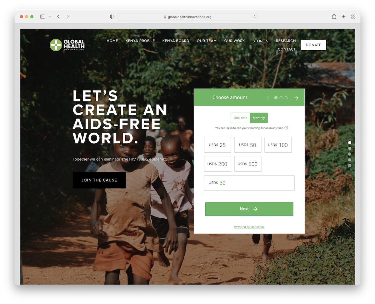
What’s unique about Global Health Innovations is the framed website layout, which we don’t see very often.
Another original feature is that their website appears like a vertical slider that you can scroll through or use the sidebar navigation to jump from “slide” to “slide.”
Lastly, the donation is easily accessible above the fold with preset donations and an option for a custom donation.
Note: Give your nonprofit website a distinct look with a framed layout.
4. World Wild Life
Built with: Ruby On Rails
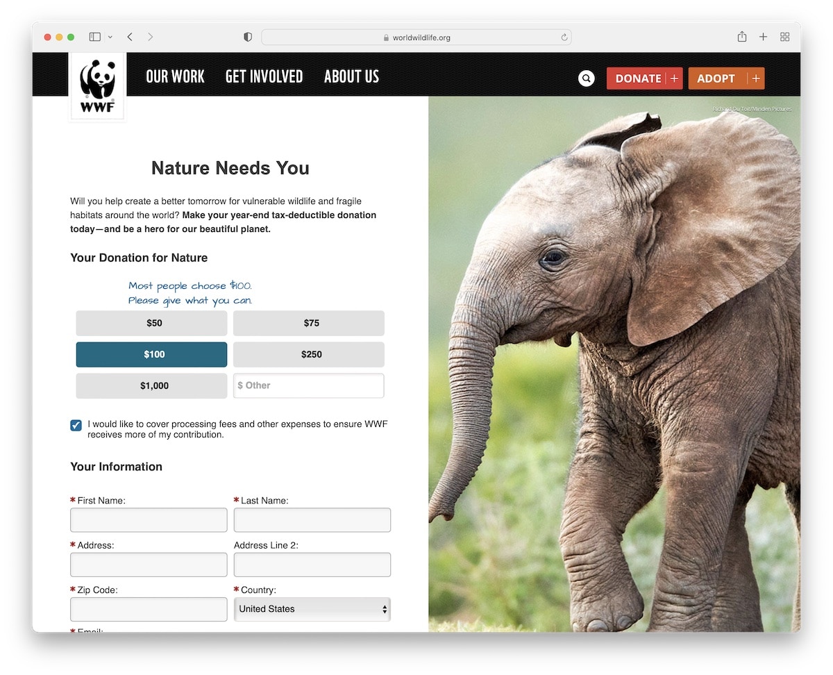
World Wild Life is a nonprofit website example with a unique hero section with a split-screen design, an advanced donation form on the left, and a sticky image on the right.
The home page is constructed from multiple sections with links and call-to-action (CTA) buttons to learn more about the organization.
Moreover, World Wild Life has a newsletter subscription form with extra fields, which isn’t too common. Also, the footer area is divided into two parts so that more information and links can be included.
Note: Keep your supporters updated about news, causes and more by letting them sign up for your email newsletter.
5. Habitat
Built with: Drupal
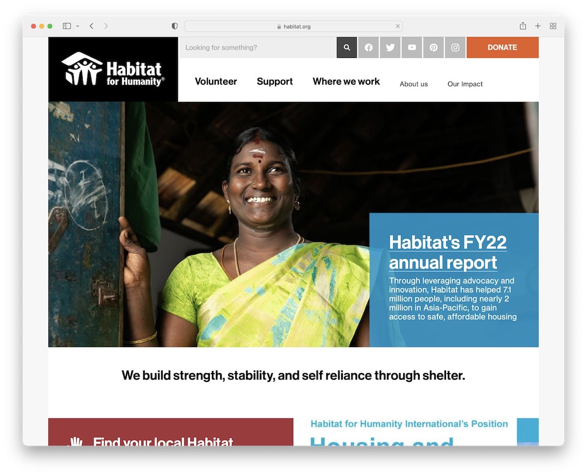
Habitat has a somewhat basic boxed page design with a two-part header that contains a search bar, social media icons, a mega menu and a donation CTA.
What’s handy is that they added news on the home page with a load more button to find the latest articles easily.
Note: Adding a news section to your nonprofit site can be highly rewarding (even from an SEO point of view).
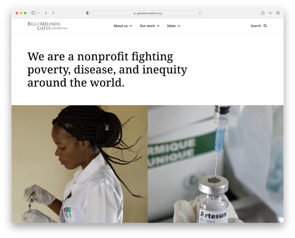
6. Gates Foundation
Built with: Sitecore
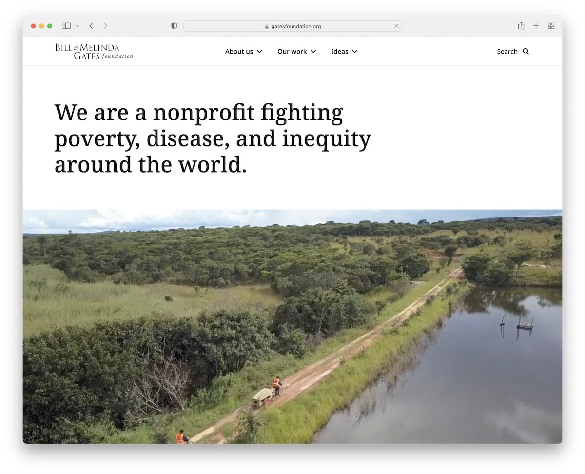
The Gates Foundation’s page starts with a clean header, mega menu, and search bar. A simple sentence describing the Foundation follows, followed by a promotional video.
The overall responsive web design is minimalist, with black and white backgrounds. Also, they have an exclusive section dedicated to sharing their foundation facts.
Note: Use numbers to show the world how much funds you raised, how many program strategies you have, and more.
7. Rescue
Built with: Drupal
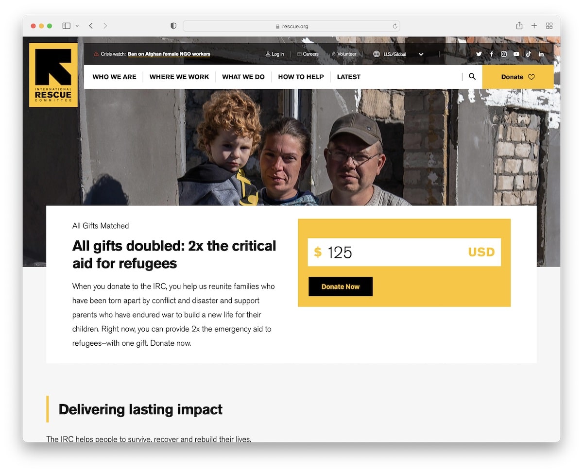
Because Rescue’s main branding colors are black and yellow, they use the color scheme strategically across their website.
They use a donation form in the hero section, so potential donors don’t need to scroll to take action.
And because Rescue works globally, the top bar location selector (or in the footer) is very practical.
Note: Use the header or top bar to integrate a location switcher if you run multiple location-based websites.
8. The ALS Association
Built with: Drupal
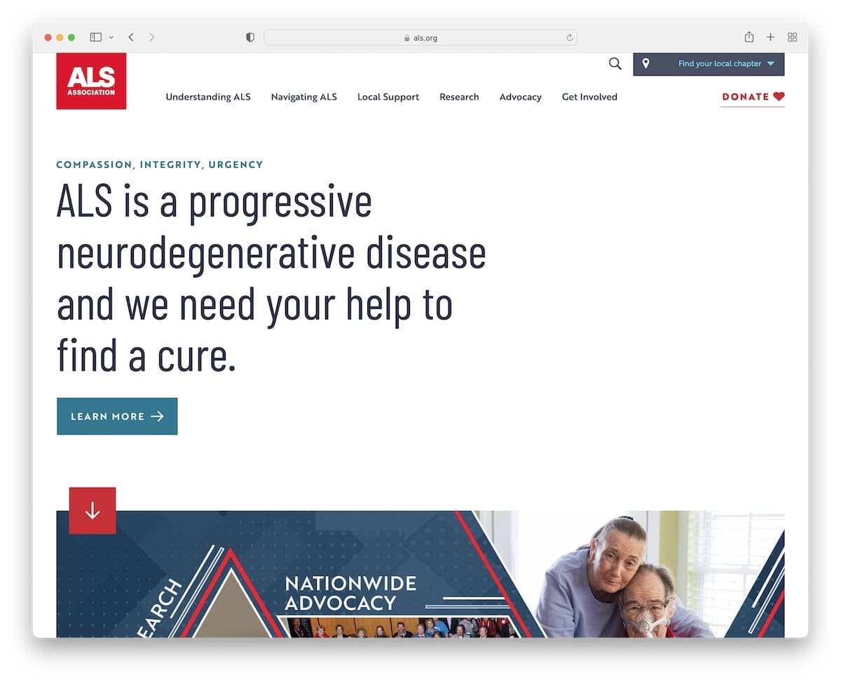
Like the Gates Foundation website, The ALS Association also starts with a strong sentence that lets visitors know what they’re trying to achieve.
The website uses cool scrolling animations that improve the browsing experience. It also includes links and CTAs for more information and donations.
The top bar has a search bar and a simple widget to find a local chapter.
Note: Use a solid-color background and a strong message above the fold instead of an image or a video.
9. National Geographic Society
Built with: Fundor Theme
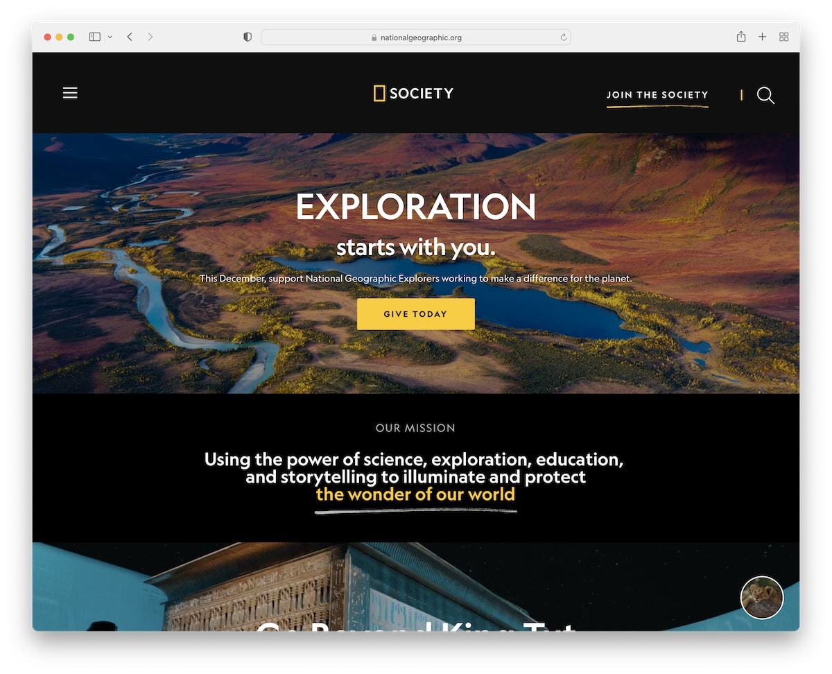
National Geographic Society’s page has a stunning dark-and-light design, gorgeous images and videos, enough white space for readability, and a donation popup.
This nonprofit website also uses a floating header, a hamburger menu, and a multi-level drop-down menu that slides from the left.
Note: A sticky header/menu contributes to a better user experience (no more scrolling back to the top).
10. Girls Who Code
Built with: Craft CMS
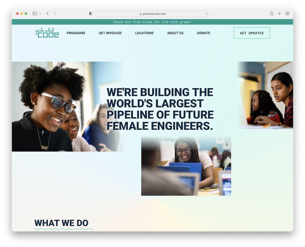
The Girls Who Code page has a nice modern look, with a gradient background in the hero area and header. The header is sticky, and a drop-down menu allows users to find other internal pages faster.
Girls Who Code also uses a link to donations and a newsletter subscription button in the header and a top bar notification.
Note: Use header and footer sections to capture more leads and grow your email list.
11. Doctors Without Borders
Built with: Drupal
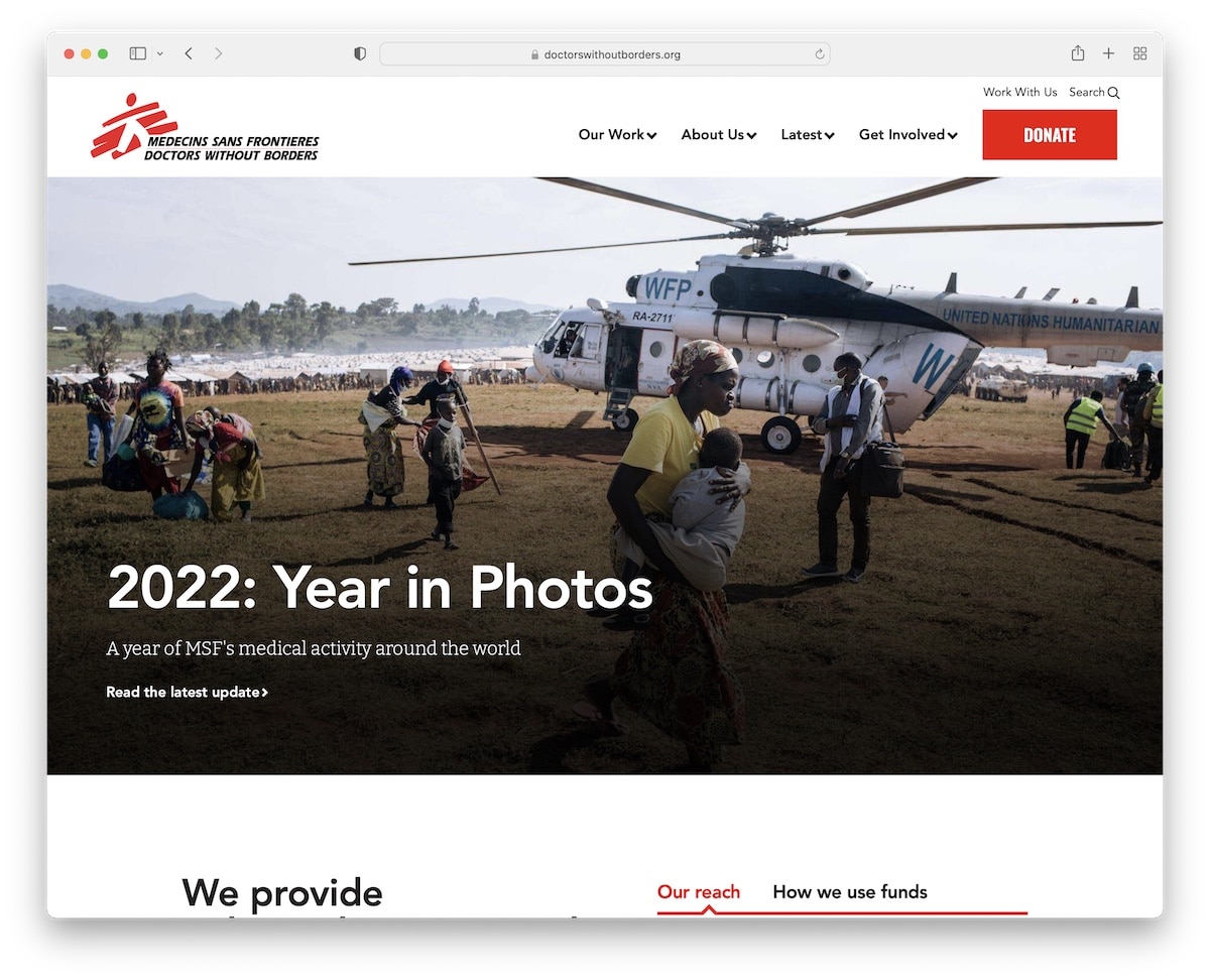
Doctors Without Borders uses a full-width banner that promotes their latest update and has a donation button.
What’s unique about this nonprofit website is the search that opens as a popup with links answering the most common questions.
The design is light, with great typography and plenty of white space to make viewing content a more pleasant experience.
Note: Use a banner to promote the latest news, causes, donations, etc.
12. Malala
Built with: Contentful
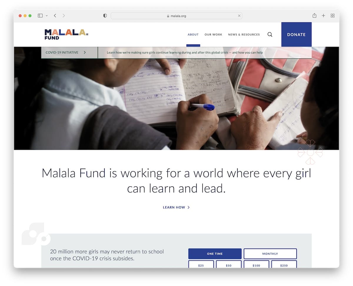
Malala’s video background above-the-fold triggers everyone’s interest and makes visitors stay on the website longer (contributes to bounce rate).
A single sentence with large text and a link to learn more about the cause follows. Malala uses a donation form on the home page, but they also try to grab your attention with a popup.
The header floats on top of the screen, giving you access to the mega menu, search, and donation buttons.
Note: Use a popup to promote donations.
13. World Help
Built with: Divi Theme
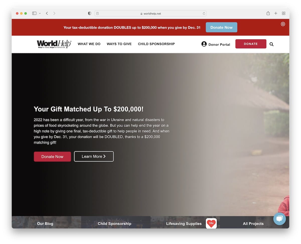
World Help uses a popup window with a question and a “give now” button that opens a form in a new tab.
But their home page uses multiple CTA buttons for donations with a large red top bar promoting their recent fundraiser. Both the top bar and the header float (but you can close the top bar by pressing “x”).
Another useful addition is the live chat function in the bottom right corner.
Note: Provide quick answers to all your (potential) supports through a live chat widget.
Lastly, these websites using the Divi theme provide more proof of how powerful this WordPress theme is.
14. Neverthirst
Built with: Shopify
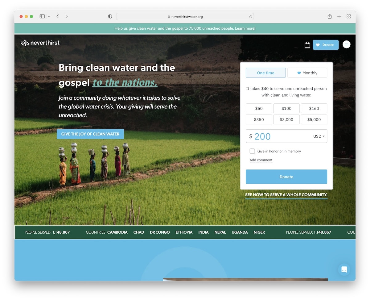
Neverthirst uses a minimalist and transparent header with a hamburger icon to make navigation appear on the right.
The hero image features text, a CTA button and a donation form with an option to choose one-time or monthly payments. Below the banner is sliding text with facts and above the banner/header top bar notification with a link
Neverthirst uses a live chat widget, a testimonials slider and a subscription form in the footer.
Note: Include testimonials from sponsors, donors, and volunteers.
15. BeLoved Atlanta
Built with: Squarespace
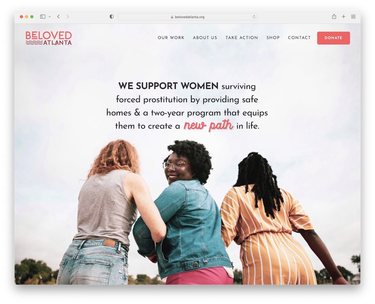
BeLoved Atlanta has a full-screen image background above-the-fold with a transparent header for a clean website look. The header has a drop-down function and a donation button. Also, it disappears on a scroll and reappears on a back scroll.
This nonprofit website’s overall look is simple, broken down into multiple sections with different backgrounds.
And the Instagram feed is a great addition of extra content.
Note: Do you want to add more content to your page? Integrate an IG feed.
Don’t miss our best Squarespace website examples collection.
16. Charity: Water
Built with: Contentful
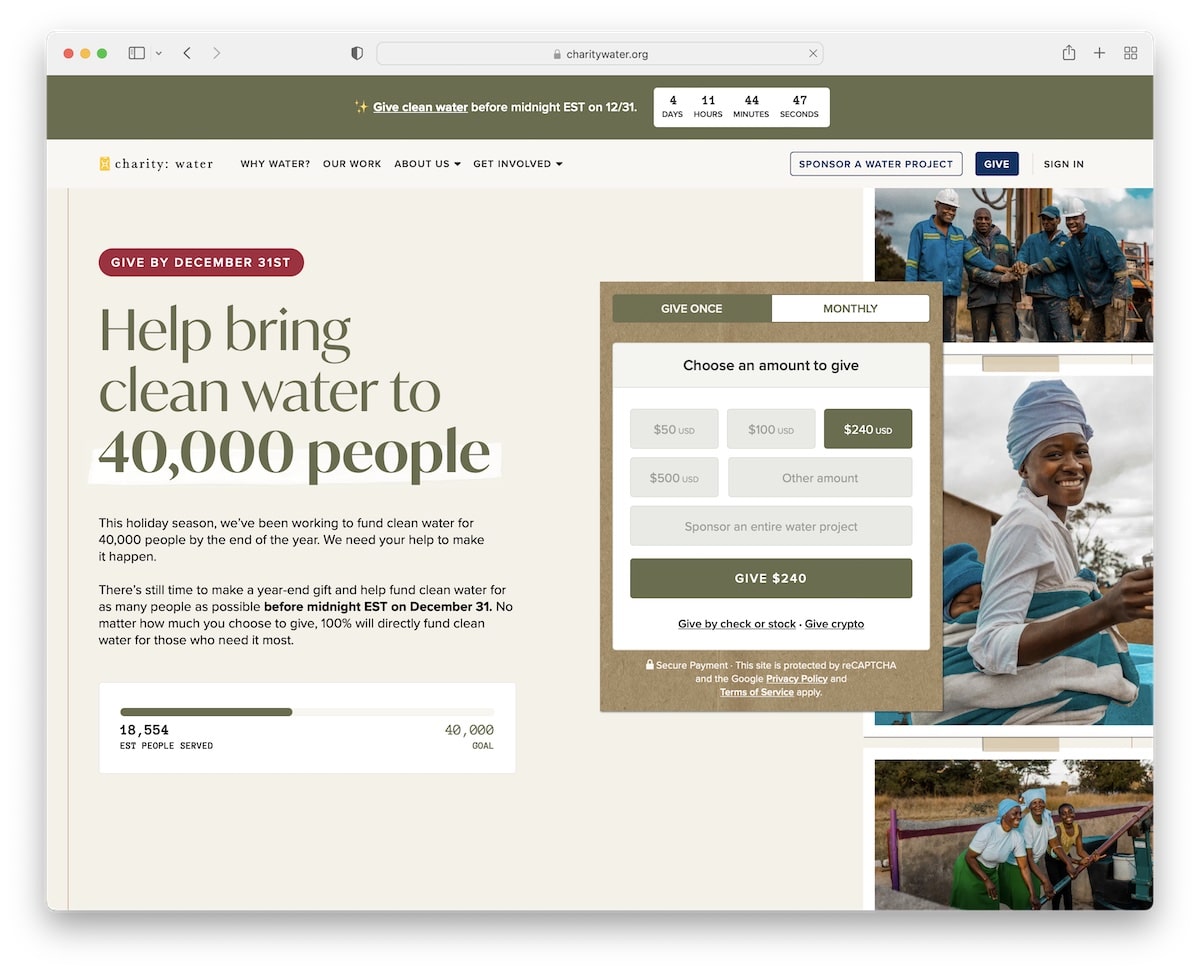
Charity: Water has a very actionable above-the-fold section, promoting the latest cause with a donation form that allows one-time payments or monthly.
The website also has a top bar notification with a countdown timer for urgency, a mega menu for easy navigation and a currency switcher (from USD to GBP).
There’s also an embedded video that showcases the “journey of your donation.”
Note: Ensure a donation form is as easily accessible as possible.
17. Beauty Foundation For Cancer Care
Built with: Squarespace
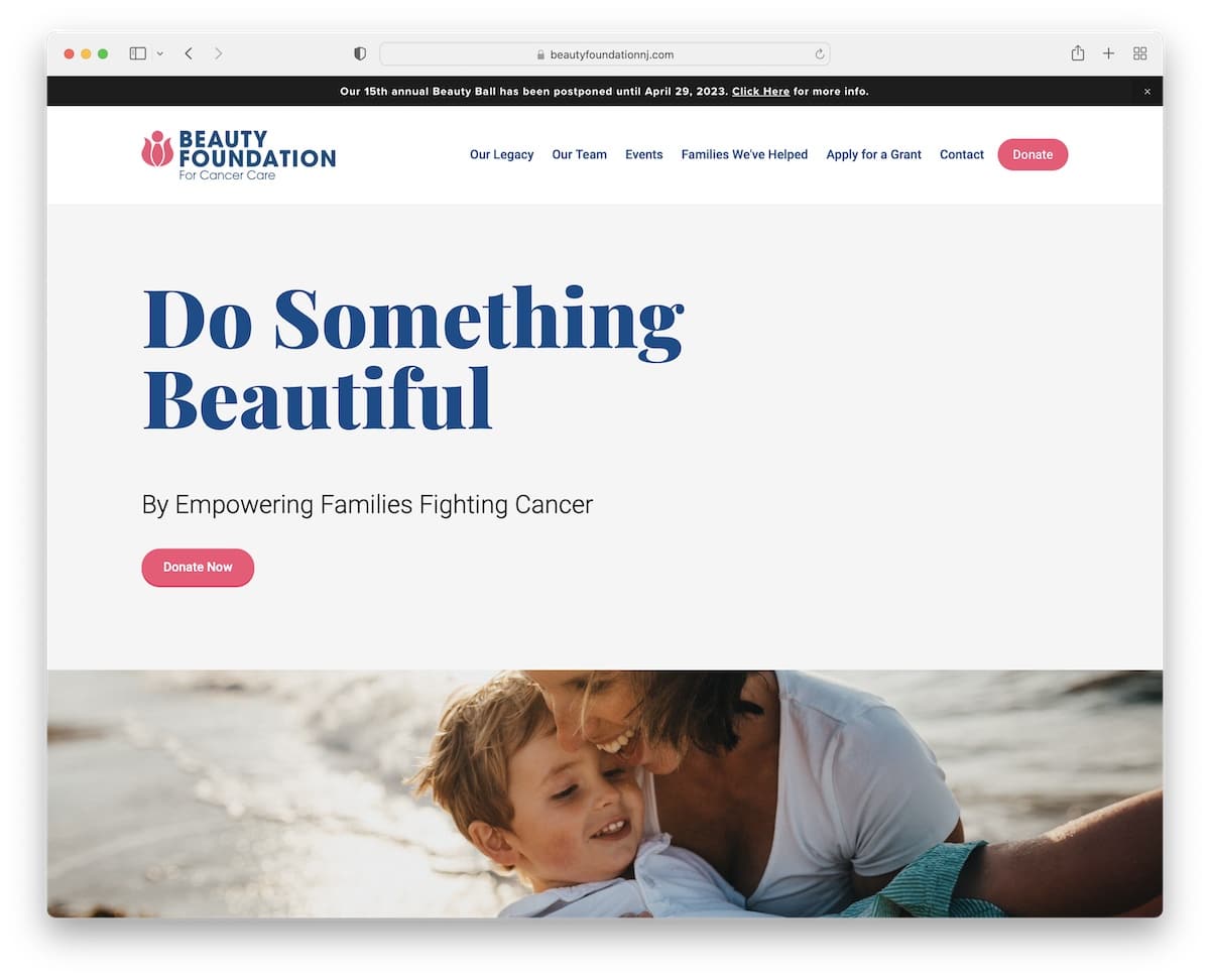
Powerful statements and messages are welcome in the hero section, and Beauty Foundation For Cancer Care does a good job at it. They use two donation buttons, one in the header and one under the text.
Beauty Foundation For Cancer Care’s website features a parallax image that adds depth and ensures great readability with a lot of white space.
Note: If you like a minimalist website look, spice things up with a parallax effect.
Did you know that you can create a similar website using a Squarespace template for charity websites?
18. Single Parent Project
Built with: Squarespace
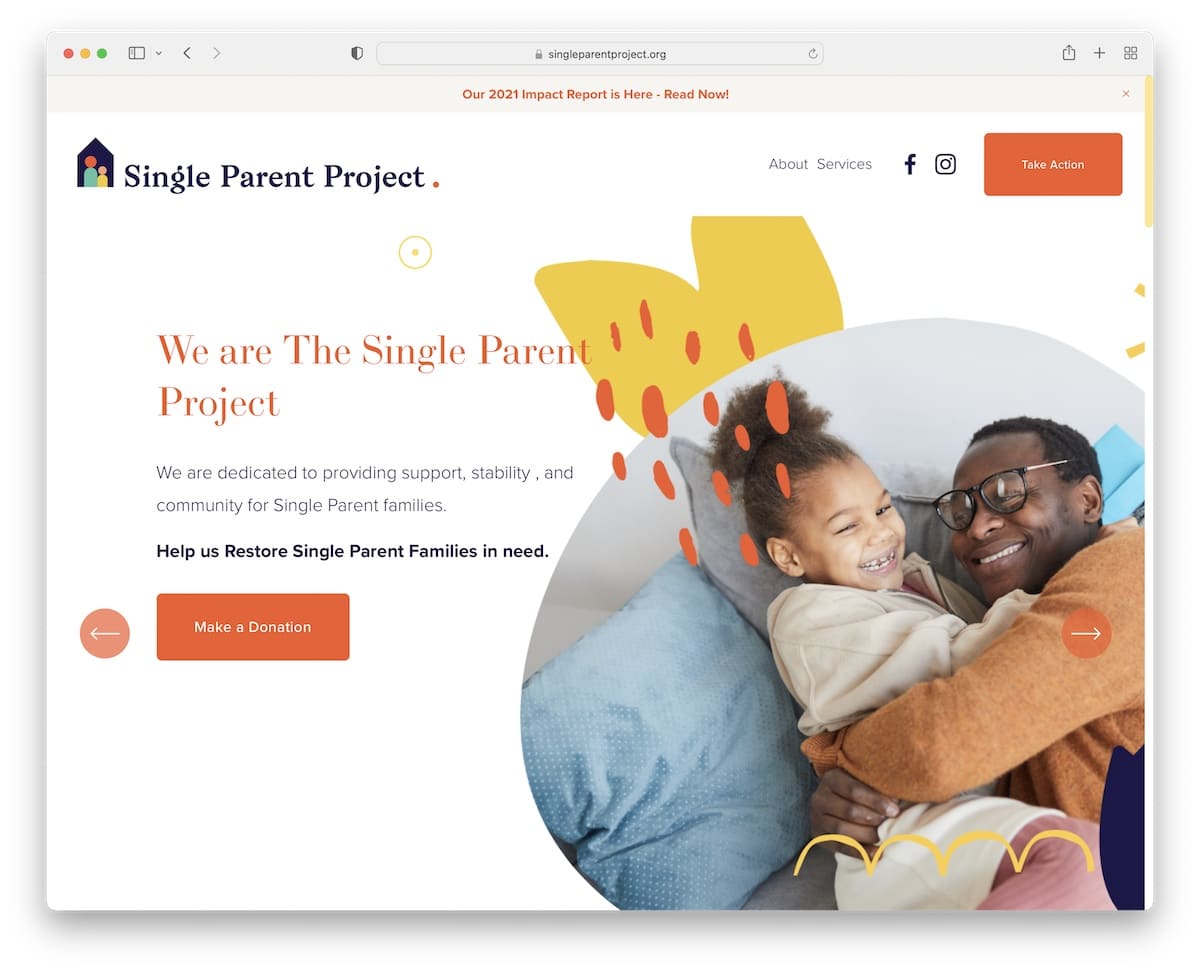
Single Parent Project website has a beautiful light design with a sticky top bar and header. The header uses simple navigation, social media icons and a “take action” button for donations, volunteers, and more.
We really like the massive carousel slider (but there’s also a hero slider) with tons of additional information and CTAs for donations.
Note: Use a slider to display more content without using too much real estate.
19. Dressember Foundation
Built with: Squarespace
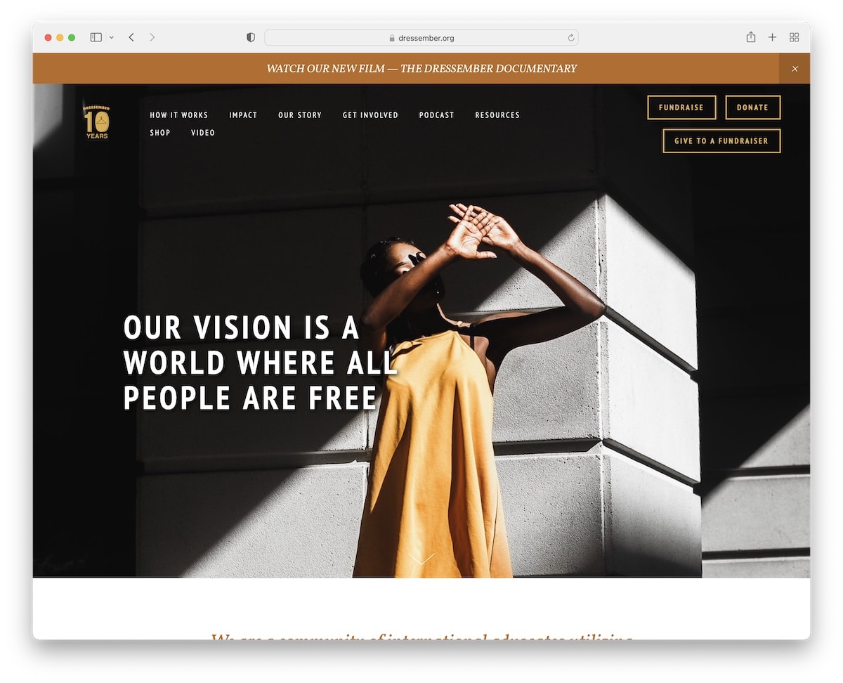
Dressember Foundation has a tidy above-the-fold section featuring a transparent header with three CTAs and a hero image with a text overlay.
When you press the scroll-down button, you immediately notice the beautiful parallax effect that adds life to this nonprofit site.
And because many authorities mention Dressember Foundation, they added a slider with clickable logos to articles.
Note: Create a logo slider with notable media companies/websites discussing you.
20. Ping Pong For Good
Built with: Squarespace
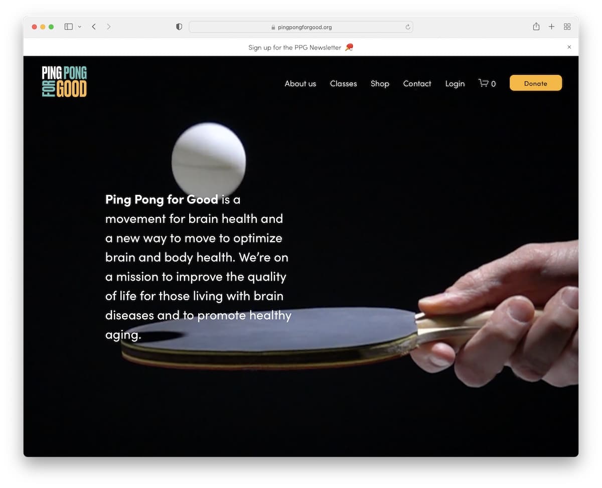
Ping Pong For Good has a full-screen video background with text explaining the organization and no CTA button.
However, they strategically place a donation button in the floating header, so it’s always available to visitors.
Ping Pong For Good reveals content while you scroll, making it much more enjoyable.
Note: Simple animations can make your website feel more lively.
21. East West Food Rescue
Built with: Squarespace
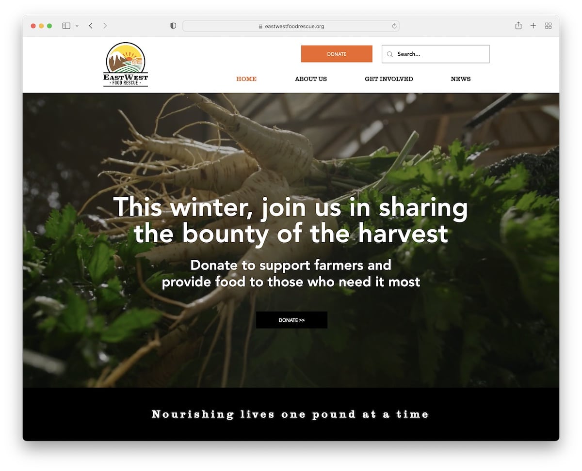
East West Food Rescue also uses a video background in the hero section with text and a donation button.
They use the sticky header as the second CTA location, which is always visible so potential donors can donate whenever they want.
The three-column footer contains additional business information, social icons, a link to the newsletter subscription form, and more.
Note: Use a short (or a long) hero video to make your nonprofit website more engaging.
22. HomeAid
Built with: Squarespace
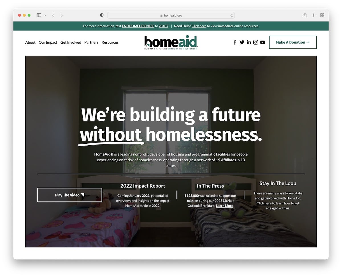
HomeAid is a terrific website example of a nonprofit that runs a modern online presence and follows the latest trends.
The disappearing/reappearing header and top bar, video background, sticky elements, video lightbox and parallax effect are some great features worth checking out.
The footer is clean and simple but provides a lot of useful information. And the header features a drop-down menu to find the necessary information quickly, plus a donation button.
Note: Use the footer to include additional links, business information, contact details, and more.
Was this article helpful?
YesNo