22 Best Developer Portfolios (Examples) 2024
Do you want to check the best developer portfolios and website examples to gain inspiration?
That’s when this collection comes in handy.
We analyzed 150 developers’ pages and tested their performance to create a list of the greatest 22.
This allowed us to come up with a collection where you can enjoy basic and minimalist design while being fun and engaging.
You’ll also find a lot of nice detailing (like custom cursors) that you may apply to your online presence.
Enjoy!
Best Developer Portfolios For Your Inspiration
1. Devon Stank
Built with: Squarespace
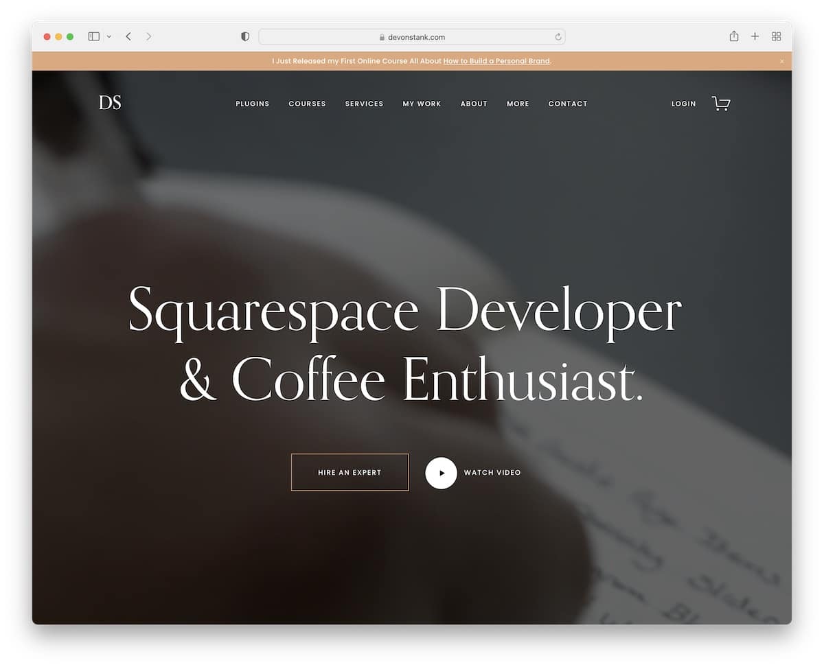
Devon Stank is a stunning page with two features that make it stand out: the hero video background and the dark design.
Moreover, this is also a great minimalist website example that creates a pleasant browsing and reading experience.
Additionally, Devon uses a top bar notification that you can close by pressing “x.”
Note: Use a video background to make your developer portfolio website more engaging.
Check out our dedicated Squarespace website examples collection for more amazing designs.
2. Michael Mannucci
Built with: Webflow

Michael Mannucci’s site is the opposite of Devon’s, using light and vibrant colors. The only similarity the two pages have is the simplistic web design.
The page has a clean, transparent header with a call-to-action (CTA) button that takes you to the contact details.
Also, Michael Mannucci runs a one-page website structure, so all the details are only a few clicks away (but a floating header would come in very handy).
Note: Use a single-page layout to boost user experience.
You’ll also like peeking at these great Webflow websites.
3. Diogo Correia
Built with: Gatsby
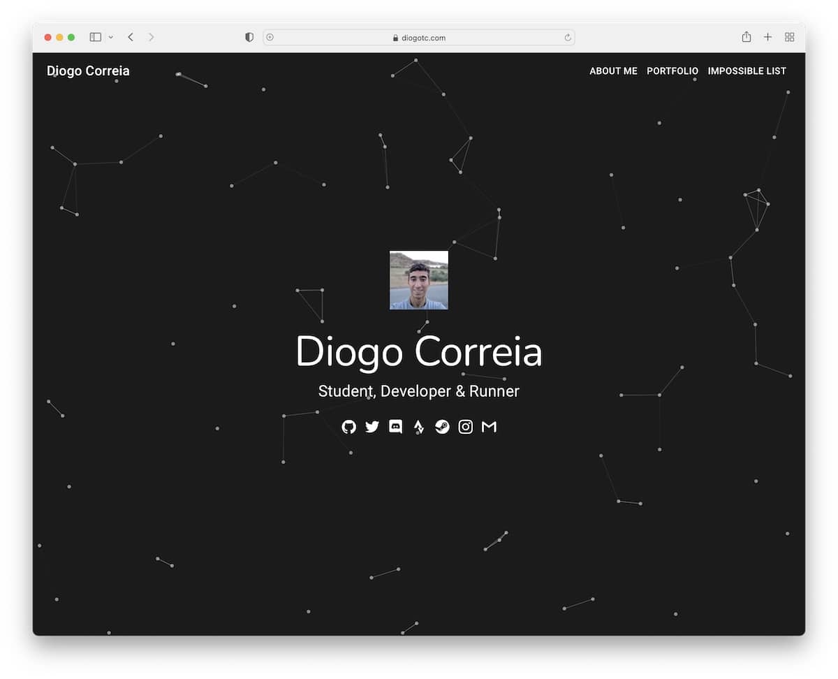
Diogo Correia has an exciting above-the-fold section with a particle effect background that spices things up nicely.
He also uses social media icons and sticky navigation in the hero section, making jumping from section to section much more comfortable.
Moreover, the timeline of work and experience reveals more details about Diogo and his skills.
Note: Use a sticky header/menu to navigate the website more easily.
4. Alex Naraghi
Built with: Squarespace
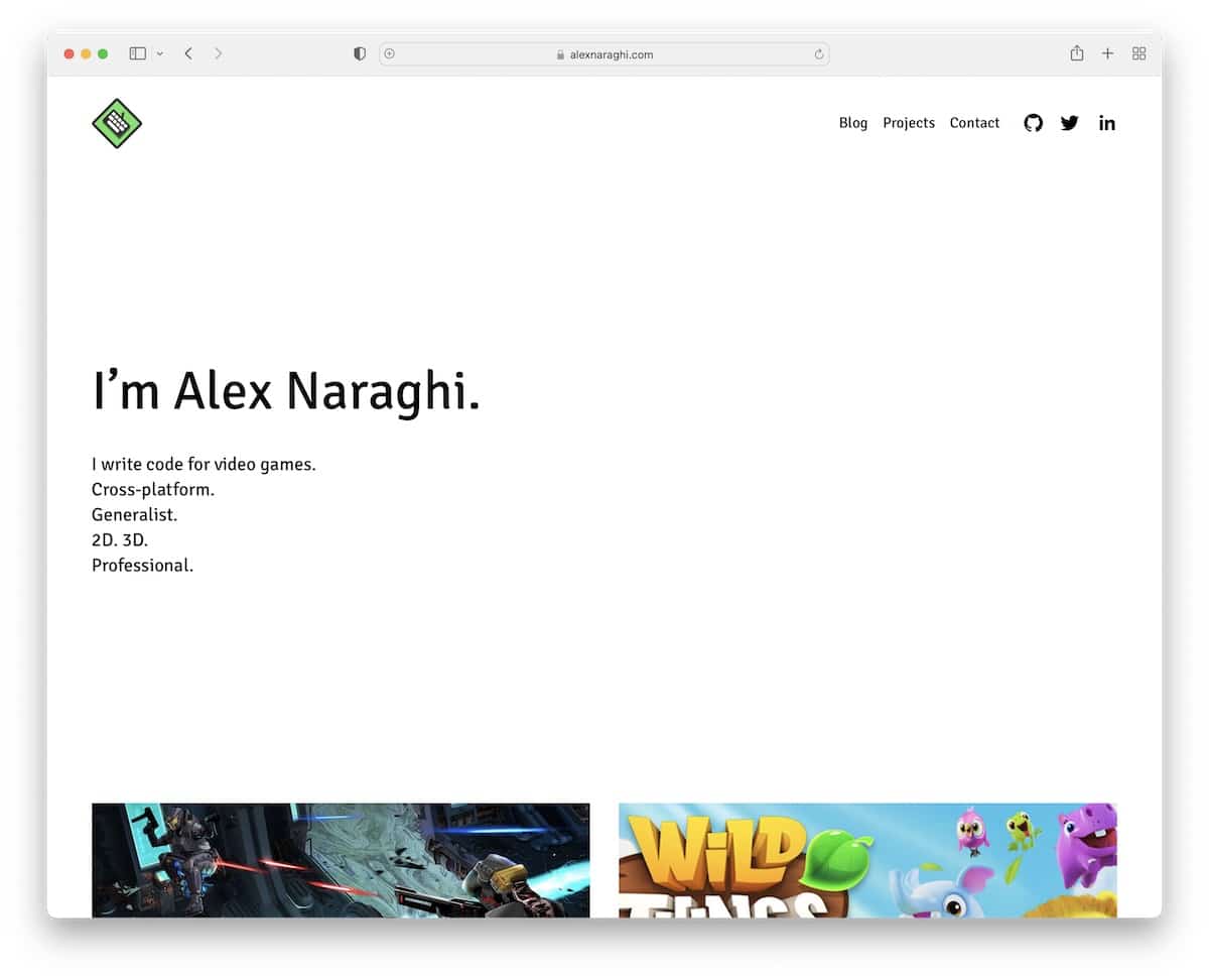
While some developers use images, videos and sliders above the fold, Alex Naraghi decided to keep it minimalist with text on a solid background. It works as a quick introduction, which is the most important thing.
Below the fold are some works and a CTA button to download Alex’s resume. The header and footer are clean, with only the main links and social buttons.
Note: There’s no need to complicate; use a text-only hero section.
5. Andrew McCarthy
Built with: GitHub Pages
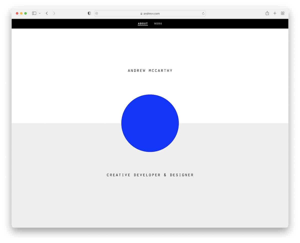
Andrew McCarthy is one of the more original developer portfolio websites we stumbled across. It has an infinite scroll with changing overlay elements, but here’s the catch: The sections repeat themselves repeatedly.
It’s tricky.
The header is basic and disappears on scroll but reappears once you start scrolling back to the top.
Note: Create a unique scrolling experience, like Andrew McCarthy!
6. La Playa
Built with: Squarespace
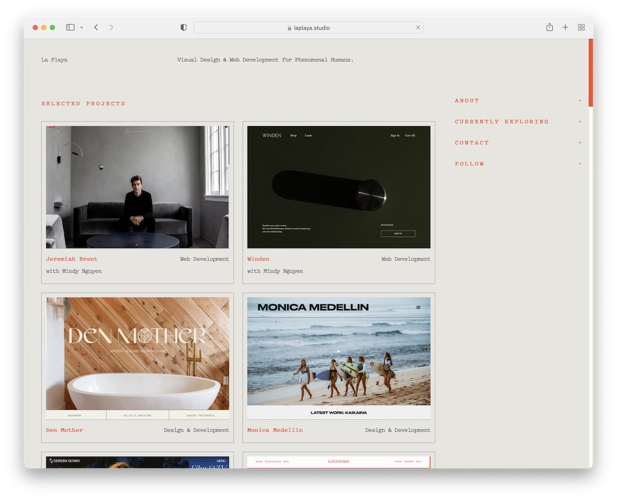
La Playa is a developer’s portfolio example with a two-column grid layout and a sticky right sidebar with a drop-down info reveal. The grid’s cool feature is that it highlights the element on hover and dims the rest.
The header and the footer are plain, with some additional info (about the Canaries).
Note: Use a sticky sidebar to ensure links and information are always available.
What’s great is that you can create a simpler website using a portfolio template for Squarespace website builder.
7. Sharlee
Built with: Next.js
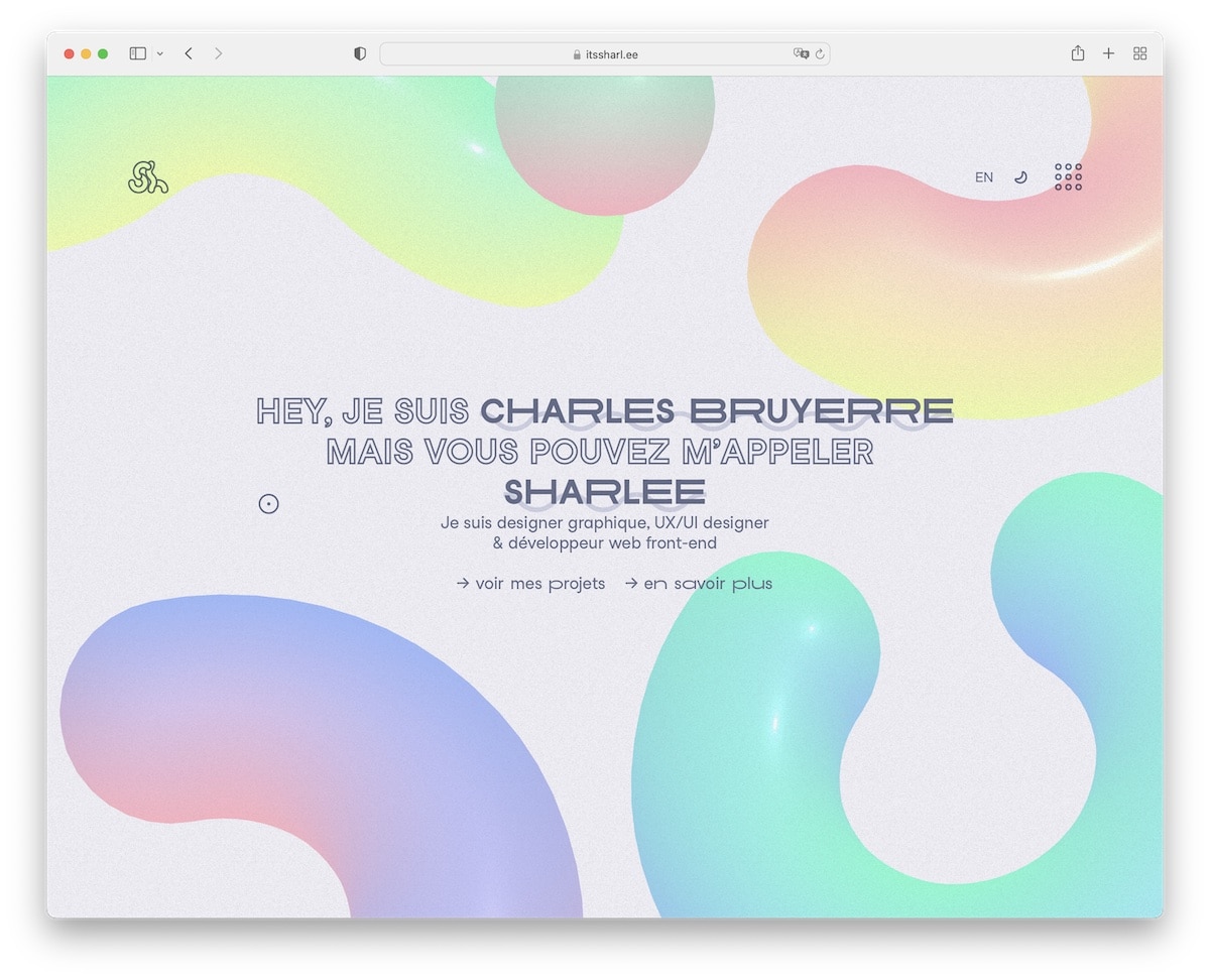
Sharlee’s engaging full-screen home page design has an animated background. It uses a day and light switcher and an overlayed hamburger menu with navigation and social media links. The header also has the option to switch languages from French to English (and vice versa).
Note: Use a dark/light mode switcher so visitors can choose how they want to view your website.
8. Brittany Chiang
Built with: Gatsby
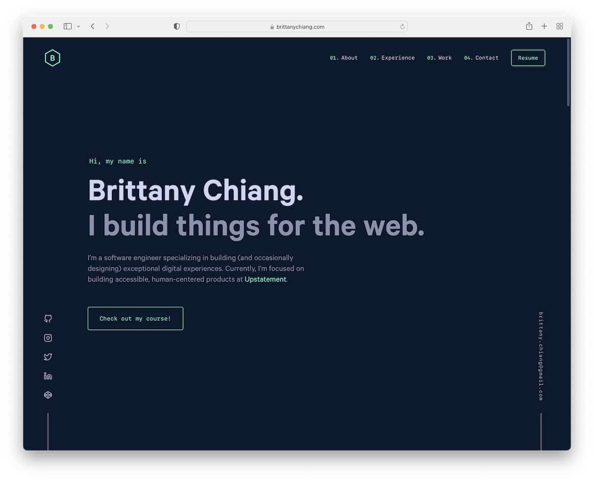
Brittany Chiang has a dark and minimalist responsive web design with a title, text and a CTA above the fold.
It uses floating sidebar elements for social media and email and a disappearing/reappearing header.
Moreover, this developer portfolio has a one-page layout, so all the detail is only a few scrolls away.
Note: You can stand out from the rest by simply using a dark-ish design
9. Lauren Waller
Built with: Webflow
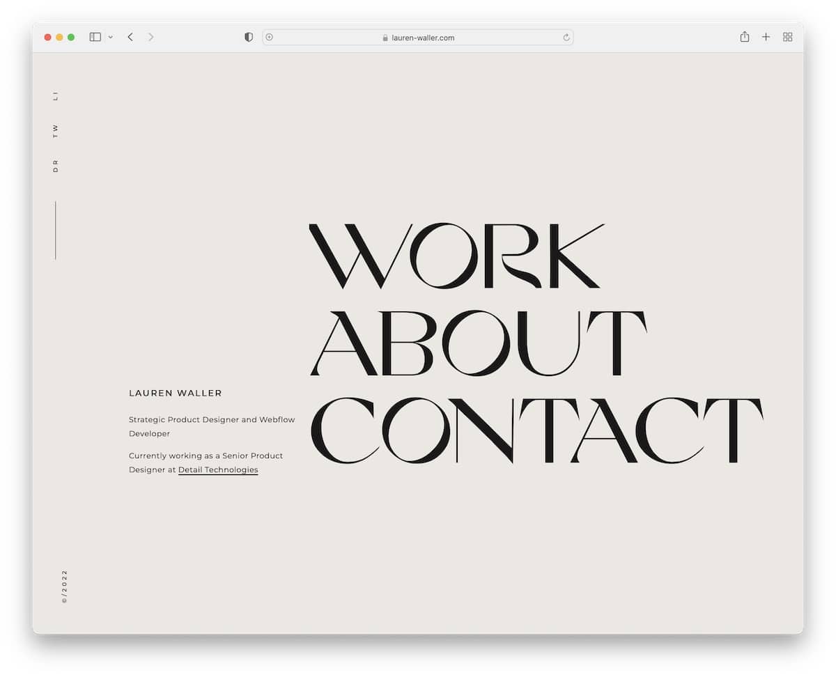
Lauren Waller’s home page is plain and simple, with a short bio and large menu links that respond on hover.
There is no header and footer, keeping the minimalistic level at an all-time high. However, there’s a neat sidebar with links to social media (or home when viewing internal pages).
Note: Do you want to keep your developer portfolio page extra clean? Skip the header and footer.
Remember, we also have a full list of the greatest clean websites you need to check out.
10. Adenekan Wonderful
Built with: Next.js
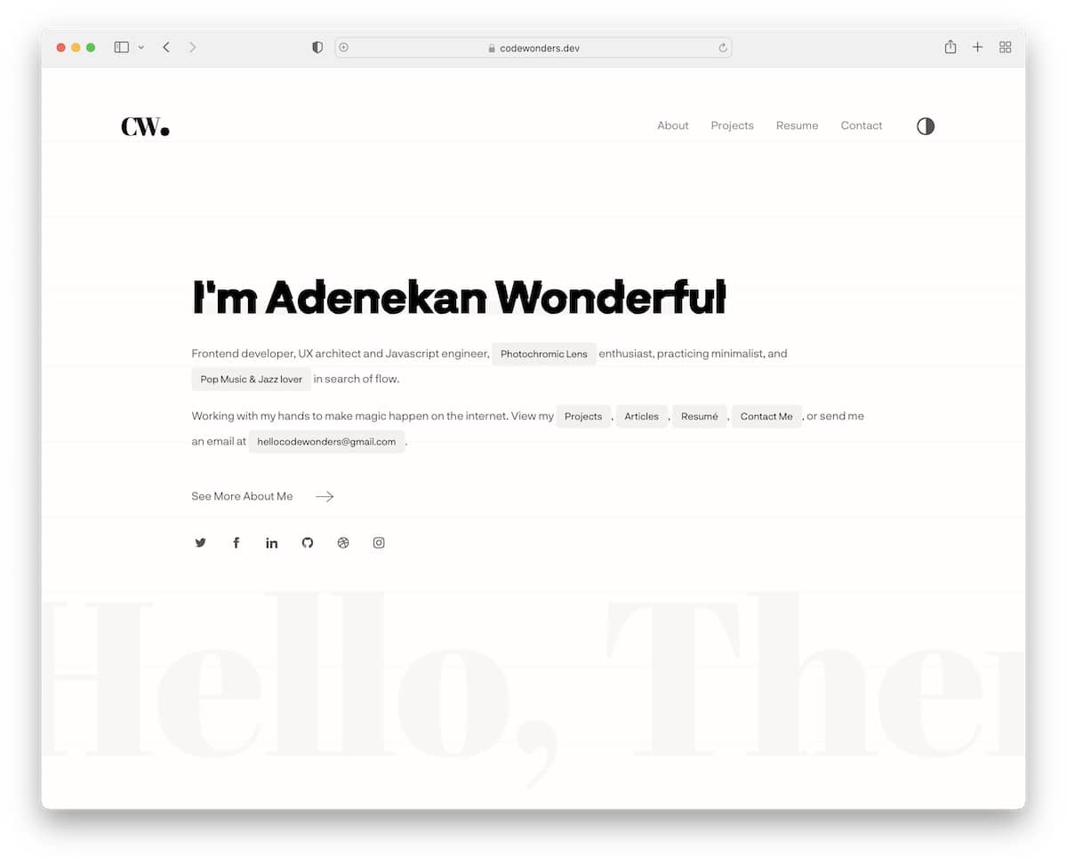
Similar to Lauren’s site, Adenekan Wonderful also has a text-only home page with some detailing to make it more captivating.
The two-sentence bio includes all the necessary (navigation) links, an email, and a link to the about me page.
Note: While pure minimalism works really well for web design, make it more exciting with a simple animation.
11. Gift Egwuenu
Built with: Gridsome
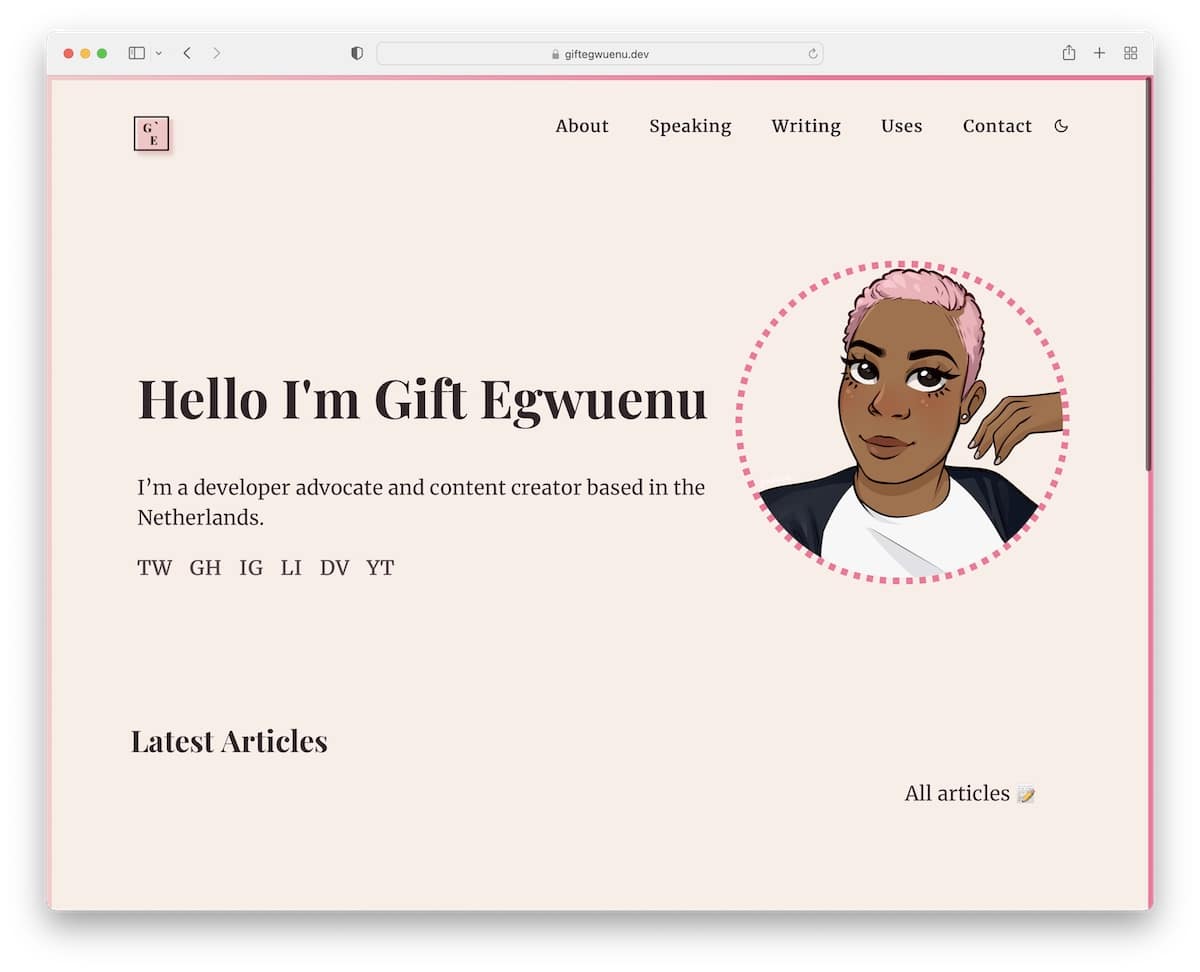
Gift Egwuenu has a modern, text-heavy online developer portfolio page with an excellent animated profile picture that disrupts the seriousness.
What’s unique about this website is the framed pink border, which becomes even more visible when you turn on the dark mode view. The pink color is also used in other elements and details, adding a nice branded touch.
Note: Add personal touches and branding to create a pleasant web atmosphere.
12. The Craftsmen
Built with: Craft CMS
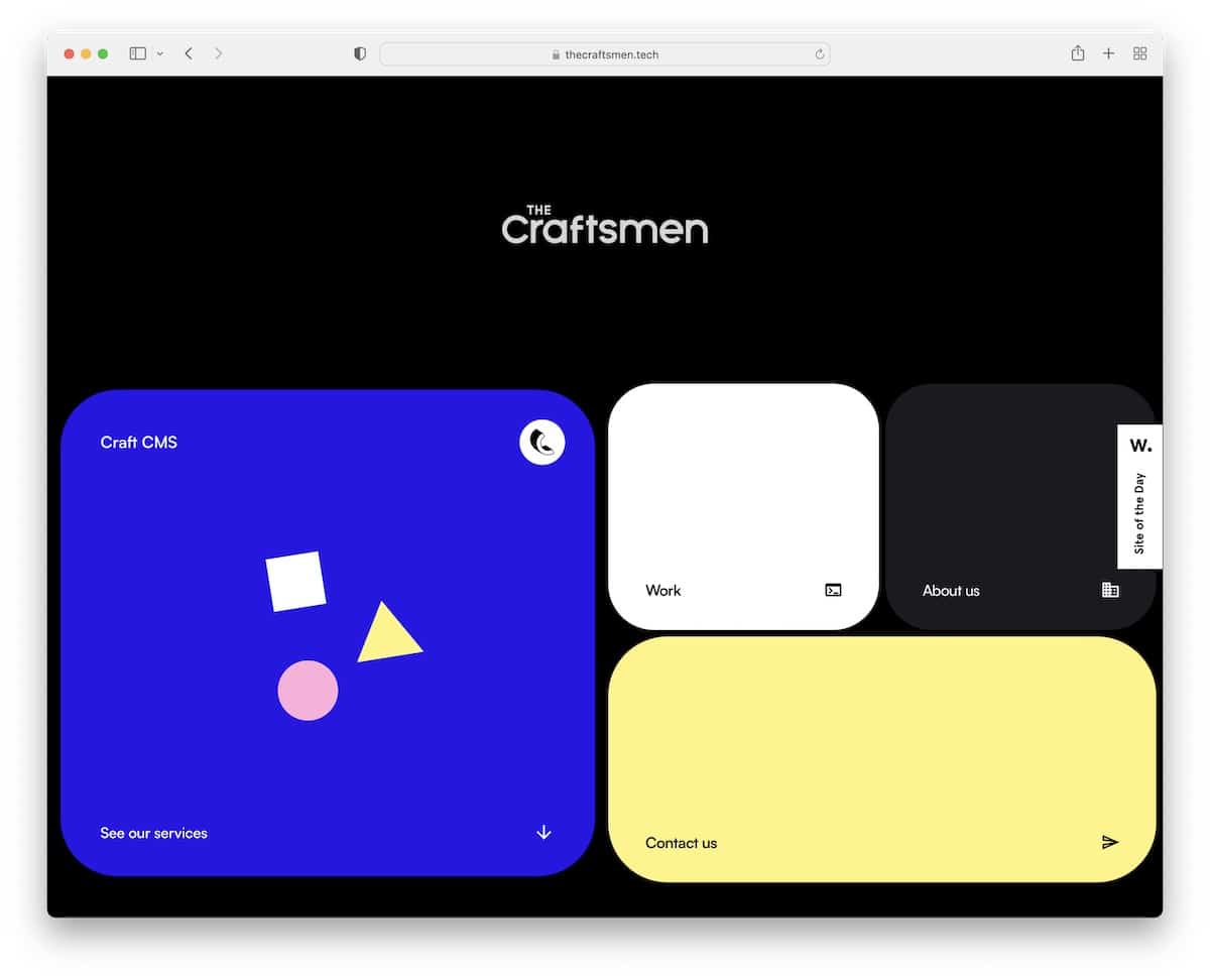
The Craftsmen is a very dynamic website with animations and moving elements that make scrolling much more exciting.
This is also a pretty one-of-a-kind single-page layout with a dark background and other, more vibrant colors that add life to it.
Surprisingly, the website doesn’t have a header, but the hero “cards” work as navigation through the page.
Note: Blend static and animated elements for a lively web design.
13. Adeola Adeoti
Built with: Next.js
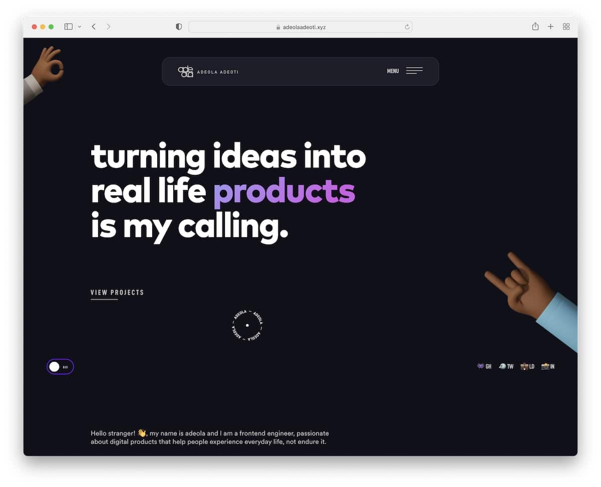
Adeola Adeoti is minimalist and modern simultaneously, with many mobile-like elements that are 100% responsive.
Two stand-out elements are the custom mouse cursor and the background audio to pause and play.
Another cool thing about Adeola Adeoti’s website is that there are no traditional testimonials, but Twitter posts in a slider you can stop on hover.
Note: Use testimonials on your website to build social proof.
14. Kenneth Jimmy
Built with: Nuxt.js
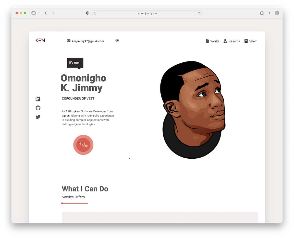
Kenneth Jimmy’s developer portfolio site is framed and boxed, with a unique scrolling experience that you must try to understand. It easily immerses you in the content and familiarizes you with Kenneth’s work.
The header features site navigation, email and a dark/light mode switcher. Kenneth also strategically uses a CTA button above the fold to contact him immediately.
Note: Instead of a full-width web layout, use a boxed or framed one.
15. Tamal Sen
Built with: Elementor
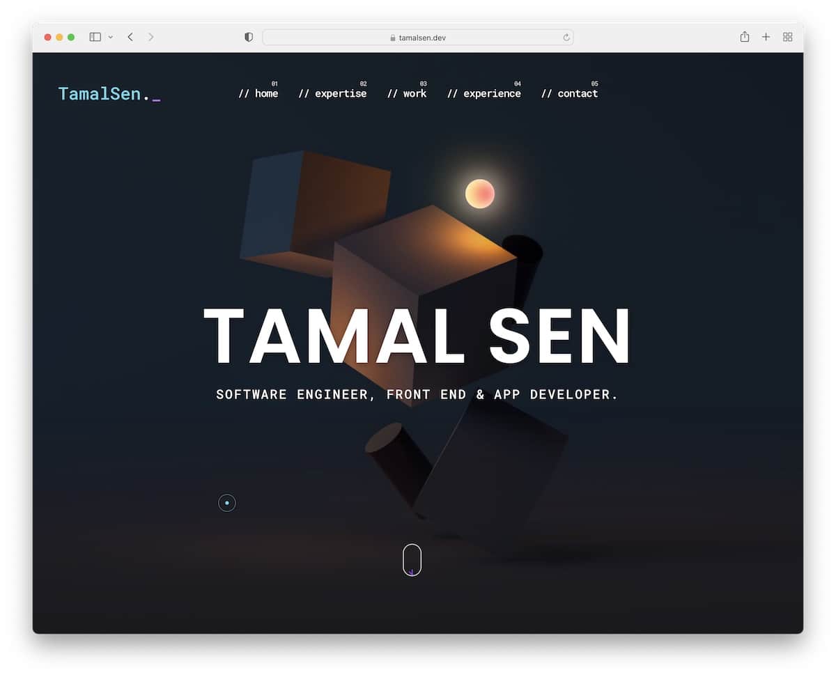
Tamal Senj’s website has a nice “developer’s” touch that blends well with the dark-ish look. At the same time, the colored details elevate the scrolling experience, which would also be amazing without it.
The floating header effortlessly navigates through the single-page layout, while the back-to-top button lets you jump to the top with a single click.
Note: Adding a back-to-top button can improve your developer portfolio’s UX.
Do you plan on using WordPress for your personal website? Then check our extensive Elementor review.
16. Matthew Williams
Built with: GitHub Pages
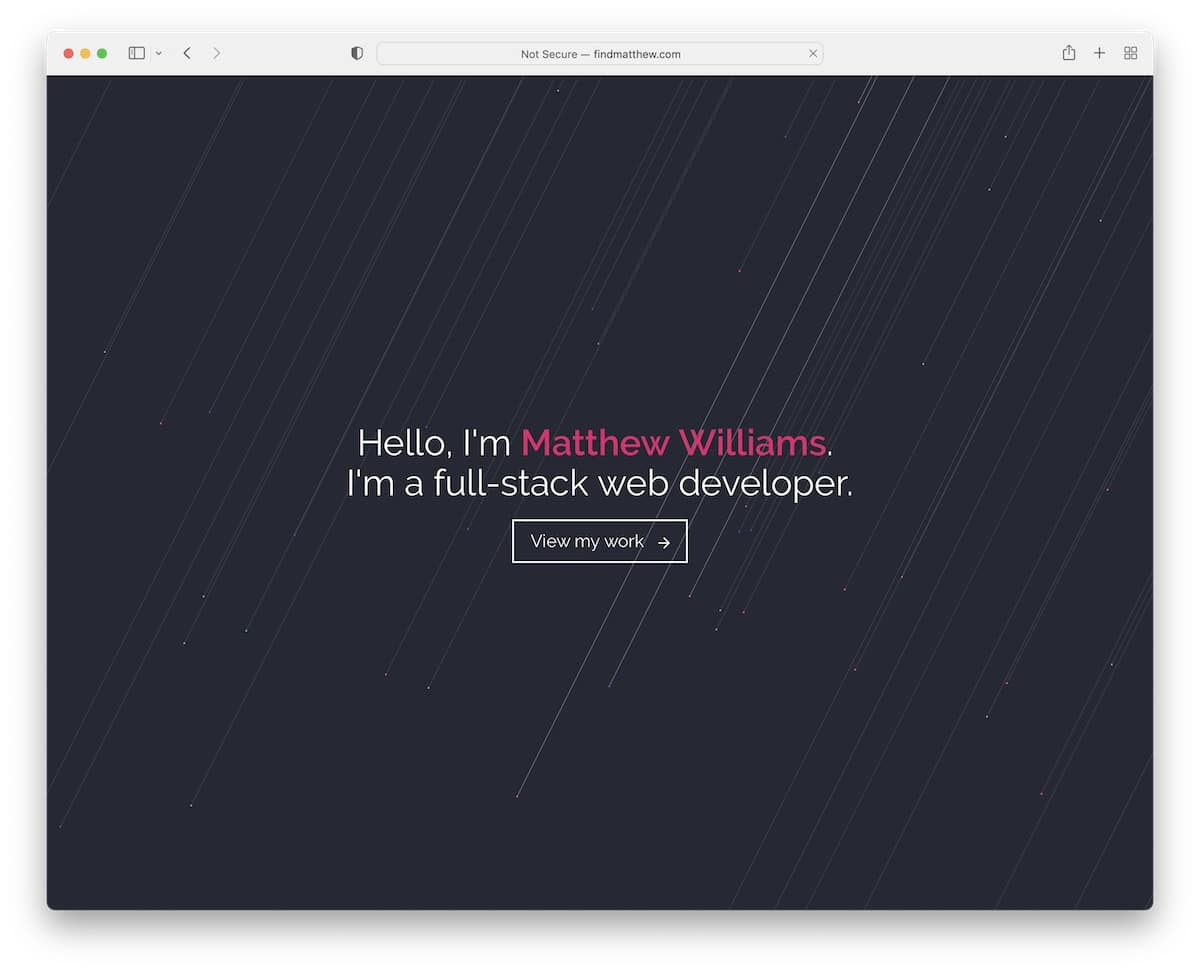
There’s one thing that most of these websites have in common: their design leans more toward minimalism.
Matthew Williams has a full-screen hero section with animated background, text and a CTA button. The navigation bar only appears below the fold and sticks to the screen.
Moreover, the site has a filterable portfolio, animated skillbars, a basic contact form and social media icons in the footer.
Note: Do you have multiple styles of projects to showcase? Use a filterable/categorized portfolio.
17. Stereo Creative
Built with: Craft CMS
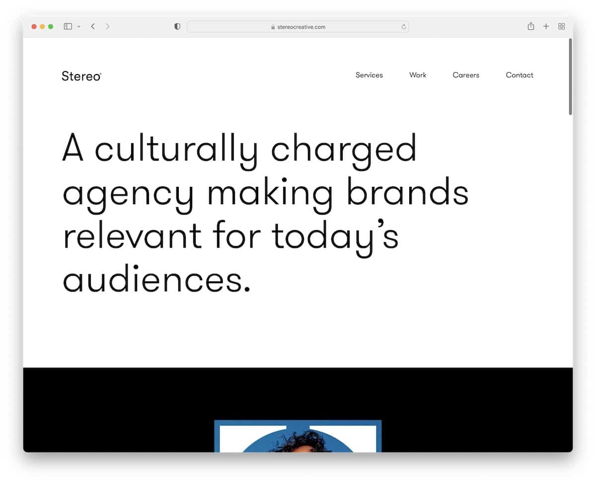
Stereo Creative is another great proof that a strong message above the fold on a solid background can work really well.
While this website starts simple, it then hits you with a cool animation that almost acts as a short promotional video.
Furthermore, Stereo Creative’s page has a header that disappears on the scroll and reappears when you scroll back to the top.
The home page also features a few of their works and a clients’ list, which builds proof of quality.
Note: Have you worked with some big brands and companies? Add them to your website as a reference.
18. Koysor Abdul
Built with: Webflow
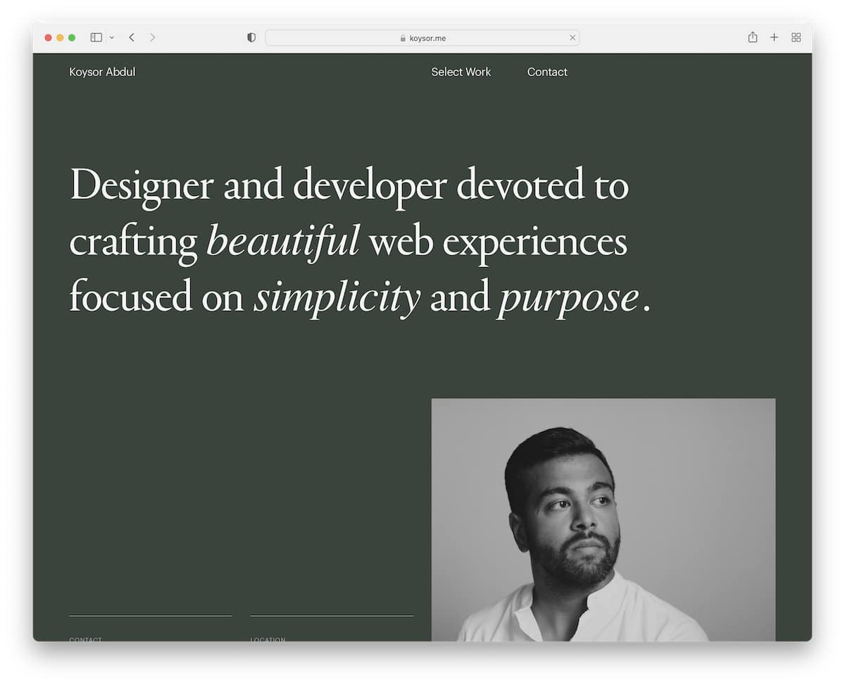
The pleasant scrolling experience makes you hope Koysor Abdul’s website never ends. Okay, it’s also because of the excellent work that he showcases for your viewing pleasure.
This is another terrific developer portfolio website example built with cleanness and great UX in mind.
Note: Link your portfolio works to live projects, so potential clients can review them first-hand.
19. Lars Olson
Built with: Webflow
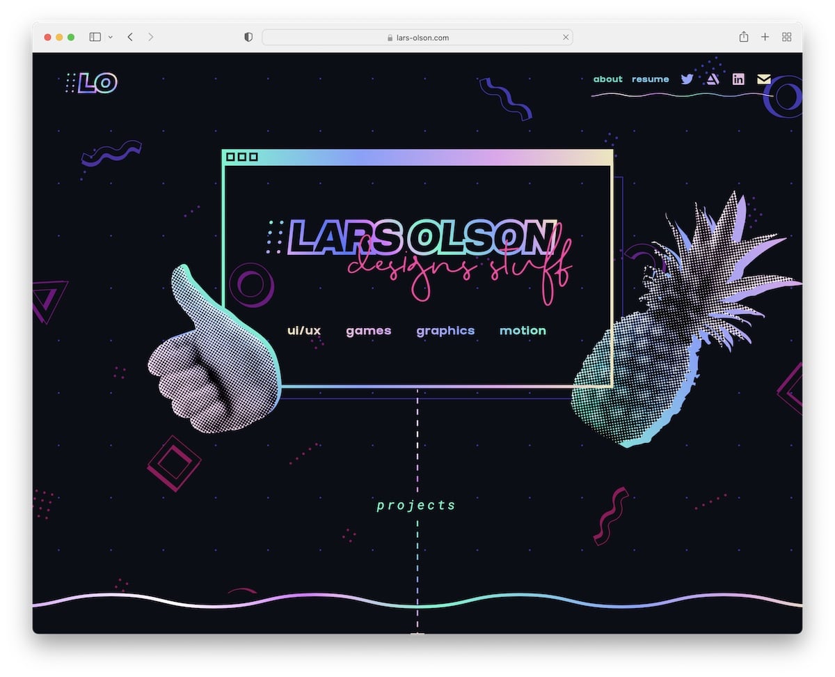
Lars Olson knows how to make a developer’s page entertaining and engaging with a cool selection of catchy details and fun elements. And the unique hover effects activate it some more.
It’s a semi-single-layout website with external links to social media and resume. Moreover, the portfolio opens projects on individual pages where you can find an in-depth presentation.
Note: Let your fun and bubbly personality shine through your web design.
20. Niall Mc Dermott
Built with: Webflow
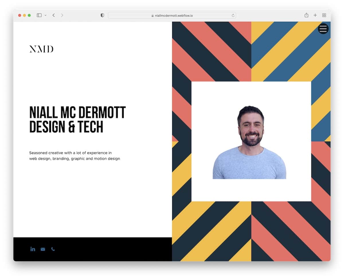
What we like about Niall Mc Dermott’s website is that even though it’s built on Webflow’s free plan, it’s still very next-level-ish.
The special thing about this developer portfolio is the split-screen design, with static left and dynamic right parts. This creates an interesting scrolling experience, but you can also use the hamburger menu to find other details and information about Niall.
Note: A free website builder doesn’t always mean half-baked products; sometimes, you cannot use a custom domain name (or the functionality is slightly limited).
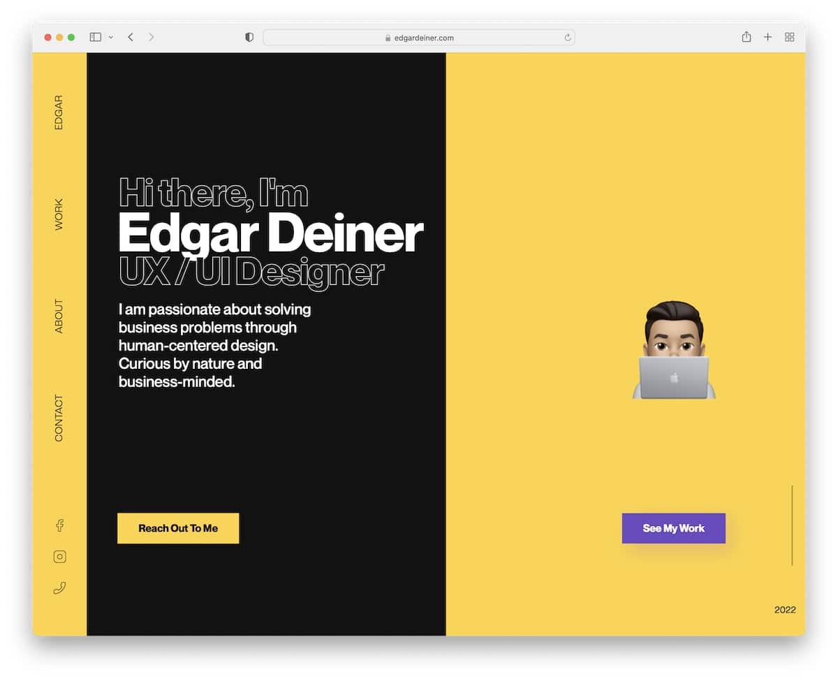
21. Edgar Deiner
Built with: Webflow

Edgar Deiner also has a split-screen design but without the sticky part. However, Edgar’s website uses a sidebar navigation/header that floats, ensuring you always have access to the menu and social media links.
A black and yellow color scheme elevates the atmosphere, while the extra white space calls for likable readability.
Note: Are you tired of traditional headers and menus? Use a vertical sidebar version like Edgar.
22. Developer Tim Gesemann
Made with: Svelte

Tim is yet another developer who turns coffee into code. He uses Svelte, a UI builder for web apps, and hosts it on Vercel. These two are the most developer things right now. The portfolio features a clean and minimalistic design with a prominent project section followed by a creative timeline of his work experience. He is working for Volkswagen as a Fullstack Software Engineer, likely working on implementing even more things into the touchscreen in your car.
Note: The website offers a mix of creativity and simplicity, making it an excellent example for everyone creating their developer portfolio.
Was this article helpful?
YesNo


