21 Best Site123 Websites (Examples) In 2024
Are you looking for the best Site123 websites to appreciate some good design and gain ideas for your online presence?
We created a collection of the 21 best web creations built with this simple website builder.
You can also create similar sites without coding or design knowledge.
Not just that, but you can make it happen for free.
Site123 is great for a quick solution if you don’t need a too advanced website.
However, you can create an online store, a landing page, an online portfolio, a site for events, photographers, etc.
Our tip: Enjoy these designs first and go from there.
Best Site123 Websites & Design Ideas
1. Active
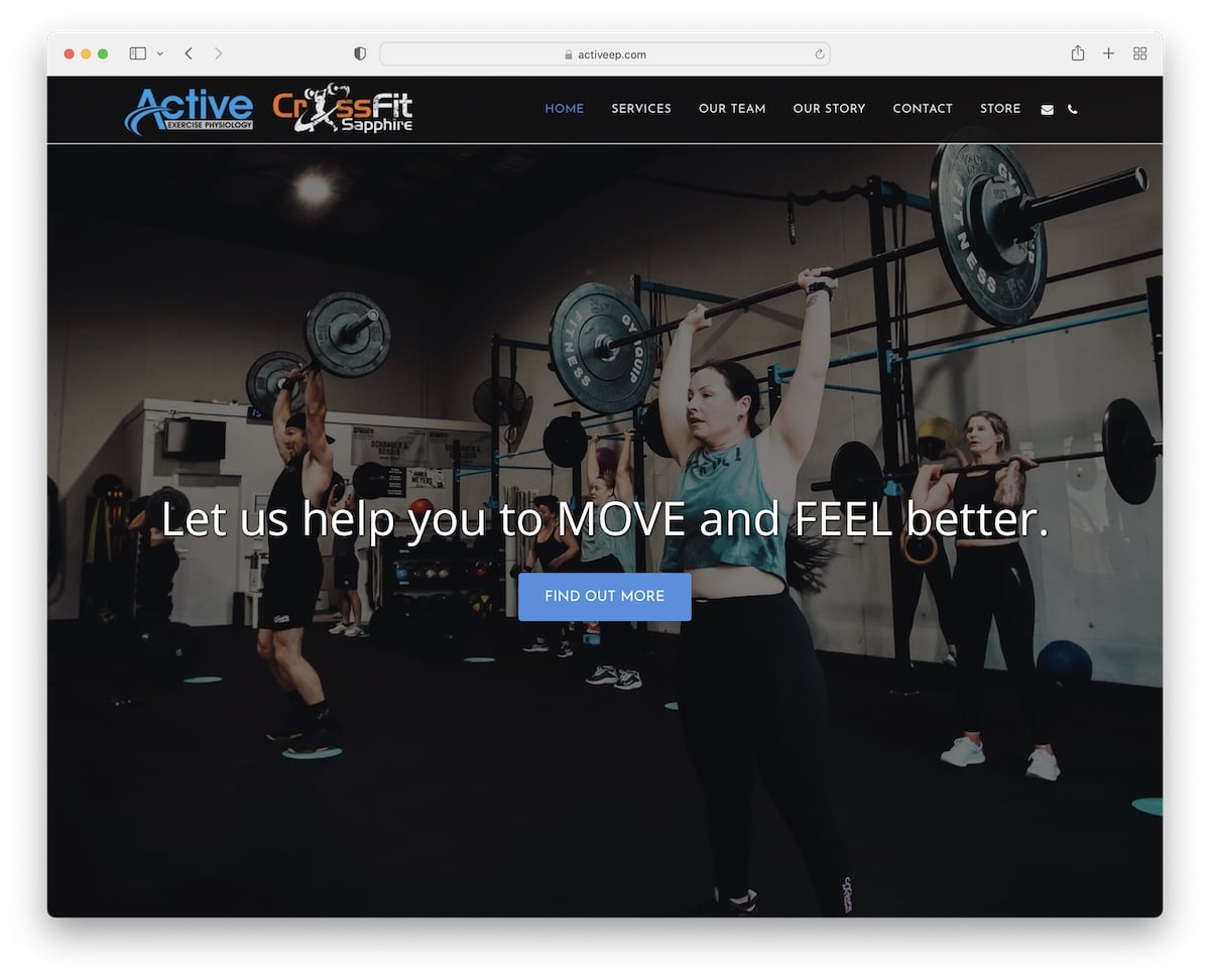
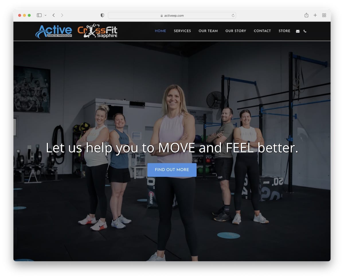
Active welcomes you to the world of sports with a full-screen slider with text and call-to-action (CTA) buttons.
The simple services section shows what you can get, and the team section includes images, roles, and links to bios.
Moreover, the integrated Google Maps showcases the facility’s location with an address for easy finding.
Note: Share the team behind the business with actual images and profiles.
2. RB Windows
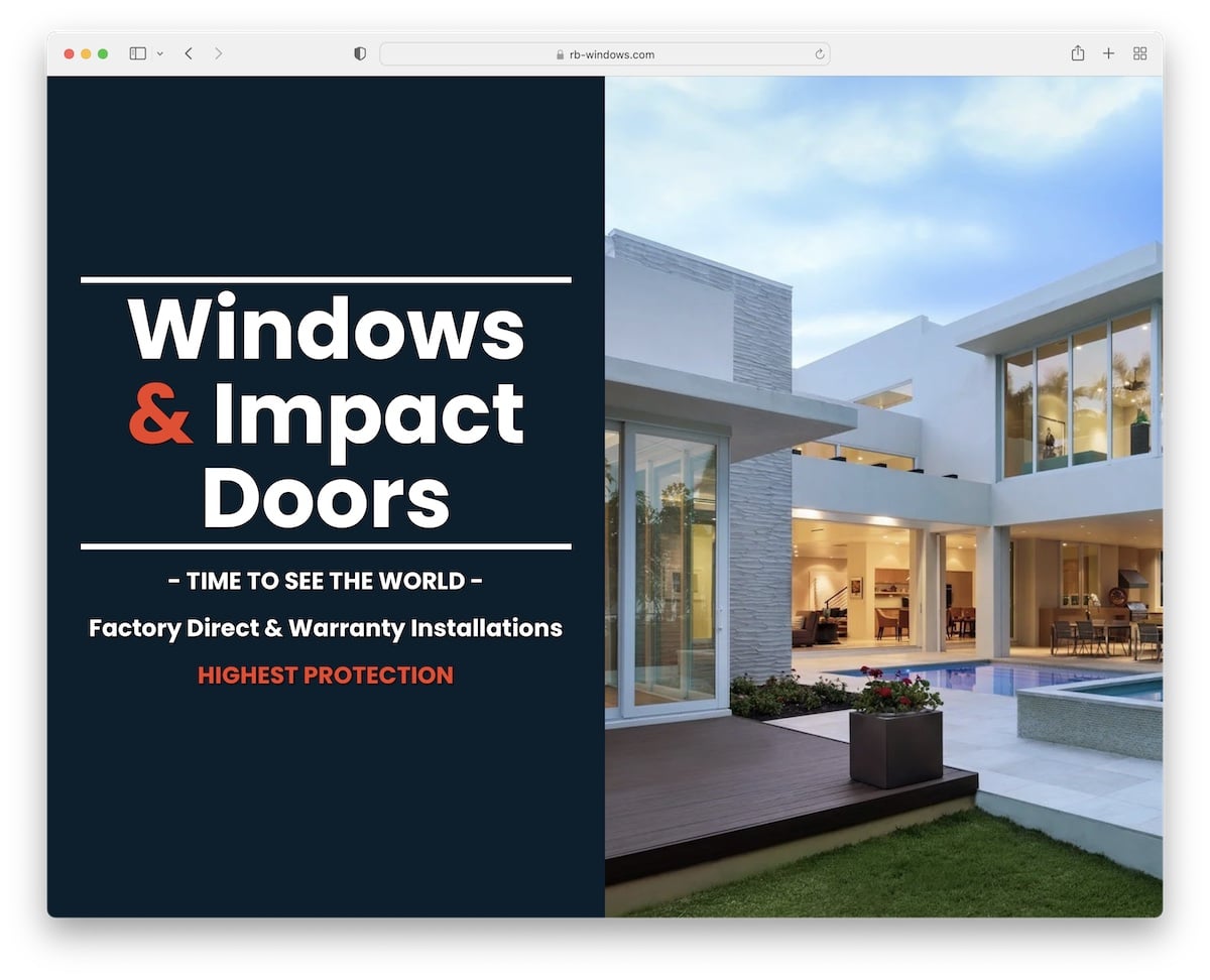
We really like RB Windows’s cool split-screen design, which features text on the left and a slider on the right.
This Site123 website example also features a cool parallax effect, a partners’ logo slider, and an About Us section on the home page.
Lastly, it’s a one-page site with a floating navbar that lets you jump from section to section with a click.
Note: Floating menu is great if you run a single-page website because it improves the overall user experience (no need to scroll to the top).
But you can also check our list of the best one-page website builders for more options.
3. Cory Gallant
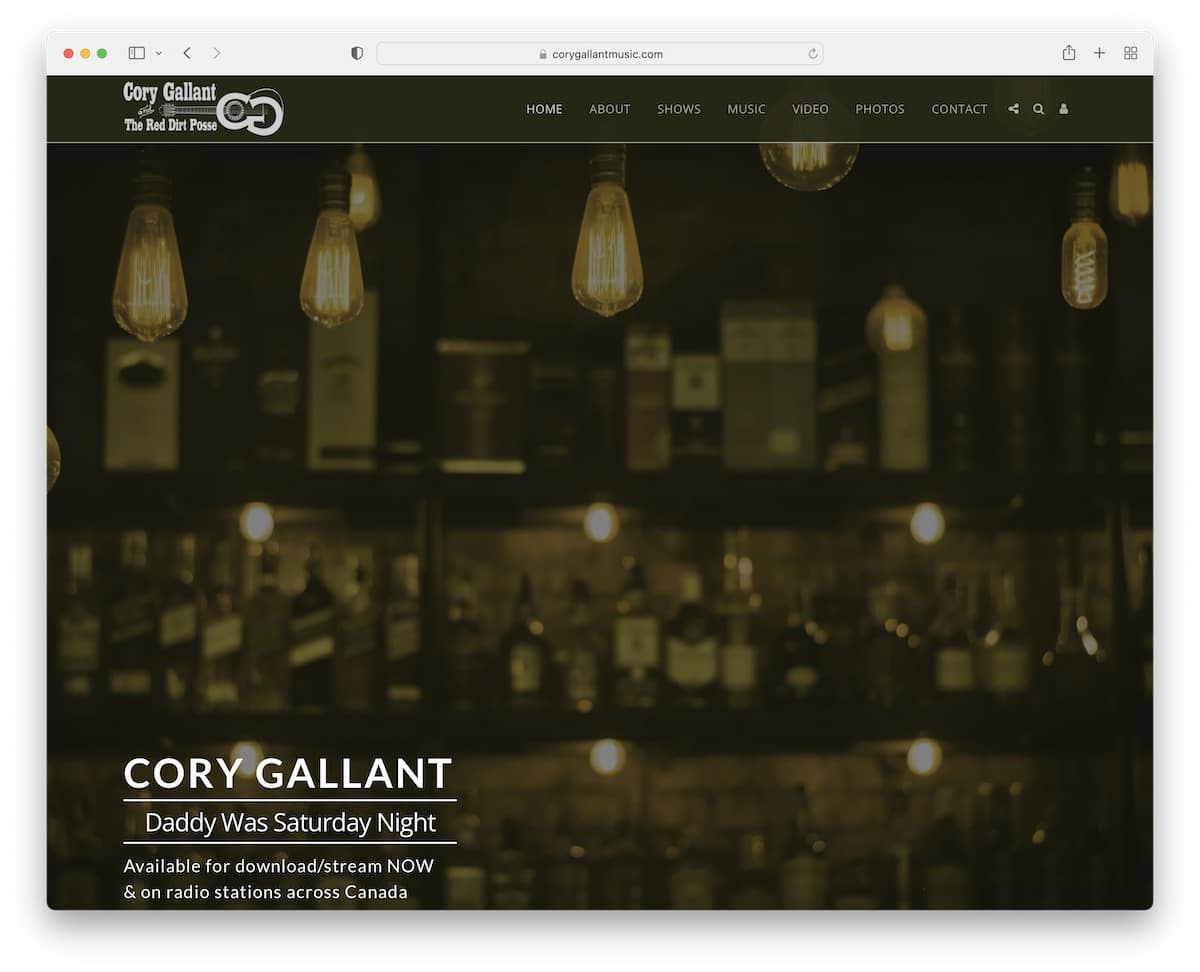
Cory Gallant runs a relatively simple artist website that he built using the Site123 builder and spiced it up with his creative touches.
The full-screen hero section comes with a parallax image background and a subscription form, continuing with the “about me.”
You will also find a lightbox photo gallery and video slider to check what his shows are like.
Note: Use the website to tell your story, promote your shows, embed music videos and include a contact form for bookings.
4. Start Up Wise
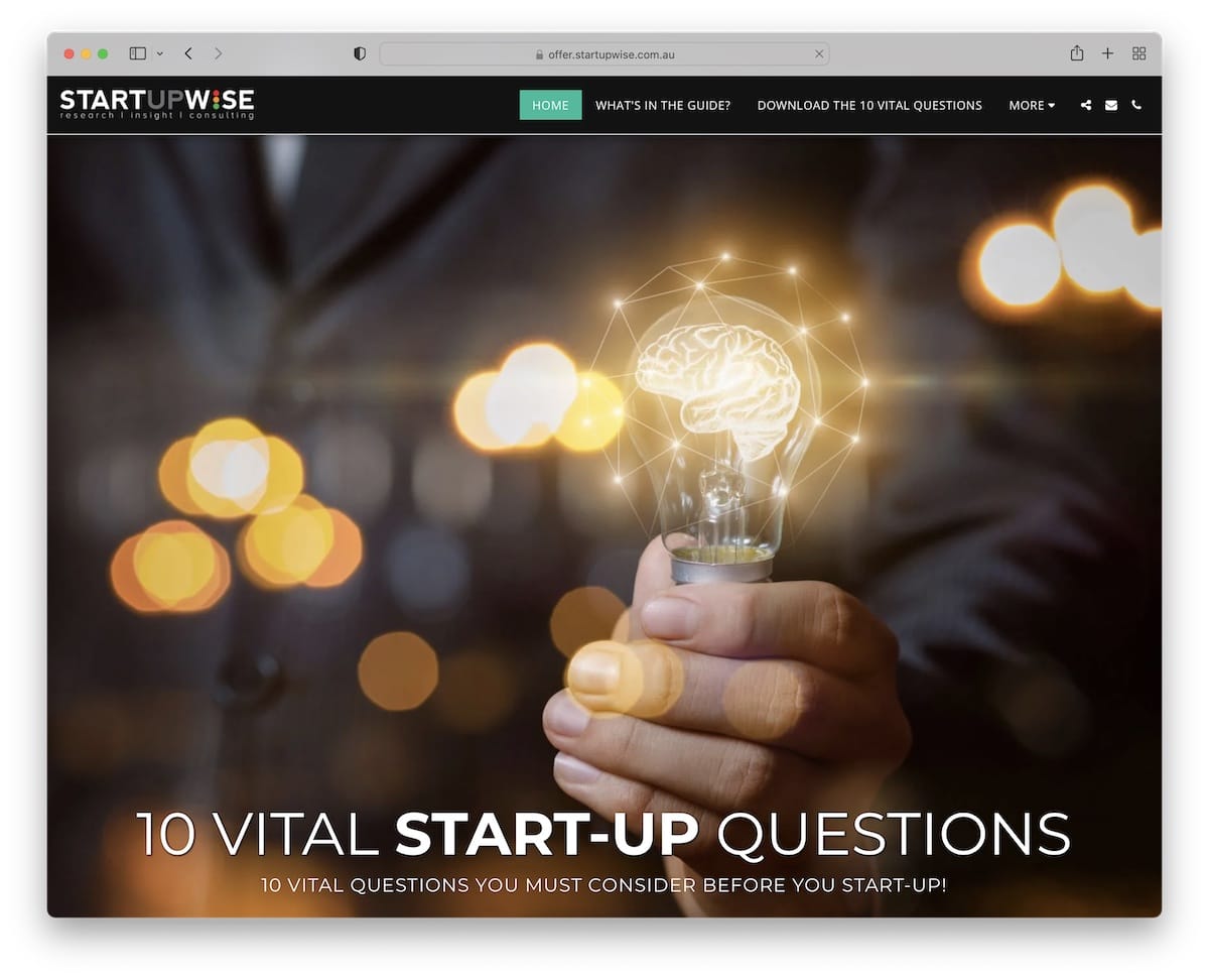
Start Up Wise is a basic one-page website by Richard Milne promoting his book. Besides giving you a glimpse at what’s in the book, there’s also a sign up form that allows the user to download the book.
This is also a great strategy to capture leads for future email marketing campaigns.
Note: The drop-down menu option keeps the header cleaner but allows for a more refined search.
5. James Movies
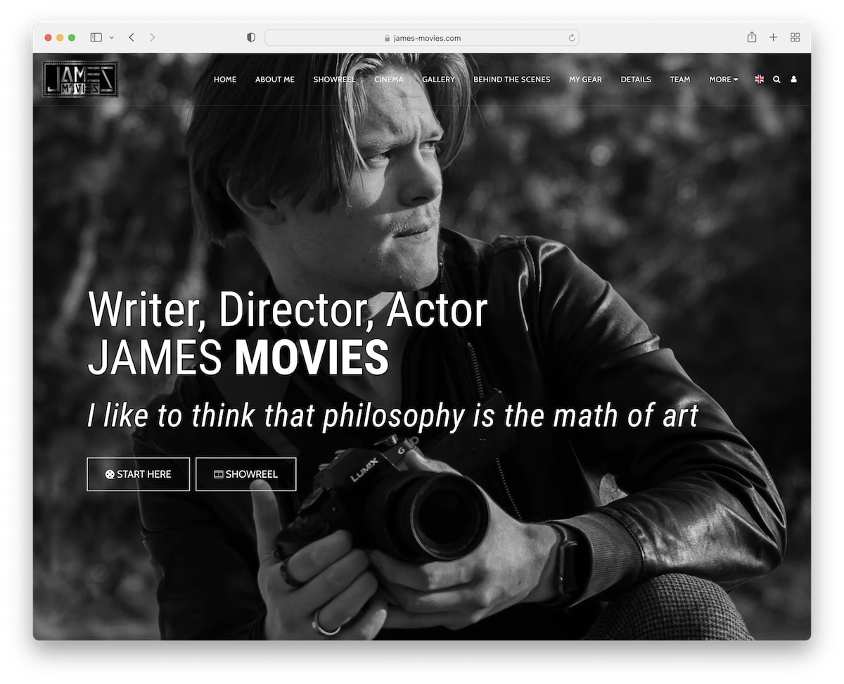
James Movies runs an online portfolio website showcasing his images and videos with filters. All the galleries have the lightbox feature, so you don’t need to leave the current page to view them.
One unique function is the donation section, which you can use to support James and his creative work.
Note: Let fans support you by donating via your website.
6. Epiphany Designs LLC
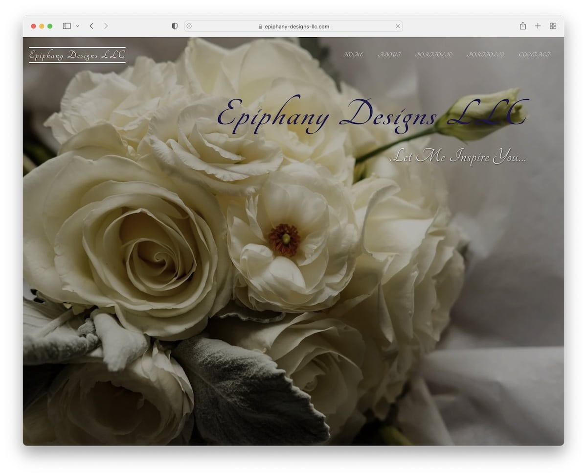
Epiphany Designs LLC features a transparent header with a full-screen background image and simple text that welcomes the potential client to Jennifer’s world of flowers.
She also broke her products and services into two portfolios so that you can view her offerings more closely before contacting her.
Note: Simple portfolio is way better than no portfolio if you want to build a business.
8. Mozave
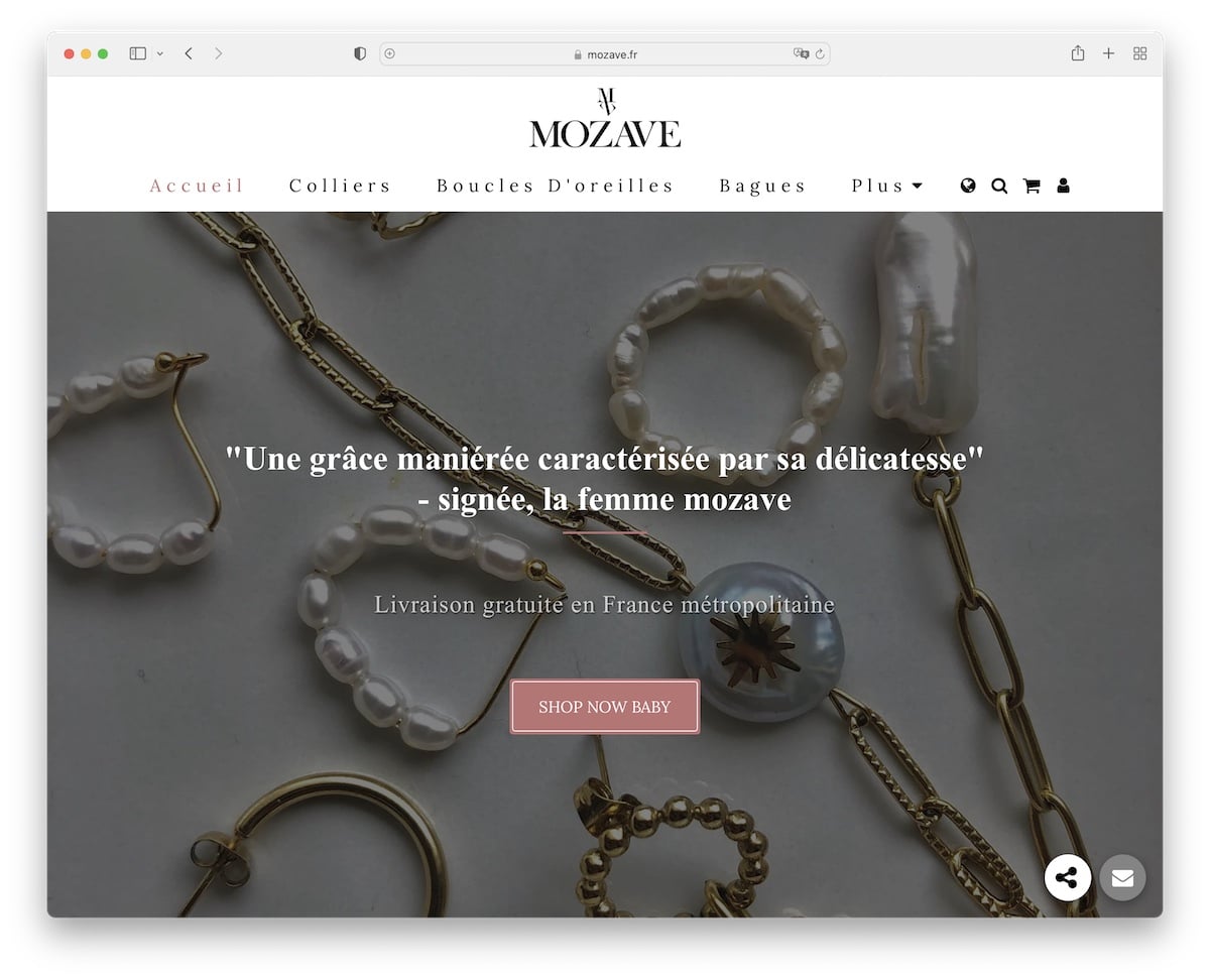
Mozave is an eCommerce website example with a clean web design that puts all their products front and center.
But the user’s experience begins with a large slider with CTA buttons. Or he/she can pick the right category using the minimalist header navbar.
Moreover, the footer area keeps the same theme with a white background, social media buttons and a newsletter subscription form.
Note: Use pricing plans if you have special deals for multi-packs or anything else.
9. Utility Audit
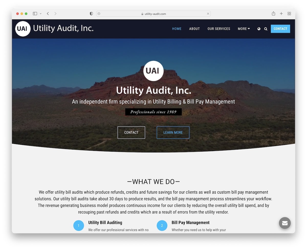
Utility Audit is a somewhat basic Site123 website example for professional services. However, scrolling is enriched with content loading and the hero section contains a beautiful video background.
The business displays its location on Google Maps and features a clickable phone number and a client logo slider for credibility.
Note: Special home page sections to explain who you are and what you do are must-haves.
10. Show Ready
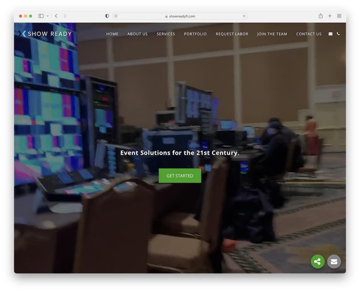
Show Ready has a full-screen video background that perfectly adapts to mobile. They also use a simple “Get started” CTA button that takes you directly to the contact form.
But you can also take the time to check who they worked with, their benefits and their portfolio.
Note: Use a CTA in the hero section to go straight to business.
11. Ivy Do Kitchen
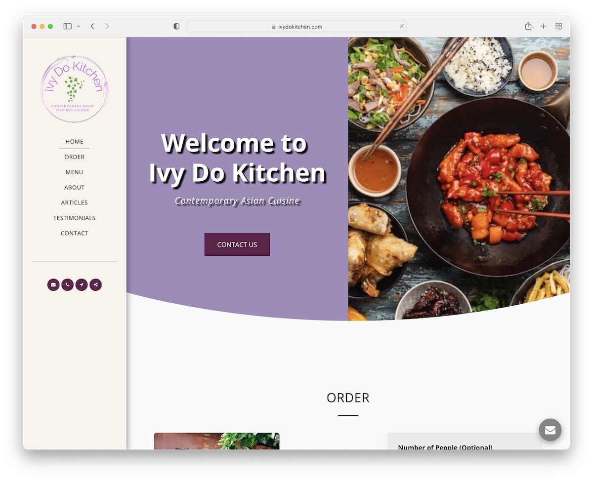
The unique factor of Ivy Do Kitchen is the sticky sidebar menu. It also features a split-screen hero design with text and CTA on the left and a parallax image background on the right.
Online ordering, a filterable food menu, testimonials and a contact form are all on Ivy Do Kitchen’s one-page layout.
Note: Instead of going with the traditional top header/menu, create a sidebar version.
12. Byscapes
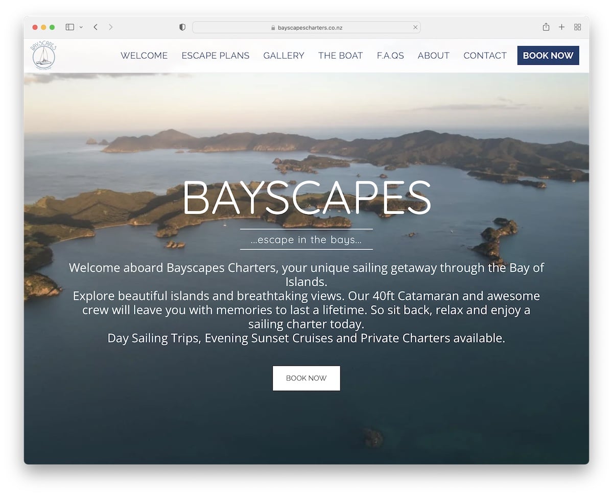
Byscapes’ simple and bold floating header with slight transparency accompanies your while you scroll to learn about the services, view the engaging image slider and read FAQs.
What’s also great is the always present “Book now” button and a Google Maps location marker, so you know exactly where to find them.
Note: Add a booking button in the header so everyone can take immediate action.
13. Gabriel Monnet
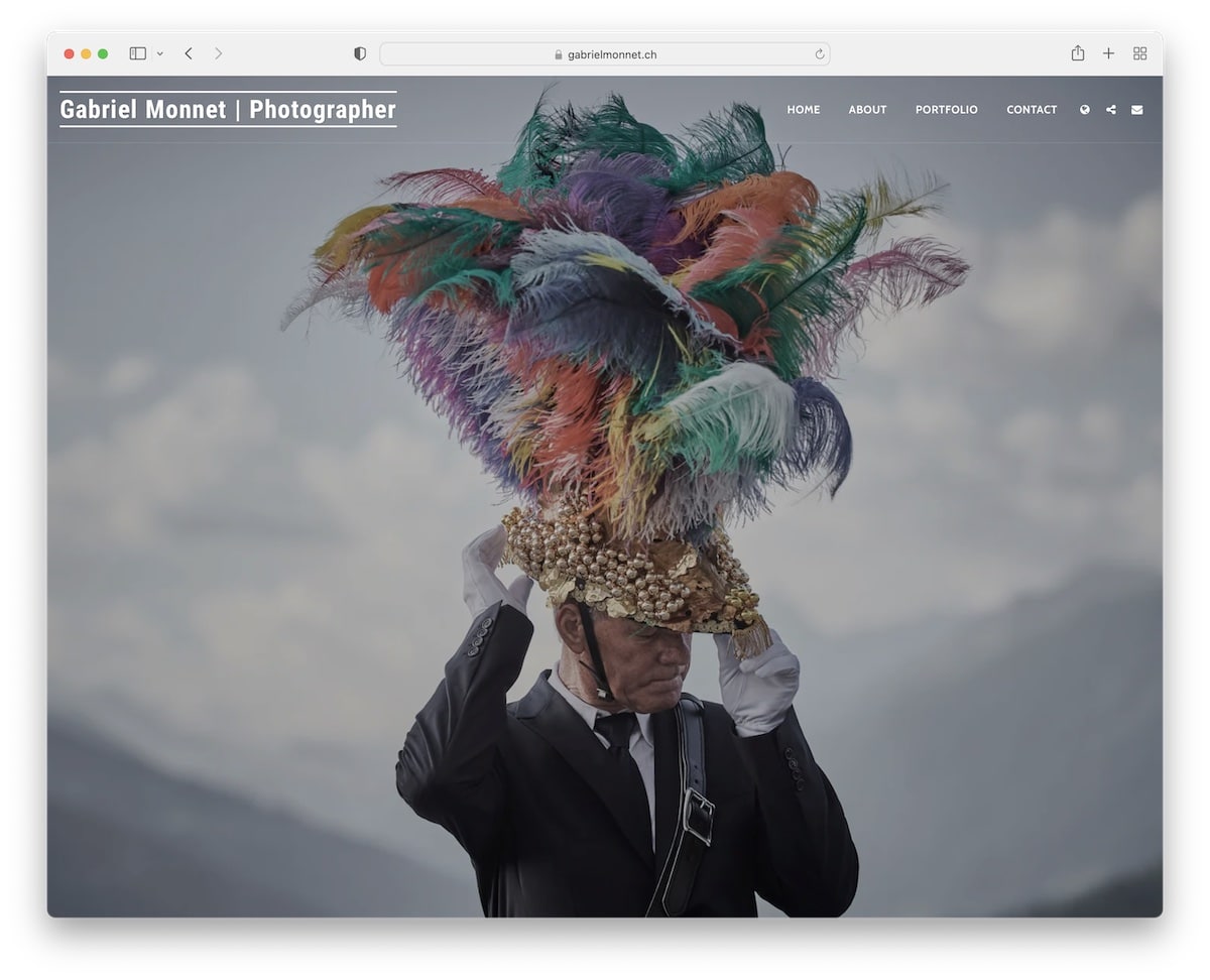
Gabriel Monnet’s online portfolio website is beautiful and clear. The full-screen (parallax) hero image is intriguing enough to make you want to see more from Gabriel.
He also dissected his portfolio into multiple filters, so you can check what you’re interested in much easier.
Note: If you’re passionate about multiple photography styles, use portfolio filters to show them for a better user experience.
14. Mohab Draz Studio
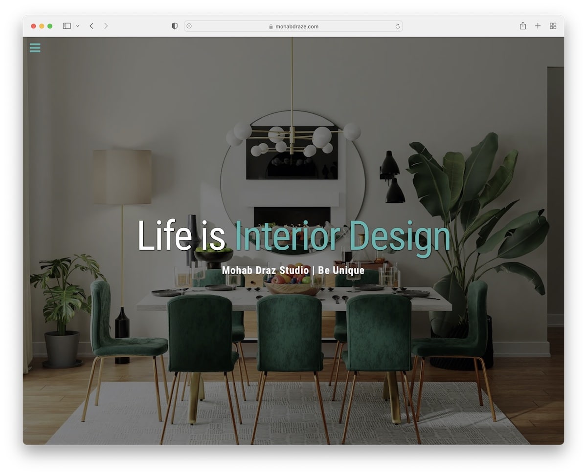
If Gabriel’s portfolio is more minimalist, Mohab Draz Studio’s is pretty advanced, with lots of great content going on.
Content loads on scroll, which gives the website a more fetching feel, but we like the before-after slider the most.
There’s also a hamburger menu icon that reveals a sidebar header on click, keeping the experience completely distraction-free.
Note: A before and after image slider is a great addition to a website, showcasing the quality of work.
15. Chokersbk
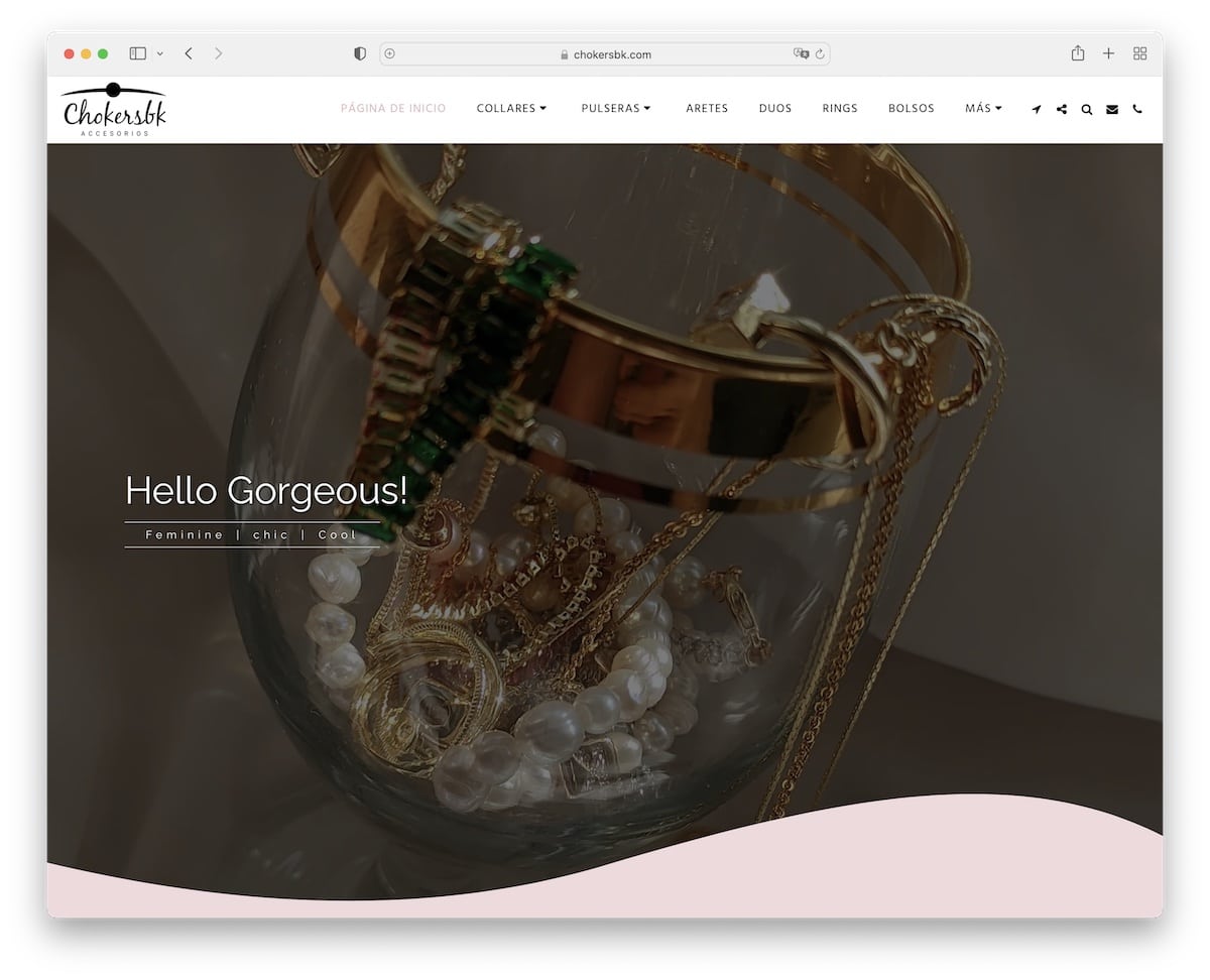
Chokersbk is an eCommerce website built on Site123 with a charming web design that gets you excited with a full-screen slider.
The website also includes a client review slider, a contact form with the exact location (via Google Maps) and a clickable phone number and WhatsApp.
Note: A review slider with stars is a great way of sharing what others think about your awesome products.
16. Troy Ford
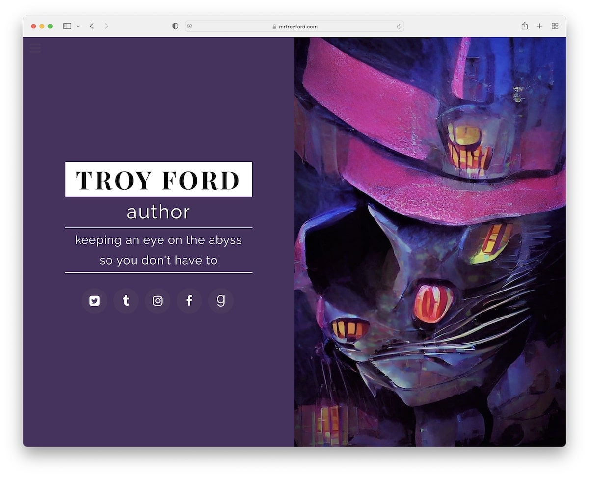
Every author interested in building a website can do so with Site123, and Troy Ford is good proof.
You don’t need experience to create the fantastic split-screen above-the-fold section, add a parallax background effect, or include FAQs with accordions.
The sticky hamburger menu with a revealing sidebar “header” is also easy to make happen.
Note: A back-to-top button is advisable if you run a “longer” website to let visitors avoid scrolling back to the top.
17. JJ Day Spa
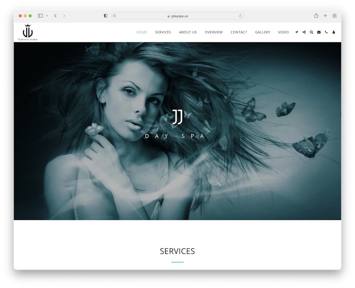
JJ Day Spa keeps things very professional with the large parallax background and brand name/logo for the hero section.
Their home page could be a single page, but they decided to break things down into multiple internal pages.
What’s cool is that they have a separate page for all their services, where you can learn more information.
Note: A minimalist design with a few creative tweaks always works.
18. Celebrate Greece
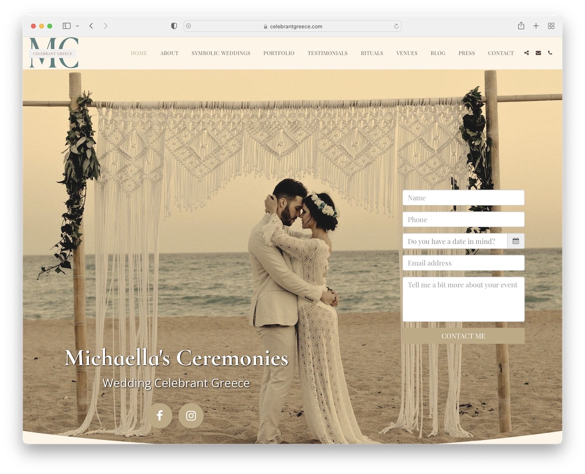
Celebrate Greece is a wedding website with a contact form above-the-fold so potential clients can contact Michaella immediately.
But you can also learn more about her, check the awesome parallax portfolio and read client testimonials. There’s also a special section for different venues and links to various press publishments.
Note: If authorities mention you, consider adding excerpts and links to your website as a reference.
19. Pitos Coffee

Pitos Coffee is a stunning single-page Site123 website with a floating and transparent navigation bar.
The About Us section uses a cool slider with a text block to enhance the reading experience.
Moreover, all their coffees, teas and creations are presented almost like a timeline with text and images. It’s very insightful.
Note: Keep your products and creations at the forefront, so everyone can get a “taste” of them only by scrolling your site.
But here here some more coffee shop websites that’ll expand your design ideas even further.
20. Kismet Spices
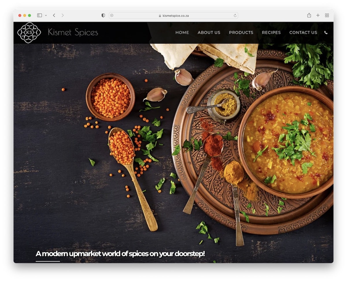
Kismet Spices welcomes its users with full-screen parallax background and barely any text, keeping it very flawless.
The number one thing that instantly grabbed our attention was the choice of dark design. It definitely “spices” things up, giving the website and the products an even more premium feel.
Note: Dark design, mixed with parallax sections and gorgeous images, will instantly take you apart from the competition.
21. ProjectAide
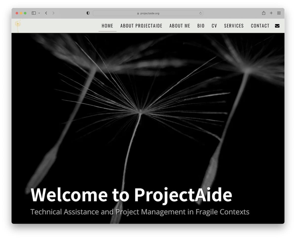
ProjectAide is a simplistic Site123 website with on scroll content loading effect and floating navigation.
It’s a one-page website with multiple sections for a better browsing experience.
We like adding an email icon in the navigation bar that opens the form as a full-screen overlay.
Note: Create a personal website that keeps your professionalism high. (Because owning a website will instantly make you stand out.)
Was this article helpful?
YesNo


