21 Best Car Wash Website Design Examples 2024
Welcome to our extensive list of the best car wash website design examples, which will undoubtedly inspire you with new creative ideas.
Don’t know where to start with creating your online business presence?
Gain inspiration through these examples first, then pick your favorite car wash WordPress theme to make it happen.
Build a page where you promote your services, display transparent pricing and even offer to book a car wash online.
You can also use Google Maps to showcase your shop’s location and start a blog to share tips, tricks and other helpful stuff that will benefit the customer. (Become an authority and increase business through SEO and organic traffic.)
Ensure the best car wash experience – starting with your fantastic website.
Best Car Wash Website Design Ideas
1. Wash My Car
Built with: Auto Spa Theme
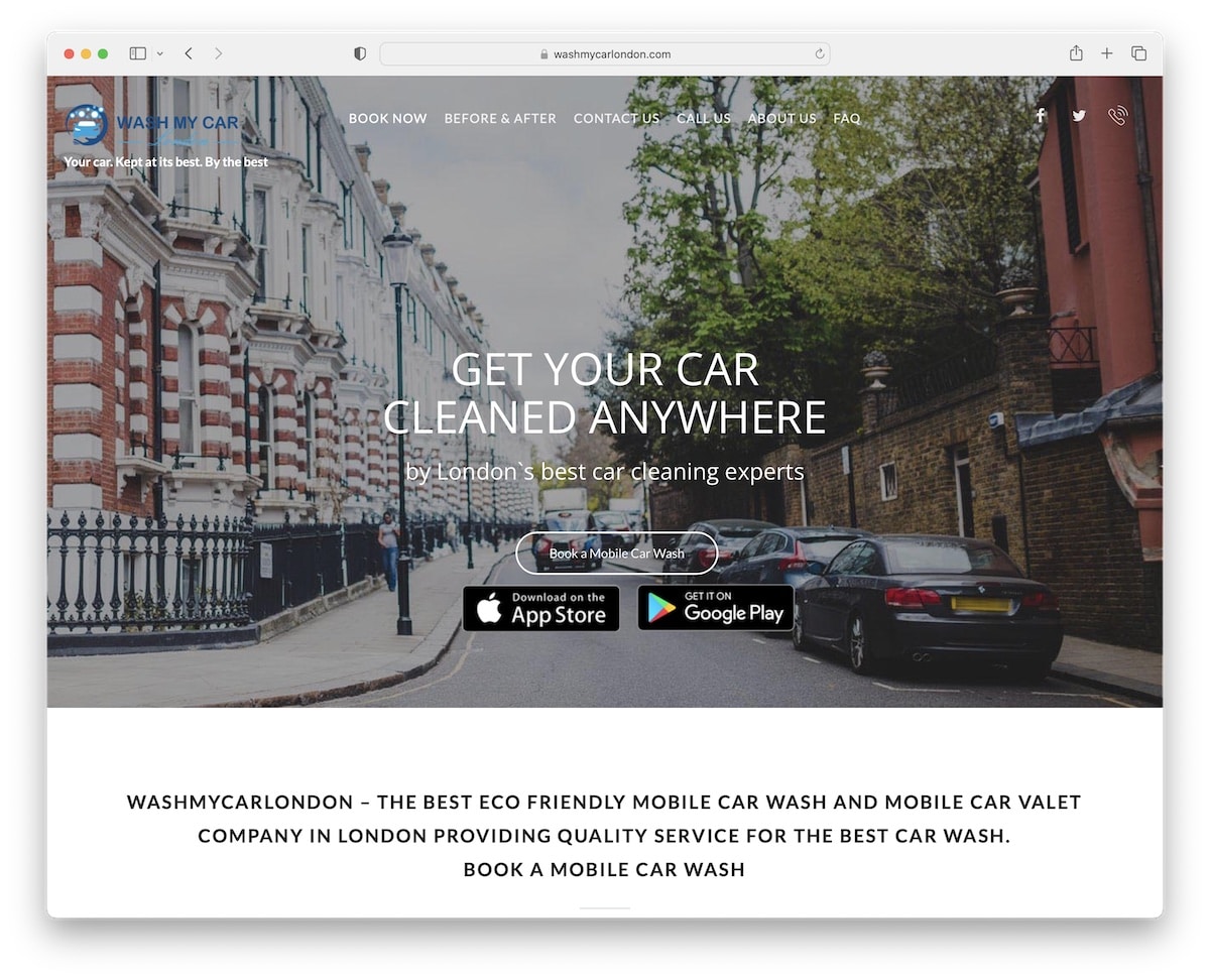
Wash My Car is a great example of a clean site design to ensure all the services and pricing are clearly visible.
It features a hero image with a transparent header, a title, text, and three call-to-action (CTA) buttons. There are also social media icons in the navigation bar and a clickable telephone number that floats at the top of the screen and is always available.
The page also uses a back-to-top button to avoid scrolling.
Note: A floating header and a back-to-top button can improve your site’s user experience.
2. Go Wash My Car
Built with: Ruby On Rails
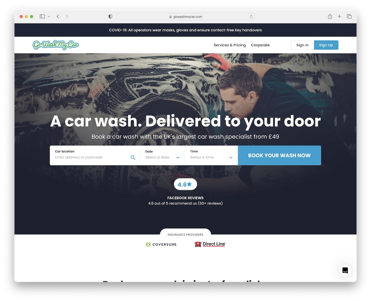
Go Wash My Car has a very actionable hero section with an online booking form to secure a wash on the spot. But there’s also a pretty advanced wizard for booking a mobile car wash or valet below the fold.
You’ll also find a top bar notification and a simple navigation bar with sign-in and sign-up buttons.
What’s also handy is the sticky chat widget in the bottom right corner, which Go Wash My Car uses to improve customer service.
Note: Keep the search bar or booking form front and center, so it’s impossible to miss it.
3. True Blue Car Wash
Built with: Divi
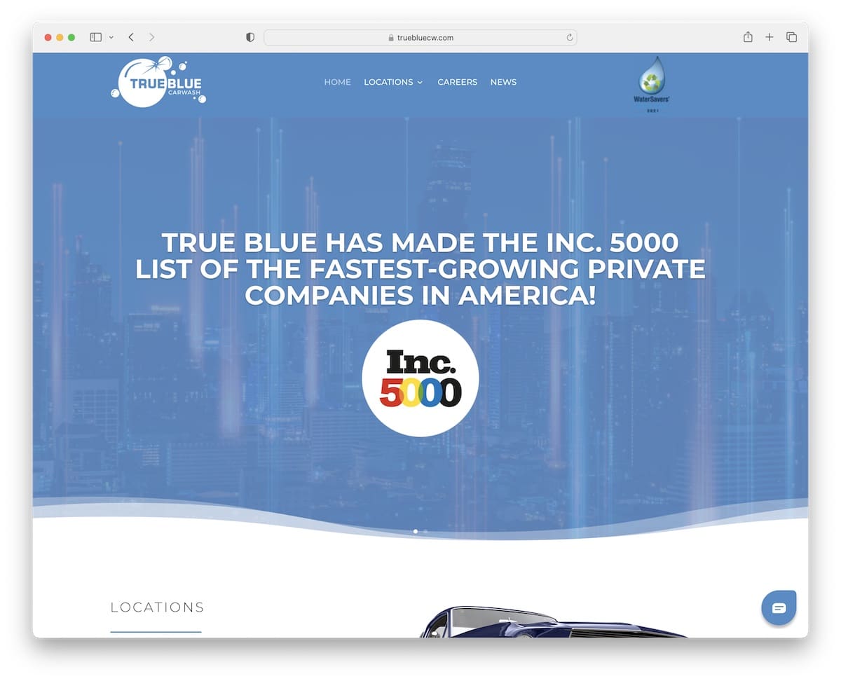
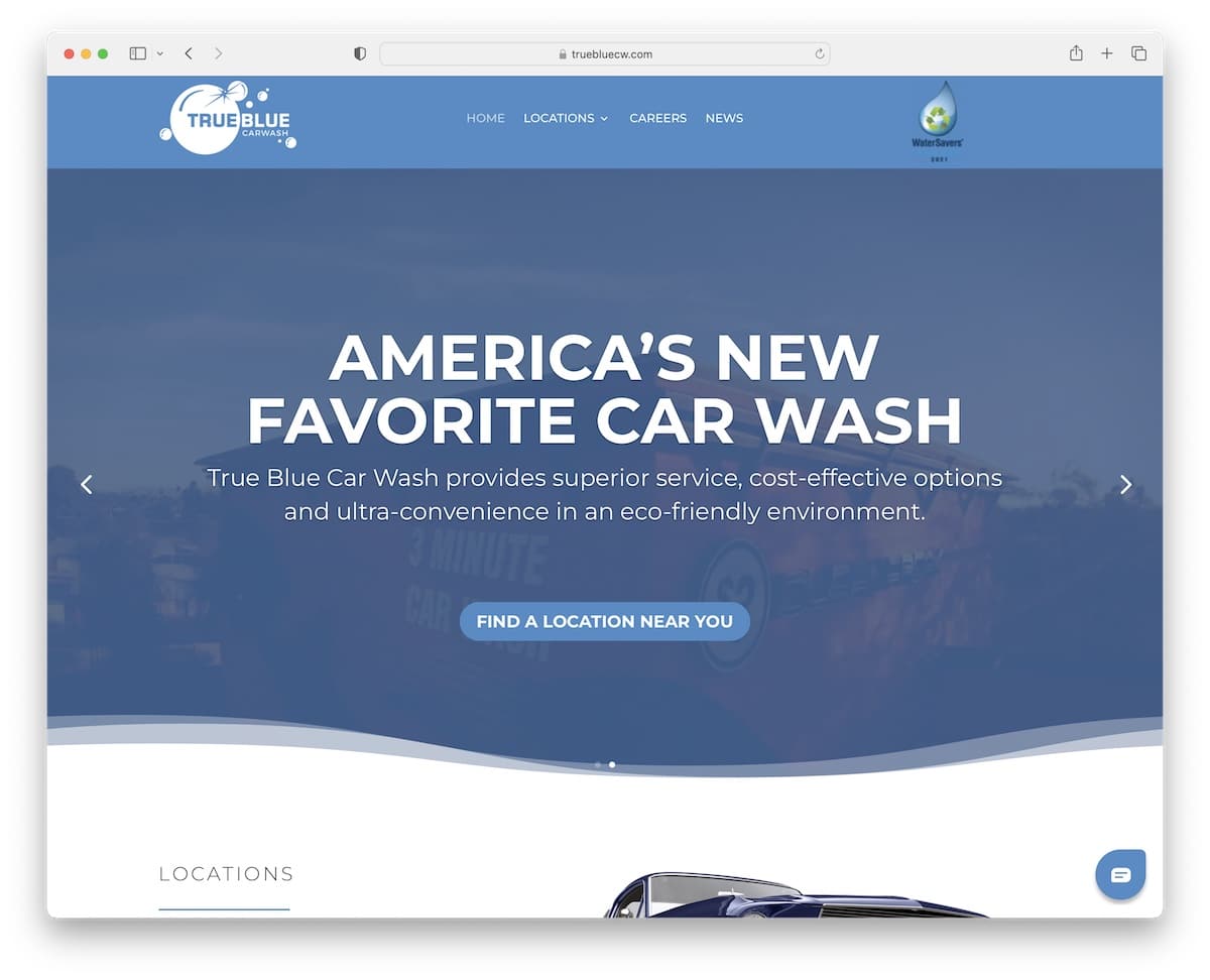
True Blue Car Wash has a modern responsive web design with some of the content loading while you scroll for a more engaging atmosphere.
This car wash website has a full-width slider (with one slide featuring a video background) to promote their greatness and services.
The menu includes a simple drop-down to pick the desired location much easier. Another practical element of True Blue Car Wash is the built-in Google Maps with location markers.
Note: Use Google Maps to showcase your car wash location(s) with custom markers and extra business/contact details.
Don’t miss other great websites using the Divi theme.
4. Fine Shine
Built with: Car Dealer
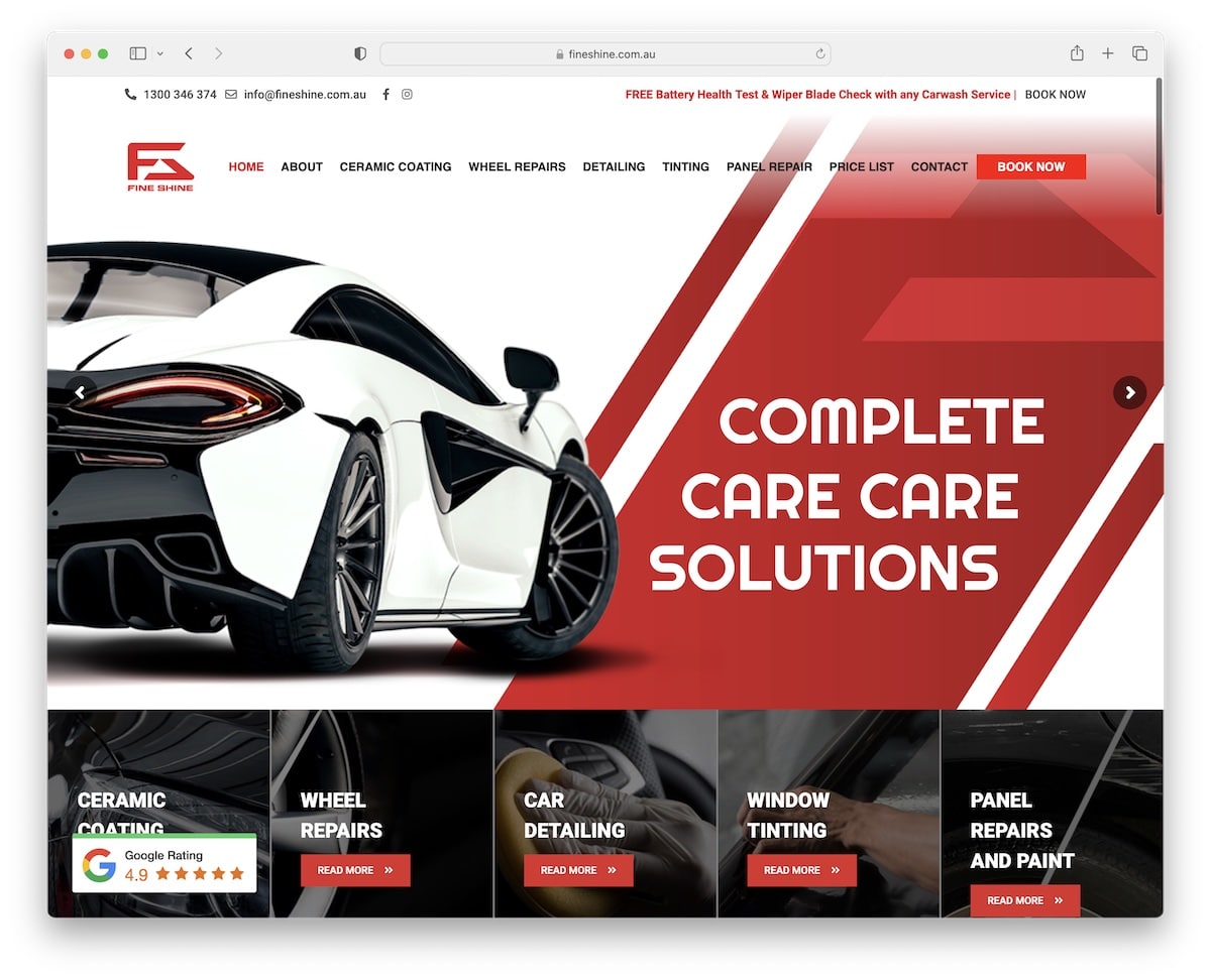
Fine Shine is a professional business website with pleasant branding that keeps reminding you about the company throughout the entire page.
Both the top bar and the header stick, so all the links and additional information are always available.
Fine Shine has a custom back-to-top button, an integrated Facebook Messenger widget and a customer testimonial slider.
Note: One of the best ways to build social proof is by adding client testimonials and reviews to your website.
5. ScrubaDub
Built with: Highend Theme
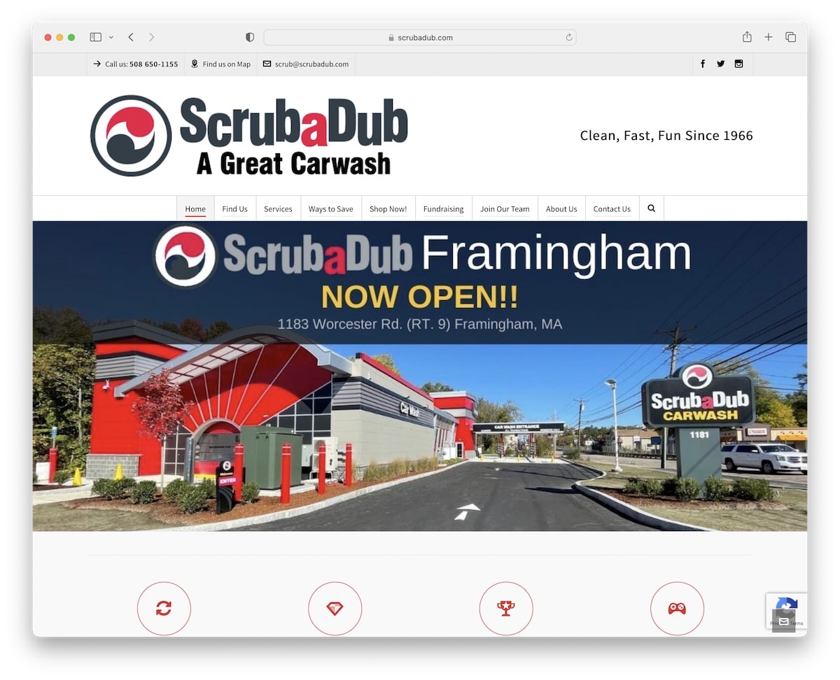
ScrubaDub is a car wash website design example with extensive navigation that combines a mega menu and a multi-level drop-down. Plus, the site also has a search bar if you’re looking for something more specific. In addition to that, the navbar sticks, so you don’t need to scroll to the top to access the menu.
From slider and parallax effect to a floating email widget in the bottom right corner and animated statistics, ScrubaDub rocks it all and then some.
Note: Take your website navigation to the next level with a mega menu, organizing links into multiple columns (or adding a multi-level drop-down).
6. Club Car Wash
Built with: Elementor
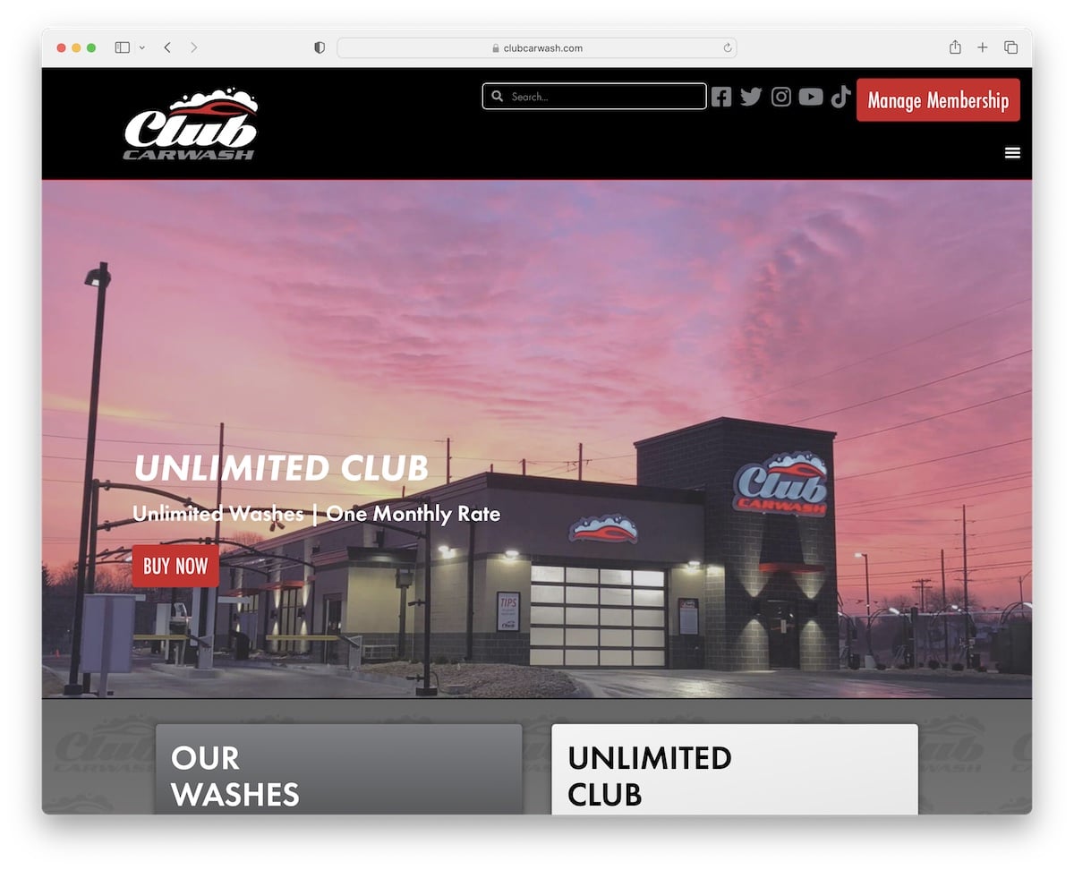
Club Car Wash uses larger typography, bold sections, and elements to pop the content more.
The sticky header contains a search bar, social media buttons, a CTA button and a hamburger menu icon, so all the necessary is within reach.
Moreover, Club Car Wash has integrated star ratings and Google reviews to build trust.
We also like the location finder page with a map and a search form to enter the location and pick the radius.
Note: If you use a 3rd-party platform to generate reviews and ratings – incorporate it into your website for proof.
You definitely don’t want to miss these top-notch Elementor websites if you’re using WordPress.
7. Hoffman Car Wash
Built with: Jupiter Theme
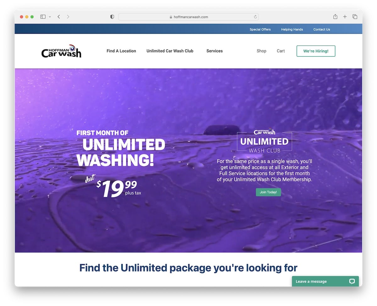
Hoffman Car Wash triggers your attention with an auto-played video above the fold, promoting their special deal with a call-to-action button.
This car wash site example also has transparent pricing, making it easier for the customer to choose the ideal package.
Furthermore, they also use a newsletter subscription form in the footer section for their email marketing campaigns.
Note: Break your services and packages down with extensive pricing tables.
8. Fast5Express Car Wash
Built with: Wix
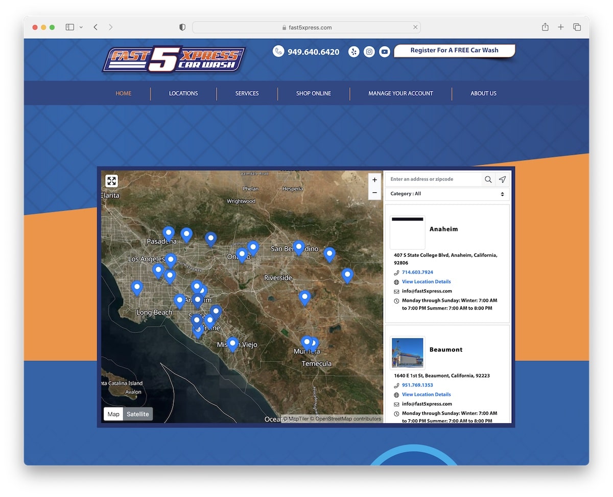
Instead of searching the website to find the car wash location, Fast5Express Car Wash uses a map with markers above the fold. You can also enter your zip code or pick the desired location from a drop-down.
What’s cool is the comparison table that gives you a quick overview of what each package has in store for you.
Note: Create a comparison table if you have multiple packages, so a customer can easily skim through to pick the right wash.
You may also be interested in checking many other websites built on the Wix platform to get inspired.
9. Autobell Car Wash
Built with: Craft CMS
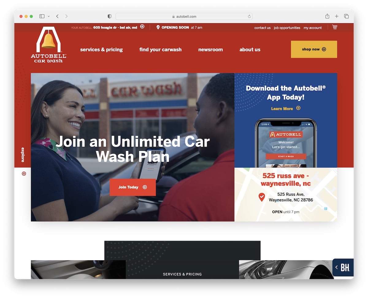
Autobell Car Wash has a modern, captivating design and color scheme to spark immediate curiosity. The hero area contains multiple sections to join the unlimited car wash plan, download the app or check the exact location on Google Maps.
The top bar has multiple quick links, opening hours and a shopping cart. Furthermore, the header has a logo, a drop-down menu and a CTA button.
Note: Autobell Car Wash is an excellent example of a top-notch website color scheme that makes a strong impression on every visitor.
10. Wash N’ Roll
Built with: OceanWP Theme
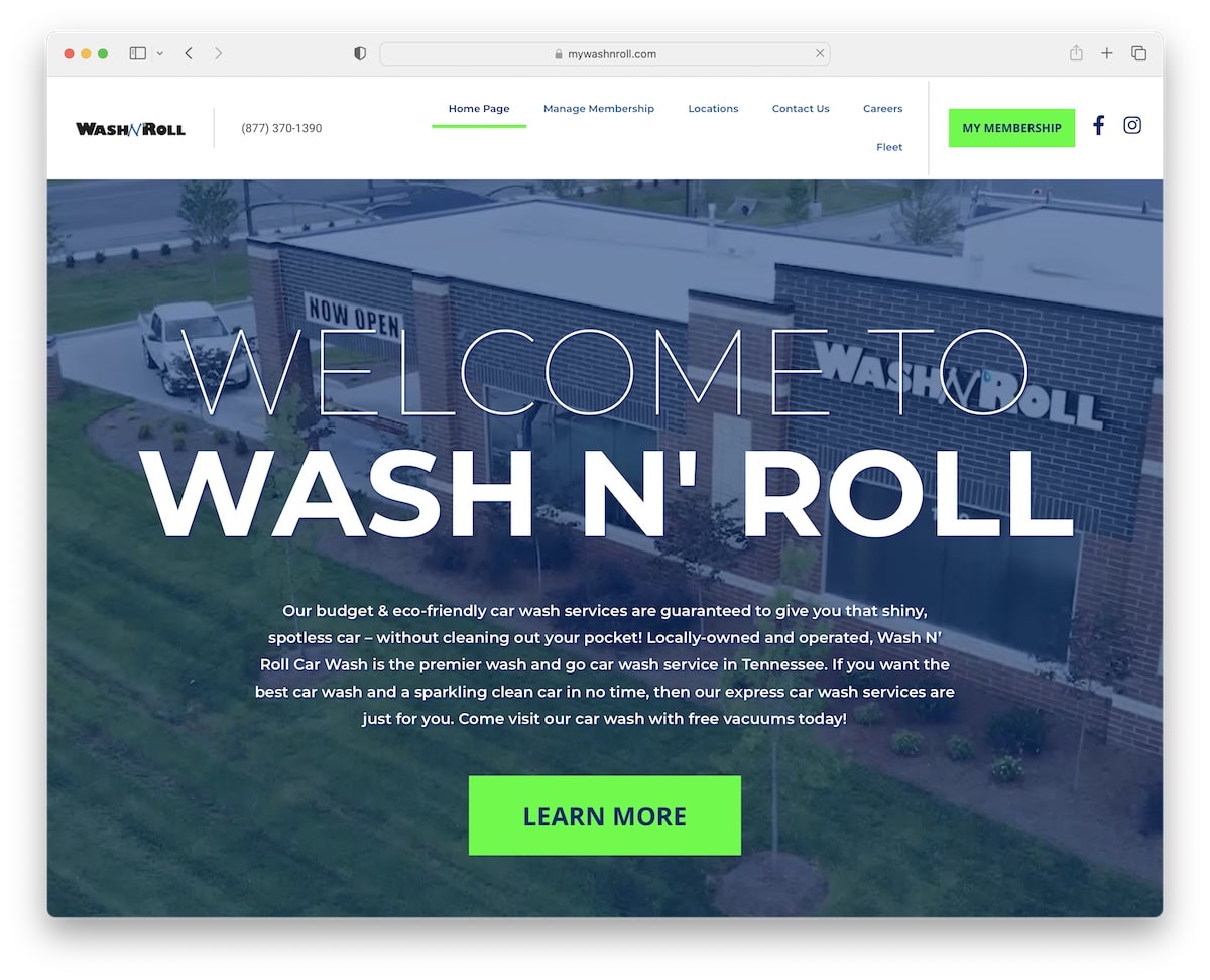
Wash N’ Roll also makes the experience more entertaining with a hero video section, using a large title, text and a contrasting CTA button that makes it very clickable.
It’s a clean website with a back-to-top button, which is handy because it doesn’t use a floating header/menu.
We also enjoy the use of the white background for the header, the footer and the website’s base – which creates a neater appearance.
Note: Make contrasting CTA buttons to improve click-through rates.
11. Magnolia Wash Holdings
Built with: Astra Theme
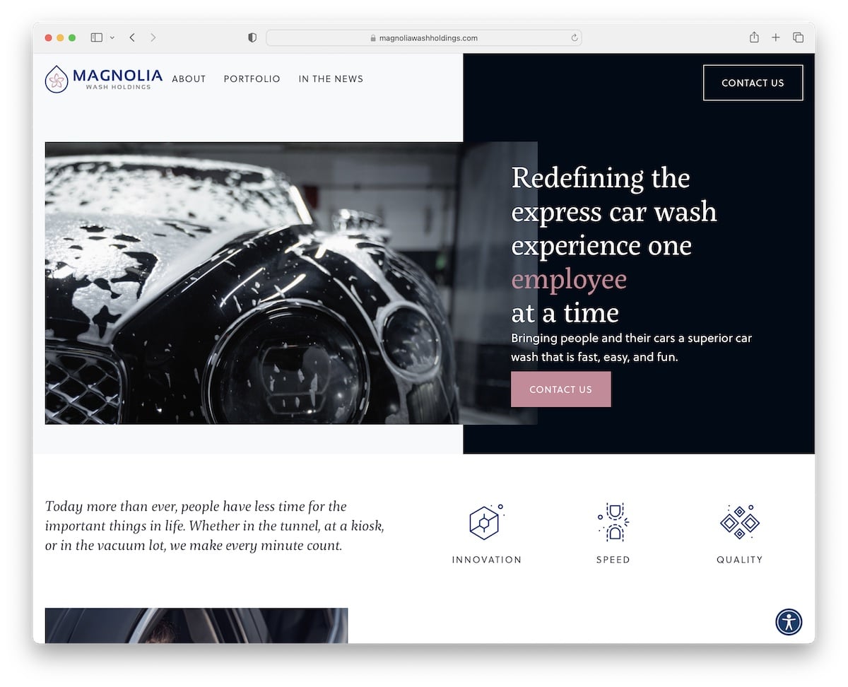
Magnolia Wash Holdings’ website is elegant, with a catchy font effect above-the-fold for a touch of engagement.
The use of accordions gives the initial clean look, while the additional information is only a click away.
One feature that makes Magnolia Wash Holdings stand out from the rest is the accessibility menu so that everyone can adjust the website experience to their needs.
Note: Add the accessibility menu so visitors can personalize your car wash website look.
12. Luv Car Wash
Built with: Elementor
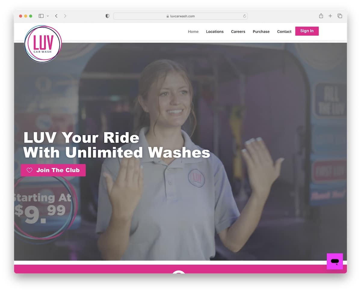
Luv Car Wash is ready to impress you with a video above the fold equipped with a bold title and a CTA button. The navigation bar floats, so menu links and the sign-in button are always at your fingertips.
Luv Car Wash has a dedicated page for locations with a map, pricing tables, animated statistics and a gallery with lightbox function.
Moreover, the footer has menu links, social media buttons and extra business/contact details.
Note: Integrate a gallery (or an Instagram feed) if you want to add more content to your website.
13. Mammoth Holdings
Built with: WPBakery
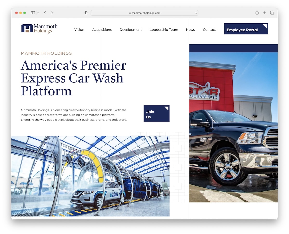
Mammoth Holdings is a beautiful car wash website design example with a user-friendly layout. The white space, in combination with white, gray and blue colors, ensures a pleasant vibe.
The page also has different hover effects, a contact form on the home page and Google Maps with location markers. The footer and the header are on the basic side look-wise but still deliver all the necessary links.
Note: Use colors strategically to boost your page’s user experience.
14. Go Carwash
Built with: Betheme
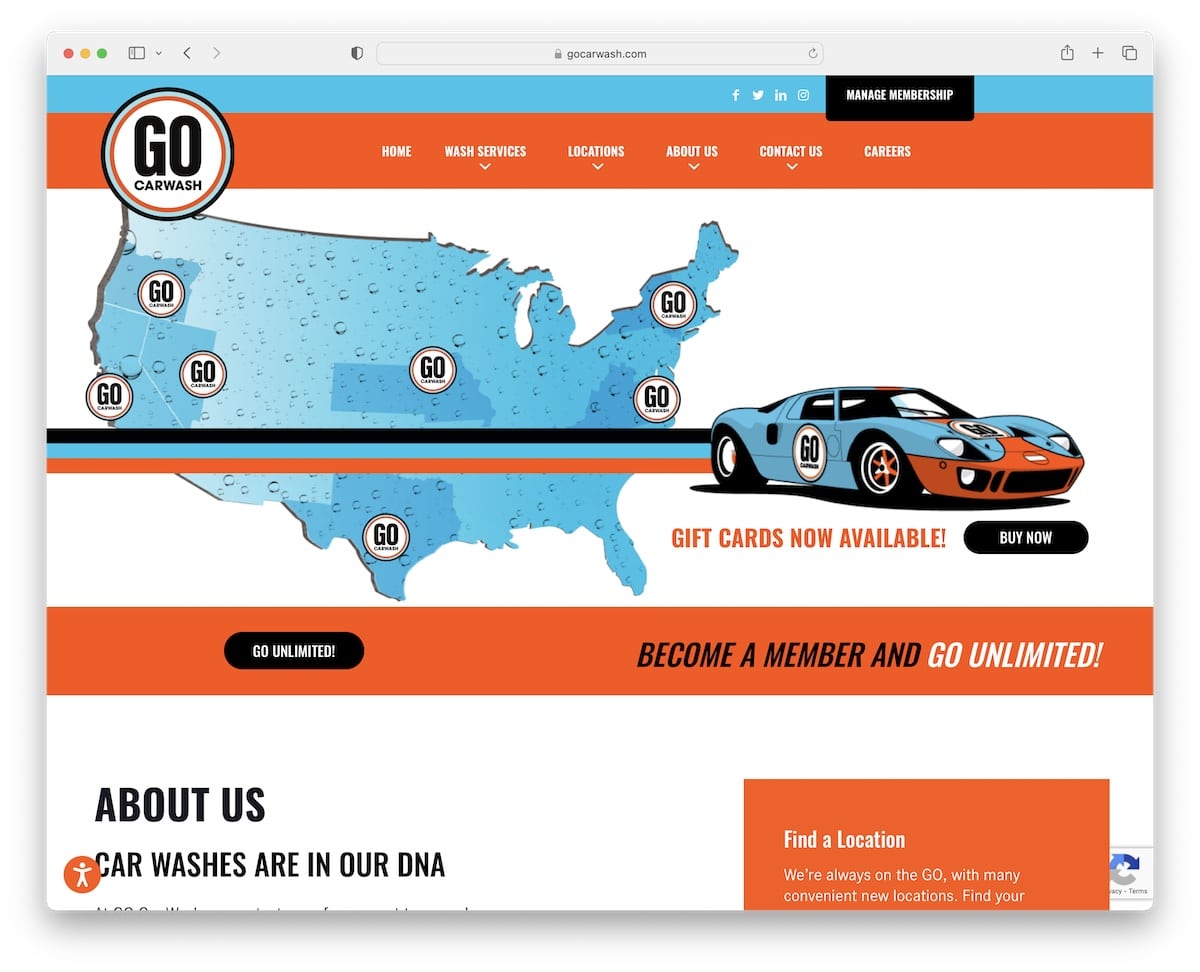
Go Carwash is a fun, exciting and catchy website with engaging elements, cool graphics and a vibrant color palette.
It has a floating navbar with a drop-down menu, a video background section, strategically placed CTA buttons, a top bar with social icons, and a membership button.
The locations page has Google Maps with handy filters to find the shop for your needs with a few clicks.
Finally, Go Carwash is another great example of a website with an accessibility configurator.
Note: Use video background sections to enliven your online presence.
Lastly, all these BeTheme examples will give you a boost in your creative thinking.
15. Waterworld
Built with: Elementor
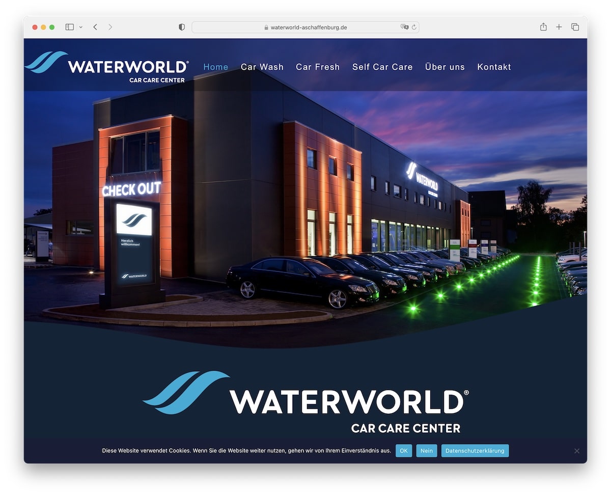
Waterworld has a dark-ish web design that instantly makes it appear more premium. The transparent header overlays the hero image for a more satisfying display.
For user convenience, the back-to-top button will appear soon after you start scrolling.
Waterworld embedded a Google Reviews slider for building social proof, with a CTA button that links to all the reviews (in the hope that even more customers will write reviews).
Note: One of the tricks to differentiate from the masses is by creating a dark website (because most use light tones).
16. Quick Quack Car Wash
Built with: Elementor
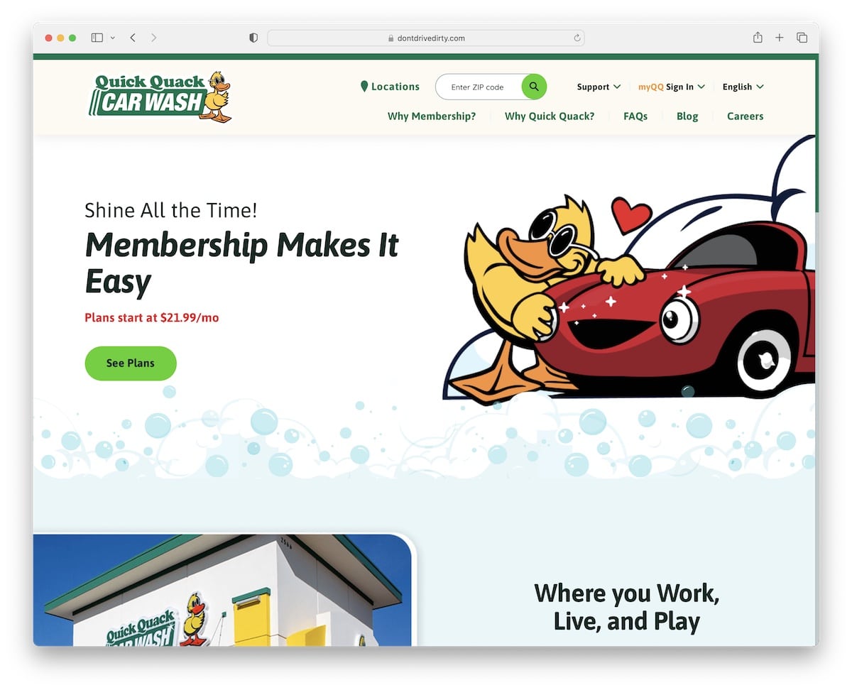
With a bubbly logo comes a bubbly website: Quick Quack Car Wash. Building a business site doesn’t always need to be so serious and formal.
If you have a bubbly personality as the owner, incorporate it into your business and create a more personal experience that’ll touch everyone’s hearts.
Quick Quack Car Wash knows that very well!
One of the features that we also want to point out is the language switcher that this car wash website design uses.
Note: Do you have a lot of foreign-speaking customers? Then it’d be wise to translate your website.
17. Whitewater Express
Built with: Beaver Builder
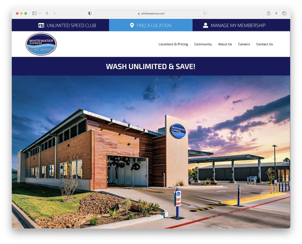
What we find interesting about Whitewater Express is that they have a massive image slider without any text and CTAs to make it less salesy. However, there’s a clickable bar just above the slideshow that gets you to the location finder.
Whitewater Express loads the content while you scroll for engagement and even uses a video background section as an icing on the cake.
Note: Use an image slideshow to promote your services and showcase your location (without distractions).
18. Wash Ninja
Built with: uDesign Theme
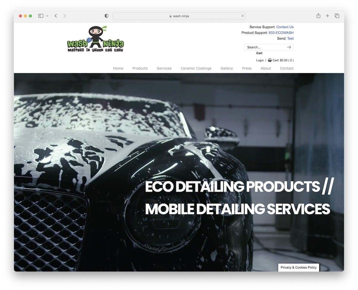
Even though Wash Ninja’s website design isn’t as modern as some others are, it still uses a giant video that sparks interest.
However, even if a more basic website, it’s still better than no website.
They have a Twitter feed, practical videos, write a blog and display other useful information that gives the visitor the impression that they are passionate about what they do.
Note: You’re welcome to stick to a more simple and basic look, which, in fact, can improve the UX.
19. Professional Carwashing & Detailing
Built with: Understrap
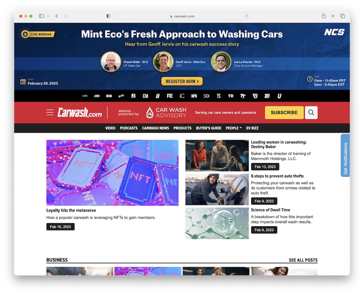
We wanted to add Professional Carwashing & Detailing to this list of the best car wash website design examples because it’s an online magazine.
It has a traditional news site layout with lots of content on the home page, but the white space makes it easy on the eyes.
Professional Carwashing & Detailing also has a stuffed header with links to their other sites, quick navigation links and a hamburger menu (with a search bar, social icons, and more), to name a few.
Note: Ensure enough white space when adding a lot of visual and text content for excellent readability.
20. Fortador
Built with: Webflow
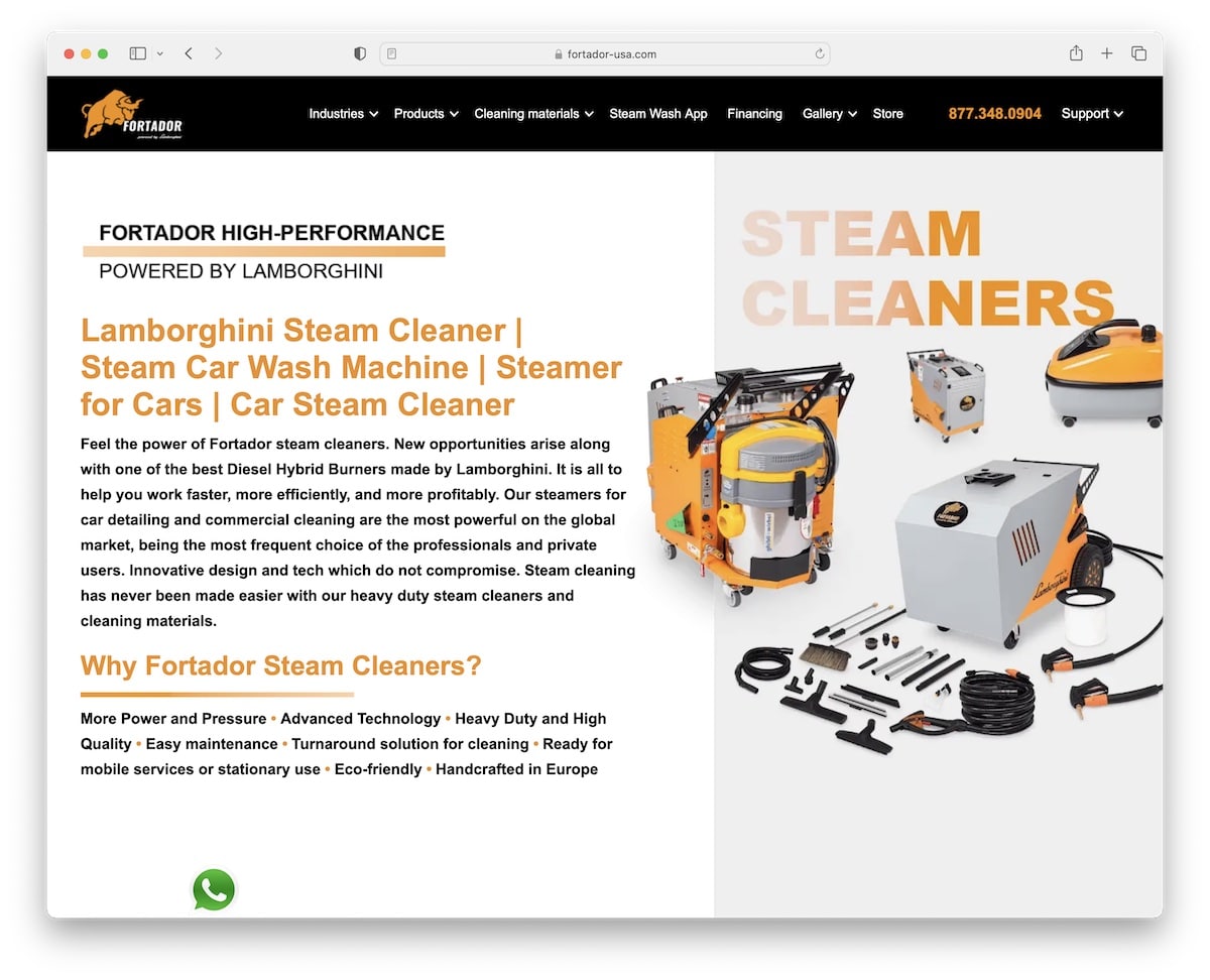
Fortador is another website not of a shop but of products used for car washes. Hey, we just wanted to add some other examples for your convenience.
It has a sticky header with a mega menu, a clickable telephone number, a floating chat widget and a comparison table with all the specs, so you don’t have to inspect them manually.
The home page is long, but the choice of colors and fonts and the loading of content on scroll don’t make it feel that way.
Note: Make it easier for potential clients to contact you with a clickable phone number (preferably located in the floating header).
Feel free to peek at some more superb Webflow websites with gorgeous designs.
21. Jet Splash
Built with: Squarespace
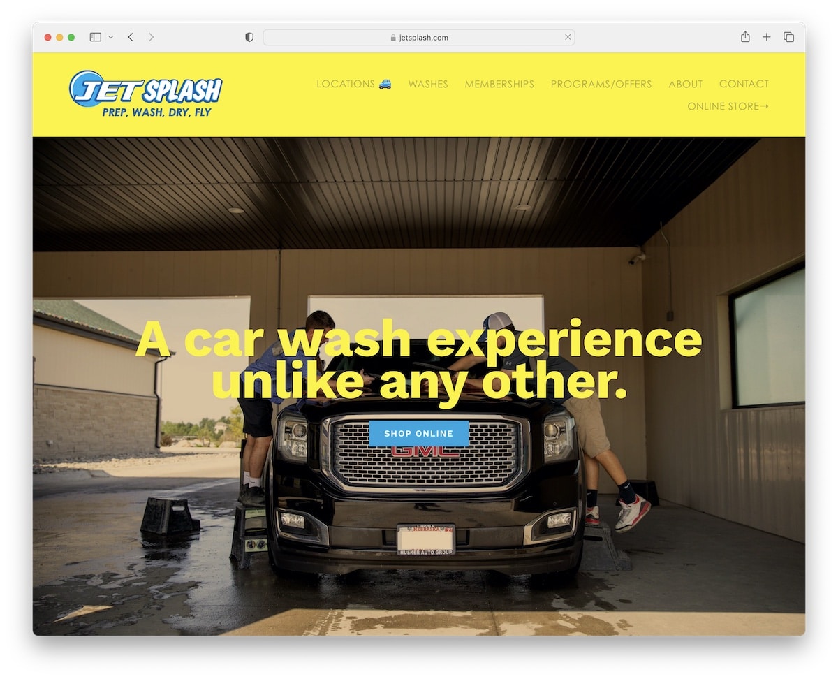
It’s the yellow color that makes Jet Splash an impactful car wash website that leaves a lasting impression on the visitor.
Jet Splash has a large banner above the fold with a title and a CTA button with plenty more CTAs scattered across the page.
You’ll also find very simplistic but tangible pricing “tables” and a “text club” SMS subscription form that promotes a free car wash in exchange for the number.
Note: Integrate an opt-in form and collect emails or telephone numbers for email or SMS marketing.
But do have a look at these Squarespace website examples if you want to see more great web design.
Was this article helpful?
YesNo


