20 Awesome Websites Designs for Inspiration 2024

We’ve handpicked these awesome websites to give you a spectacular view of brands that want to leave a lasting impression on their audience.
The primary objective of building a website is to gain a competitive advantage. Likewise, web presence helps brands get more leads, create a professional brand, and boost sales. But building an awesome website with intuitive, innovative and modern features is not as easy as one may think. Hence, expert developers are needed for such projects. In this collection of awesome websites, brands who want to stand out in their respective industries will get brilliant web design ideas. If you wish to hire adept web designers to create your website or acquire outstanding themes and templates, these awesome websites are worth reviewing.
Here, you will find a variety of awesome websites built for different purposes. Although they differ in products or services, they have outstanding features and brilliant animations that make them stand out. So, check out these websites and get inspired!
Best Web Design Examples
1. Rally Interactive
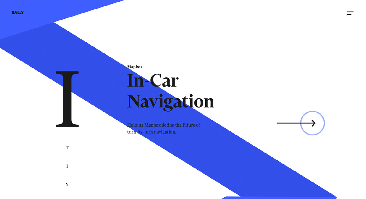
Indeed, a website can provide a demographic reach for brands that take digital marketing seriously. Rally Interactive stands out as one of the awesome websites with a great mobile-friendly design. It’s a small digital product studio in Salt Lake City, Utah, with an experienced team of designers & developers. The website is warm and welcoming with mesmerizing homepage animation and a unique scrolling experience. Thanks to the power of GSAP, animations are indeed breathtaking. With such a presentation, the works look simple yet striking. The social media icons are also visible in the off-canvas menu. Other notable features include a slider, visual hierarchy, and more.
How did they make it?
It is a custom-built website with libraries like Barba.js, Flickity, and more. The website is hosted with Amazon AWS.
2. Awesomed
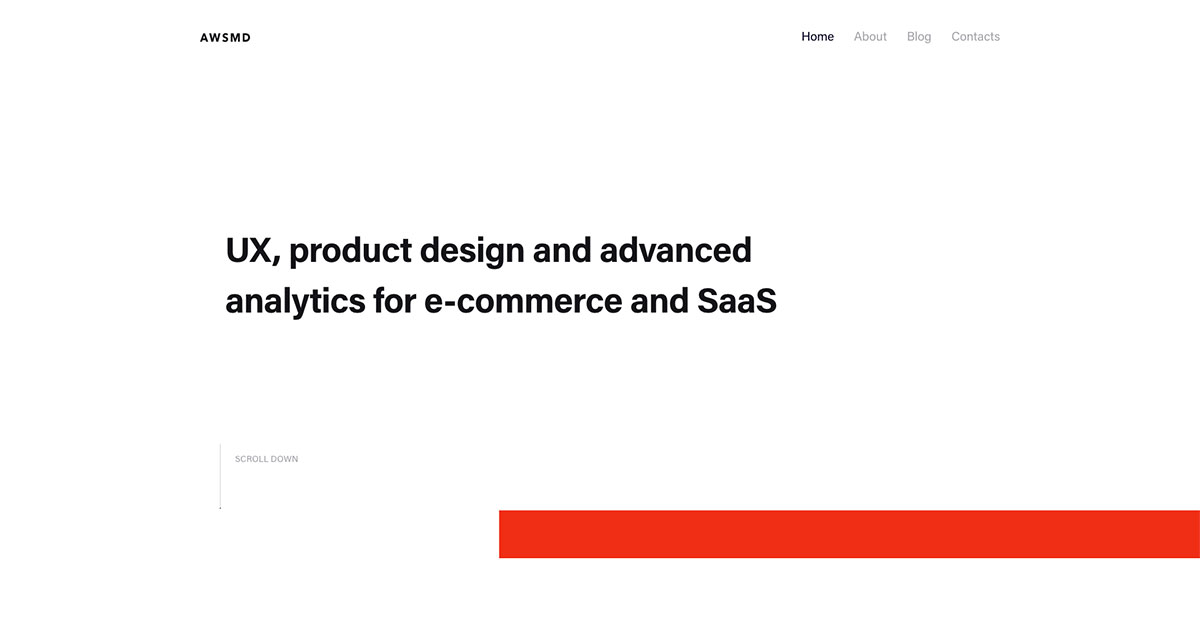
Brace yourself as you discover wonderful features in these awesome websites we’ve collected. Awesomed excels in its interactive elements on the homepage. It is a digital marketing and design firm based in San Francisco that offers a data-driven approach blended with creativity and innovation. With the power of white space adopted into the homepage, the design grabs the attention, though it looks simple and minimalist. By embedding GSAP into the design, smooth animation spreads throughout the site. Since testimonials increase the brand’s credibility on the web, the testimonials section is enticing, along with the display of the logos.
How did they make it?
Awesomed website is made using Next.js and is hosted using Zomro.com. It is a hosting company based in The Netherlands but with servers worldwide.
3. Awesome Motive
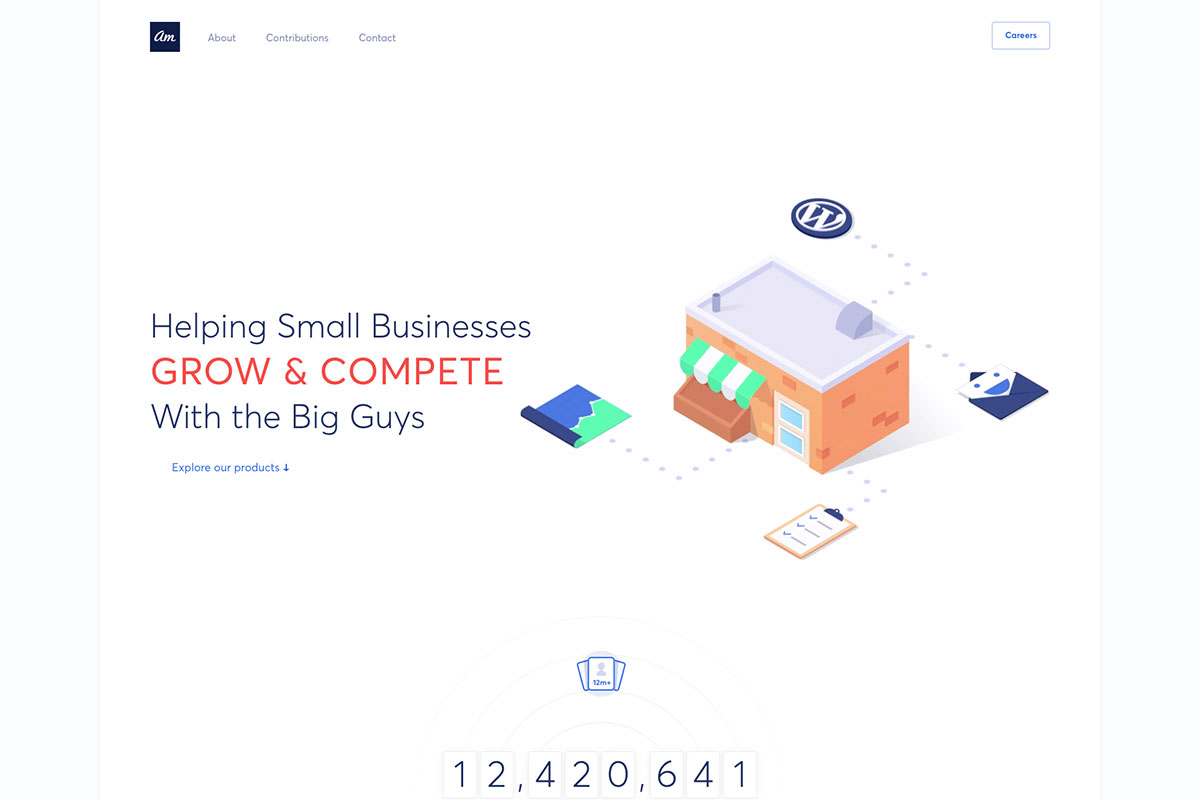
As its name implies, Awesome Motive’s site is worth including in this list of awesome websites. It is a technology company that helps small businesses grow and compete with the big guys with their remarkable tools and training. With the grandeur services they offer to their clients, they deserve to show their capabilities on their website. Indeed! The homepage design is ready to create a good impression. While the white space gives enough space for the web elements to breathe well, the visual hierarchy is applied to organize and prioritize content effectively. Aside from the client presentation, the success indicator is another way to improve the brand’s reputation. And on this website they’re apparent!
How did they make it?
Awesome Motive’s website is made with WordPress and hosted with Cloudflare. The website’s performance is optimized using WP Rocket, a popular WordPress caching and performance optimization plugin.
4. Genrod
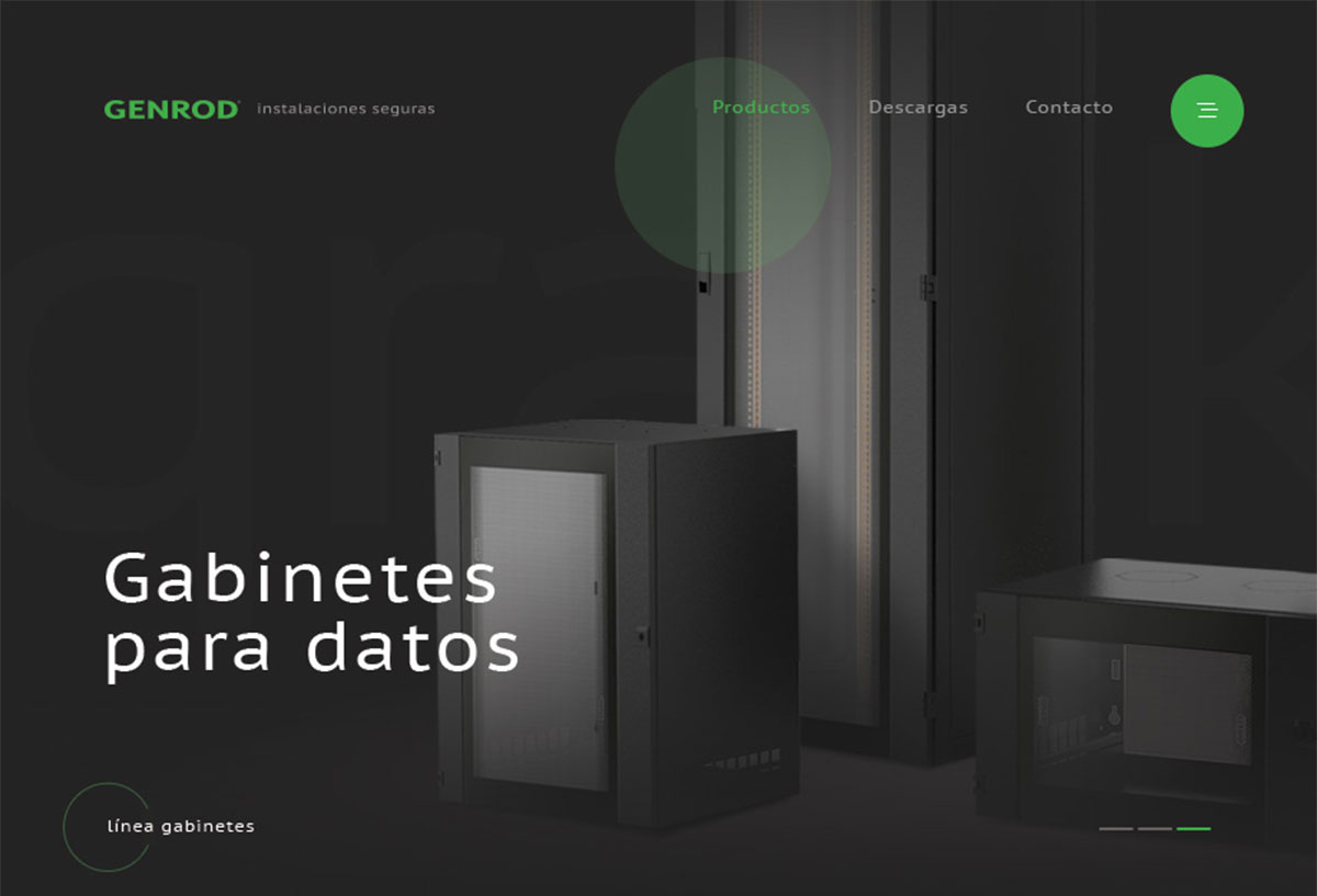
With the huge variety of themes and templates available today, setting up a website is just a few clicks away. But it takes expertise to create an excellent website that stands out. Genrod is truly exceptional and flawless when it comes to web design. It’s an industrial company that develops, manufactures, and markets solutions for secure electrical installations of the highest quality. While the display of the products is seamless through slider, the presentation of their services never impresses visitors. Genrod draws the audience’s attention with enticing and creative animations.
How did they make it?
Genrod is a custom-built website using Express Engine for Node.js. The website is hosted on a local server in Argentina. Other tools worth mentioning are Hotjar, Zendesk, and Office 365 integrations for support, tracking and email.
5. DM Home
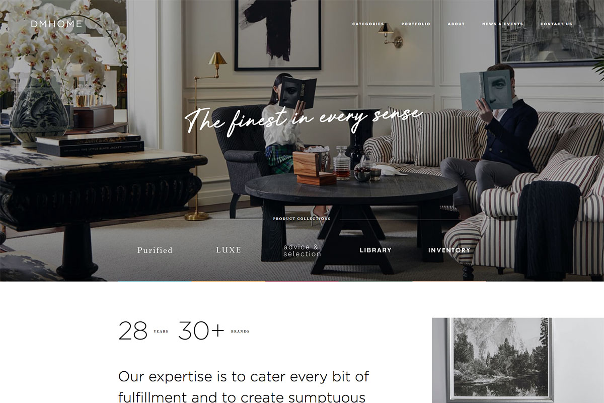
Crafted to boast its ultra-luxury website, DM Home truly belongs to these awesome websites. This catalog-based site is designed to present top furniture brands in its portfolio. The website reveals diverse animations in every section with the desire to dazzle potential clients. Thus, making the design more visually appealing and worth exploring. The stunning animations added on the hero header exhibit the product collections uniquely and creatively. That’s not all, the unique way of scrolling animation surely boosts the site’s creativity. Additionally, the brands they use to make their works excellent appear flawless and sleek.
DM Home is a fantastic portfolio website example.
How did they make it?
DM Home website is made using Concrete CMS, while the rest of it is specifically built for the company. It is hosted using Cloudflare for added performance and security.
6. Long Story Short
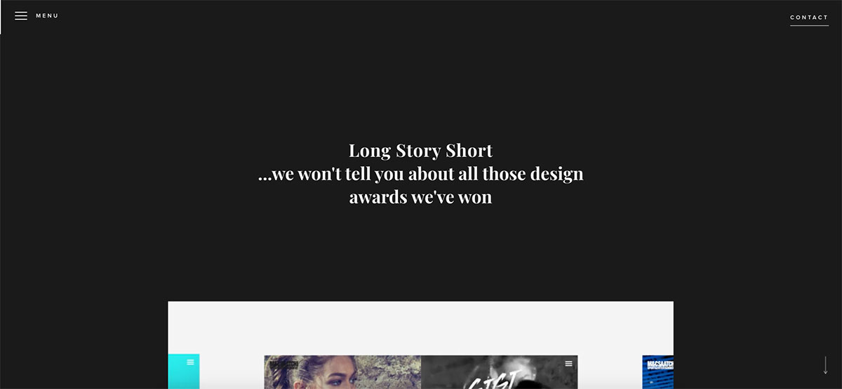
With the latest web technologies emerging these days, it’s not hard to find awesome websites as inspiration. Today, we’re glad to share with you these truly amazing websites. Long Story Short is a digital agency based in Brighton. It features a graceful and awesome animation ready to welcome the audience. The contents look grandeur with a nice scrolling experience.
Additionally, the cool hover effect guarantees a better experience for the users. Specifically, the projects are presented creatively and intuitively with images, short descriptions, and clear CTAs. The off-canvas menu is also added to the website and is fixed for quick access to other pages.
How did they make it?
Long Story Short website is made using WordPress and Elementor Pro. Another tool worth mentioning is Mailchimp for email subscriptions. It is hosted using Cloudflare.
7. Interword
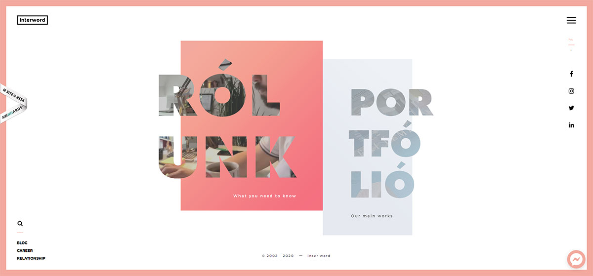
In building your website, it’s easier to overdo it with overwhelming animations. However, it takes a lot of inspiration to create exceptional ones. These awesome websites are worth sparing time with. Here’s Interword, a web, and marketing agency with unique and innovative website design. Tailored to boost the web presence of this marketing agency, it has beautifully built its website that deserves recognition from Awwwards. The homepage features a full screen layout with video integration, social icons, logo, search, and the off-canvas menu. While its services are presented uniquely, the awards look exceptional, adding extra credibility to the brand.
How did they make it?
The Interword website is developed using the Prototype JavaScript framework and hosted with Cloudflare. They use Active Campaign for email marketing and automation.
8. Shape
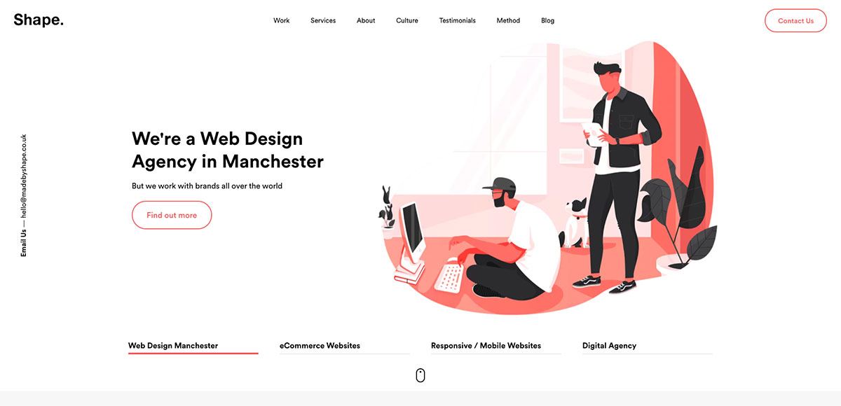
If you haven’t embraced the power of digital marketing in your business, perhaps it’s time to shape it up. Here’s Shape, one of the inspiring and awesome websites you must check out. It’s an award-winning web design agency based in Manchester, UK. It specializes in web design, development, eCommerce, and organic SEO. The web design is modern, minimalist, intuitive, and sleek, emphasizing visual hierarchy combined with the awesome GSAP animation. Committed to shaping up their clients’ brand, the website is built with professionalism and innovation in mind. Furthermore, the testimonials look great and informative as they use video integration.
How did they make it?
Shape website is made using Netlify and CraftCMS and optimized using an SEOmatic plugin. This is another website that is hosted with Cloudflare. It looks like a no-brainer hosting option for any important website.
9. Sliders
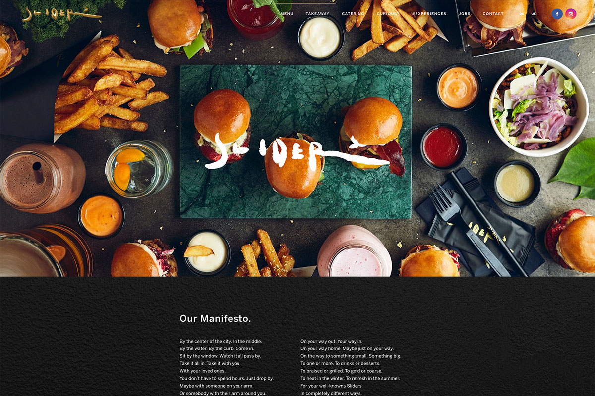
These awesome websites will be valuable if you want to keep them minimal or extraordinary. No matter what type of website you’re planning to build, it is always best to consider other established brands that manage to stand out. Sliders in Copenhagen is a restaurant and takeaway business that offers delicious mini-burgers with cosy atmosphere. The homepage reveals an attractive image with a creative logo on top. It shows off its awards as “Best Burger in Town” with icons representing them each year. The black grunge texture makes the background look elegant and sleek. Additionally, the menu appears remarkable with simple but attractive hover effect.
How did they make it?
Sliders’ website uses WordPress for content management. They use WPForms, OptinMonster, and WP Rocker for forms, popups, and performance optimization. The website is hosted locally in Denmark by team blue.
10. Appetite Creative
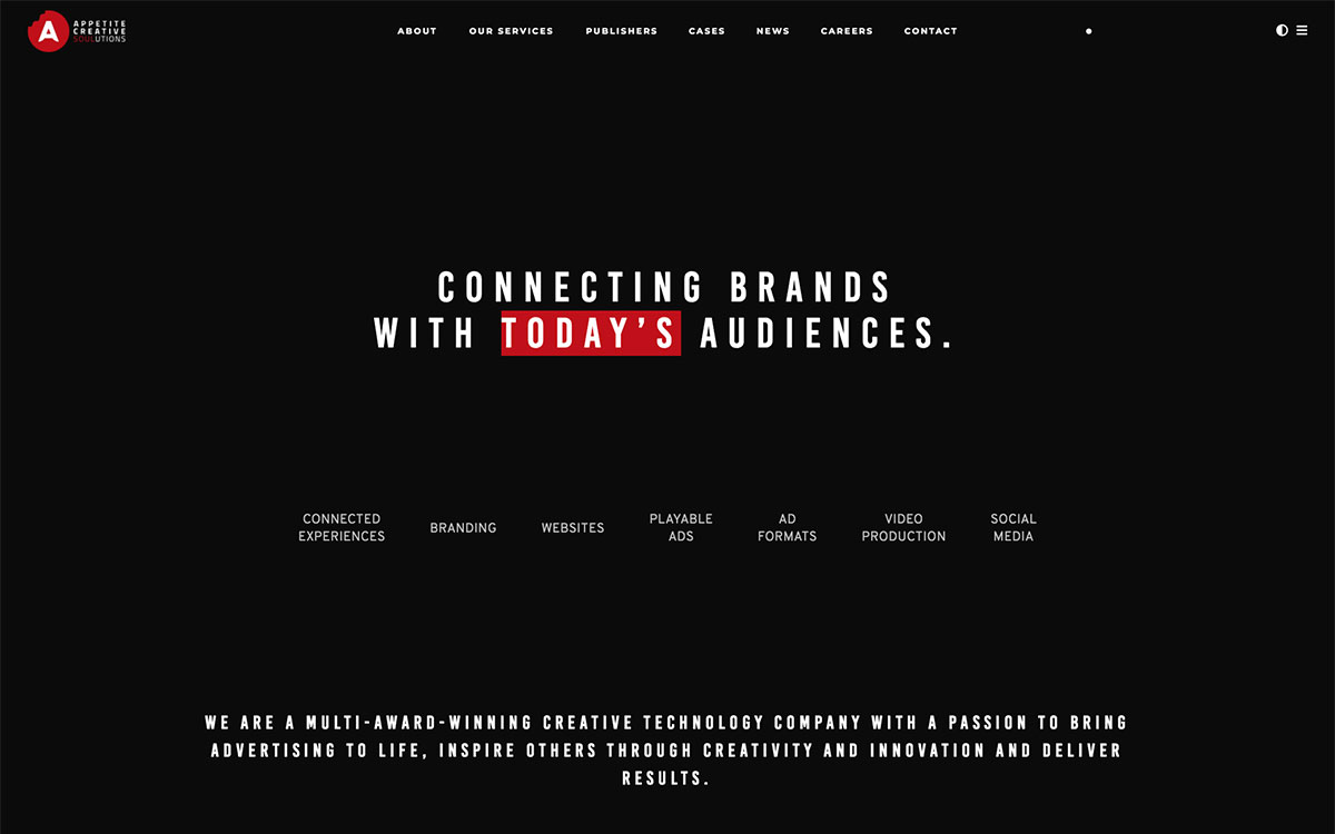
The website generate more leads for the business. That’s why if you consider this marketing strategy, you must look for awesome inspiration. Appetite Creative is a multi-award-winning technology company that delivers effective, global, branding and digital campaigns. As it brings advertising to life and is committed to delivering quality results, the brands that trust this company are visible on the website via logo presentation in black and white through grids. With the integration of GSAP, this website promises subtle and charming animations. Moreover, it manifests a clear content exhibition as elements are arranged according to importance.
How did they make it?
The website is hosted using Vercel, a web application platform hosted by Amazon AWS. It uses technologies like Nuxt.js, Laravel, Vue.js, and Hubspot Forms. Emails and subscriptions are automated using Sendgrid.
11. WSP Anticipate
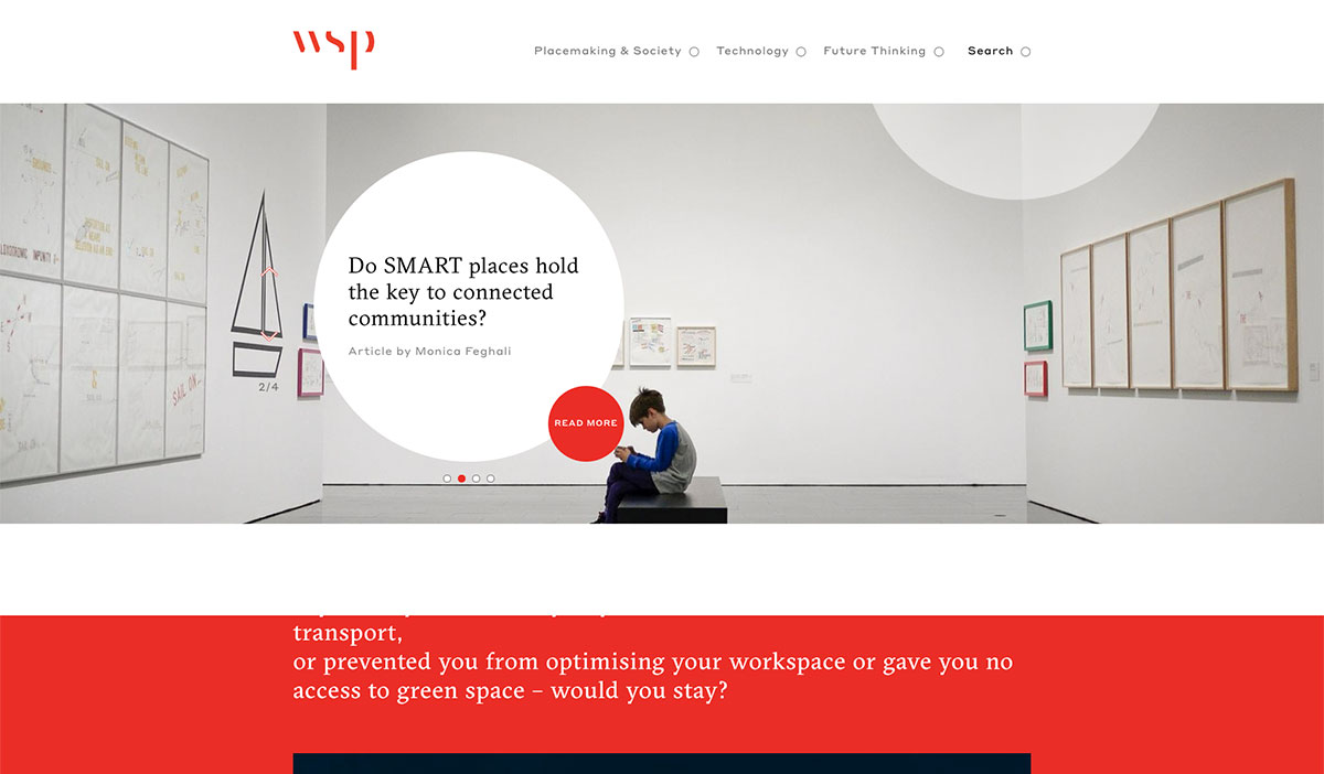
You will surely find this list awesome from modern minimalist, trendy styles to unique and creative websites. Discover the best features you can find in this collection and enjoy it! WSP Anticipate anticipates trends to propose innovative ideas for their clients and meet business objectives. Its website manifests an aesthetically appealing design with a touch of elegance and minimalism. The slider welcomes visitors with various articles and different background images. Moreover, the featured articles appear attractive in the asymmetrical layout and video integration. Stunning animation is also visible upon hovering over various elements.
How did they make it?
WSP website is made using WordPress. It uses plugins like Autoptimize, Contact Form 7 and reCAPTCHA. Website is hosted with Hostinger.
12. Runaways
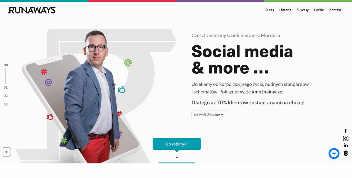
Never settle for less when it comes to inspiration. You can look for awesome websites in this collection that vary in design, purpose and style. Runaways are a unique group of specialists in communication in social media. Determined to value an innovative approach and creativity, Runaways created a website to empower their brand. The contents are presented via a slider that shows their services and credibility as a social media agency. Each slide renders useful web components that are pleasing to the eye. They’re exceptional from line icons and stunning images to clear call-to-action buttons. It also embraces the sticky header for the logo, accessible menu, and social media icons.
How did they make it?
The website is hosted with Cyberfolks LiteSpeed in Poland. It was custom-built using the Foundation CSS frontend framework.
13. Emanuele Papale
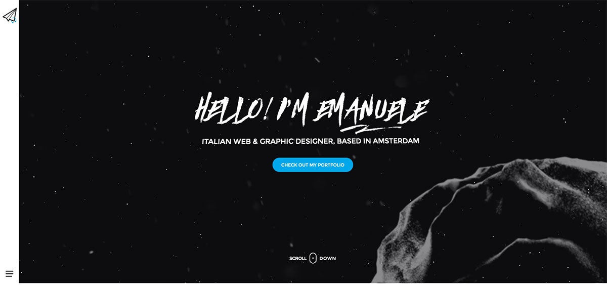
Emanuele Papale’s website as a web and graphic designer is worth including in these awesome websites for inspiration. His portfolio is tailored with unique, modern, and intuitive design to draw more clients to his profession. Each of those projects has detailed webpages that can introduce it more fully. It may look simple, but the site also enhances its look and feel with a brilliant hover effect.
How did they make it?
Emanuele Papale’s website is yet another WordPress-based site. It is built using Simplica WordPress theme and website builder. Other things worth mentioning are NitroPack for performance optimization and Yoast SEO for controlling how Google sees your website.
14. Limely
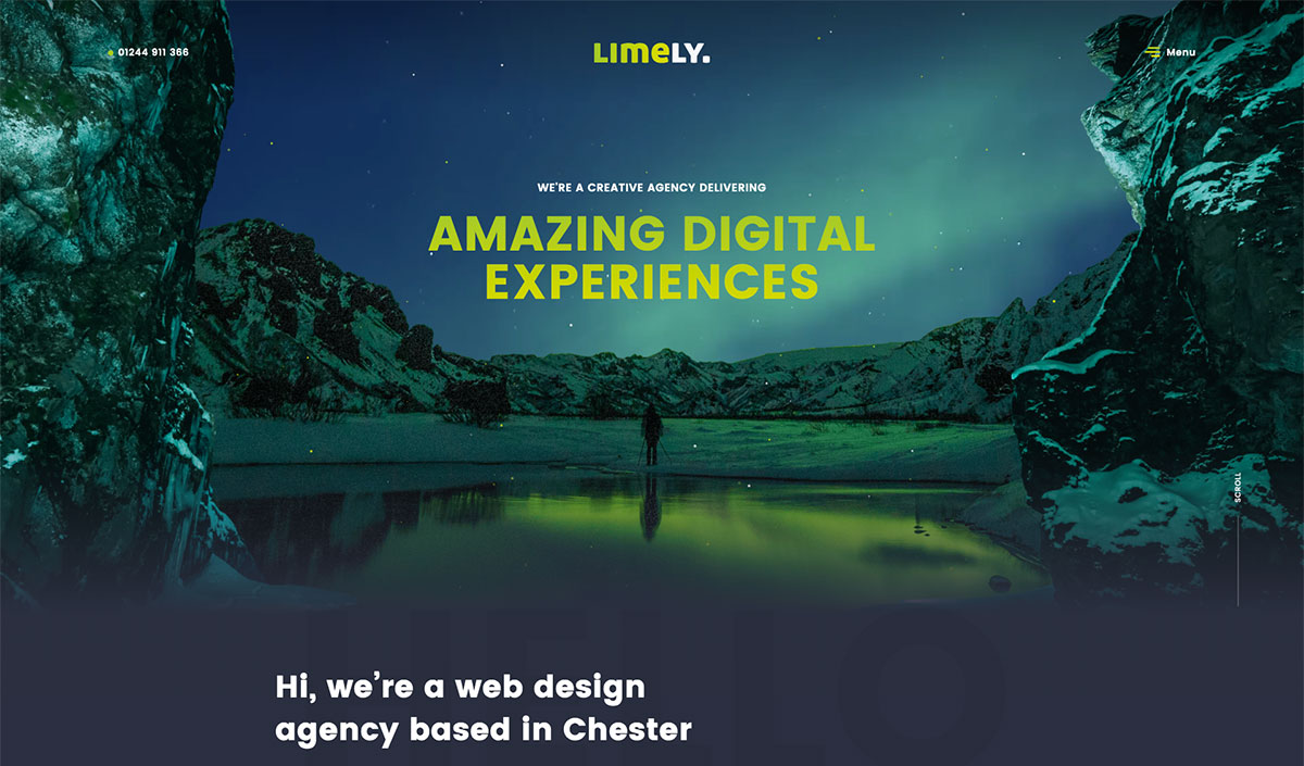
While it is ideal for a business to provide optimum client services, its website must exceed its expectations. That’s what Limely thinks upon building its website. It’s a UK-based web agency that prides itself on providing clients with digital excellence and a flawless web experience. Its website is loaded with remarkable features that make the brand more enticing, worth remembering, and of course, one of the awesome websites to cherish as inspiration. It stands out with the smooth movements of web elements and its readability. Additionally, promoting one’s brand may vary from one style to another. With Limely, their clients’ logos stand out in grids and in grayscale.
How did they make it?
The Limely website uses a custom WordPress theme. Notable plugins for performance optimization are Contact Form 7 and WPRocket. The website is hosted with Cloudflare.
15. WP Configurator
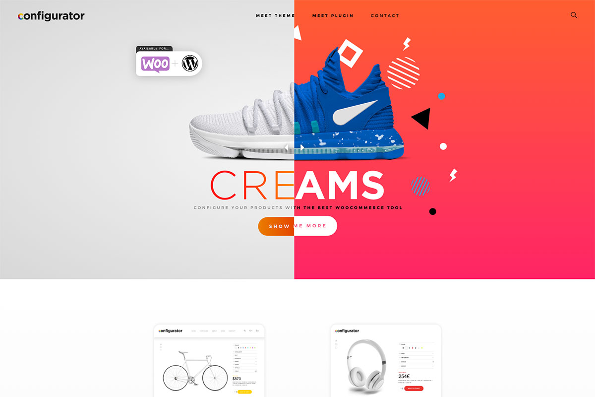
Perfect to use for online stores, WP Configurator is the best tool in the market to create personalized products. Typically, it allows brands to create product configurations and arrange them creatively, neatly, and professionally in their online store. Being part of these awesome websites, this landing page powerfully introduces the products. The web elements convey the message whether the brand needs a theme or a plugin. Of course, the clean and minimalist design enhances the design of the landing page to shine. The excellent visual hierarchy also plays a vital role in the exhibit of the products. In addition, the sticky header allows the customer to access other detailed web pages.
How did they make it?
WP Configurator website is made with WordPress, Elementor Pro website builder, MonsterInsights and WooCommerce. The design is based on a heavenly modified version of a free WordPress theme called Hello Elementor. The website is hosted by Diagonal Hosting in Barcelona, Spain.
16. Maximilian I
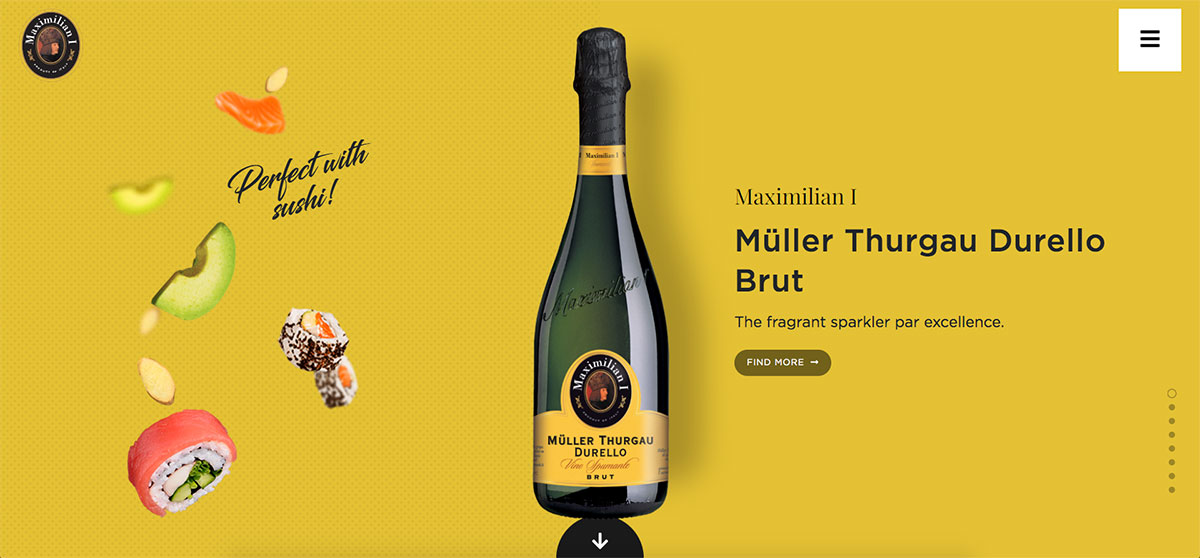
This historic brand of sparkling wines of Cantina Di Soave excels with its sparkling process and territory. Maximilian I adopt the innovative design of introducing its brand across the web. The website is added with flair through smooth movements of food particles as though they’re sprinkled from the top to make it look excellent. The website itself is awesome with a lively and charming slider representing one section at a time as the user scrolls the page. Meanwhile, the vintage logo and the off-canvas menu is fixed so customers can easily check the necessary pages included in the website. Social media icons are also added to the off-canvas menu for further marketing and brand promotion.
How did they make it?
While the website uses an Italian domain name, it is hosted by Hetzner in Germany. It is completely custom and made using ASP.NET.
17. 7H34
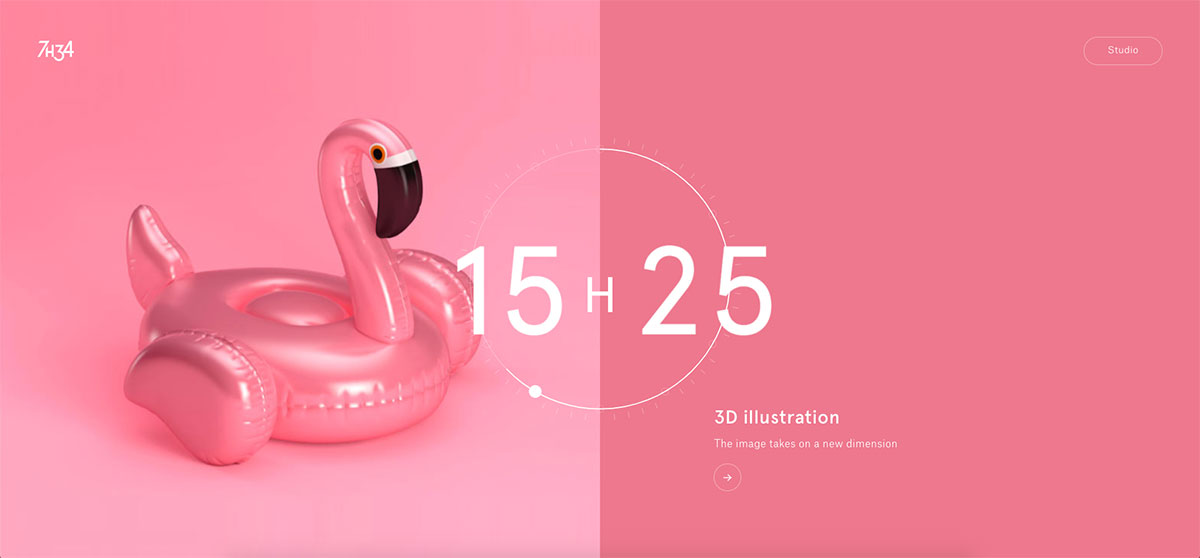
There are plenty of awesome websites you can find on the web for effective inspiration. So, whatever the purpose of your website, if you wish to be distinct, this collection is worth exploring. 7H34 is a graphic design studio based in France. It has tailored a colorful and creative website to bring meaning to aesthetics and give the clients the best design. Each project is presented in a split-screen layout (a combination of plain color and an image on the other side) with a clock dial that indicates when the screen transitions to the next slider. Of course, each project has nice detailed pages that potential clients can look into. The logo is also visible on the header to play its role in branding.
How did they make it?
7H34 is a simple WordPress website with only one plugin – Yoast SEO. Website is hosted in France by OVH Cloud Hosting
18. Ronin Amsterdam
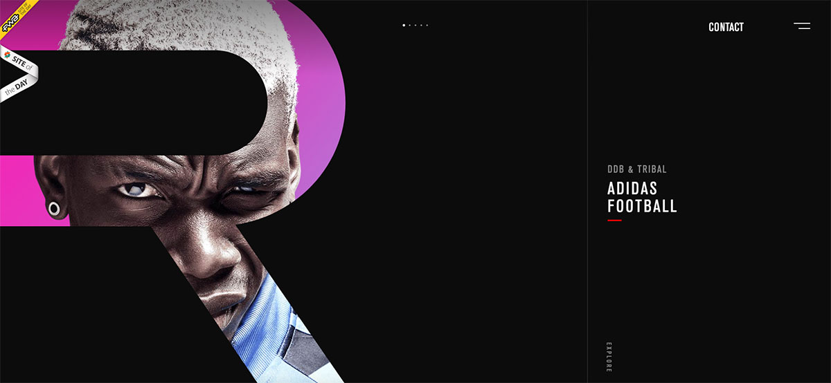
Have you been stuck on your web design lately? Perhaps you haven’t explored plenty of awesome websites. Why not have a glimpse of these websites to help you unleash your creativity? Here’s Ronin Amsterdam, which you can examine if you’re working with a digital studio website. It’s an independent studio dedicated to digital design. The homepage design is creative with a slider to highlight the featured projects. The GSAP integration makes the web design more appealing with smooth and lovely animations. Graceful page transitions also add charm to the website.
How did they make it?
Ronim website is made using Nuxt.js and Vue.js. It features Mailchimp for email subscriber management and Homerun as a hiring tool. The website is hosted on a VPS with DigitalOcean.
19. Ma True Cannabis
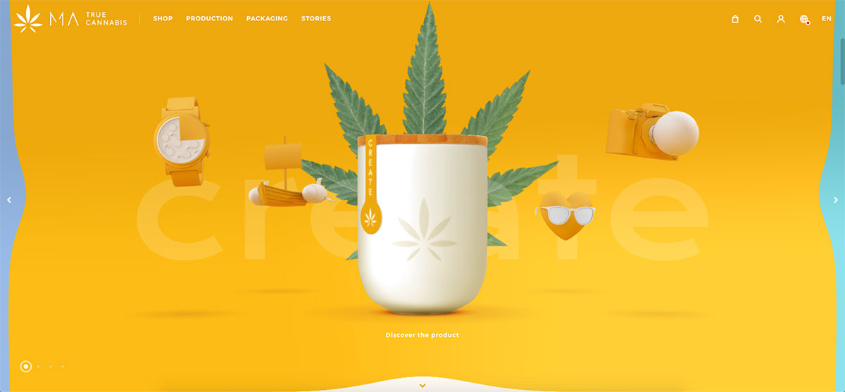
Ma True Cannabis is an eCommerce website that sells natural weed, nicotine-free, and 100% Swiss-made CBD. It features a delightful, brilliant experience as the website manifests exciting animations and attractive and vibrant colors. No wonder it is one of the brands that stand out on the web today. Aside from the awesome design, the contents also look interesting by prioritizing structure, navigation, and smooth movements of web particles. Other notable features on this website include a sticky header, lovely slider, and others. This eCommerce site has a seamless display of products on the shop page where customers can easily purchase and check their details.
How did they make it?
Ma True website is made using React. For email management on campaign automation they use Active Campaign. It is hosted by Pexys IT Solutions in Switzerland.
20. Dog Studio
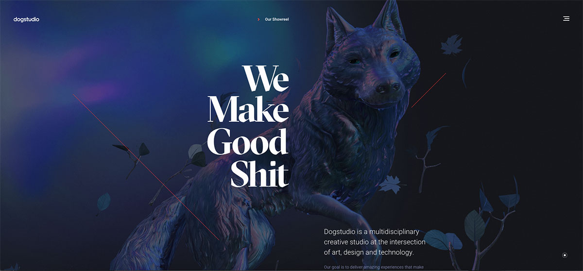
While functionality is important on a website, the design creates the first impression. So, don’t let these awesome websites slip out, explore them and get inspired! Dog Studio is a multidisciplinary creative studio at the intersection of art, design and technology. The website reveals the quality of services they provide for their clients. Typically, excellent projects can boost the credibility or reputation of the brand. With Dog Studio, the featured projects look simple but attractive. Moreover, animations also appear stunning, thanks to GSAP technology. Adding finesse to web components is impressive.
How did they make it?
Dog Studio website is made with WordPress and a custom-designed theme. The website uses WPRocket for caching and Yoast SEO for optimization in search engines. It is hosted with Cloudflare.
Dog Studion is an excellent example of responsive website design.
What Makes A Great Website?
A great website typically combines aesthetics, functionality, and usability to provide the best possible user experience. Some of the key elements that contribute to cool and effective website designs include:
Visually Appealing Design
- High-Quality Graphics: Use sharp, clear images that enhance the content and convey professionalism. Graphics should be optimized for web use to ensure they don’t slow down page loading times.
- Harmonious Color Palette: Choose colors that reflect the brand and are pleasing to the eye. The palette should be consistent throughout the website, with a good balance between contrast and harmony to make text readable and elements stand out.
- Clean Layout: A clutter-free layout with ample white space helps focus attention on important content and makes the site more navigable. Keep designs simple and avoid overcrowding the page with too many elements.
User-Friendly Interface
- Intuitive Navigation: Menus should be easy to find and use, with clear labels that accurately describe the content of the pages they link to. Dropdowns or mega menus can be used for sites with extensive content.
- Logical Page Hierarchy: Organize content in a way that makes sense to the user, with a clear path from general to specific information. This helps users find information quickly and understand the structure of your site.
Responsive Design
- Flexible Layouts: Use responsive design techniques such as fluid grids and flexible images that adapt to the size of the user’s screen.
- Media Queries: Implement CSS media queries to apply different styling rules based on device characteristics, ensuring a consistent experience across all devices.
- Touchscreen Compatibility: Ensure that interactive elements are large enough to be easily tapped on a touchscreen and that the site is usable without a mouse or keyboard.
Fast Loading Times
- Optimize Images: Compress images without losing quality to reduce their file size.
- Minimize Code: Use clean, efficient HTML, CSS, and JavaScript. Minify and concatenate files where possible to reduce the number of server requests.
- Leverage Browser Caching: Set up caching rules to store some data on the user’s browser, so it doesn’t need to be reloaded with each visit.
High-Quality Content
- Relevance: Ensure all content is pertinent to your audience and serves a clear purpose.
- Informative: Provide value through well-researched and well-written text, images, and multimedia.
- Engagement: Use a tone and style that resonate with your audience, and encourage interaction through comments, shares, and other forms of engagement.
Search Engine Optimization (SEO)
- Keyword Research: Identify and use relevant keywords throughout your content to improve search rankings.
- Meta Tags: Use descriptive title tags and meta descriptions to improve click-through rates from search engine results pages.
- Mobile Optimization: Ensure your site is mobile-friendly, a significant factor in search rankings.
Accessibility
- Standards Compliance: Follow the Web Content Accessibility Guidelines (WCAG) to ensure your site is usable by people with disabilities.
- Text Alternatives: Provide alt text for images and transcripts for audio and video content.
- Keyboard Navigation: Ensure all interactive elements can be accessed and used with a keyboard alone.
Interactive Elements
- Animations and Effects: Use CSS animations and transitions to enhance the user experience without distracting from the content.
- Multimedia Content: Incorporate videos, podcasts, or interactive infographics to engage users and provide information in different formats.
Consistency
- Design Elements: Keep fonts, button styles, and other design elements uniform across the website to support a coherent visual language.
- Content Tone: Maintain a consistent voice and tone in all written content to reinforce the brand’s personality.
Branding
- Logo and Imagery: Use the brand’s logo prominently and consistently, and choose imagery that aligns with the brand’s values and message.
- Brand Colors and Typography: Implement the brand’s color scheme and typography choices throughout the site to reinforce brand identity and improve brand recognition.
By addressing each of these points in detail, you can create a website that looks great and performs well in terms of user experience, accessibility, and SEO.
FAQ: Cool Website Designs
A cool website design typically combines innovative layouts, engaging visuals, intuitive navigation, and cutting-edge technology. It should capture the user’s attention, provide an excellent user experience, and reflect the latest trends in web design.
Colorlib has a great selection of cool website examples, including Rally Interactive, Awesomed, Genrod, and many others.
Mobile responsiveness is crucial in modern web design. With most internet traffic coming from mobile devices, a cool design must look and function well on smartphones and tablets.
Current trends include minimalism, bold typography, organic shapes, dark mode, micro-interactions, and immersive 3D elements. These trends evolve, so it’s beneficial to stay updated with design publications like Colorlib and uiCookies.
Color psychology plays a significant role in website design by influencing perceptions and emotions. Different colors can evoke different feelings; for example, blue often represents trust and security, while yellow can signify energy and optimism. Colorlib provides an in-depth look at color psychology in design.
Designers use various tools, such as Squarespace, Wix, Adobe XD, Sketch, Figma, and InVision, to create wireframes, prototypes, and high-fidelity designs. These tools offer collaboration features and integration with development workflows.
Animations can enhance a website’s cool factor by adding motion and interactivity, leading to a more dynamic user experience. However, they should be used judiciously to avoid overwhelming users or causing performance issues.
Absolutely! A cool website design can and should be accessible to all users, including those with disabilities. Incorporating accessibility principles, such as keyboard navigation, screen reader compatibility, and proper contrast ratios, can make a website cool and inclusive. The Web Content Accessibility Guidelines (WCAG) provide standards for web accessibility.
The success of a website’s design can be measured through user engagement metrics such as time on site, bounce rate, and conversion rate. Additionally, user feedback, A/B testing results, and usability testing can provide insights into design effectiveness. Tools like Google Analytics and Hotjar can help track these metrics.
Inspiration for cool website designs can be found on design inspiration websites, design blogs, and following the work of leading web designers and agencies. Pinterest, Dribbble, Instagram, and design conferences are excellent sources of fresh ideas.
Was this article helpful?
YesNo


