19 Best Webflow Websites (Wow!) 2023
Are you searching for the best Weblfow websites to gain inspiration and see what’s possible with this builder?
The first thing we noticed when studying dozens of awesome websites made on Webflow is how creative they are.
Thus, it was really hard curating this collection of the best. (We might be adding some more in the future.)
But we managed to pick twenty of the TOP, covering multiple industries for your convenience.
Every website is unique and has cool details that you can apply (and improve) to yours.
Best Webflow Websites For Design Inspiration
1. Anrok
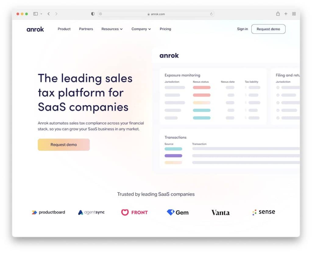
Creating a browsing experience that’s engaging and informative at the same time is something that Anrok did really well.
Plus, they use a lot of white space, so users’ eyes are on what’s important (not distractions!).
Note: Create product presentation, benefits and “how it works” with cool scrolling animation.
2. The Furrow
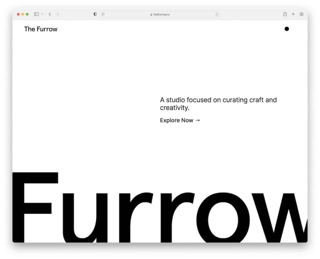
If your business is about design and creativity, ensure your website resembles just that. The Furrow is a fantastic Webflow website with a minimalist above-the-fold section and awesome content distribution once you start exploring it.
We also like the black dot that reveals the menu once you hover over it and dark/light mode switcher.
Note: If you offer unique services, let your website promote them – in a unique way.
3. byPeople
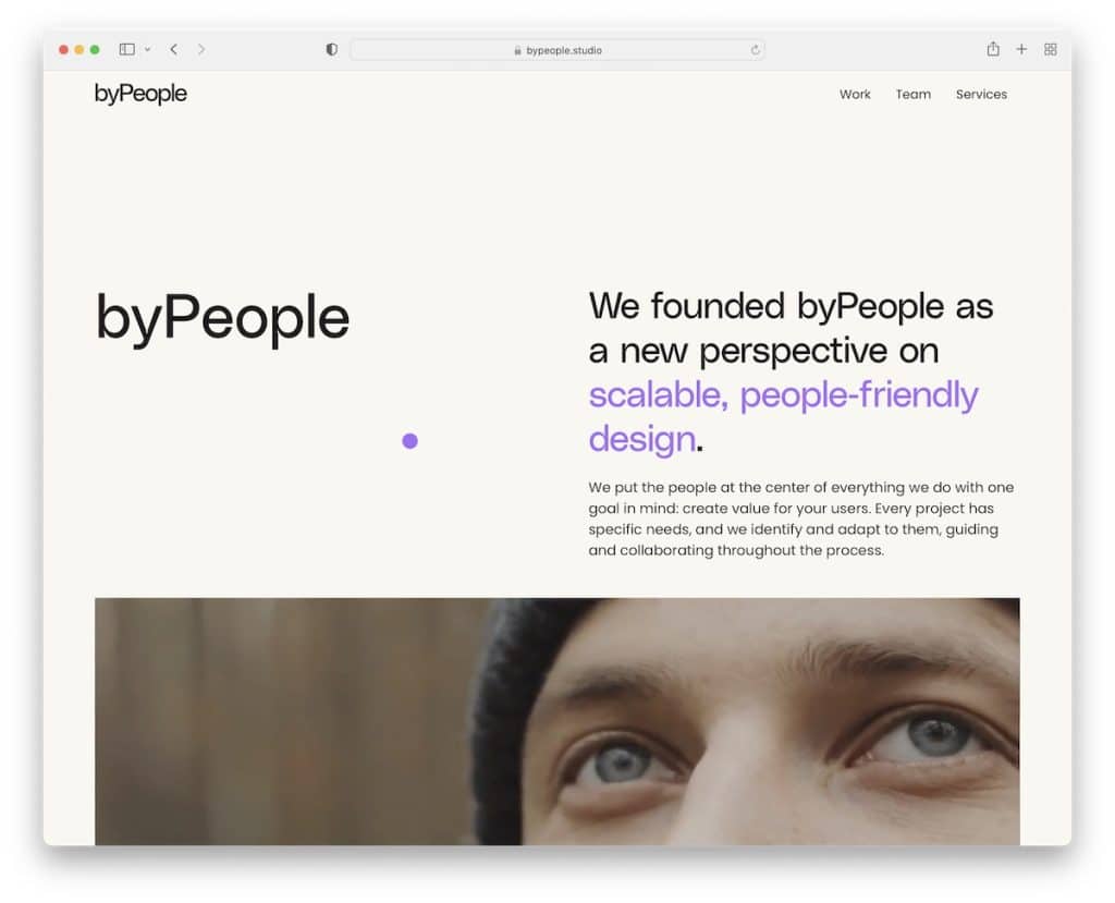
byPeople’s Webflow website captures the user’s attention with two-toned text and auto-played video above the fold.
They also strategically placed the Services section on a dark background to make it stand out.
Finally, the team carousel (with roles and contact details) familiarizes you with the folks behind byPeople.
Note: Text and video go hand in hand very well, so feel free to test them for your business.
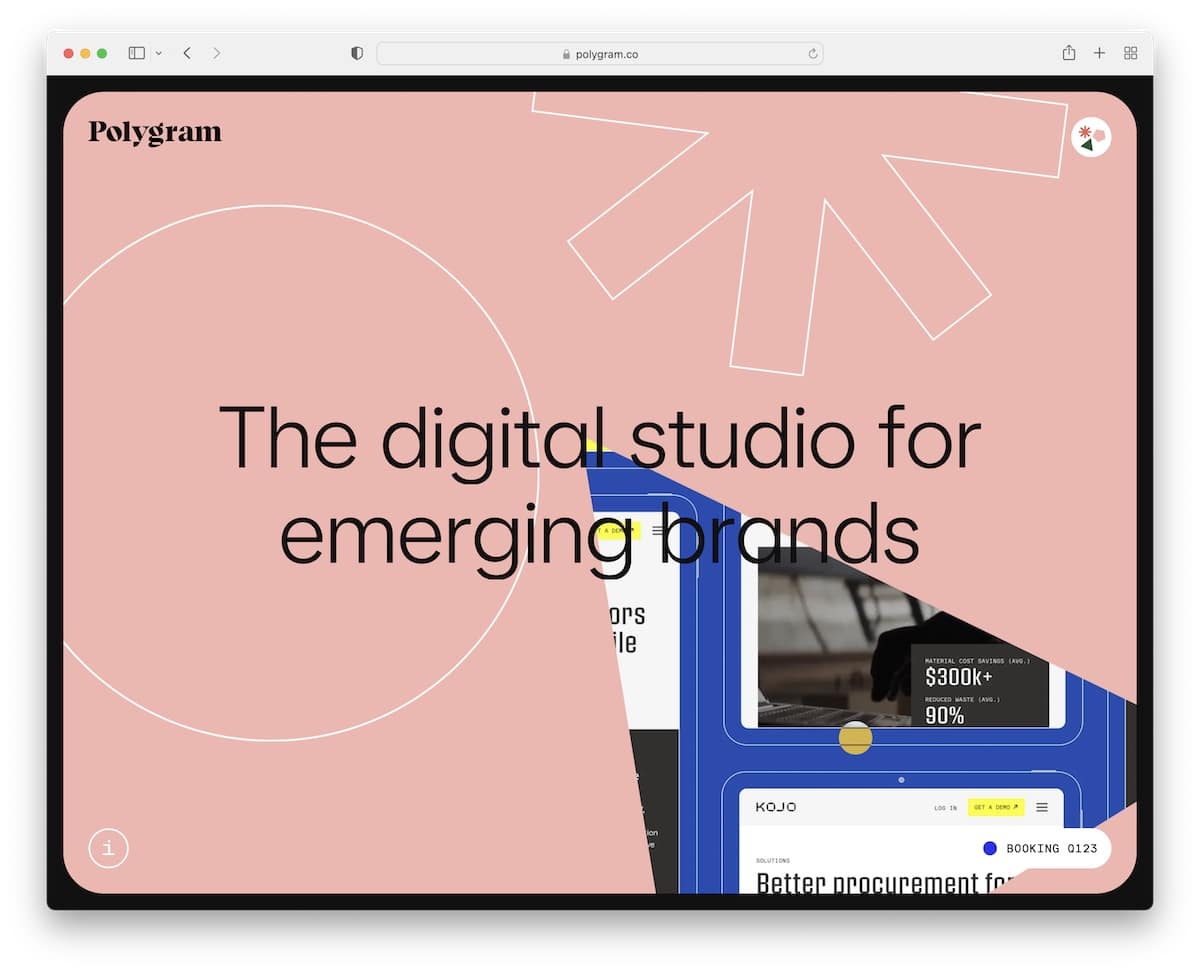
4. Polygram

Whether viewing it on a small or large screen, Polygram’s responsive web design is worth your attention.
What’s unique about Polygram is that the three shapes move with you and show content on hover. Try it.
The only clickable element is the “i” icon in the bottom left corner which reveals more details with a CTA for bookings.
Note: Go one-of-a-kind and minimalist simultaneously, just like Polygram.
5. Roast Like Sherlock
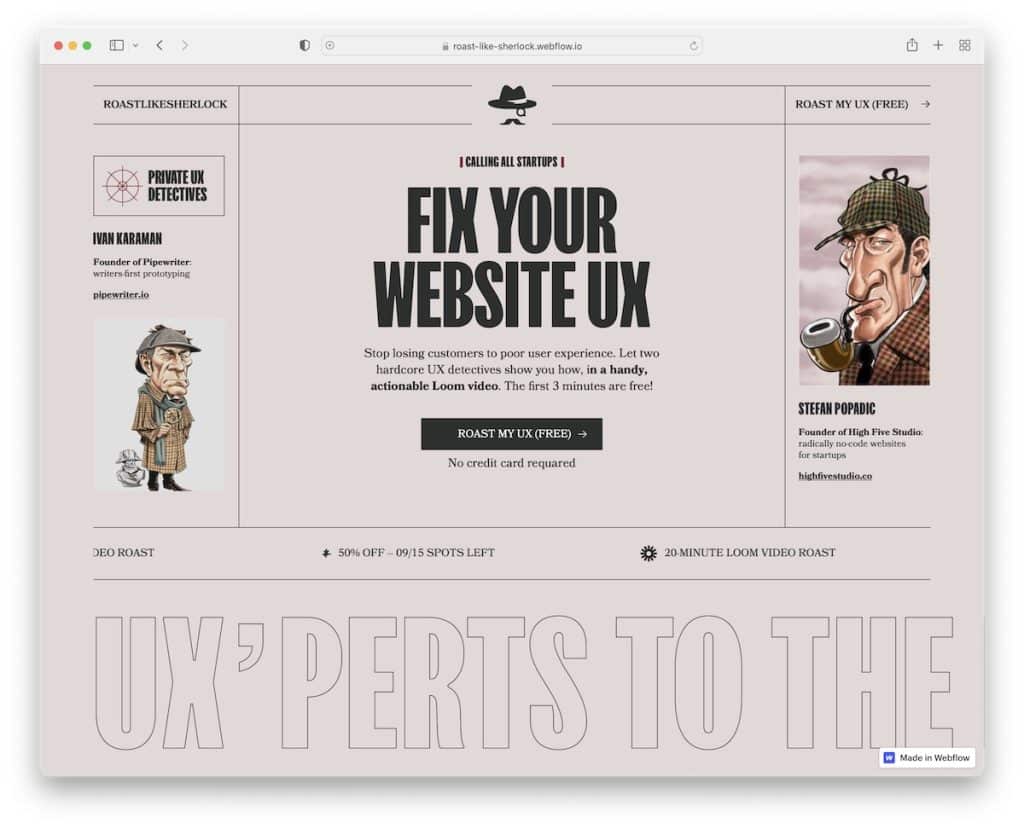
Roast Like Sherlock is one of the more original websites that we’ve ever seen. It’s super interactive and fun, but it all begins with a clever name.
The old typewriter types out the entire sheet of paper with a text reveal function to spice things up even further.
There’s also an example video and automatically sliding blocks with more info.
Note: The scrolling capabilities have no boundaries, so make a special one.
6. Spark Library
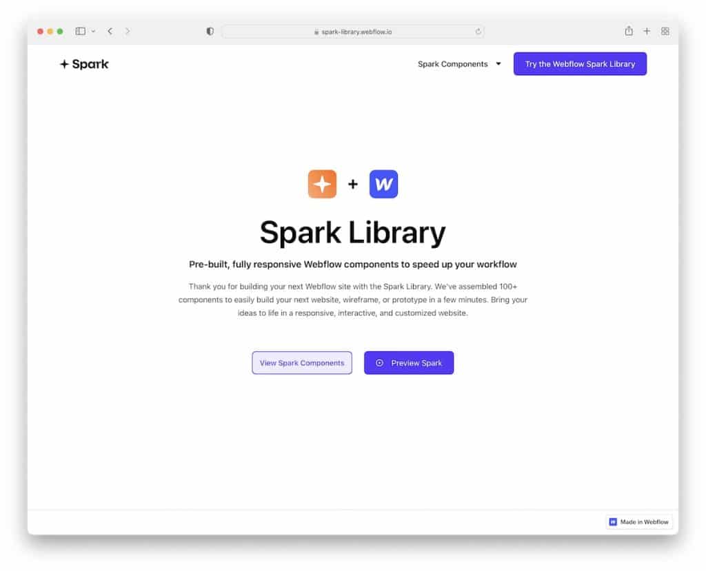
Spark Library boasts simplicity, focusing on one thing only – the product. It keeps the hero section minimalist but with enough text to explain everything.
Next, you’ll find the portfolio of products with a filterable sidebar navigation that shows different categories on click.
Note: If you have a library of elements, display them with categorized buttons on your home page.
We also have a collection of the best portfolio websites for more creative ideas.
7. The Bakery
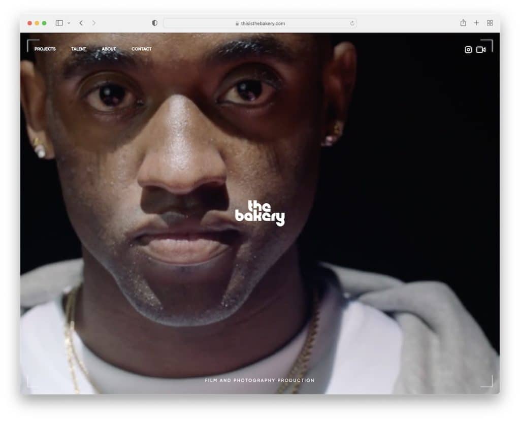
Film and video production companies can learn a lot from The Bakery. The home page is a collage of videos covering the entire screen regardless of the screen size.
But they also added navigation to visit projects, talent, about and contact sections, and clickable IG and Vimeo icons.
Note: Be bold with a full-screen video presentation/background.
8. Nicolas Hercent
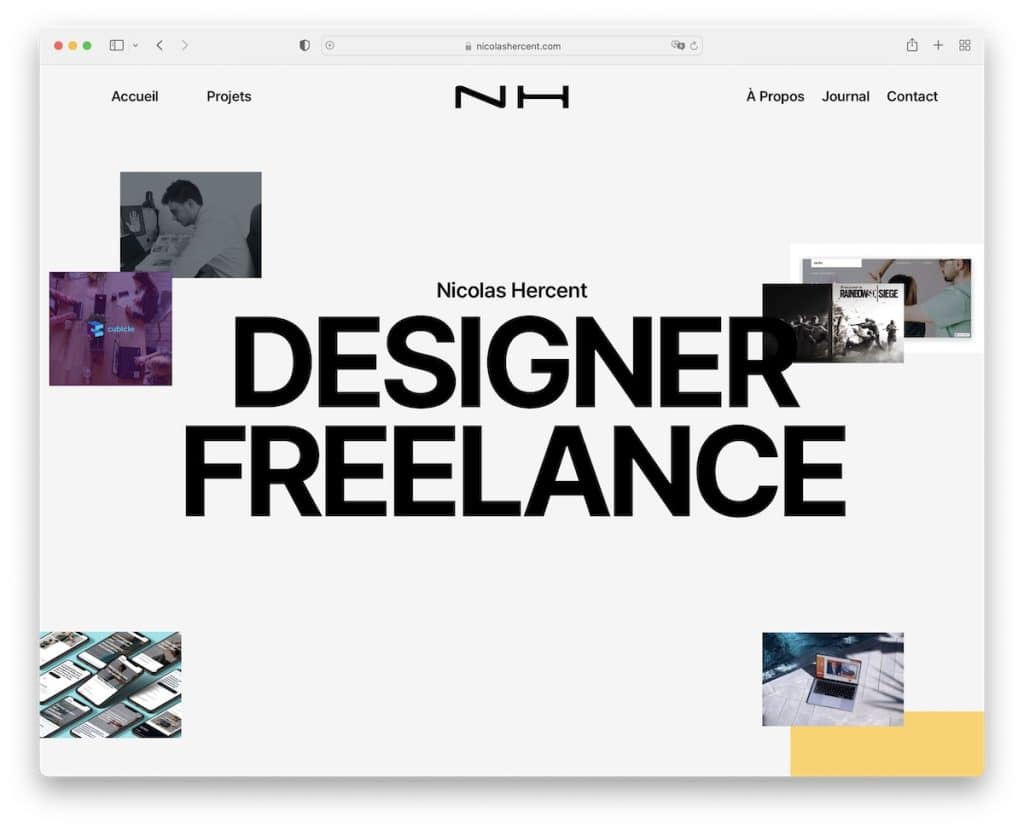
Promoting your freelancing business happens a lot easier with a solid website.
Nicolas Hercent’s online presence is a superb example of a Webflow website that’s engaging and impressive, offering a top-notch browsing experience.
But it also has everything necessary a potential client wants to learn from Nicolas before hiring him.
Note: Add projects, testimonials and contact details to your website that’s designed with great care as a freelancer.
9. AndDan
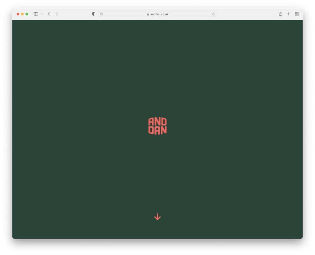
AndDan makes you want to start scrolling because you want to see what happens beyond the logo.
It grows and takes you to other home page sections once you start scrolling. But you can also click the scroll-down button and let it take you on a journey.
We also like the inclusion of FAQ accordions, a testimonial slider and a floating navbar that’s always accessible to visit internal pages.
Note: You don’t always need to reveal everything in your hero section. Let the visitor “play a game” in a similar style as AndDan does.
10. Blott
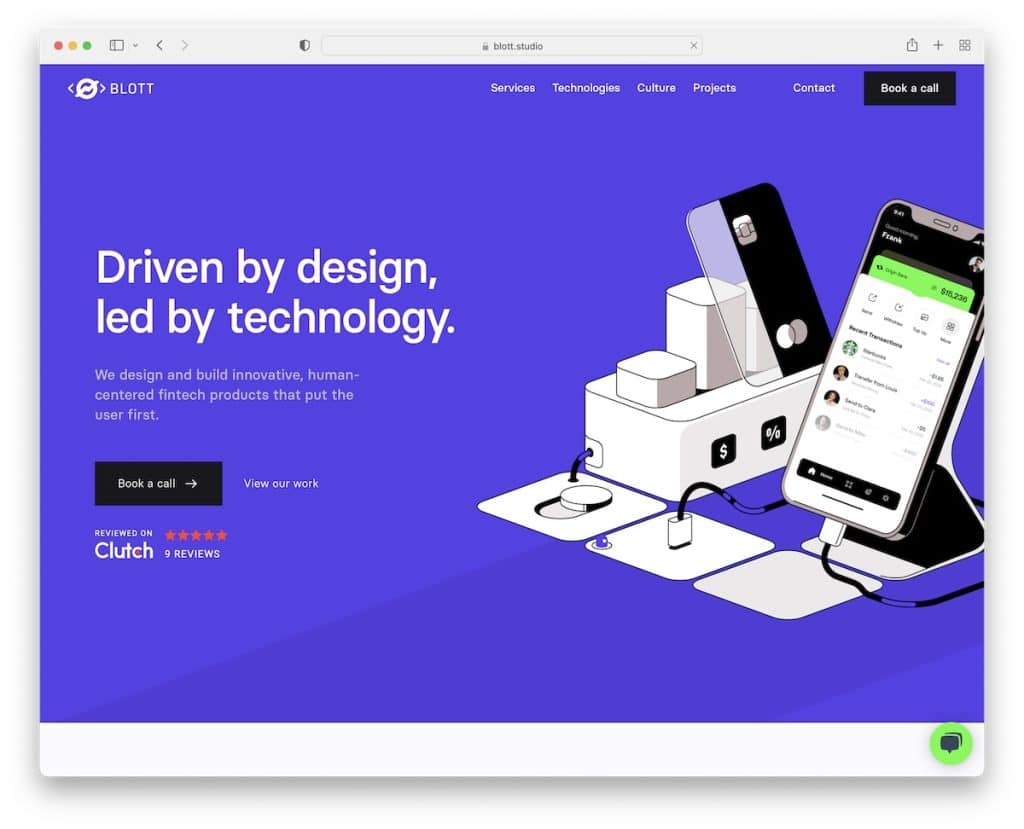
Blott has a modern and practical design that’s simple to view on handheld and desktop devices.
While the entire home page is WELL-DONE, the testimonials section is something you don’t often see (or at all). Instead of text, they included video testimonials that start playing on hover.
So. Cool.
Also, if you pay attention to the section with client logos, they randomly change to different business logos they worked with.
Note: Ensure you pay attention to the details of your site, especially if you’re in the design and development space.
11. DTCP
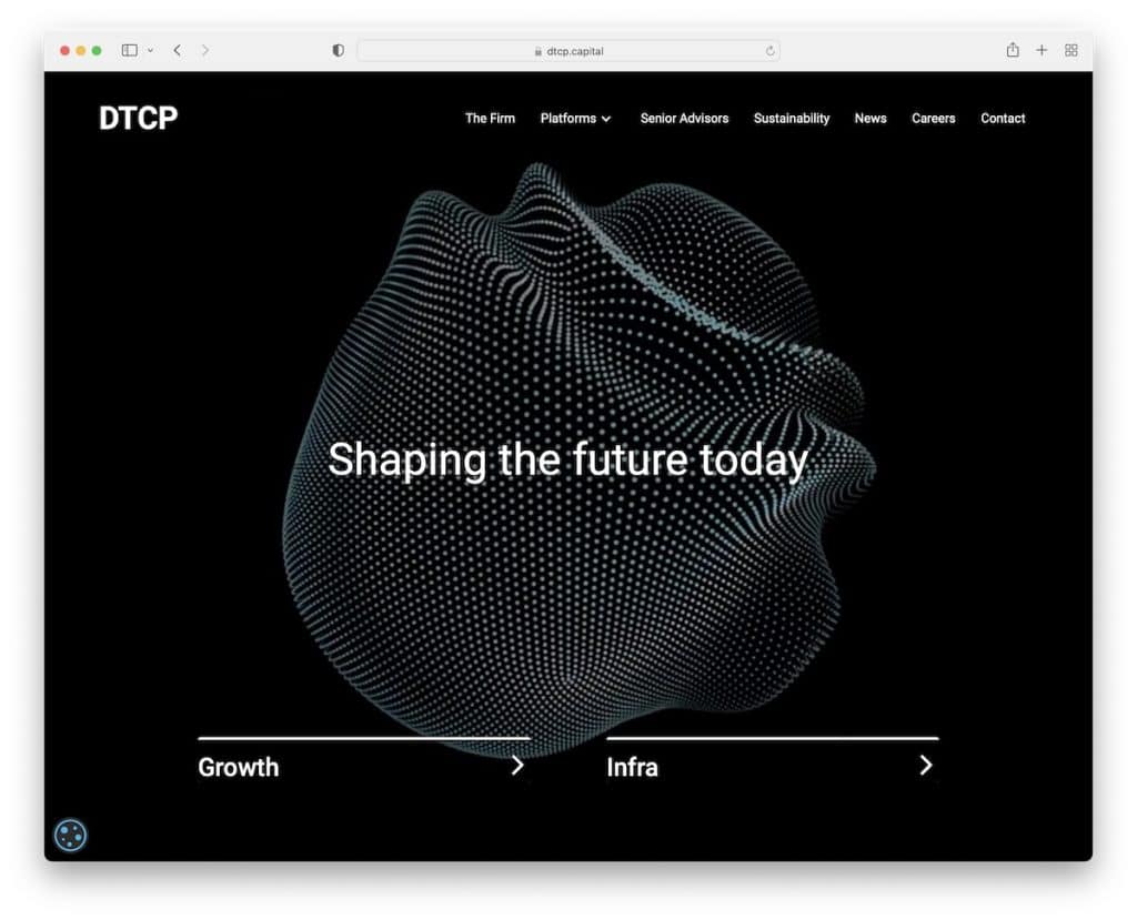
Using an animation in the hero section of your website that resembles what you do is a clever way of welcoming potential clients into your world. Just like DTCP does it.
DTCP home page is non-scrollable but comes with a minimalist navigation bar and two calls to action.
Note: Minimalist design is great, but it gets even better with a touch of smart creativity.
You can also check these great animation websites that will have you WOWing.
12. Hone Naera-Scott

If you’re a minimalist by heart, then you can easily create a Webflow website that expresses that.
Hone Naera-Scott runs a simple two-page website (home and about) that’s split into two sections: information on the left and a slider on the right.
Note: Give your work extra shine with a split-screen web design.
Hint: Here are some more photography websites that’ll give you more ideas and web design inspirations.
13. Vionaro V8
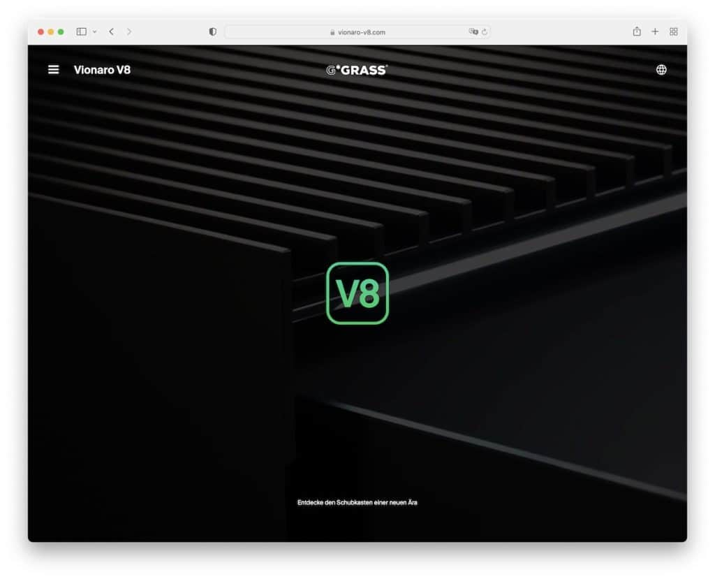
Once you start scrolling the Vionaro V8 page, it almost feels like Apple’s presentation of a new Mac or iPhone.
The interactive experience makes you want to scroll forever (in hopes it’ll never end). The awesome collection of static and moving elements with a great selection of colors makes Vionaro V8 REALLY special.
Note: Create an in-depth, extensive product presentation that’s at the same time super engaging and immersive. Vionaro V8 is a great example of an interactive website.
14. Flow Guys
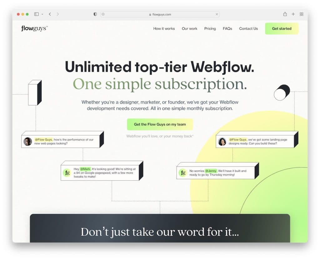
Flow Guys is a one-page Webflow website with these cool “3D elements” that make it very catchy. They also put client testimonials quite high on the home page because they know they build trust.
And their comparison table is one of the most creative and original ones we’ve ever come across. (The same applies to pricing plans.)
Note: Even if you think that everything is already done, think again and check Flow Guys’ website.
You may also want to take a peek at our list of the top landing page examples that we’re sure will inspire you.
15. Mondays Coffee
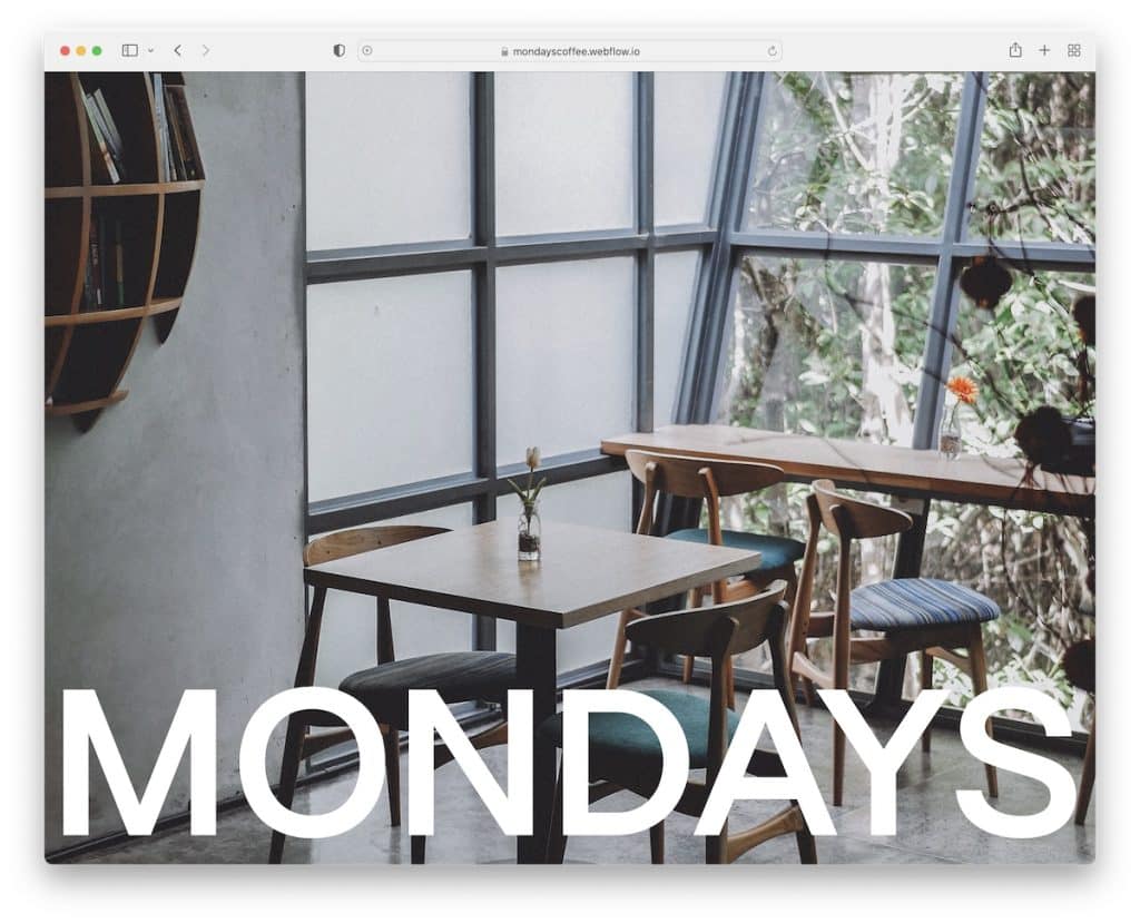
A full-screen image of the coffee shop with a bold name that animates into a header section once you scroll is such a good feature of Mondays Coffee.
And the section that shows you “how to do Mondays” is worth checking out twice. Also, the footer reveal function with a news-ticker-like presentation of their coffee blends is an excellent addition.
Note: Make potential customers feel like they’re at your coffee shop by visiting your website.
We also found many more coffee shop websites with exceptional designs, which you must check.
16. Aarland
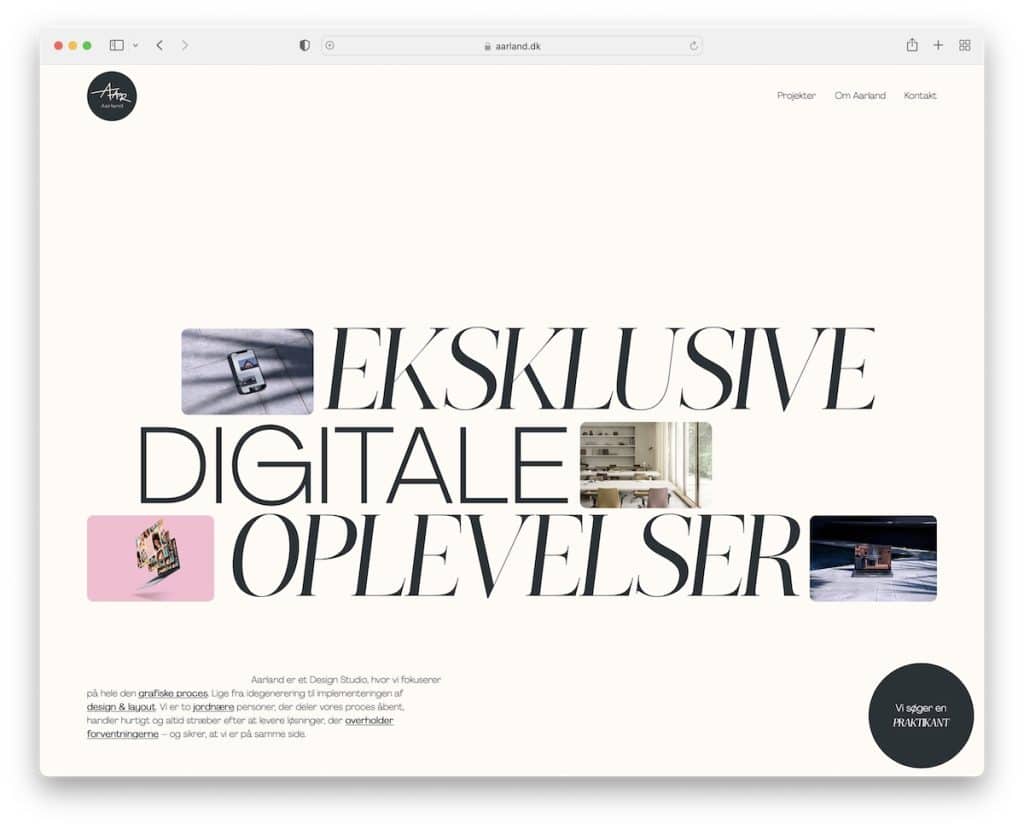
Need inspiration for displaying your digital work on your website? That’s when you need to take a peek at Aarland.
The changeable thumbnails with large text are a great welcome treat. But the treat gets even better with animated scrolling.
We must also mention the reveal of the brand owners’ image that you control with scroll.
Note: Creativity knows no limitations. Aarland as a website is a great example of thinking about web design differently.
17. Marta Tchai
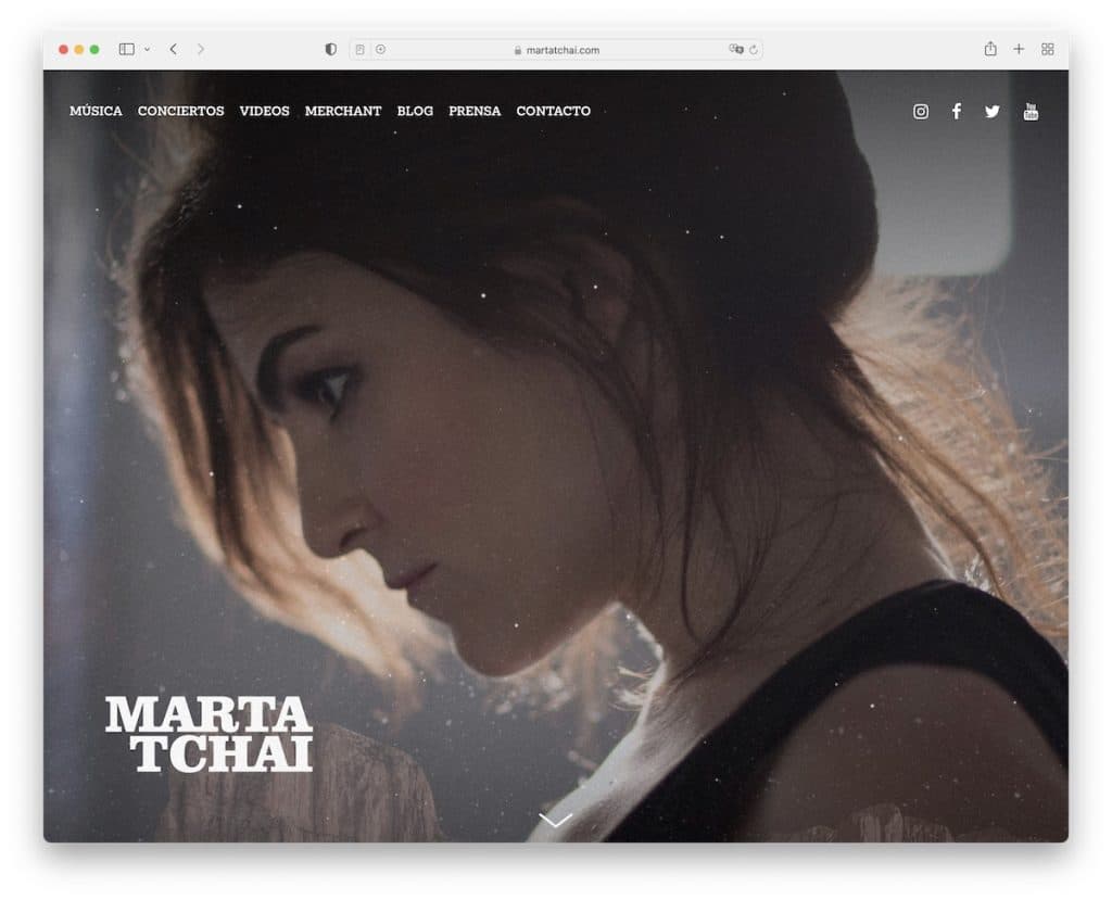
Marta Tchai features a full-screen image with her name on it that spices things up with particle effect.
The scroll-down button reveals more information about her and her work with buttons for Spotify and Apple Music. She also added a music video and a list of upcoming concerts.
Another mention is how she separated the footer section only with a line, keeping the background unchanged.
Note: Many artists miss the opportunity that a website can bring, so build one.
But you can also check other personal website builder options that are great Webflow alternatives.
18. Ready
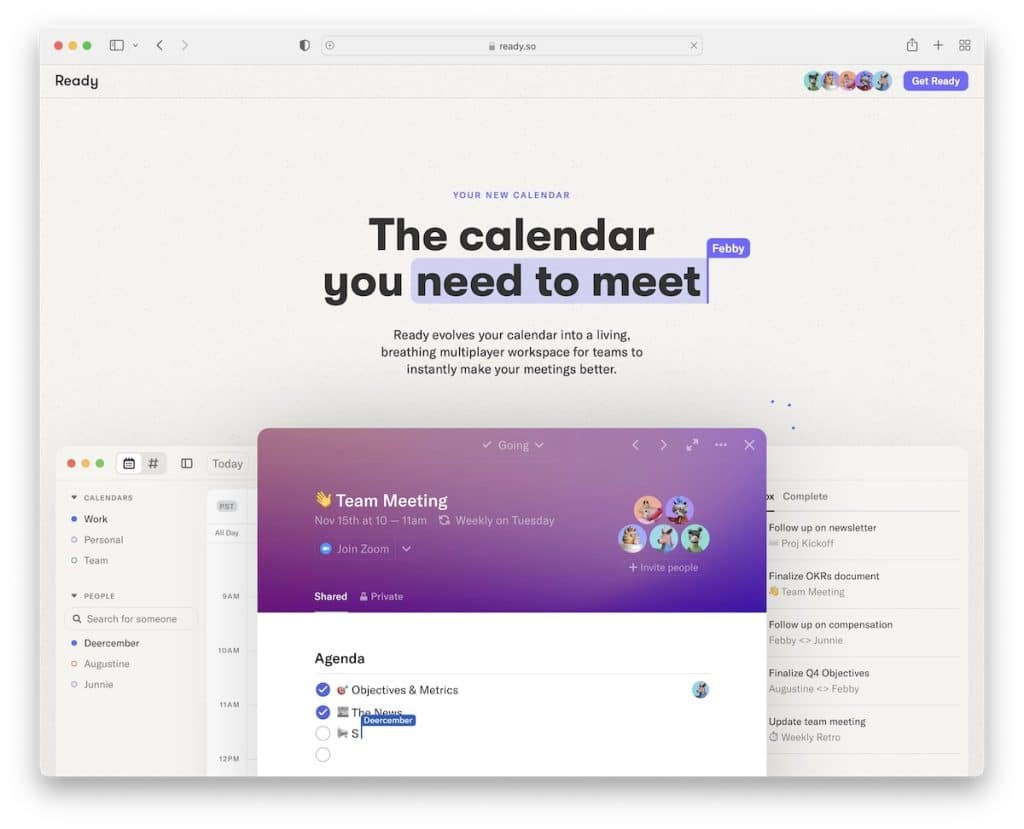
Ready is a one-of-a-kind single-page website with many creative elements that stir even the most advanced web designers.
It features a text highlight that’s used for the title, followed by what Ready is about and then straight to demonstrating the calendar in use.
But the cool sections don’t end here, giving you a fun way of getting familiar with Ready.
Note: You can instantly grab users’ attention with great animations and a product demonstration.
19. Nimbble
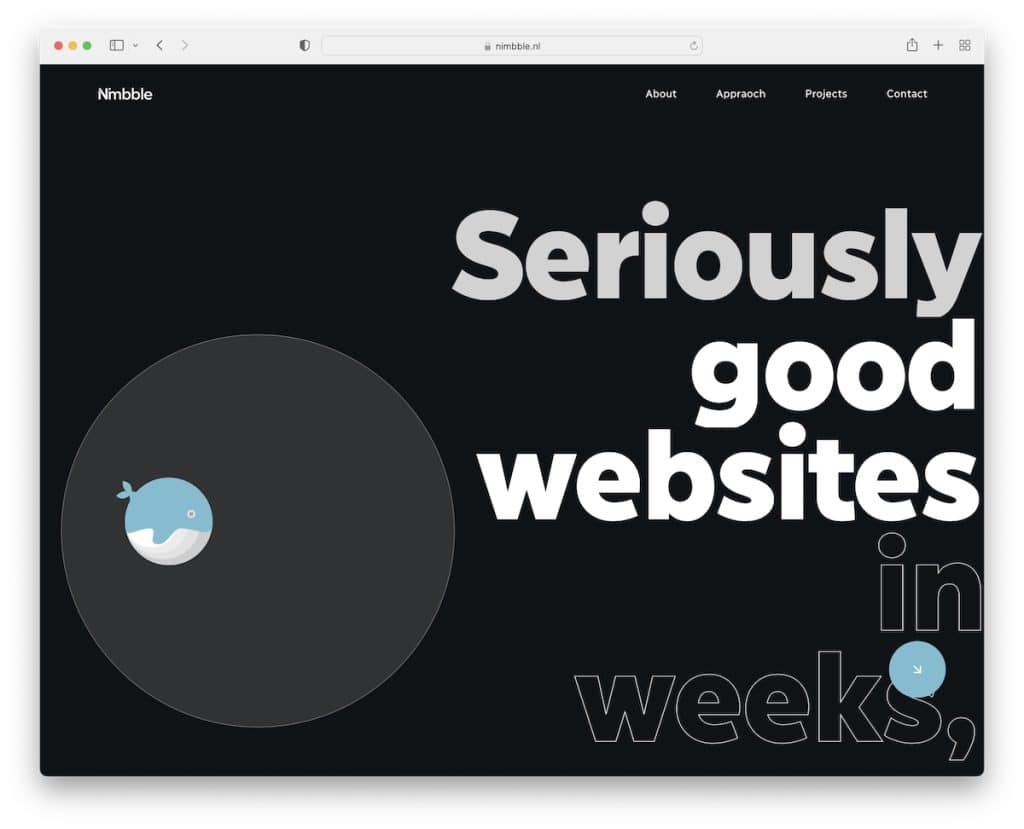
Nimbble is a Webflow website that makes the dark design look extra beautiful. It features an animated whale, bold and outlined text, content that reveals on scrolling, an awesome example/project using a laptop, and more. Nimbble is special.
The navbar also transforms into a menu icon to create a more pleasant viewing experience.
Note: If everyone uses a light web design, you can stand out from the masses by using a dark one.
Was this article helpful?
YesNo


