16 Best Bluehost Websites In 2025
For your convenience, we created a collection of the best Bluehost websites across multiple industries.
From personal and business to eCommerce websites, we tried to cover them all so everyone can use them as inspiration.
We highly recommend reviewing these before proceeding if you don’t know where to start.
Remember, these websites are hosted on Bluehost but don’t necessarily use their website and online store building feature.
Luckily, you can create your online presence fast and effortlessly with Bluehost and their website builder (or a custom WordPress theme).
Enjoy the originality of all these examples first and create yours second.
Best Bluehost Websites Design Inspiration
1. Wes McDowell
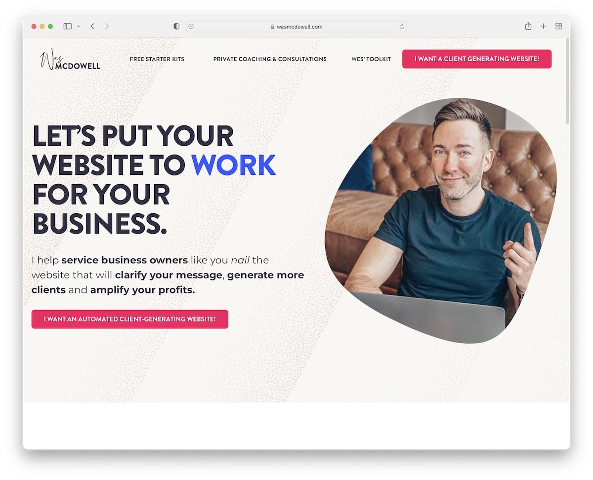
Wes McDowell has an excellent online presence for his business, which every professional and freelancer can learn from.
While we are fans of minimalist websites, Wes’s is done with great care, even though a lot is happening on the home page.
Great scrolling experience with floating navigation to jump from page to page without scrolling back to the top.
Note: The bubbly animation above the fold is a great attention-grabber that makes a website stand out more.
2. Keiko Lynn
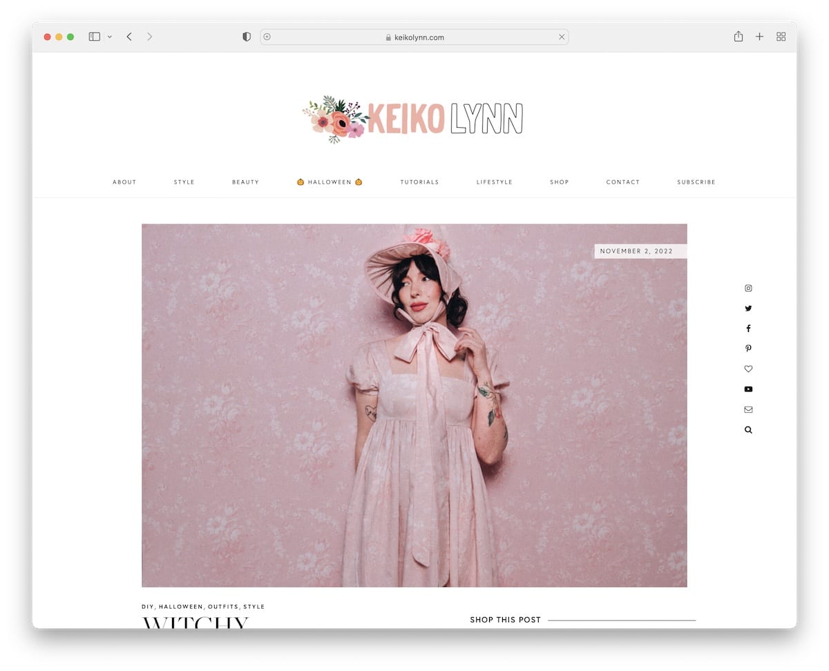
Keiko Lynn’s website can provide new ideas for personal, lifestyle, and DIY bloggers. Her home page includes blog posts, items for sale, an Instagram feed, and more.
While Wes’s page is much more crowded, Keiko keeps things simple. The sticky navbar comes in handy because she has loads of stuff for you to browse. (The drop-down menu makes finding something more specific easy.)
Note: The floating social media icons in the right sidebar are a great way for the reader to connect with the blogger. We like that she also added a search and an email icon.
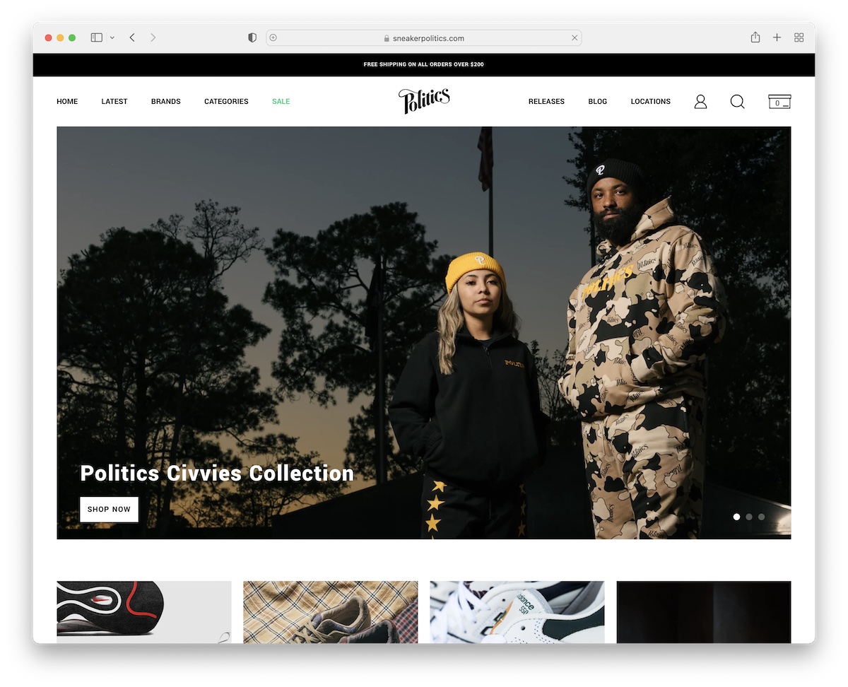
3. Sneaker Politics
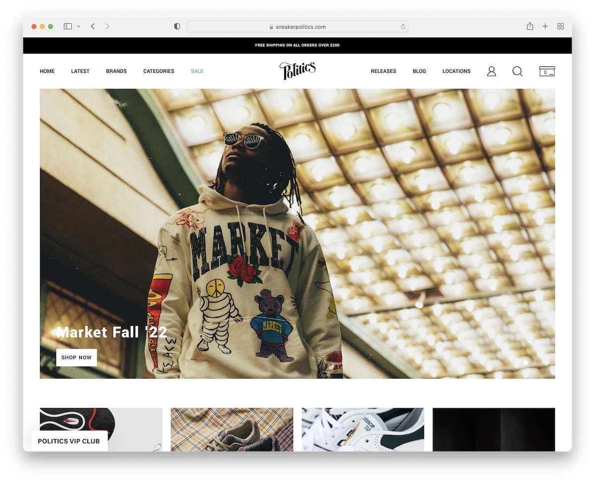
Sneaker Politics is a fantastic Bluehost website example for everyone in the eCommerce space.
The large slider promotes special drops, while the rest of the home page pushes the latest products and featured posts.
It’s a simple front page that takes the customer to the right section without doing much searching.
Note: Use a slideshow for special drops, sales and everything else that needs additional shine, like Sneaker Politics.
4. FirstMile
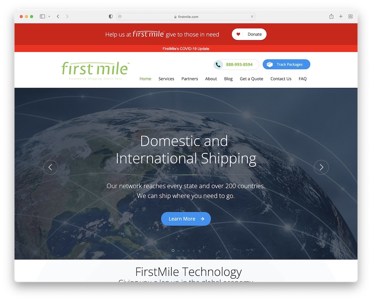
FirstMile is a somewhat basic Bluehost website at first glance, but once you start scrolling, you are treated to animations and effects. (You may also be interested in our list of the best animation websites.)
But it all begins with a slider with images, texts and CTA (call-to-action) buttons.
Everything is big and bold, so potential clients can easily learn about FirstMile’s services.
Note: Make your services pop on your home page with contact details to negotiate quick business deals.
5. iSunshare
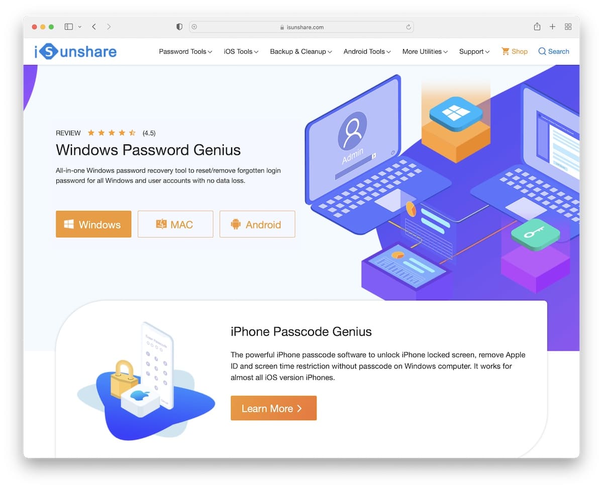
Modern software, tools and plugins tend to have very vibrant websites, like iSunshare. It’s an excellent website example with great attention to detail.
The tool’s benefits, testimonials, and CTAs are strategically placed on the home page, with a smart question: “Why Choose iSunshare Software?”
Note: If you offer a downloadable item, use CTA buttons above the fold so you don’t lose a user.
6. Start Website Online
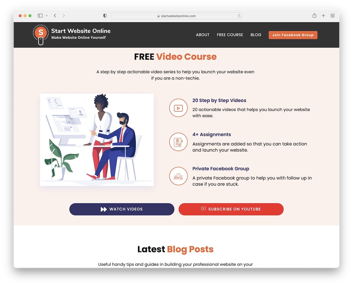
Start Website Online has a very strategic approach to promoting a free video course above the fold.
They also added the latest (educational) blog posts with links to join their Facebook group and top recommended tools.
Start Website Online shows how to use a website to share knowledge and help users build their goals.
Note: You can use the home page’s above-the-fold section to promote your course(s) with a CTA, so you don’t waste users’ time.
7. Leandro Ceder
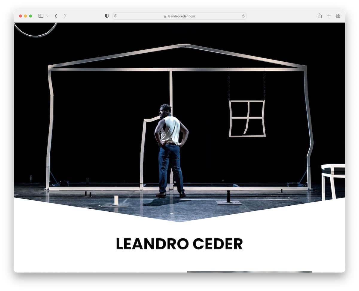
Let Leandro Ceder inspire you to create a simple website, whether you’re an artist, actor, athlete, musician, etc..
What’s cool is that Leandro also added an image slider and embedded videos to his project. Once the potential client warms up, there’s contact information to get in touch for a collaboration.
Note: Instead of relying on social media or LinkedIn, create a (simple) personal website to appear even more professional.
Also, check these great actor website designs for more ideas.
8. Ryan Sitton

Ryan Sitton’s website is a great example of how you can create a strong first impression with a dark design.
His footer section is also cool with floating particles. And the sticky header doesn’t cause interruptions due to the 100% transparent background.
Note: Go dark mode if you want to do something different with your website.
9. Dot Com Women
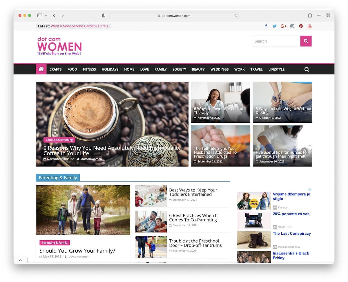
Dot Com Women is a nice representation of an online magazine website hosted on Bluehost.
It has a news ticker in the top bar, back to top button, a slider with (most popular?) posts and a floating menu with links to different categories.
While we’d reduce the ad number, Dot Com Women still creates a pleasant browsing and reading experience.
Note: You can imitate Dot Com Women’s approach to present different categories on the first page, which works great for magazine sites.
10. PWPonderings
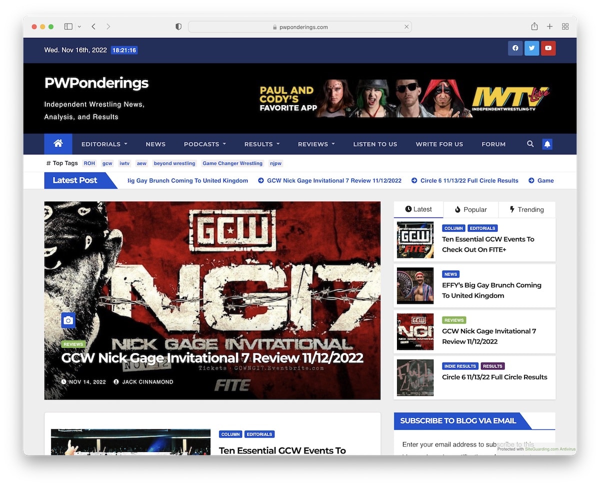
PWPonderings is a modern niche news site about wrestling. Its top bar displays a date and time with social media icons, a news ticker, and a slider with the latest posts below the header.
PWPonderings also has a widget that promotes Popular and Trending content in the right sidebar.
Note: You can use a news ticker to push the latest or trending posts as a news site.
11. Frontline Gaming
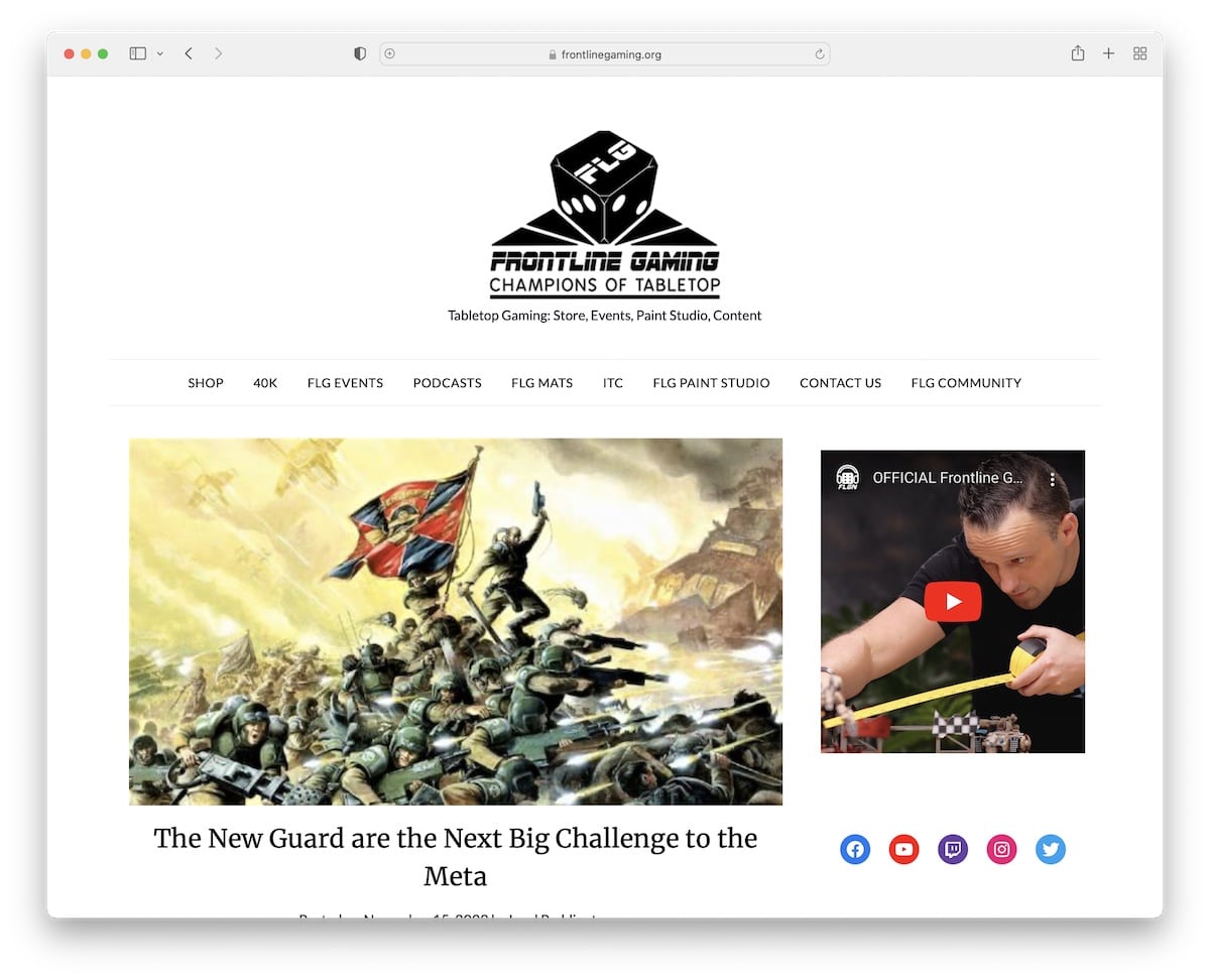
Frontline Gaming is a simple blog-style website with enough white space to ensure great readability. It also features multiple widgets in the sidebar, including a promotional video.
But we also have many more gaming blog designs for you to check.
Note: Leverage the blog’s sidebar to promote content and online shop (similarly to Frontline Gaming).
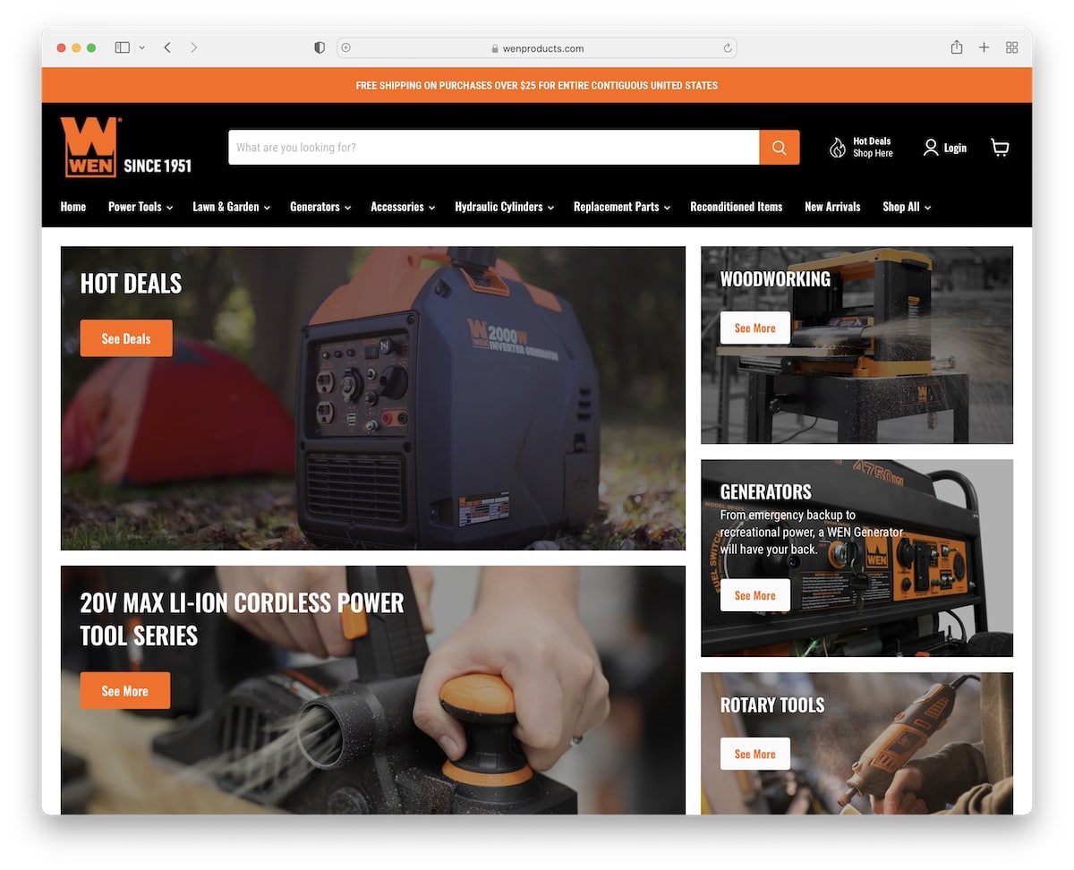
12. WEN
WEN is an online tools store with a modern design and smooth shopping experience, thanks to the responsive web design. We like how they use the above-the-fold section to promote hot deals and other popular collections, which you can strategically apply to your eCommerce website.
Note: The first few seconds matter the most, so ensure you trigger attention with special deals, great imagery, and CTAs that increase conversions, like WEN.
13. Wigs For Kids
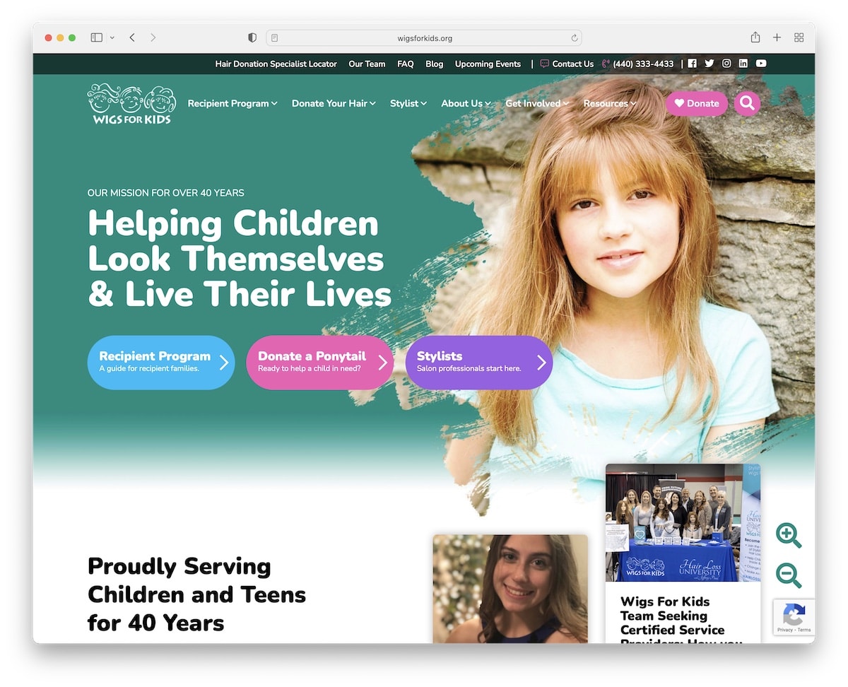
Wigs For Kids is a superb charity website that places donors, volunteers, and more first.
The site has a modern and colorful design that’s easy to skim when finding more information about its cause. Plus, it has a cool font resizer that makes the page more accessible.
Note: Even if you plan to use various content on your home page, make it more dynamic, which is exactly what Wigs For Kids does very well.
14. Freed’s Bakery
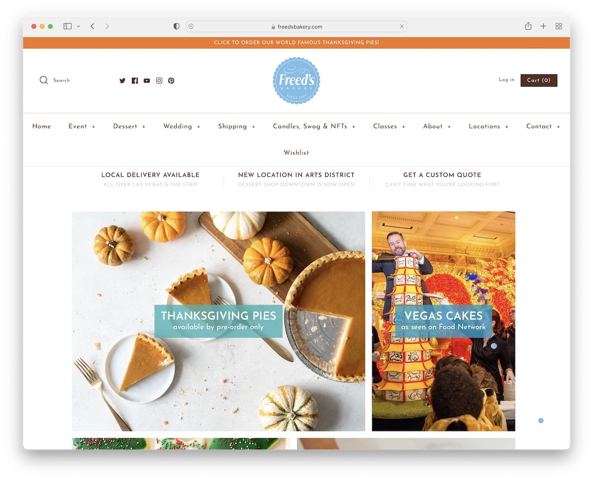
Large, professional imagery of baked goods and smooth page scrolling make Freed’s Bakery’s website very appetizing. The page also has a very original drop-down menu that you don’t see daily.
Note: Ensure professional photography of cakes and bakes to water visitors’ mouths and get them on your side.
We also carefully curated the best bakery website design collection for additional inspiration.
15. Vlogger Gear
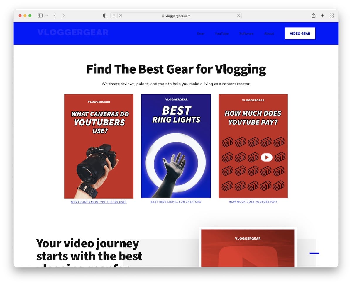
Vlogger Gear is a modern blog with a home page that immediately conveys professionalism. The front page features the most valuable content, and a newsletter subscription is located at the bottom.
Note: Instead of using a blog as the home page, you can create one from where you link to different (most important) areas of your site/blog.
16. Skin + Joints
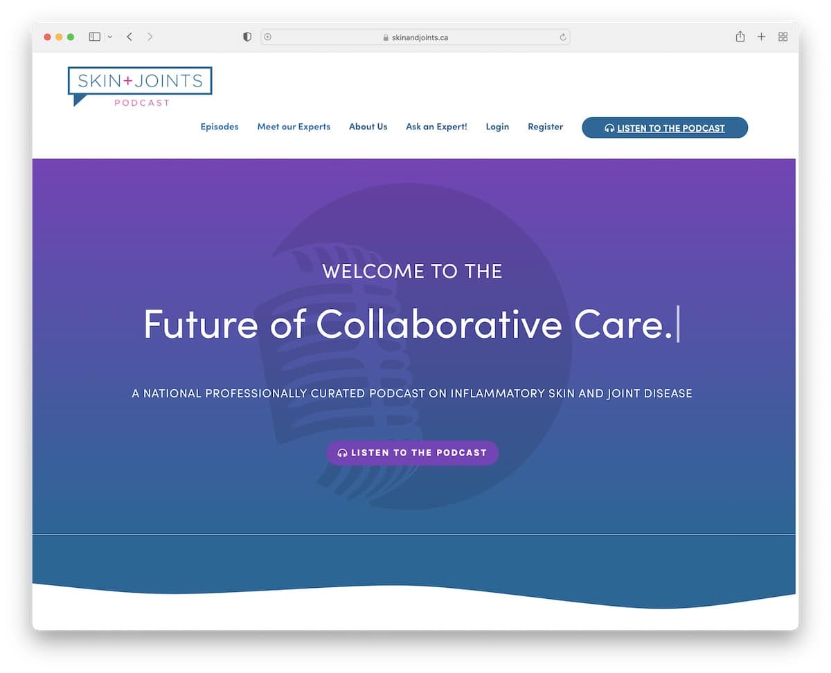
Skin + Joints’s website has a lot of white space and animations for a more engaging browsing experience. The typewriter effect spices things up.
They also feature their latest podcast episode on the home page so everyone can easily find it.
Note: As a podcaster, your front page should include experts, the latest episode(s), platform links, and more. Make your site a promotional hub to grow your business.
Was this article helpful?
YesNo