13 Best Squarespace Wedding Websites 2024

We’ve scoured the internet to bring you a curated list of Squarespace wedding websites that stand out for their creativity, user experience and beauty.
Crafting the perfect wedding website can be as thrilling as planning the big day, especially with platforms like Squarespace offering a canvas for your love story to shine online.
In this article, we’re diving into the world of Squarespace wedding websites, showcasing the crème de la crème of matrimonial web design.
Whether you’re looking for inspiration to announce your union or a web design specialist keen on the latest trends in wedding websites, you’re in the right place.
These websites set the bar high, from elegant layouts and stunning photo galleries to seamless navigation and interactive features.
Let’s journey through digital aisles adorned with the best of Squarespace’s wedding website designs.
Best Squarespace Wedding Websites
Below, you’ll discover a selection of Squarespace wedding websites that set elegance and functionality standards.
Each example embodies the perfect blend of personal storytelling and professional design, making them ideal sources of inspiration for your own nuptial website.
Note: Enjoy even more fantastic design examples by viewing our collection of the best wedding websites.
1. Weddings By Lisa Nicole
Built with: Squarespace
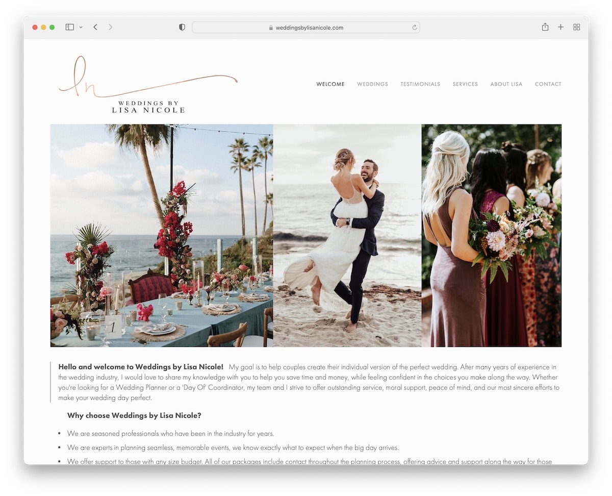
Weddings By Lisa Nicole’s Squarespace site stands out with its light, minimalist design, which ensures a serene and elegant user experience.
The website features a clean header and footer, creating a refined, uncluttered look highlighting essential elements.
A dedicated testimonials page showcases heartfelt feedback, adding a personal touch.
Moreover, the contact form is thoughtfully designed with extra fields, making it easy for potential clients to share detailed inquiries, enhancing overall engagement and user interaction.
Note: When it comes to the site’s overall design, sticking to minimalism usually works like a dream. (Check these epic minimalist website examples.)
Why we chose it: For its elegant simplicity and user-friendly features.
2. Alison Bryan
Built with: Squarespace
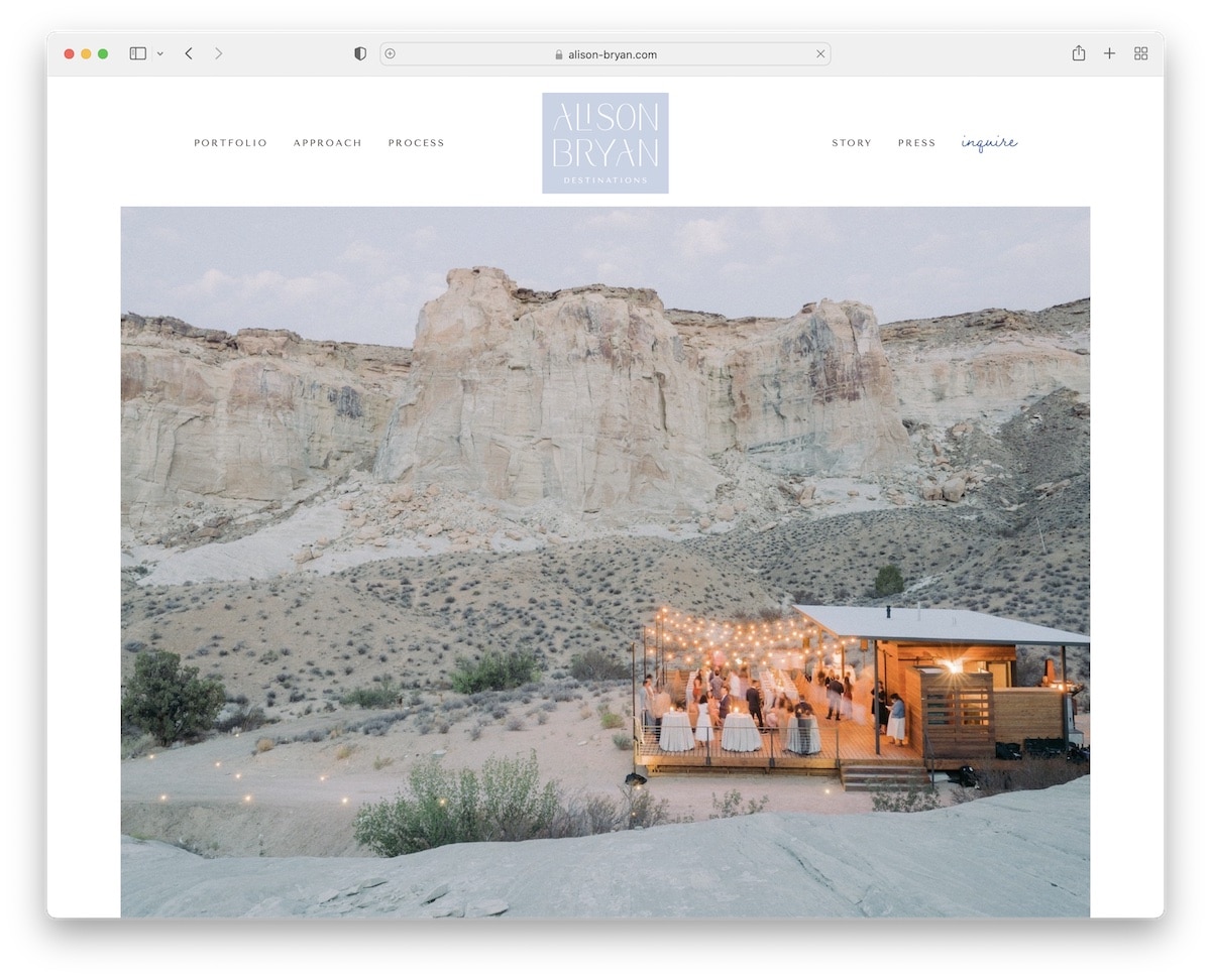
Alison Bryan’s Squarespace wedding website captivates visitors with its dynamic floating header and immersive parallax images that add depth as you scroll.
The site is further enhanced by video background sections, bringing the storytelling to life.
A beautifully crafted testimonial slider showcases happy couples alongside their glowing reviews, adding a personal and trust-building element.
Additionally, the integrated Instagram feed keeps the content fresh and connected to real-time updates, creating a vibrant, engaging online presence.
Note: Boost your website’s user experience with a floating header/navbar.
Why we chose it: For its engaging visual elements and dynamic features that beautifully showcase the work.
3. Bridal Bliss
Built with: Squarespace
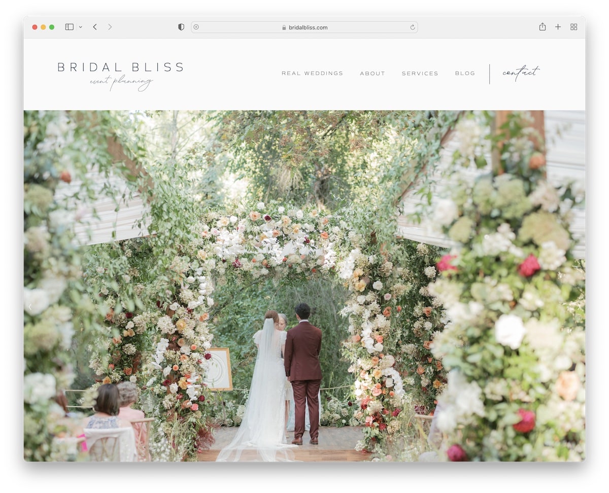
Bridal Bliss’s Squarespace site mesmerizes with a massive, image-only slider above the fold, setting a grand visual tone.
The elegant header, with its intuitive drop-down menu, seamlessly guides visitors. We also enjoyed the parallax sections and an Instagram feed in the footer, which blend modernity with social engagement.
An advanced contact form, alongside embedded videos, enriches the interactive experience.
The site also boasts a blog and galleries with lightbox features, offering a comprehensive glimpse into services and successes in wedding planning.
Note: Save space while still delivering your amazing content by using a slider.
Why we chose it: For gorgeous presentation and comprehensive features that effortlessly guide visitors.
4. Engaged & Inspired
Built with: Squarespace
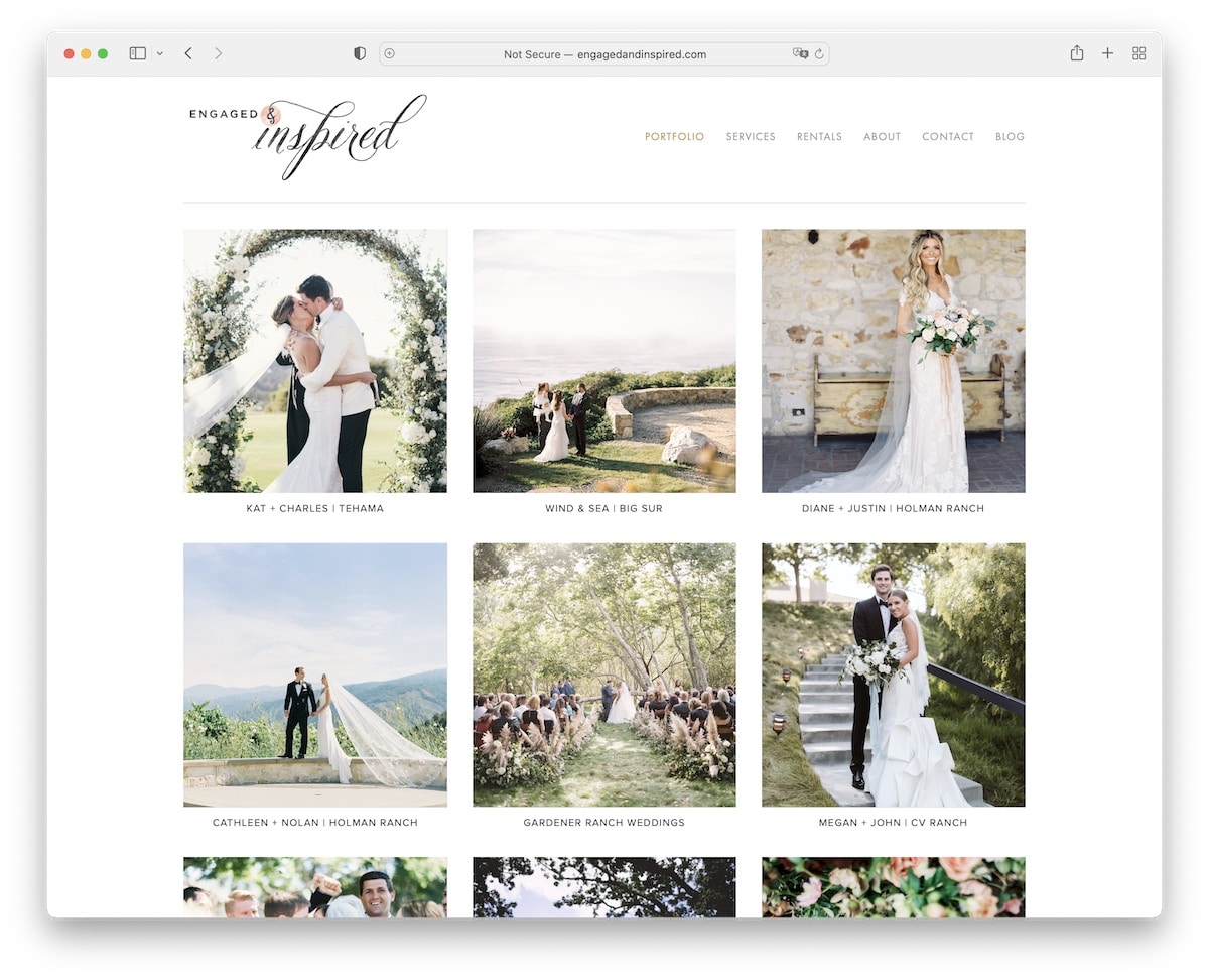
Engaged & Inspired’s Squarespace site impresses with its simple yet impactful three-column grid presentation. The homepage elegantly showcases weddings.
The boxed page layout adds a structured, clean look, enhancing readability and focus.
Its services page is efficiently organized, detailing packages and pricing clearly, making decision-making easier for potential clients.
The site’s minimalist header and footer contribute to its uncluttered appearance, so the content and imagery remain the focal points of visitor engagement.
Note: Use a grid layout for an organized content presentation.
Why we chose it: For its clarity and ease of navigation, which highlights services and wedding success stories.
5. Piper & Muse
Built with: Squarespace
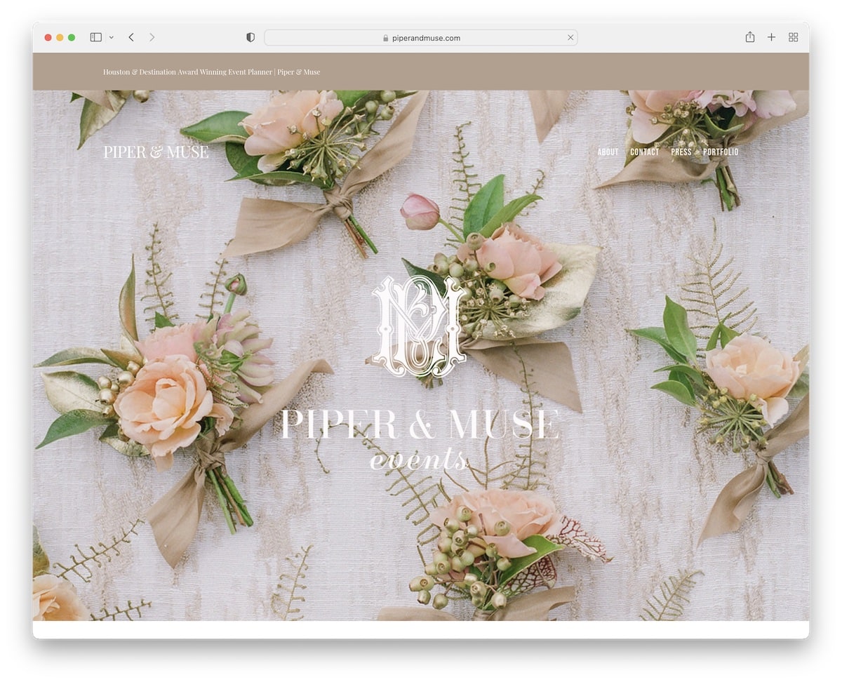
Piper & Muse’s Squarespace site stands out with its captivating full-width parallax background sections. These add a layer of depth and dynamism to the browsing experience.
The transparent header blends seamlessly with the site’s visuals, and a top bar notification for important announcements complements it.
The footer is thoughtfully designed, housing contact details, business information, and social media links for easy accessibility.
Additionally, the contact page features a user-friendly form and an integrated Google Maps, facilitating effortless interaction and location finding.
Note: Use Google Maps with a (custom) marker to showcase your business location.
Why we chose it: For its immersive visual experience and well-structured contact features.
6. Ryan Flynn
Built with: Squarespace
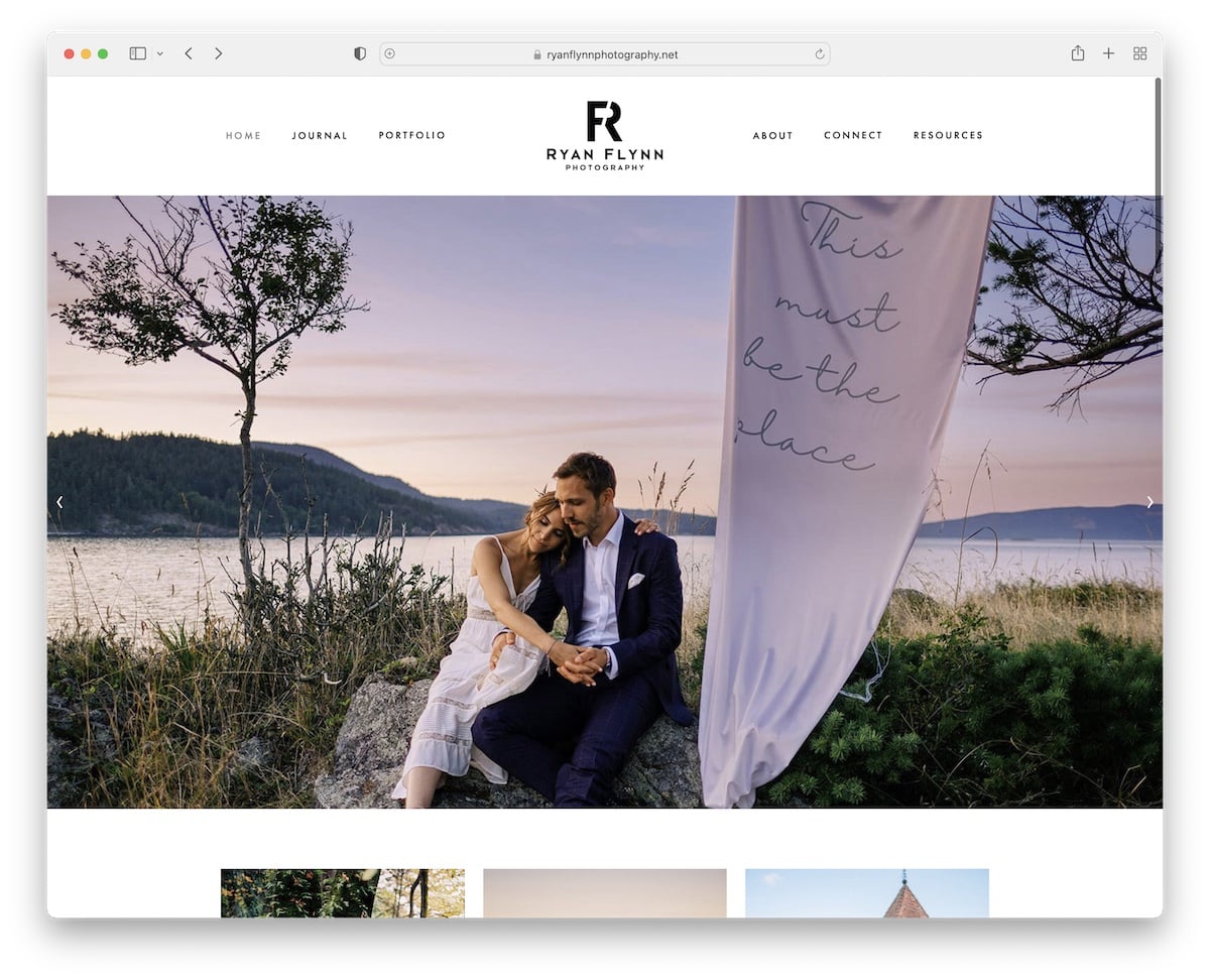
Ryan Flynn’s Squarespace wedding website captures the essence of his photography with a simple header that leads straight to the heart of his work. This image-only slider showcases his artistry.
The site’s footer is uniquely spacious, offering additional resources and information.
Grid-style portfolios with lightbox functionality allow a pleasurable viewing of Ryan’s photographs.
Moreover, the blog section and Instagram feed keep the content dynamic, offering insights and updates in a visually engaging format.
Note: Don’t neglect the footer, where you can put lots of additional useful information for the client.
Why we chose it: For its focus on showcasing photographic talent through a clean yet impactful design.
7. Blush + Bowties
Built with: Squarespace
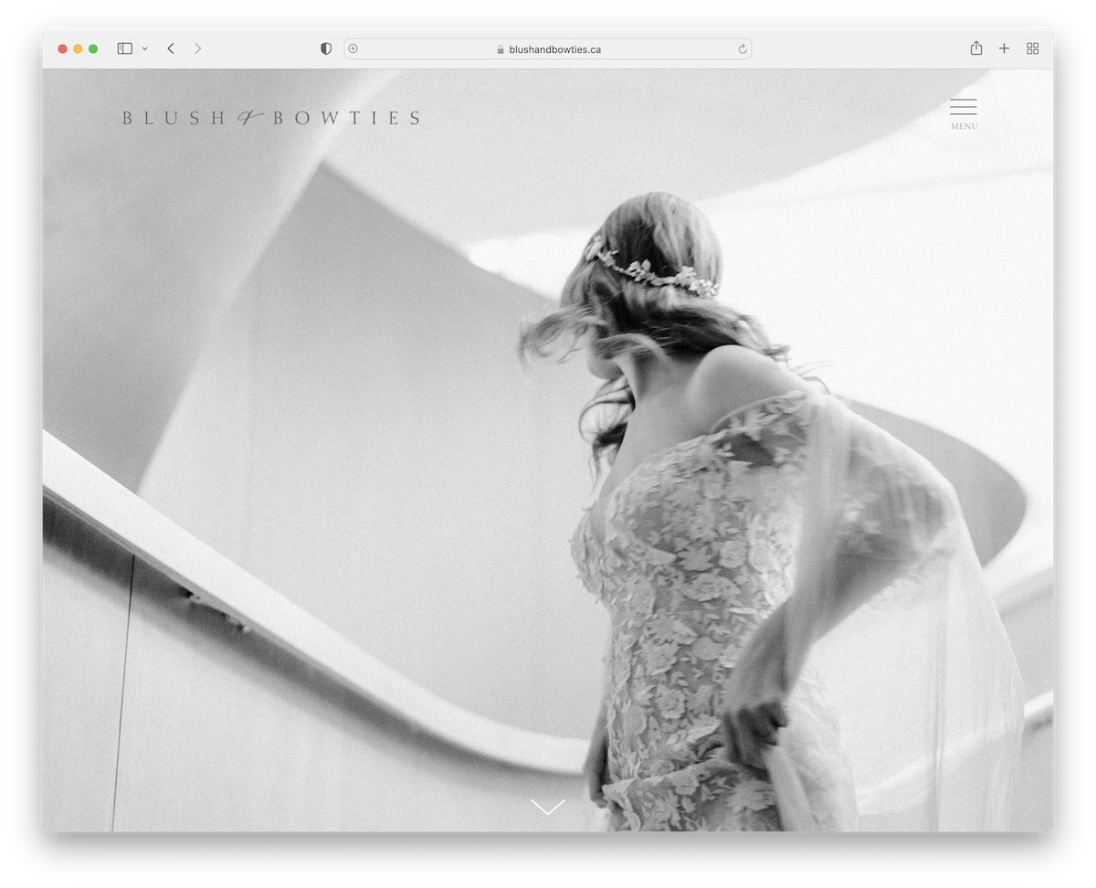
Blush + Bowties’ Squarespace site enchants with a full-screen image background employing a parallax effect right above the fold. (It creates a strong first impression without text or CTAs to distract.)
The transparent header with a minimalist hamburger menu enhances the site’s sleek design.
Throughout the page, more full-screen parallax sections weave a visual narrative, complemented by a portfolio gallery slideshow that showcases their work elegantly.
The footer is packed, featuring an Instagram feed, social icons, and a concise company bio, inviting further exploration and connection.
Note: Images speak more than a thousand words—use them strategically! (Remember to incorporate video content, too.)
Why we chose it: For its catchy visual storytelling and clean, user-friendly design with strong attention to detail.
8. A Day To Cherish
Built with: Squarespace
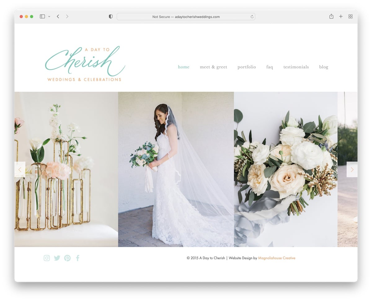
A Day To Cherish’s Squarespace site charms with its unique home page, featuring only a minimalist header, footer, and striking slider. This embodies elegance and simplicity, which our eyes cannot get enough of.
The site expands into multiple internal pages, each thoughtfully designed to showcase portfolio and FAQs, share glowing testimonials, and host an updated blog.
The About page is adorned with an impressive array of certificates and award badges, attesting to their excellence and expertise in wedding planning, adding credibility and trust.
Note: If you have certificates, awards, etc. – showcase them on your website, just like testimonials.
Why we chose it: For its cleanness combined with thorough content and acclaimed success.
9. Nicole George
Built with: Squarespace

Nicole George’s Squarespace wedding website amazes with its large yet uncomplicated header and footer, neatly containing all essential links and social media.
The site is visually striking, featuring massive parallax sections that add a dynamic layer to browsing.
A masonry grid portfolio with generous spacing elegantly displays her work, inviting viewers to explore further.
The extensive contact form, detailed with additional fields, ensures that inquiries are comprehensive, facilitating a seamless communication process with potential clients.
Note: Use a contact form with additional fields to learn as much as possible from a potential client.
Why we chose it: For its perfect balance of visual appeal and functionality in an accessible and engaging manner.
10. Rush & Danit
Built with: Squarespace

Rush & Danit’s Squarespace wedding website greets visitors with a captivating full-screen home page. It elegantly displays their logo (aka Rush + Danit), a warm “we’re getting married” announcement, and an inviting “enter” button.
The transparent header over an image background hero section sets a romantic tone, while the timeline feature outlines the wedding schedule.
Integrated Google Maps ensure guests find the venue easily, and the dedicated RSVP page simplifies confirmations.
A subscription form widget in the footer keeps guests engaged and informed with updates, adding a thoughtful touch to guest communication.
Note: An RSVP is a must if a couple is building their website as a wedding announcement. Keep it modern!
Why we chose it: For its inviting entry and handy design that seamlessly guides the visitor.
11. Alex And Andrew
Built with: Squarespace
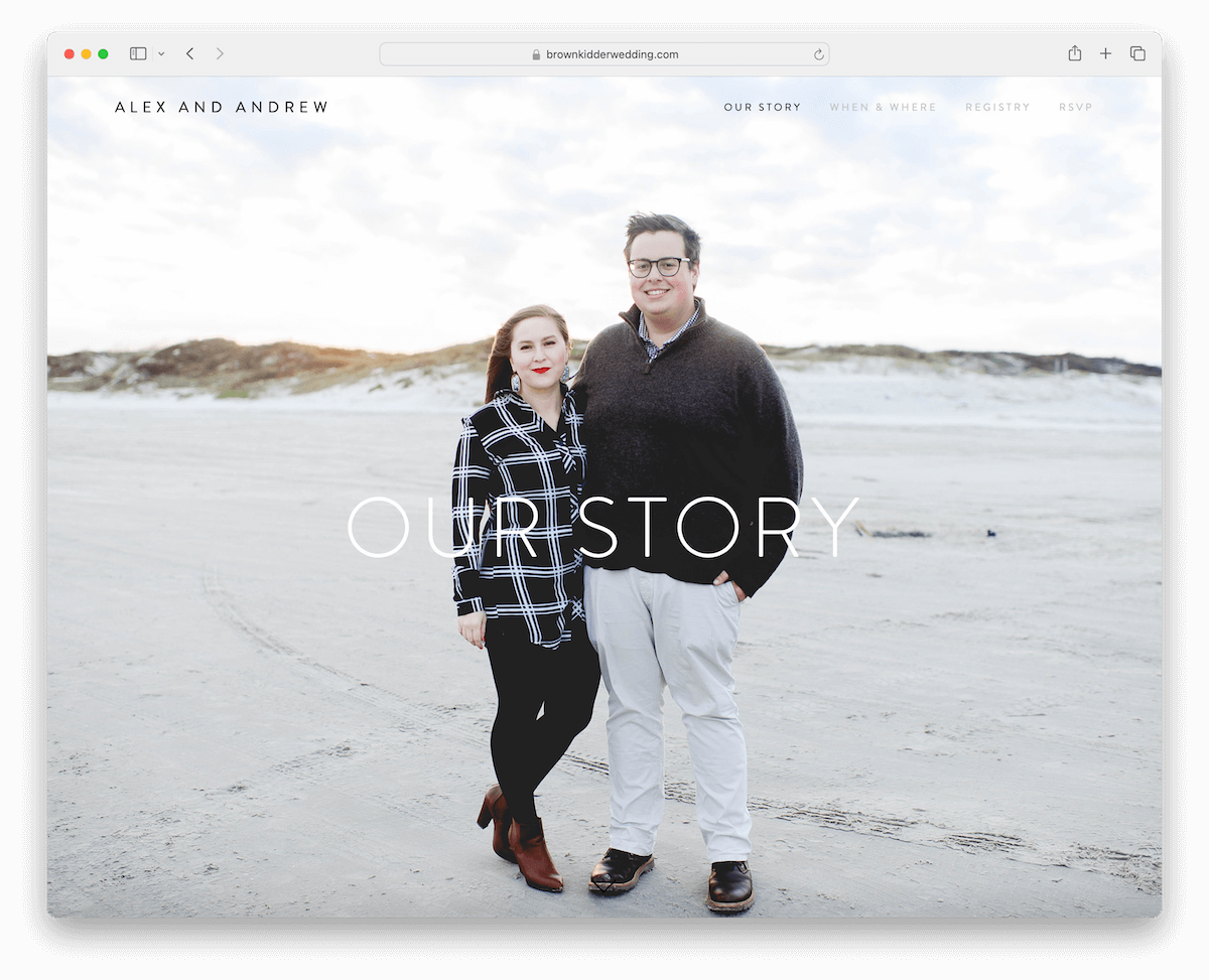
Alex and Andrew’s Squarespace wedding website triggers attention with a full-screen image background above the fold. (It immediately consumes visitors in their story.)
Navigation is boosted by interactive dots on the right side, revealing their hover purpose.
The floating header adds to the site’s modern feel, while a gallery grid with a lightbox beautifully showcases their moments.
A convenient back-to-top button facilitates easy navigation, and the choice of an empty footer emphasizes the site’s minimalist and focused approach.
Note: Integrate a back-to-top button so visitors don’t have to scroll to reach the navigation. (This might be unnecessary if using a floating header.)
Why we chose it: For intuitive navigation, a large parallax section and a seamless and engaging exploration.
12. Sam + DJ
Built with: Squarespace
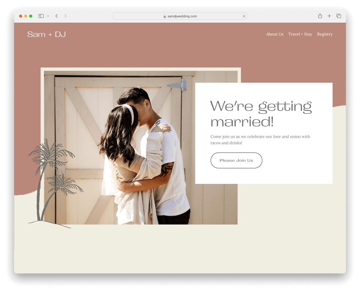
Sam + DJ’s Squarespace wedding website grips you with its soothing color scheme, creating a tranquil and welcoming atmosphere.
The site cleverly loads content as you scroll, maintaining a clean look with plenty of white space.
Its innovative header disappears to minimize distraction on a downward scroll but conveniently reappears when scrolling back up, ensuring easy navigation.
A straightforward RSVP form, a unique slider showcasing vertical images, and a minimalist footer featuring just a hashtag, encapsulate the site’s easiness and modern convenience.
Note: Incorporate white space to ensure better readability and a more focused experience.
Why we chose it: For its serene atmosphere and user-centric design with smooth and calming browsing.
13. Humayra & Henri
Built with: Squarespace

Humayra & Henri’s Squarespace wedding website is a light and clean design masterpiece, ensuring a serene UX.
The smart header disappears and reappears, facilitating uninterrupted viewing while maintaining easy site navigation.
The location page is thoughtfully curated with a gallery and integrated Google Maps, while the accommodation page details options with clear pricing.
Comprehensive event details, a specific dress code section, and dedicated photo and video pages offer guests a thorough insight into the wedding. These make every aspect of the celebration transparent and accessible.
Note: Dedicated a section or an entire page to the even details so attendees know what to expect.
Why we chose it: For its elegant design and meticulous attention to detail.
Fun fact: Have you seen these Squarespace statistics? (Do you know how many websites use Squarespace?)
How To Make A Wedding Website With Squarespace
Creating a wedding website with Squarespace is simple. Follow these six steps to get your site up and running:
FAQs About Squarespace Wedding Websites
How customizable are Squarespace wedding website templates?
Squarespace templates are highly customizable, allowing users to modify layouts, fonts, colors, and more. This flexibility ensures that your wedding website can be tailored to match your specific theme and style preferences.
Here are the best Squarespace wedding website templates that come with stunning designs and are easy to customize.
Can I integrate external services, like maps or registries, into my Squarespace wedding website?
Yes, Squarespace allows you to integrate various external services, including Google Maps for directions to your venue and links to your wedding registries. You can add these through embedded code blocks or dedicated content blocks designed for such integrations.
Is it possible to use custom domains for Squarespace wedding websites?
Yes, Squarespace enables you to connect a custom domain to your wedding website, making it easy for guests to find and remember the URL. You can purchase a domain directly through Squarespace or connect an existing one.
How does Squarespace handle RSVPs and guest management?
Squarespace provides built-in form blocks for creating customized RSVP forms. Responses can be managed within Squarespace or exported to a spreadsheet, helping you keep track of guest information and preferences efficiently.
Are Squarespace wedding websites mobile-friendly?
Yes, all Squarespace templates are designed to be responsive. This means your wedding website will automatically adjust to look great on devices of all sizes, from desktops to smartphones, ensuring a seamless experience for your guests no matter how they access your site.
Was this article helpful?
YesNo


